Inside Omlet: Brand Identity by Ragged Edge
Ragged Edge crafts a global brand identity for pet hardware pioneer Omlet, pairing an egg-shaped wordmark with witty poster typography.
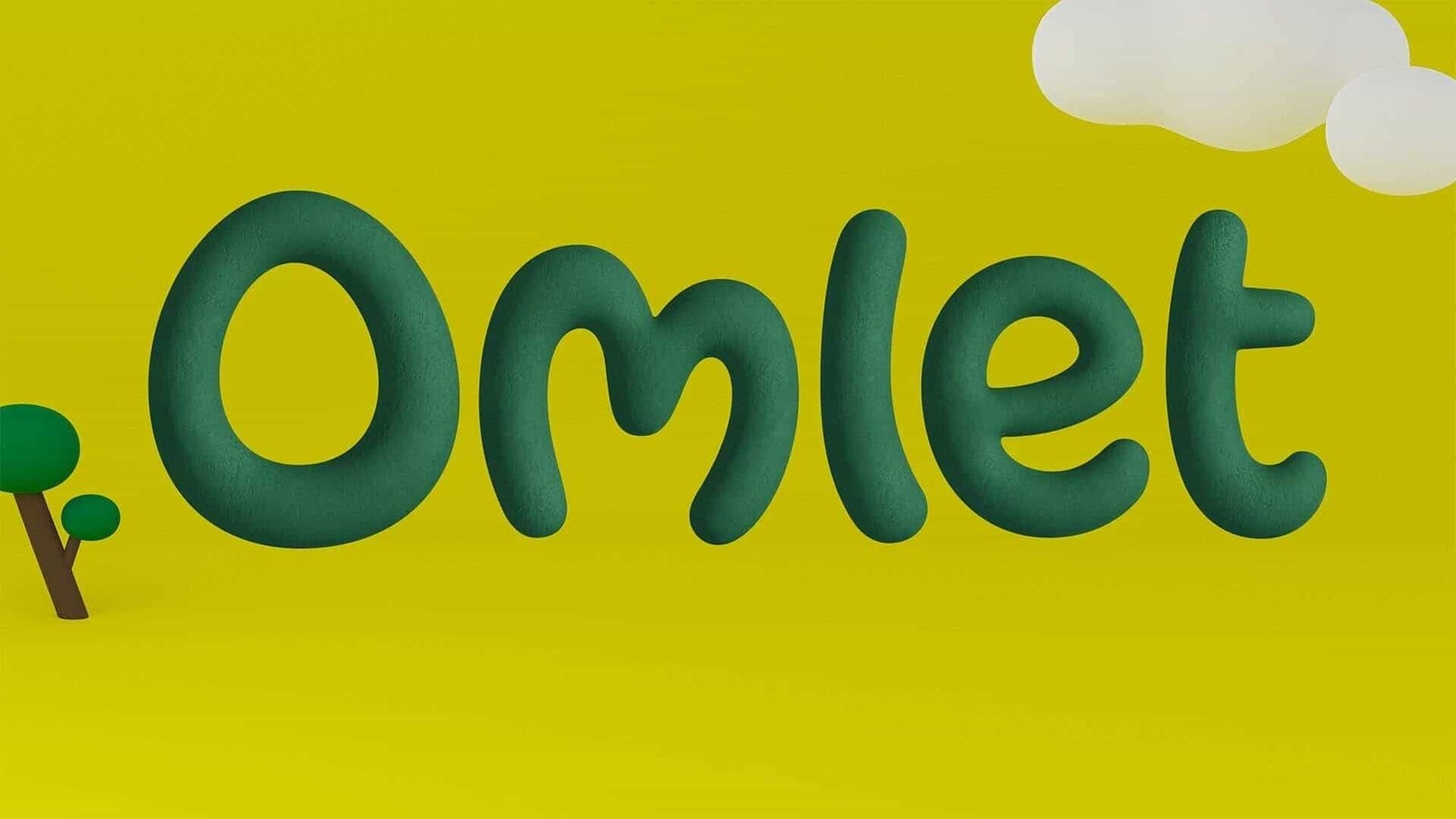
Omlet’s industrial-design founders started their journey with one disarmingly simple question: can a chicken be a pet? Their answer was the Eglu Cube chicken coop, engineered from scratch to make backyard chicken-keeping effortless. By the time London studio Ragged Edge came aboard, they’d sold 150,000 coops worldwide and raised fresh investment to scale across the $250 billion global pet care sector. Sentimental paw prints didn’t stand a chance. Working closely with Omlet’s founding and in-house teams, Ragged Edge distilled that habit of questioning convention into World Of Wonder, a playful brand identity rooted in industrial rigor. The redrawn Omlet wordmark sets the tone right away. Sculpted in deep forest green over acid chartreuse yellow, its oversized, tilted capital O teases whether it’s a letterform or a freshly laid egg.
Playful Rigor in Global Brand Identity
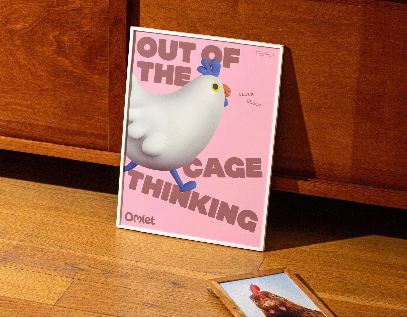
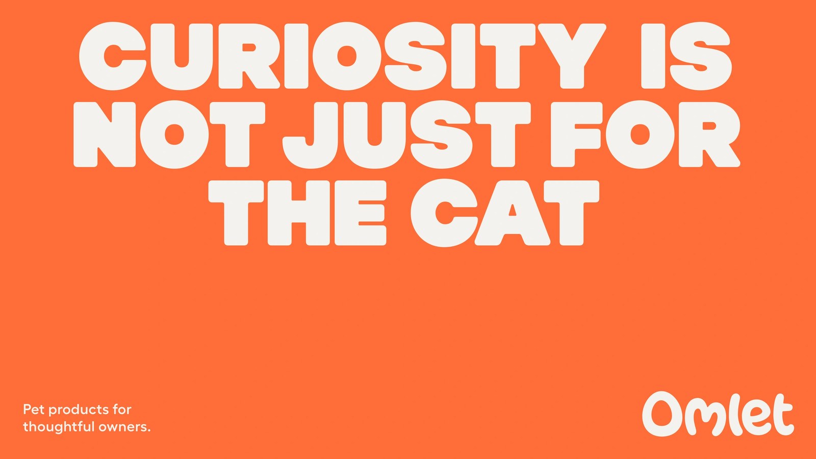
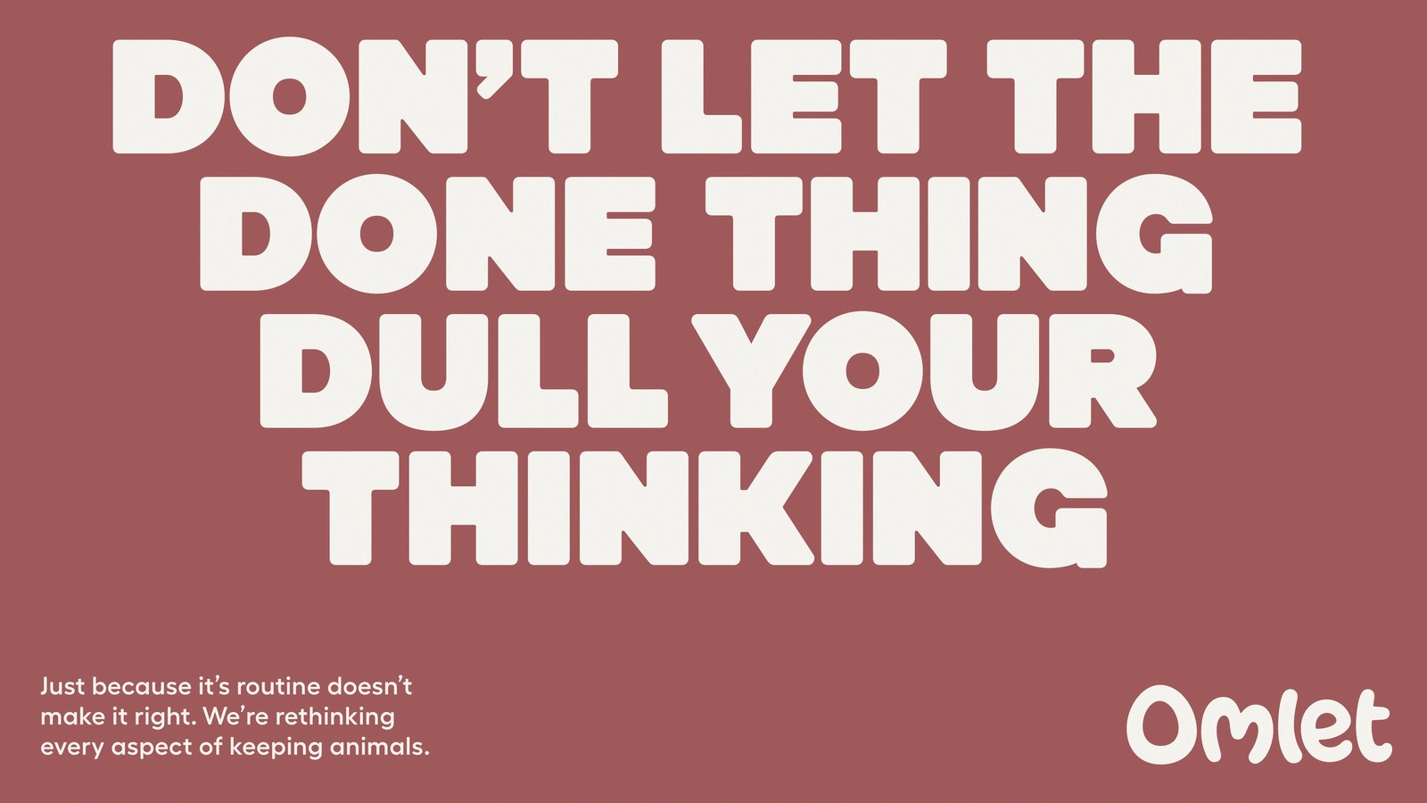
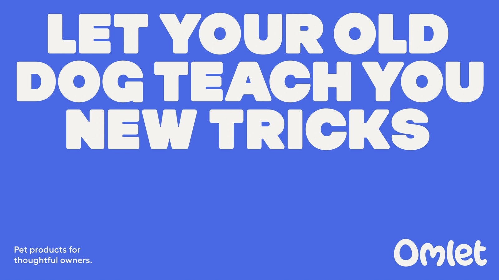
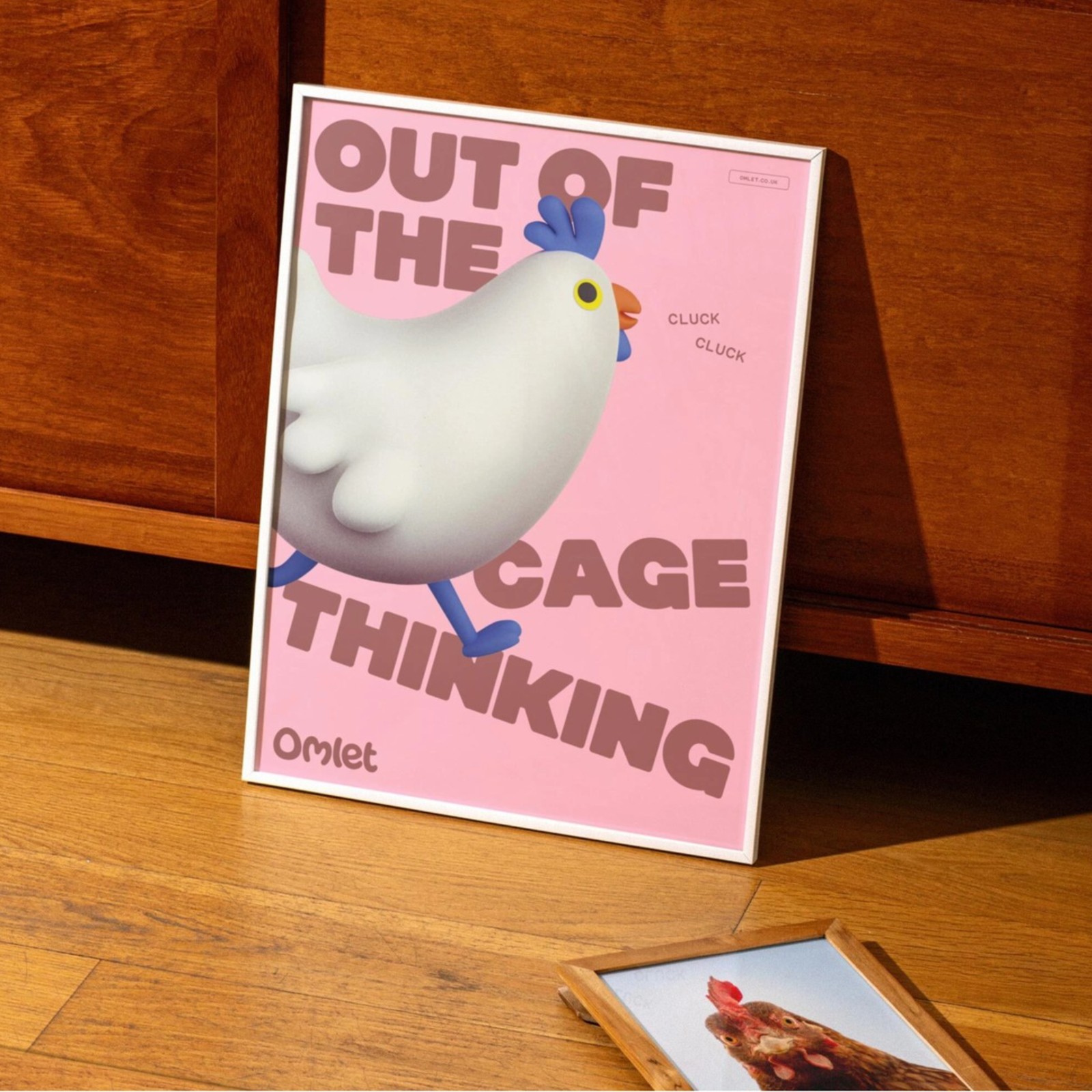
The display type hits hard. Heavy, ink-softened off-white block capitals stack tightly across saturated cobalt-blue, tangerine-orange, and warm terracotta posters, delivering wry lines like “CURIOSITY IS NOT JUST FOR THE CAT.” Down along the bottom margin, crisp left-aligned sans-serif copy balances the rounded Omlet logotype anchored in the lower-right corner. Nothing in the grid feels precious. Alongside the typography sits the Curious Collective, a cast of tactile 3D character illustrations celebrating the everyday comedy and imperfection of living with pets. On one framed blush-pink poster, a plump white hen with a periwinkle-blue comb strides straight across angled brown display type reading “OUT OF THE CAGE THINKING,” complete with tiny “CLUCK CLUCK” callouts.
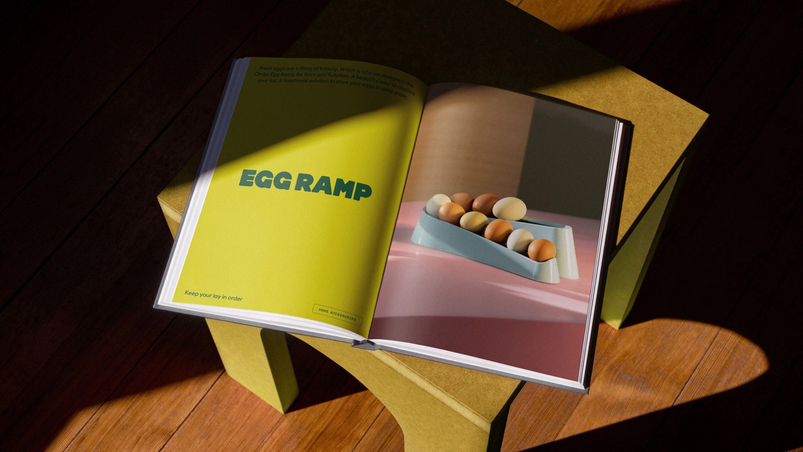
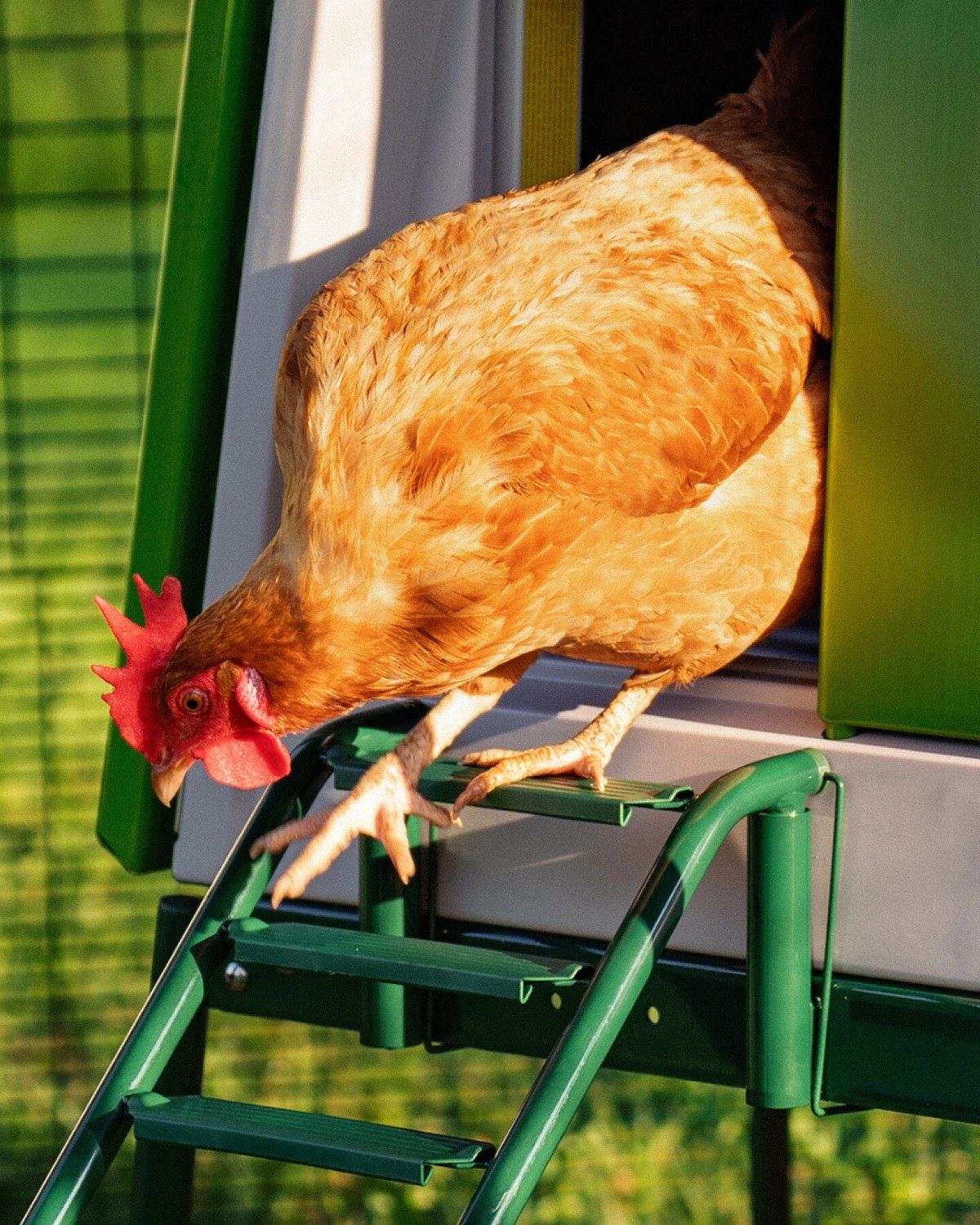
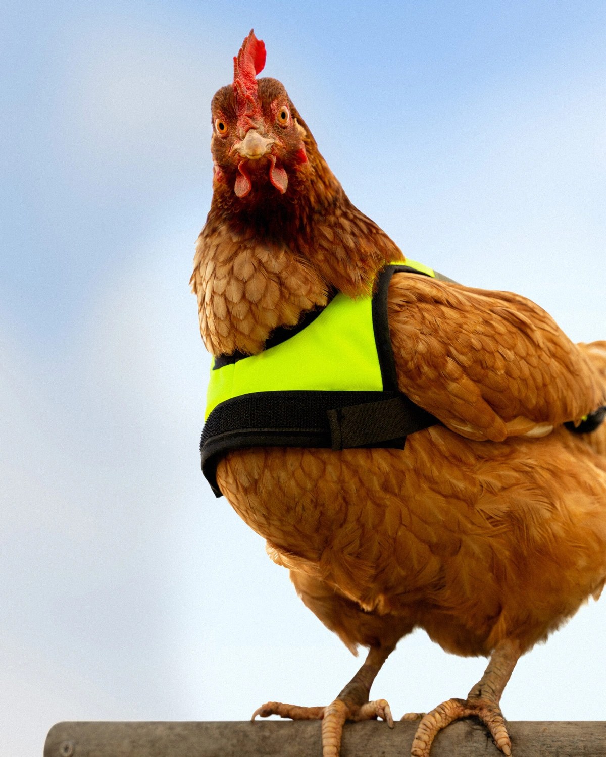
Every graphic detail connects back to physical hardware. An open hardcover manual spread set in InDesign pairs a sunlit chartreuse left-hand page and bordered category pill tag opposite studio photography of speckled eggs resting inside Omlet’s sage-blue Egg Ramp. Out in the yard, crisp daylight photography captures a ginger hen stepping down the powder-coated green ladder of an Eglu automatic coop door — plus another hen wearing a fluorescent lime-yellow Velcro high-visibility jacket against a clear blue sky. It’s weird in the best way. Grounding dry British copywriting in real product engineering gives Omlet an unmistakable brand identity built for international growth.
See the full project by Ragged Edge on Ragged Edge.