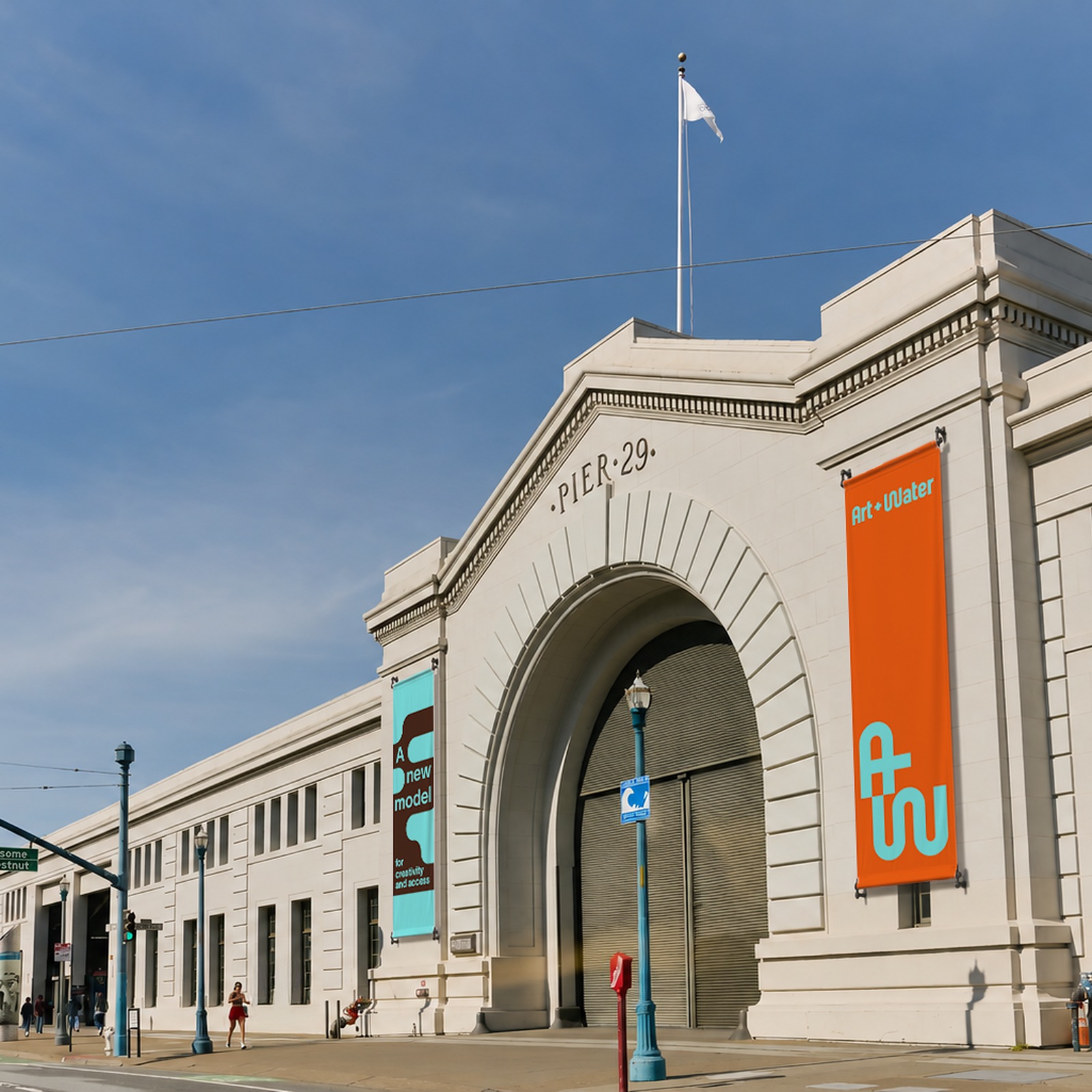
Art + Water: A Fluid Brand Identity by MacFadden & Thorpe
MacFadden & Thorpe and Anisha Sachar craft a fluid brand identity for Art + Water, an alternative art hub at San Francisco's Pier 29.
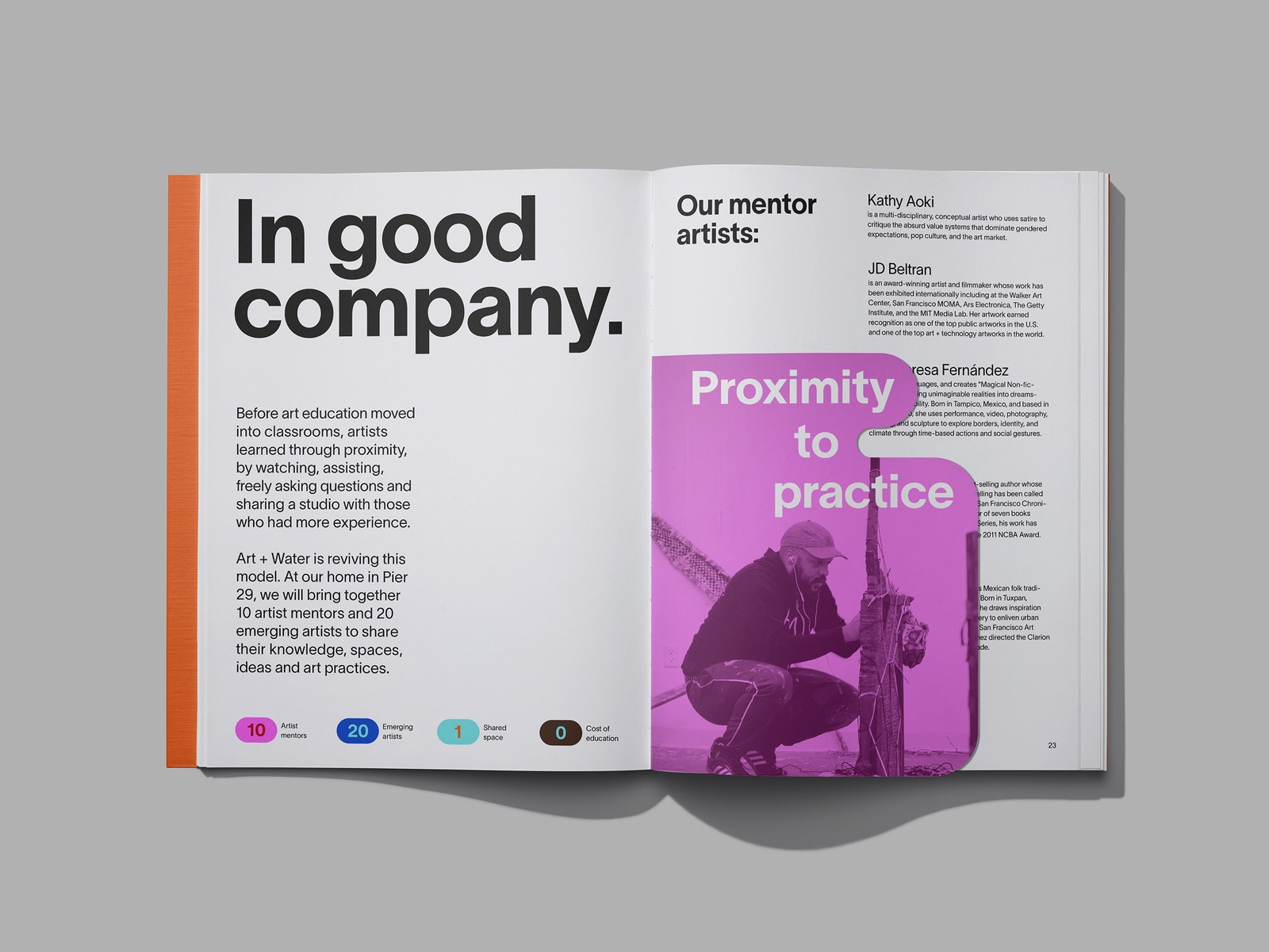
Art school tuition has reached absurd heights. Watching emerging talent get priced out of creative careers pushed Co-Directors Rebecca Teague and Nicole Avril, alongside artists Dave Eggers and JD Beltran, to build a working antidote. Eggers, the celebrated author and McSweeney's founder whose community-driven educational experiments like 826 Valencia redefined grassroots literacy, brings a lifelong commitment to accessible public storytelling. Beltran, an acclaimed conceptual artist, filmmaker, and former longtime President of the San Francisco Arts Commission, contributes deep civic leadership and institutional vision. Together, they partnered with the Port of San Francisco to lease an expansive historic pier, resurrecting the apprentice model: ten established artists receive paid studios, mentoring twenty emerging artists on a completely tuition-free basis. San Francisco studio MacFadden & Thorpe teamed up with London-based designer Anisha Sachar to shape the visual ecosystem, favoring an expressive language built around movement, warmth, and collective craft.
A Fluid Brand Identity Built on Knowledge Exchange
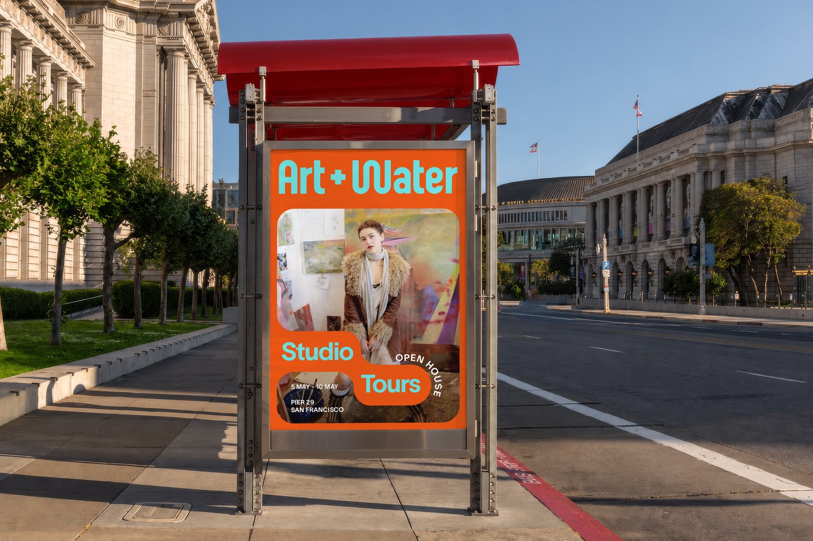
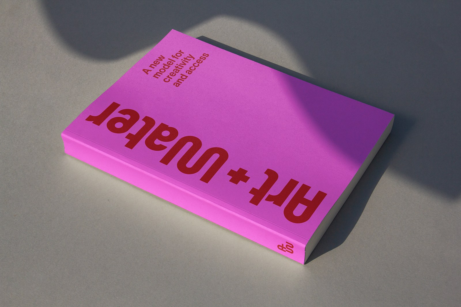
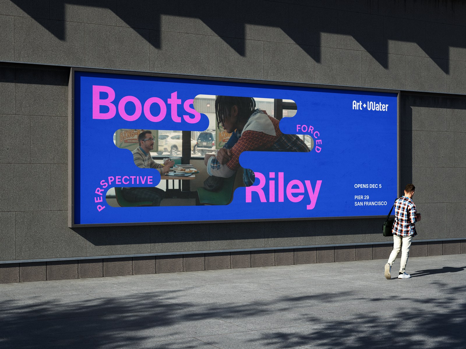
At the center of this brand identity is the concept of flow. It acknowledges the bay waters lapping against Pier 29, but it primarily honors the transfer of knowledge between artists working under one roof. The custom-drawn wordmark introduces undulating, elastic letterforms that bend with liquid ease. Typography frequently breaks free from standard horizontal baselines, meandering along curving paths and wrapping around imagery. Fluid photo containers swell, contract, and reshape across print spreads and digital surfaces. Nothing here feels locked down or static. The letterforms expand to monumental scale across transit shelters, or compress into dense margins around exhibition documentation.
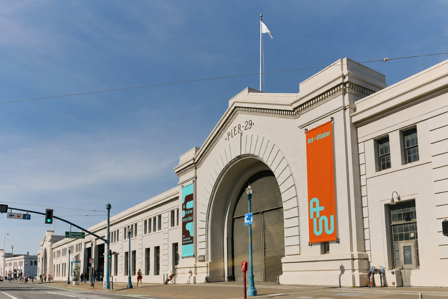
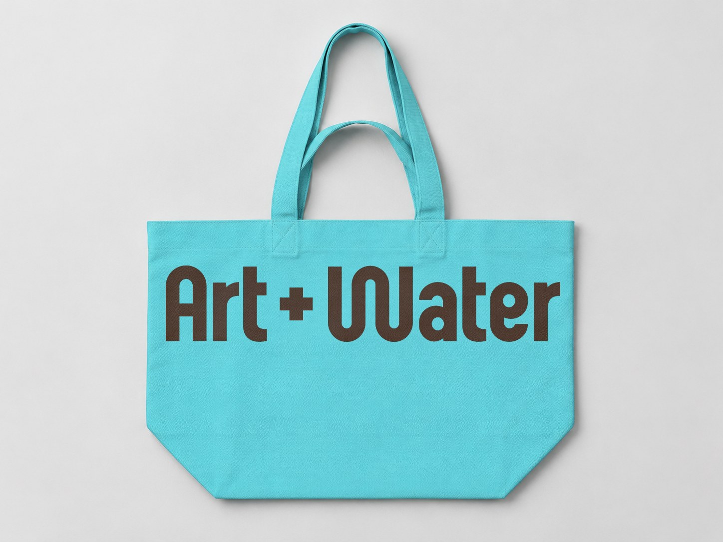
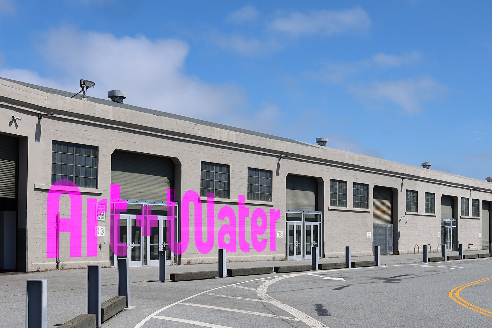
The color direction draws directly from the waterfront climate, pairing hot fuchsia and electric aqua against salty coastal tones. That chromatic tension carries straight into physical production. Pier banners, heavy canvas totes, and printed collateral rely on bold color floods rather than sterile gallery white. For the exterior of Pier 29, massive architectural supergraphics establish an unmistakable beacon along the Embarcadero. Ahead of the December inaugural show, Forced Perspective: The World of Boots Riley, the visual system proves that cultural institutions can feel genuinely accessible, open, and alive.
Explore more from Art + Water and MacFadden & Thorpe.