PS1 Is Your Place: A Masterclass in Brand Design by Porto Rocha
Porto Rocha’s PS1 Is Your Place turns MoMA PS1’s 50th anniversary into a living declaration: your place to explore, gather, dance, and discover.
The idea works because it treats identity as invitation. Rather than a logo refresh, Porto Rocha built an adaptable messaging framework around the declaration PS1 IS YOUR PLACE: your place to explore, to gather, to dance, to create, to discover something unexpected. Born out of the Alternative Space movement in 1976 and housed in a repurposed Queens public school, PS1 has spent fifty years as one of New York’s last true third places, and the studio answered with type loud enough to say it from a rooftop.
PS1 Is Your Place stretches from murals to merch
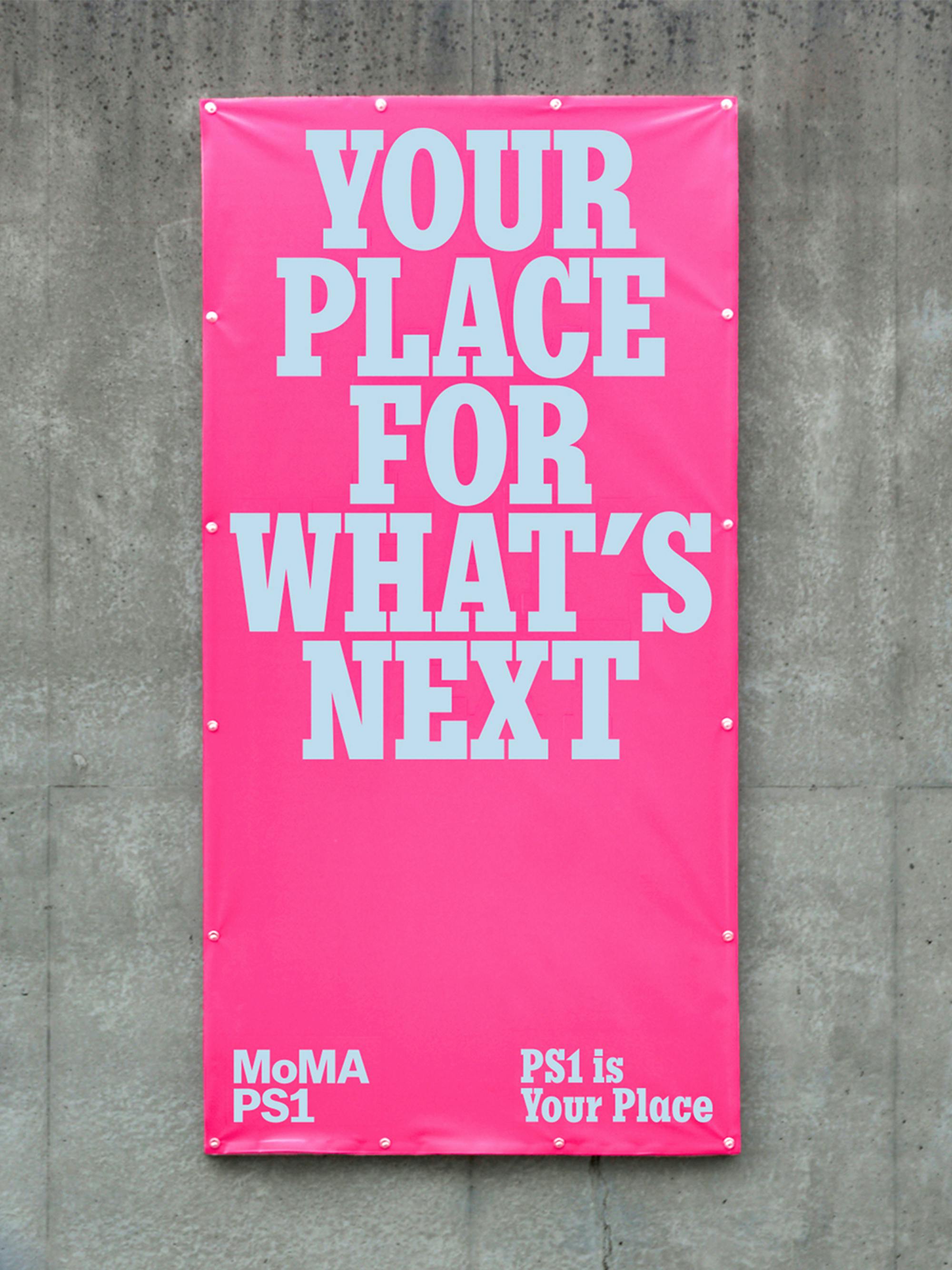
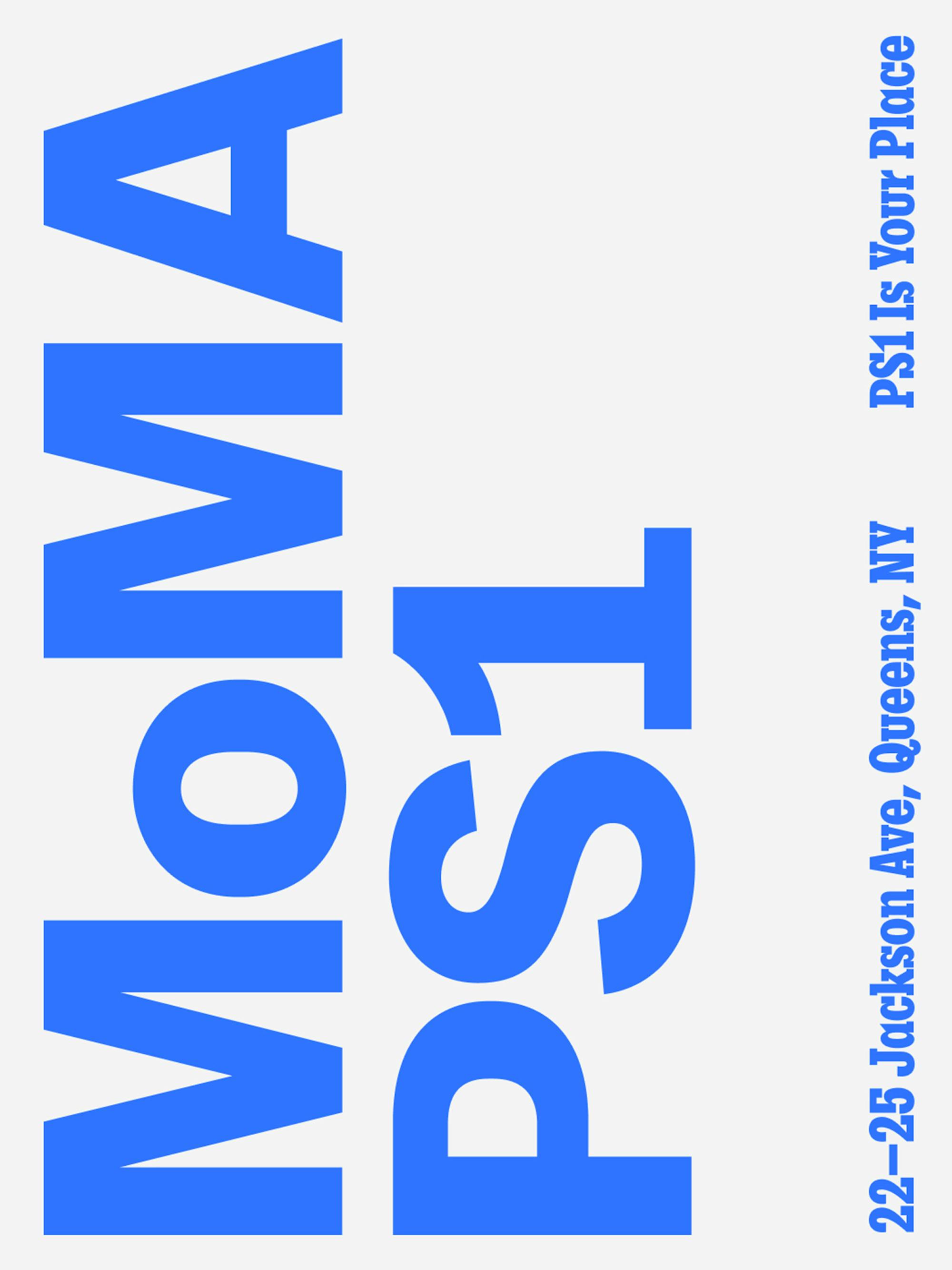
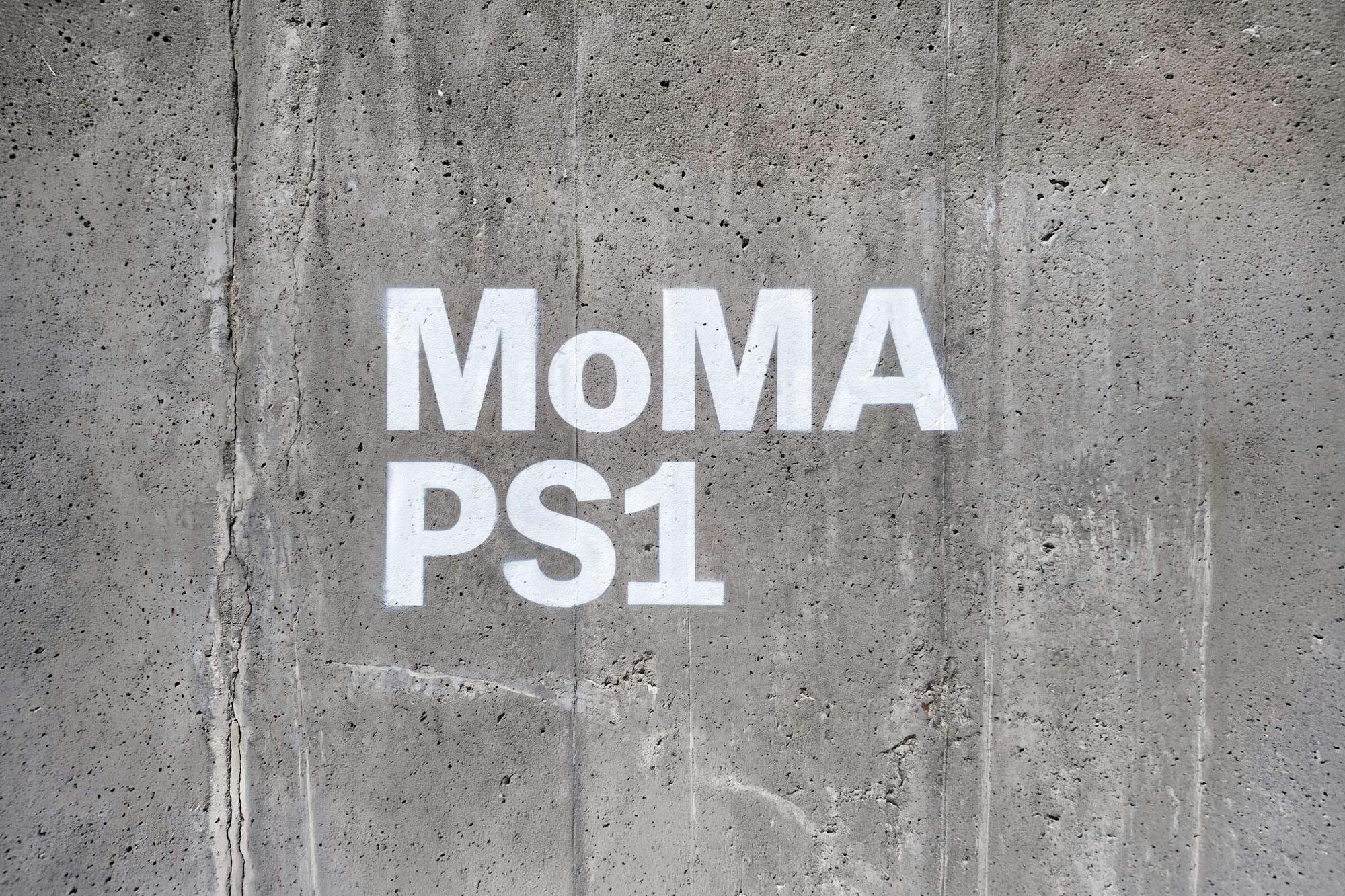
The system’s confidence lives in PS1 Slab, the institution’s distinctive slab serif, which carries every campaign message at poster scale. Porto Rocha keeps the existing MoMA PS1 logo but blows it up and rotates it across applications, letting institutional weight collide with street-level energy. One lockup sets the museum’s Queens address vertically against oversized anniversary numerals; a stencil version stamps the wordmark in white straight onto raw concrete. Every slogan reads like a poster made to be pasted, not scrolled.
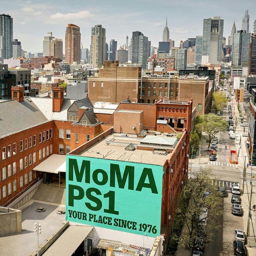
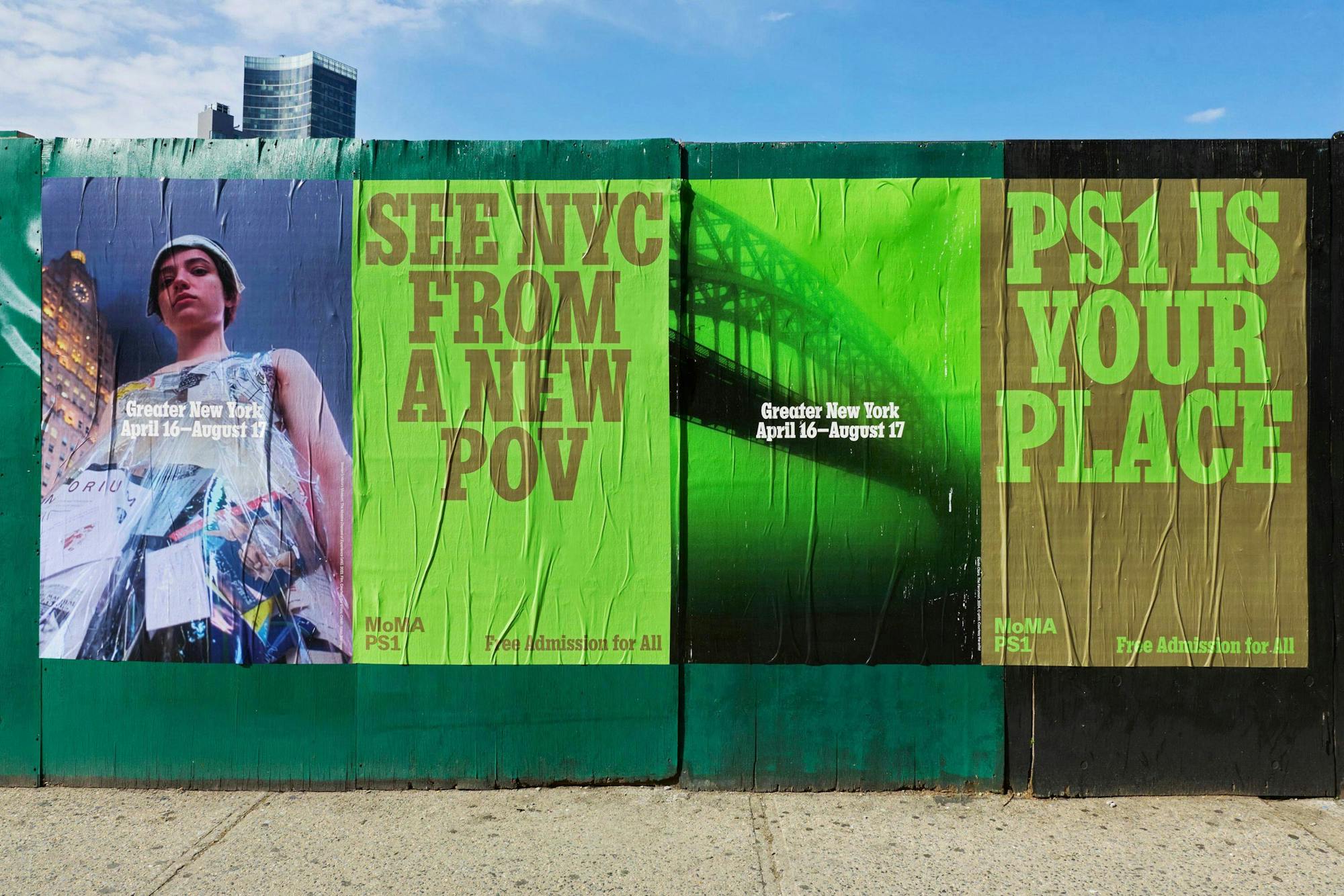
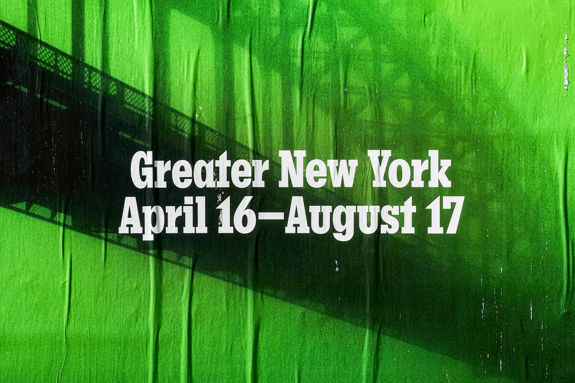
That paste-up quality is the whole point. On a construction hoarding, SEE NYC FROM A NEW POV runs in olive slab on acid lime beside a duotone bridge photograph, the paper creasing under the sun, footers announcing Greater New York, April 16 to August 17, and free admission for all. The building-side mural carries MoMA PS1 / YOUR PLACE SINCE 1976 in deep forest green on mint, readable blocks away. Hot pink banners, acid lime wild postings, white stencils on concrete: the platform behaves the way PS1 itself does, public first and completely unpretentious.
See more from Porto Rocha on their website.