Brand Identity: Koto's Stack Overflow Rebrand
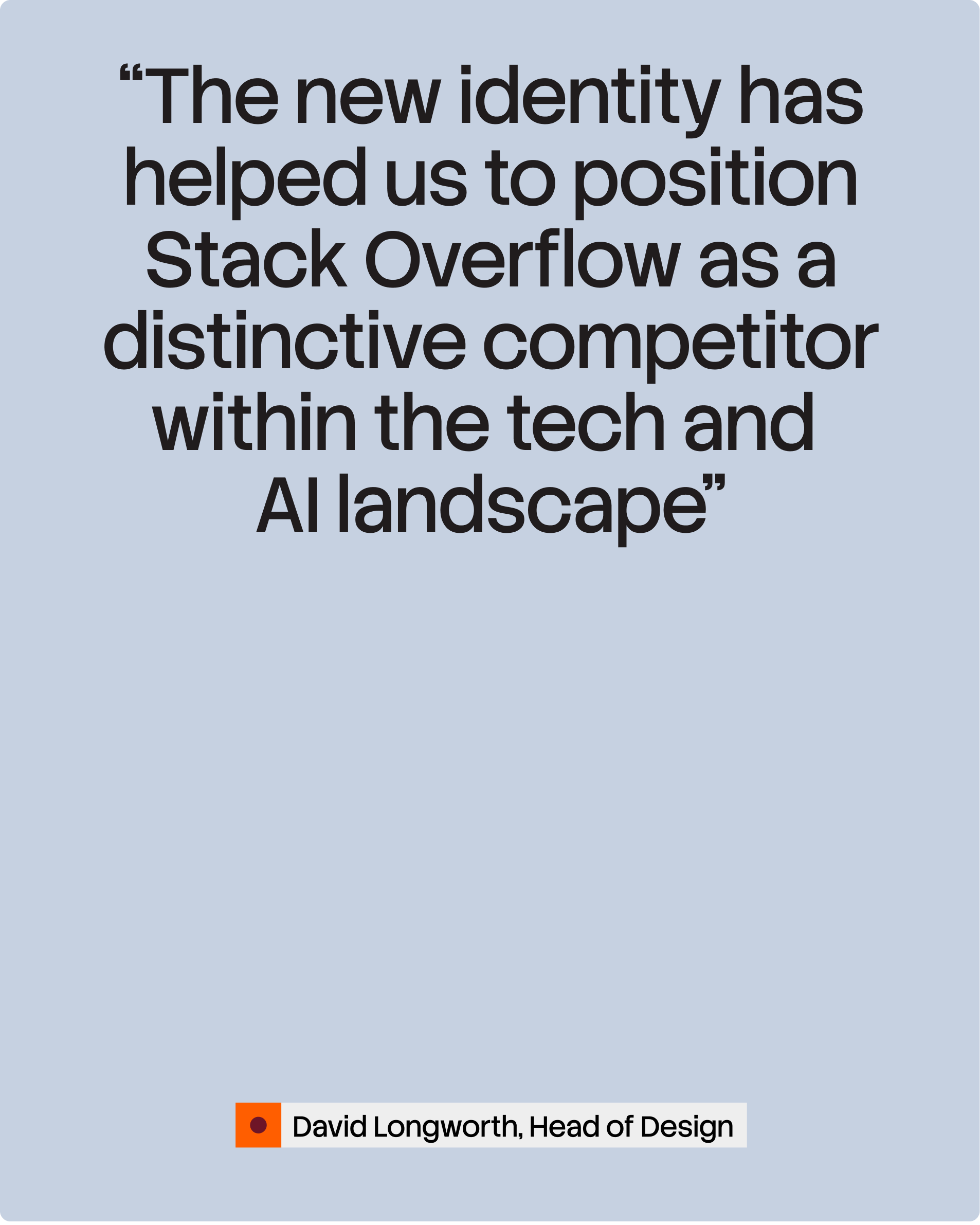
Koto's Stack Overflow rebrand casts the platform as the human-truth anchor of the AI era, in a generative identity built to stay always in build.
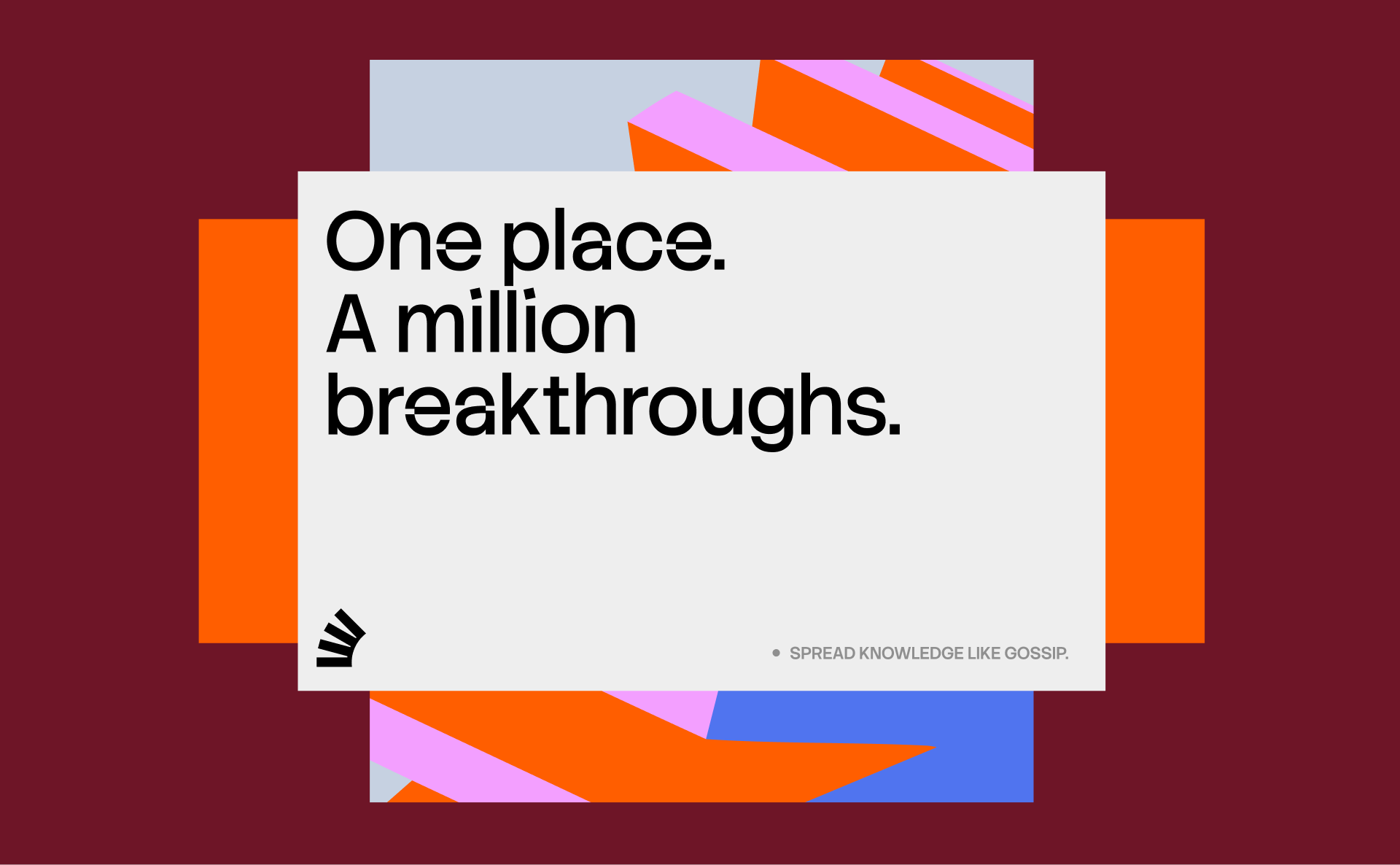
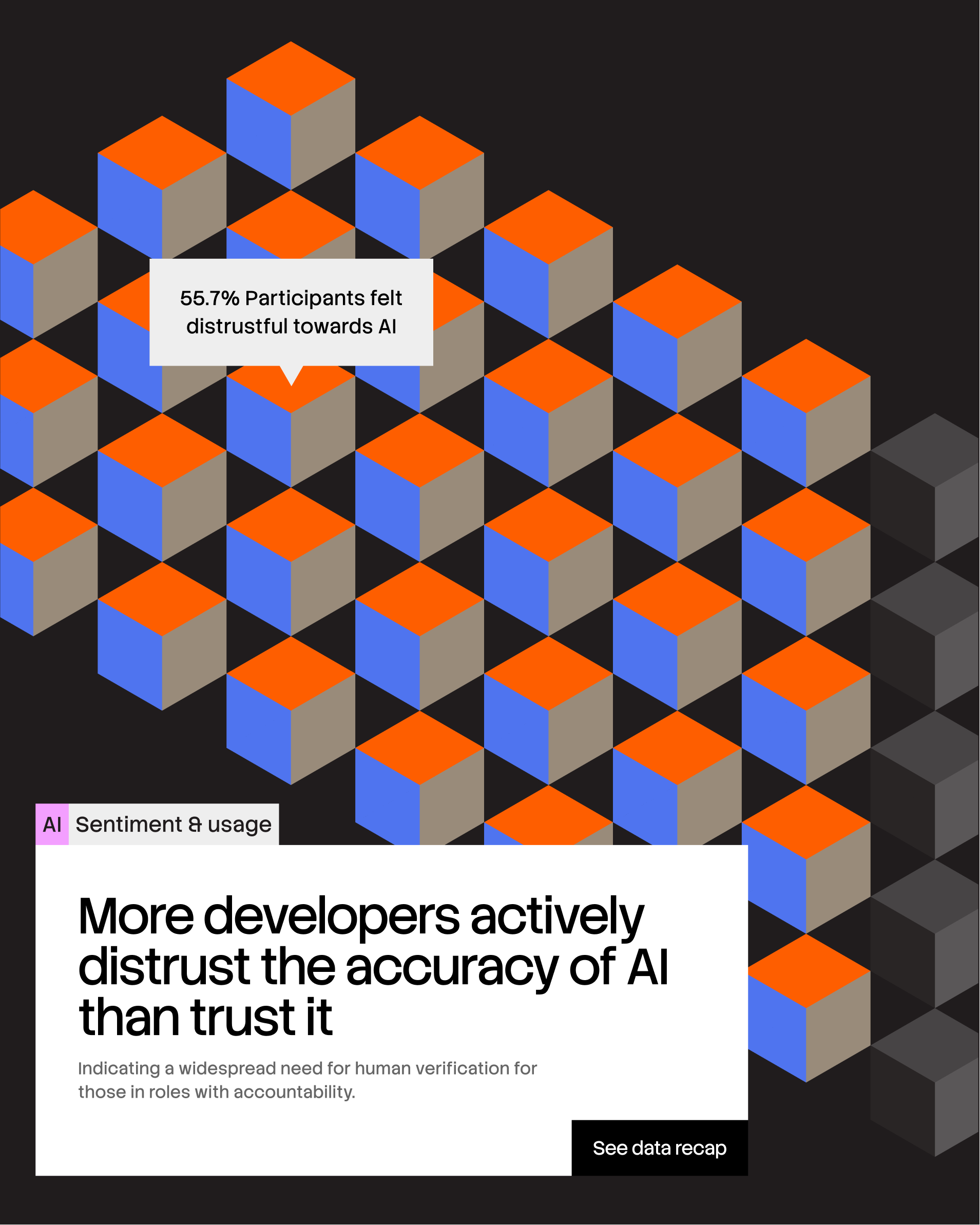
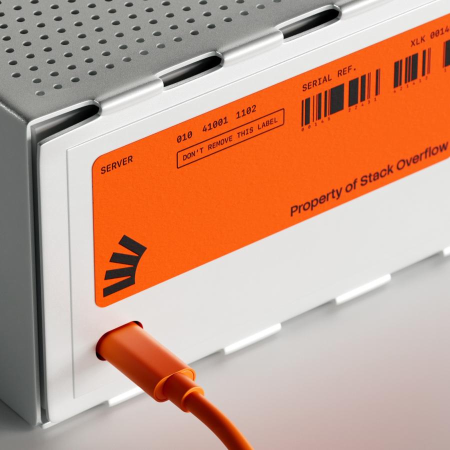
Is there a place for Stack Overflow in an AI-first world? Koto treated that as an existential question, not a styling exercise. Their answer reframes the platform's vast archive of expert discussion and human-validated knowledge as a goldmine — the ultimate arbiter of truth for the industry — under a new vision of becoming the world's most vital source for technologists. The portfolio got radically simplified too, with public platforms consolidated under Stack Overflow and products and services under Stack Overflow Business. Visually, the idea is "Always in Build": the logo's geometry unfolds into a fluid visual language of shapes that reformat, reorganize and rebuild in real time, mirroring the iterative rhythm of a developer's workflow. Koto renders it as glossy 3D — stacked isometric blocks in signal orange, lilac and cobalt, server hardware tagged "Property of Stack Overflow", ribbons of color folding and refolding. The palette stays loyal to Stack's historic orange but pushes it into a wider engineered system: black grounds, cream cards, sharp accent brights.
The Stack Overflow Rebrand, Always in Build
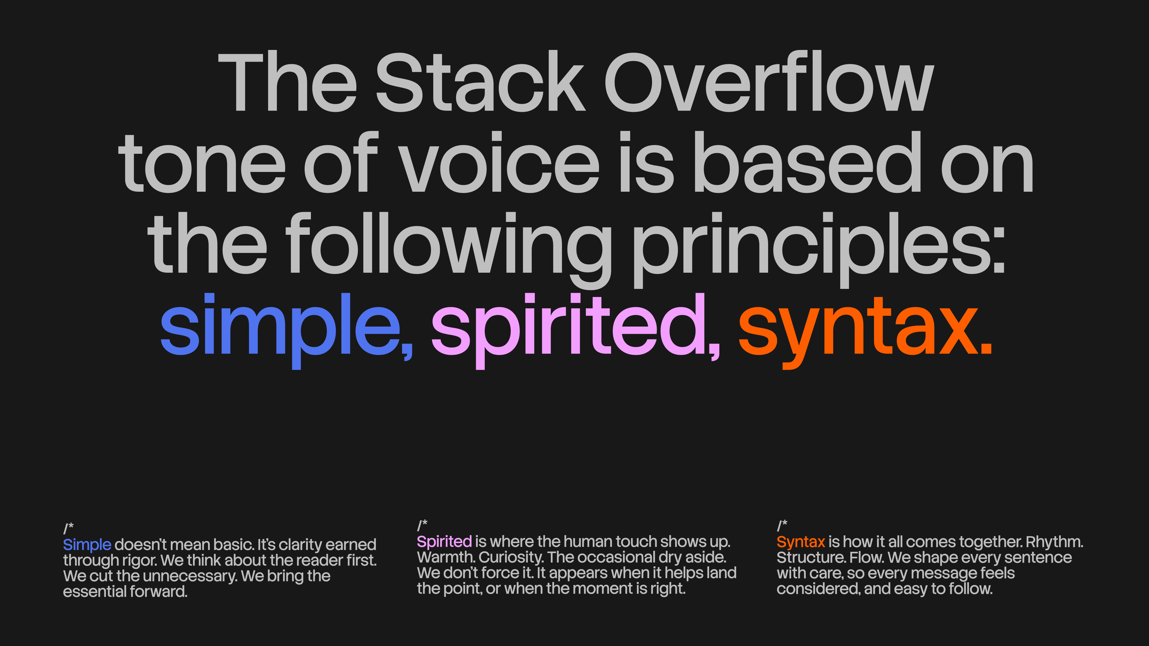
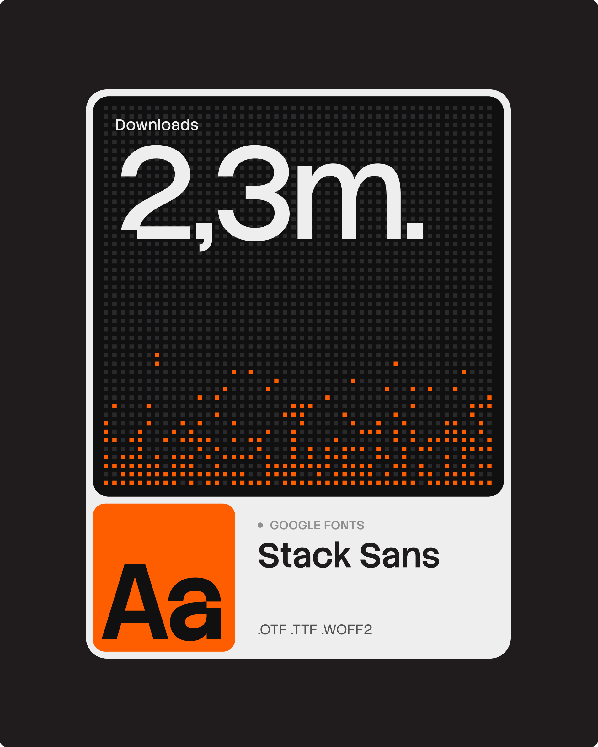
Typography carries the system's voice. Koto drew Stack Sans, a custom family with a distinctive "notch" cut into the letterforms — a detail inspired by the building process itself — and released it on Google Fonts in headline and text styles. Set large, the notch gives headlines a machined rhythm, and the tone-of-voice spread shows the family handling long-form principles with equal confidence. The specimen card carries a quiet flex: 2.3 million downloads and counting.
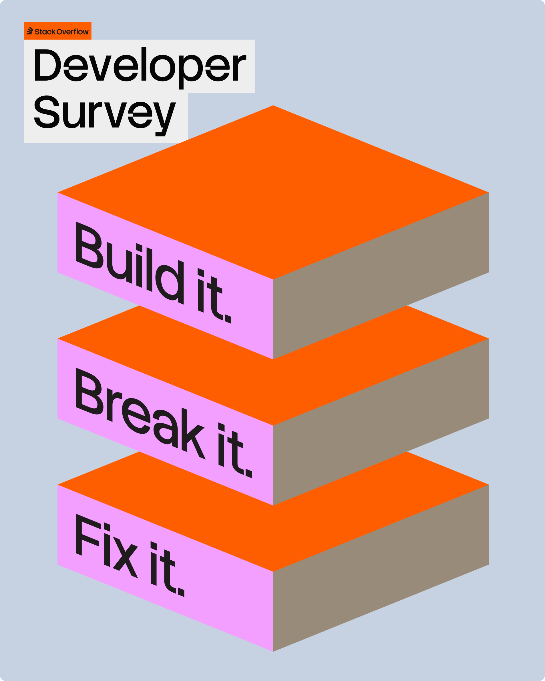
To keep the system alive at scale, Koto built Stack's own team a custom generative tool that outputs the unfolding-geometry assets on demand — a whole universe of compositions without the production headaches. The digital behavior is deliberately two-speed: quiet and unobtrusive inside the product to protect the developer's flow state, then dialed up across campaigns and the annual Developer Survey, from the isometric "Build it. Break it. Fix it." poster to data-visualization spreads on AI sentiment. Even the voice got rebuilt as "simple, spirited, syntax" — studious clarity with a dry, human wit, pushing back against a tech sector that mistakes density for depth. The outcome, in Koto's words: a static repository of knowledge reframed as a living truth engine, proving that in an increasingly automated world, verified knowledge from actual human brains is still king.
See the full case study of the Stack Overflow rebrand at Koto.