Inside Puustelli Miinus: Brand Identity by BOND
Explore the Puustelli Miinus brand identity by BOND Creative Agency, pairing raw kraft stationery and ecological data grids with Nordic craft.
Kitchen catalogues usually drown in glossy showroom clichés. When Finnish manufacturer Puustelli spent years developing an ecological kitchen system built on the principle of radical reduction, Helsinki-based BOND Creative Agency stripped the visual language down to match. The name Miinus literally means minus in Finnish. Everything non-essential gets cut. Unveiled for the Habitare fair and Helsinki Design Week, the identity trades synthetic greenwashing for honest materials and hard numbers.
Reductive Craft in the Puustelli Miinus Brand Identity
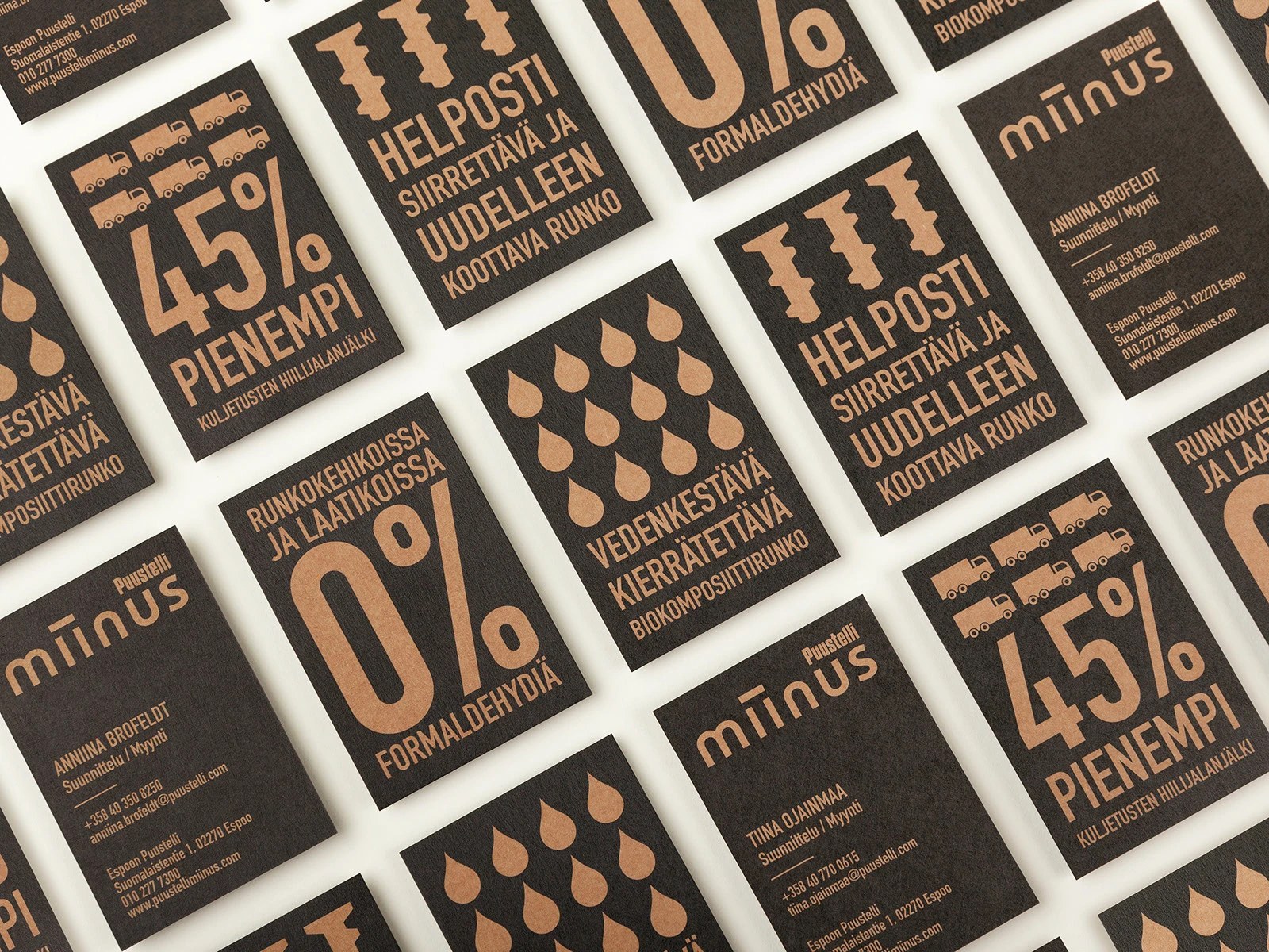
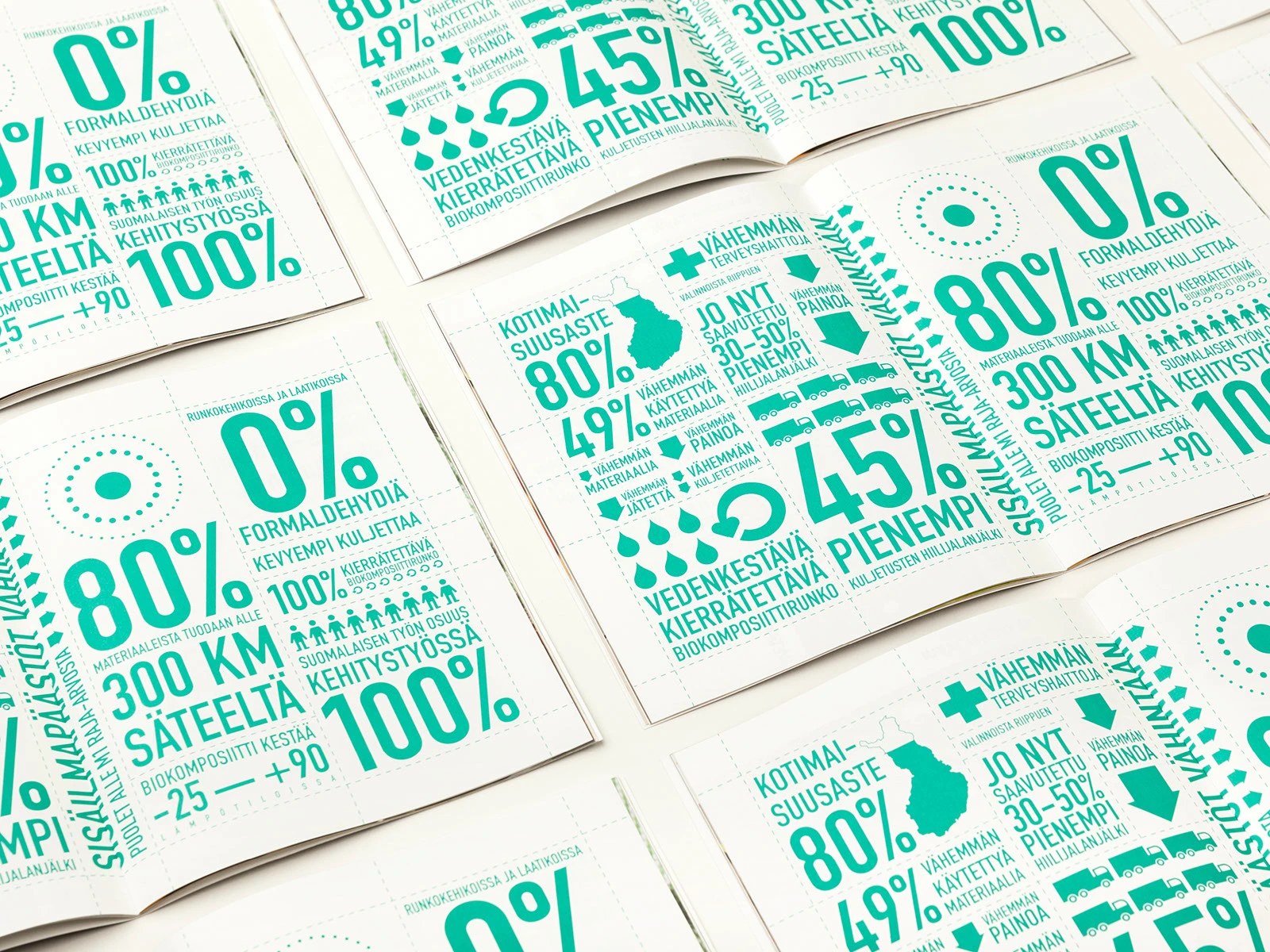
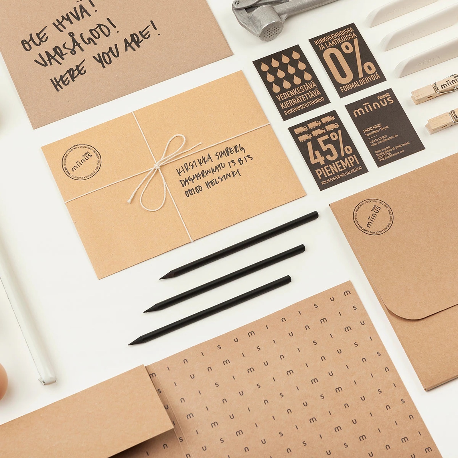
The wordmark carries the whole concept on its back. Drawn in Illustrator, the lowercase miinus logotype bridges its twin central stems with a heavy horizontal minus bar, while the condensed uppercase Puustelli mark tucks cleanly above the right edge. It's direct and unpretentious. Across the print collateral laid out in InDesign, BOND turns complex lifecycle metrics into bold modular infographics printed in emerald green on uncoated white pages or warm kraft-tan ink on dark charcoal business cards. You don't have to hunt for the environmental facts — oversized numerals call out 0% formaldehyde in the frames and drawers, a 45% smaller transport carbon footprint, 49% less material mass, and 80% domestic Finnish sourcing within a 300-kilometer radius.
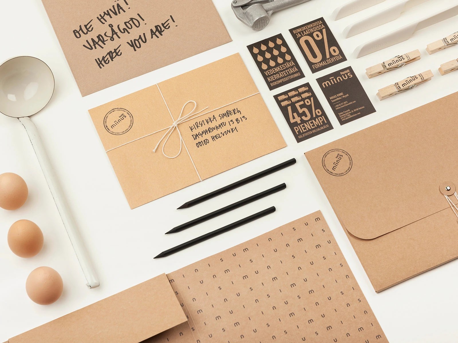
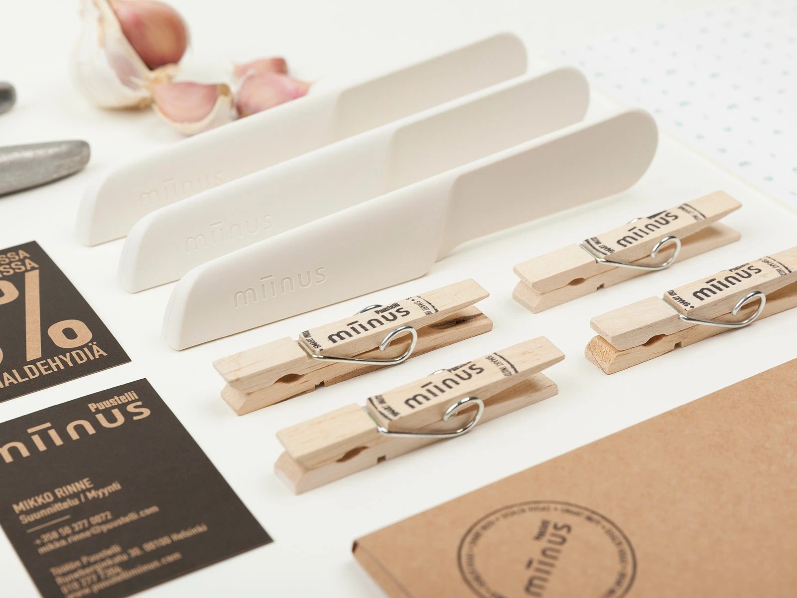
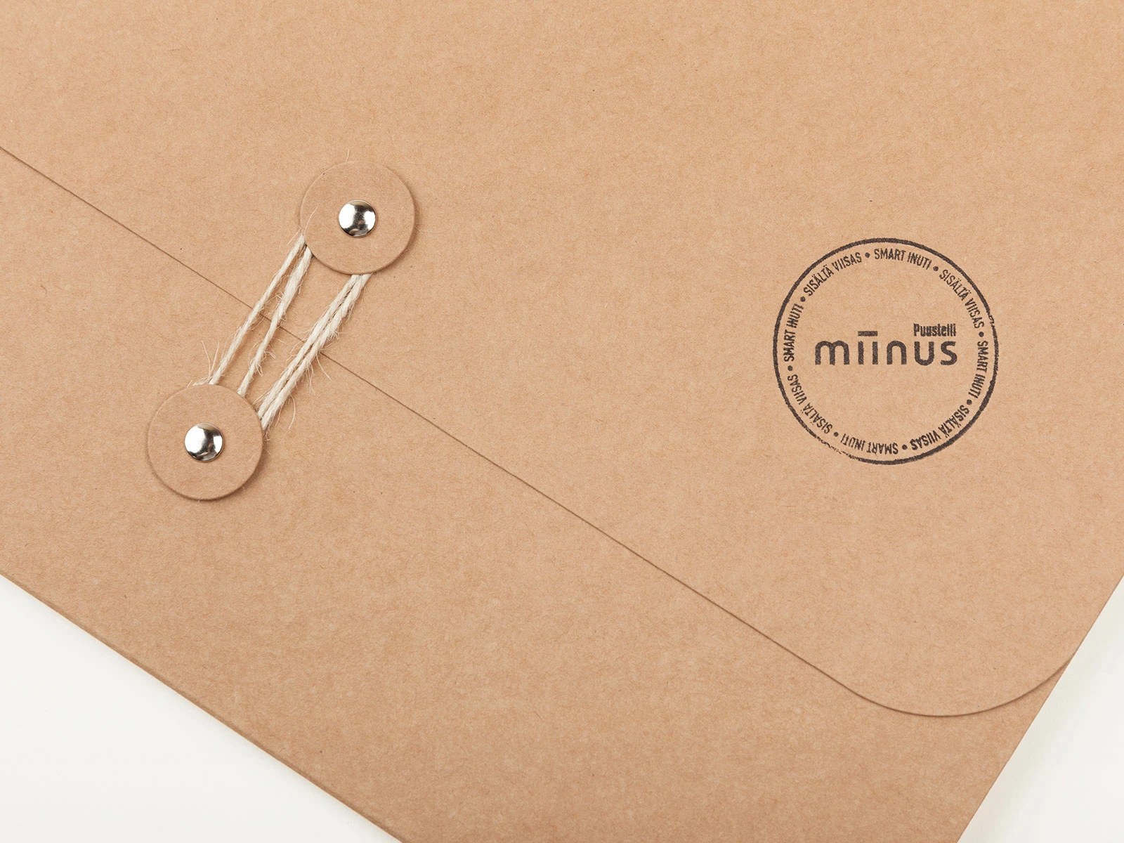
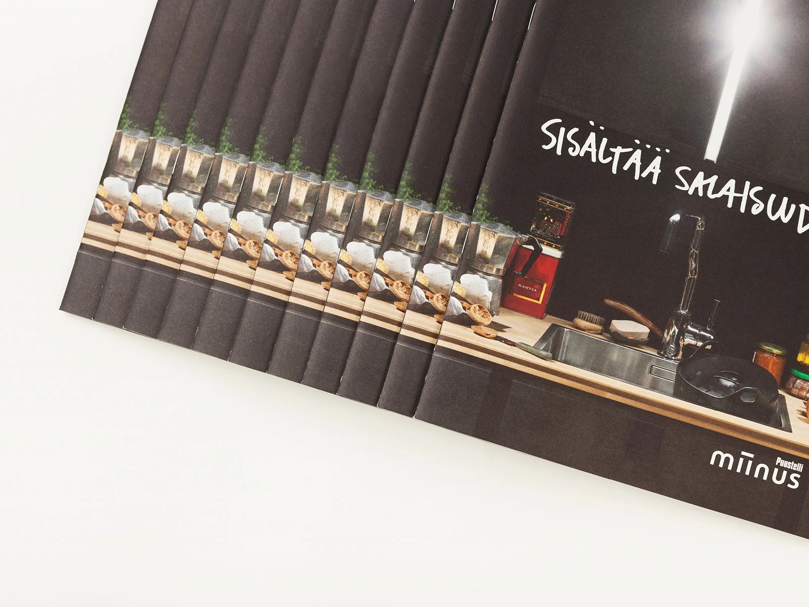
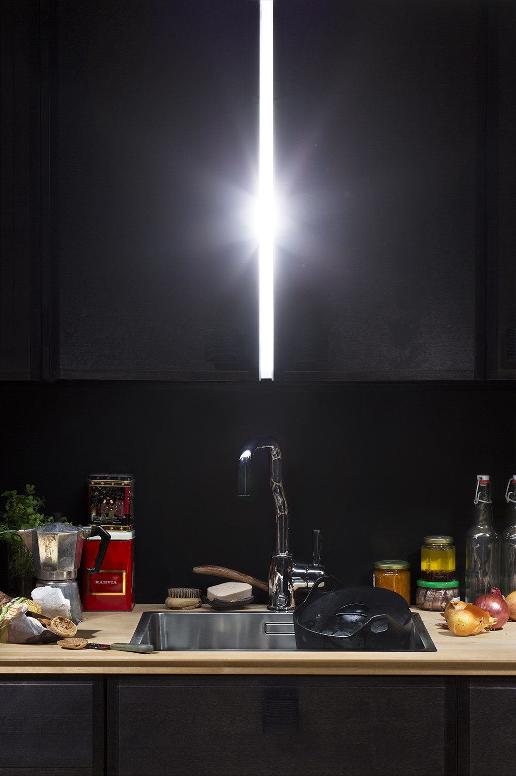
The physical touchpoints feel just as grounded. Unbleached kraft folders close with classic string-and-washer eyelets and carry a circular black rubber stamp reading SMART INUTI and SISÄLTÄ VIISAS ("smart inside" in Swedish and Finnish), paired with twine-tied envelopes addressed in loose brush-pen lettering and lined with a repeating grid of lowercase letters. Even the giveaway objects prove the material story. Alongside wooden spring clothespins wrapped in branded tape, guests handle matte off-white butter knives molded directly from the kitchen's water-resistant, recyclable biocomposite and debossed with the logo. Then there's the photography by Paavo Lehtonen and Angel Gill. Dark-stained cabinetry, a vertical beam of light over a stainless sink, a battered Moka pot, a red Kahvia coffee tin, and fresh onions on solid wood make the brochure spreads feel lived-in rather than staged.
See the full project by BOND Creative Agency on Behance.