Humbleteam Unveils Podium UI/UX Design & Web System
Explore the Podium UI/UX design and brand system by Humbleteam, built around a Pantone 185 red spotlight motif and modular interface cards.
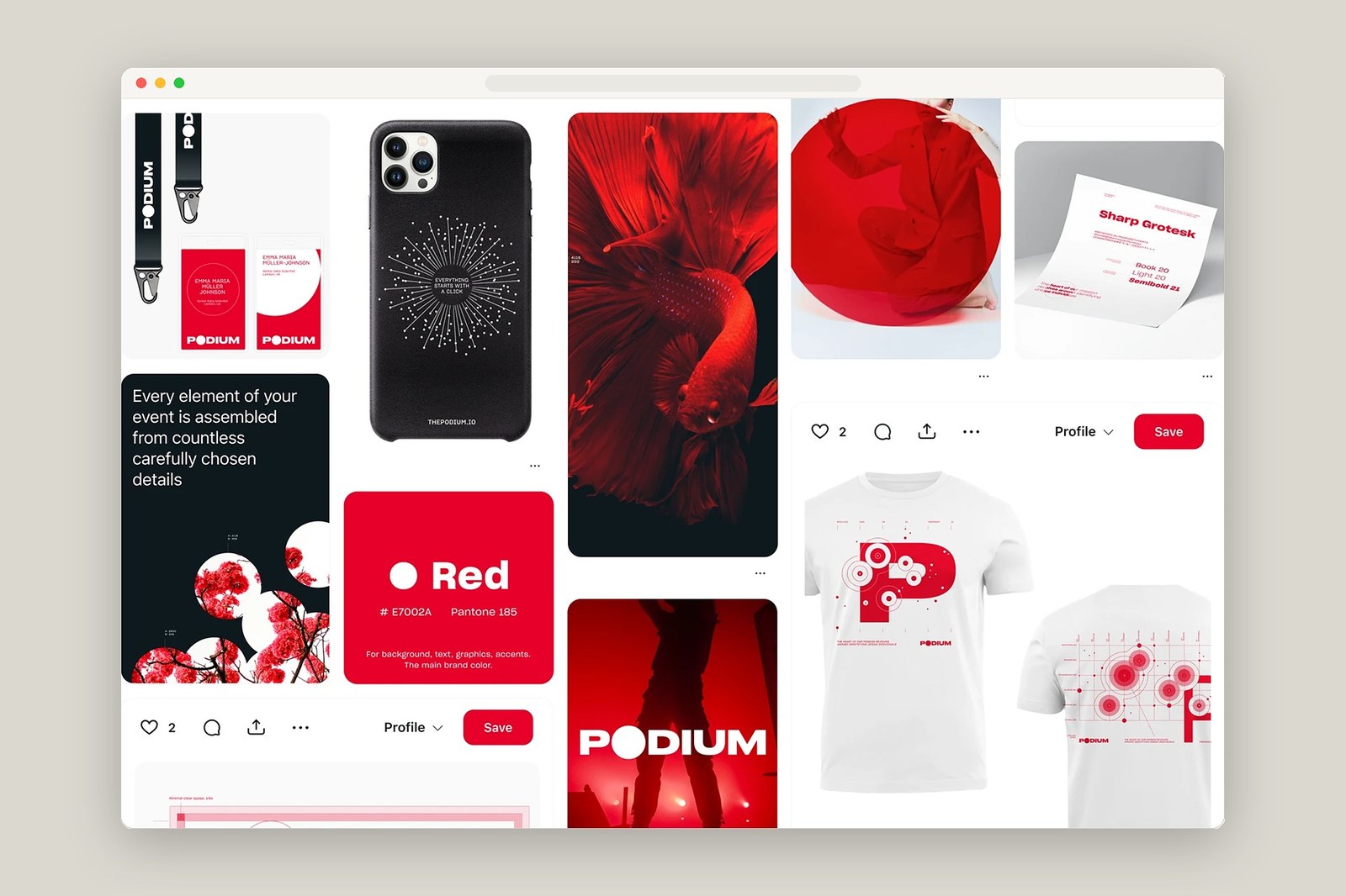
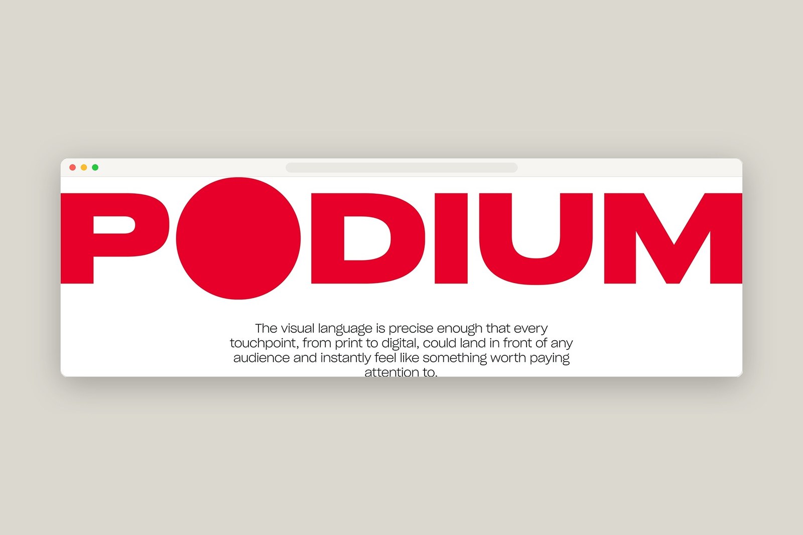
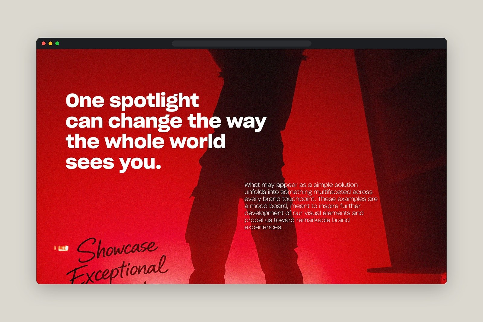
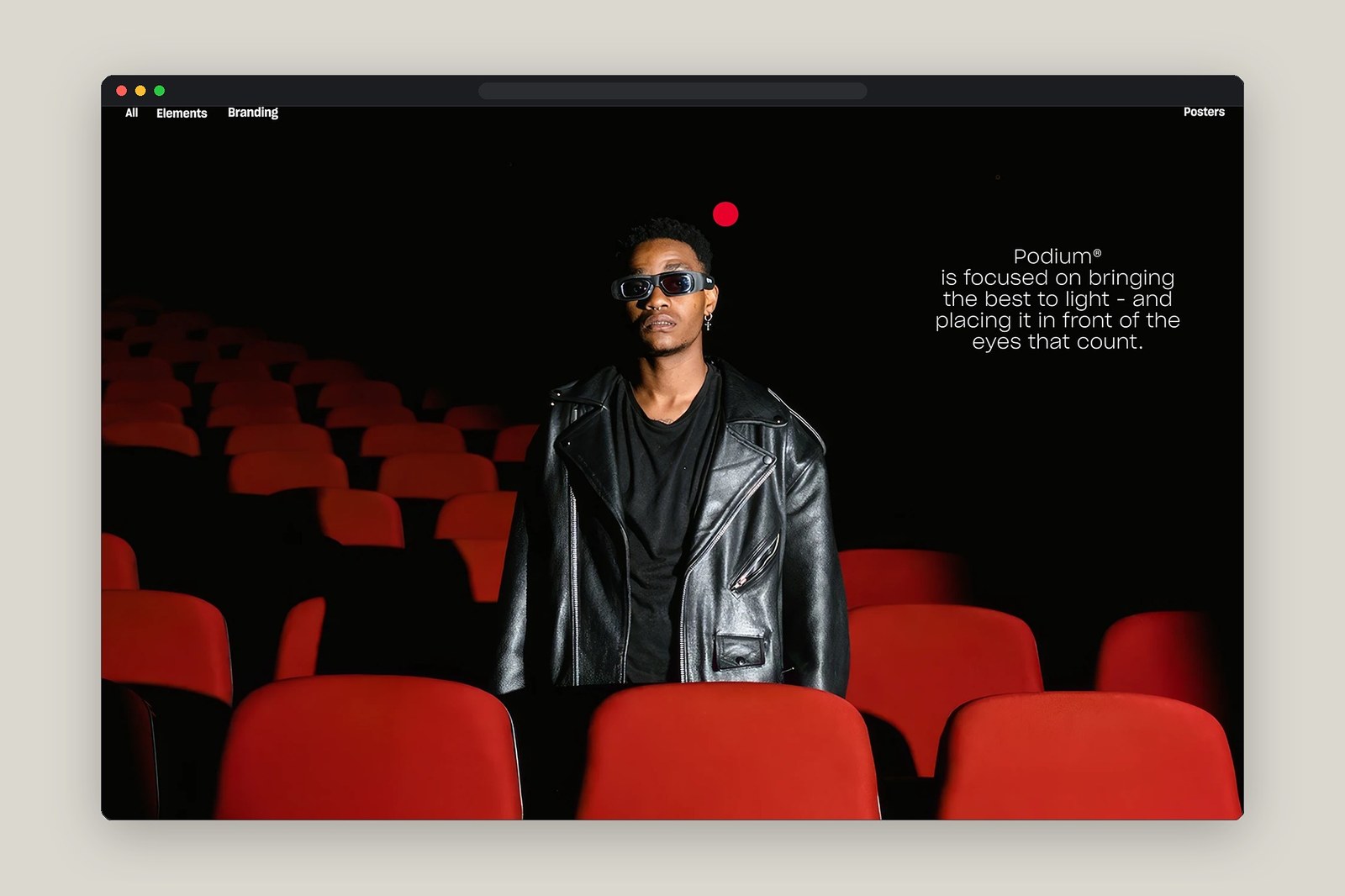
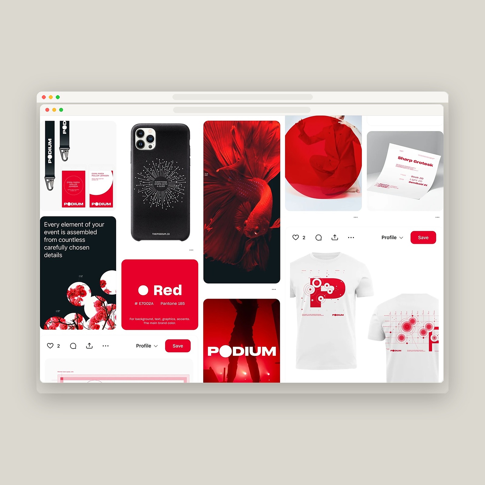
Performance marketing usually drowns in noisy dashboards. Humbleteam took a much sharper route for Podium. Because the agency specializes in driving high-quality traffic and putting clients in front of the right audiences, the Dubai-based studio anchored the entire identity around a single visual hook: the spotlight. You see it immediately in the uppercase wordmark, where the letter O expands into a solid Pantone 185 red disc (#E7002A) that breaks clean past the cap height and baseline. Five motion reels bring that circular beam to life across dark cinema-seat backdrops and stage silhouettes, framing the tagline "One spotlight can change the way the whole world sees you."
Spotlight Geometry and Modular UI/UX Design
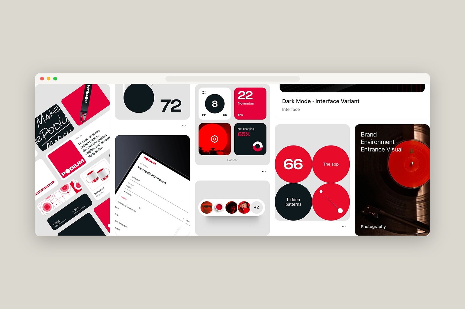
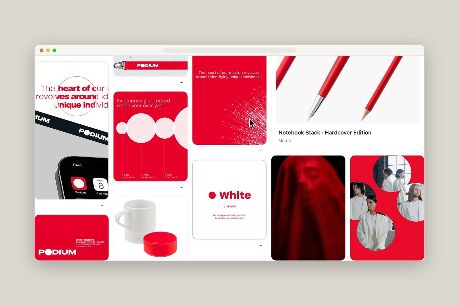
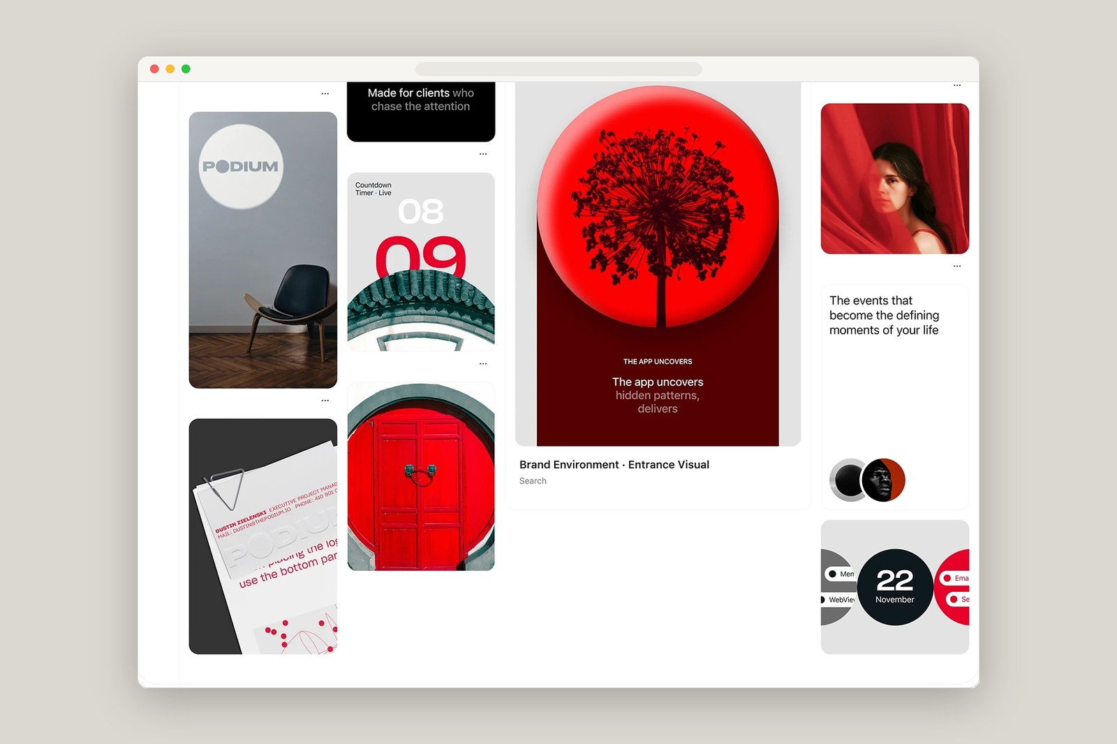
The circle does all the heavy lifting here. Built in Figma, the product interface and bento-style moodboard grids organize data around crisp circular geometry and Sharp Grotesk typography in Light 20, Book 20, and Semibold 21 weights. Four-up mobile widget cards pair a dark-mode clock and a 65% battery ring with a red calendar tile for Thursday, November 22. Right beside them, a six-step onboarding drawer ("Your basic information") walks advertisers through country selection fields, while quarterly analytics cards track +15%, +46%, and +23% reach growth with vertical stem lines rising toward glowing white discs.
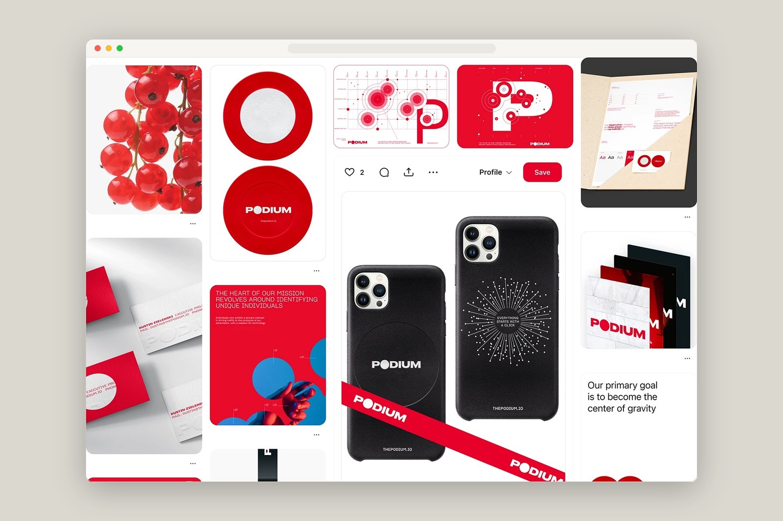
It works on paper first. Humbleteam carried the same red-and-white geometry across physical merch and stationery — ensuring the brand doesn't vanish once you close the browser tab. Uncoated business cards and kraft presentation folders for Executive Project Manager Dustin Zielenski use blind-debossed wordmarks where only the top half of the letters peeks above the bottom edge, paired with two-piece ceramic and red-base coffee cups. Even the back of the matte black phone case ("Everything starts with a click") and the screenprinted white t-shirts turn radial data coordinates into a technical P monogram that rewards a closer look.
See the full project by Humbleteam on Behance.