Properly Studio Unveils the Axi Rebrand
Properly rebuilt Axi's brand, website and trading app in four months. The Axi rebrand keeps the signature red and adds a custom typeface.
Four months. That is the timeline Properly took to rebuild the brand, a 150-page website and the trading platform UI of Axi, the global online trading provider. Most rebrands this size ship a logo and a landing page and call it a system. This one treats the whole company as the canvas: brand, site and product rebuilt together so the app reads as the same brand as the billboard.
The visual premise is restraint with one loud color. Properly kept Axi's logo and signature red, then built everything else around it: off-white fields, slate gradients, dark rock photography. The red never fills a background. It shows up as a dot on a chart, a corner tick, a single word set against black. That discipline is what makes the system scale across a hundred-plus markets without splintering into local versions.

The Axi Rebrand: Type, Grid and Generative 3D
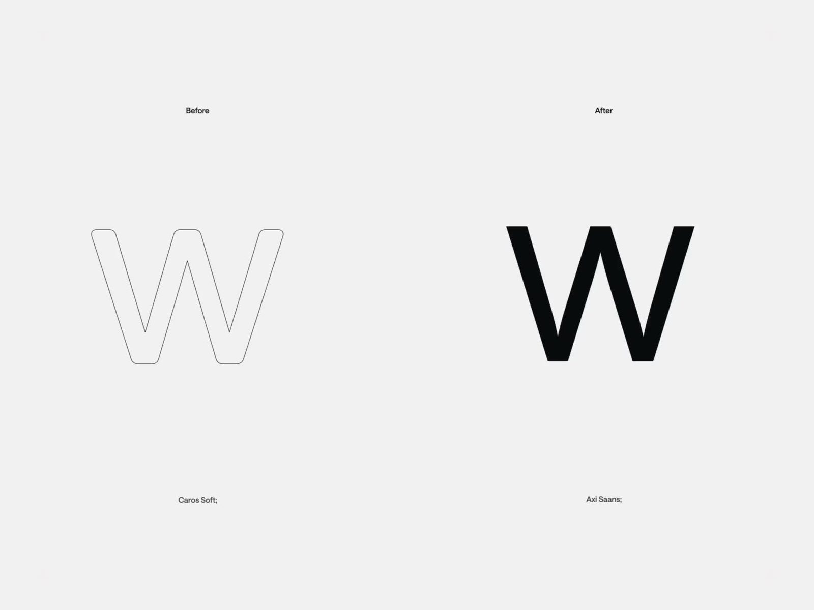
The type move is the spine of the project. Axi's old face, Caros Soft, is out; a custom grotesque called Axi Saans is in, and the before/after frames make the shift obvious: tighter apertures, squarer curves, a more mechanical rhythm at large sizes. It carries headlines, UI labels and the app onboarding in one voice. Set white against the signature red, it is doing the job type is supposed to do in a rebrand: make the company sound like itself.
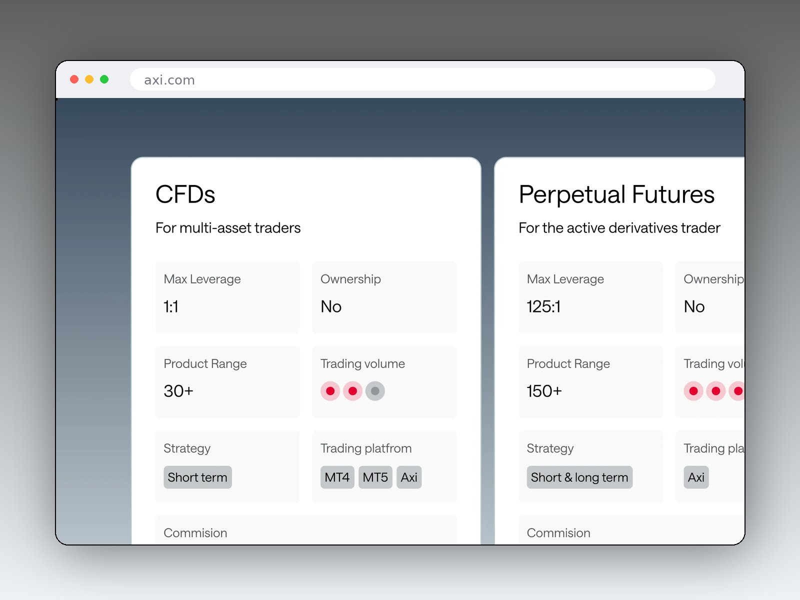
The grid discipline shows up clearest on the product pages. Cards for CFDs, Perpetual Futures and shares sit on a strict modular grid, each cell holding one fact: max leverage, product range, trading platform. One weight, one size step, generous margins. It reads like a data table that learned manners.

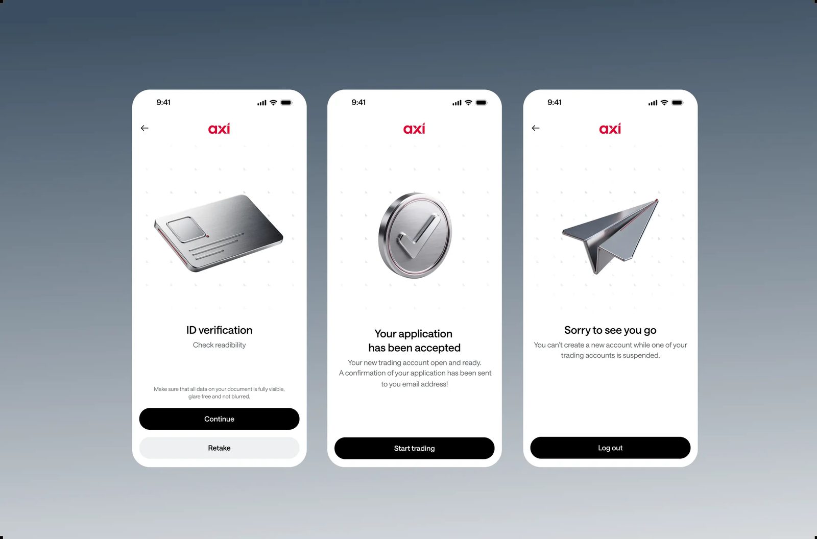
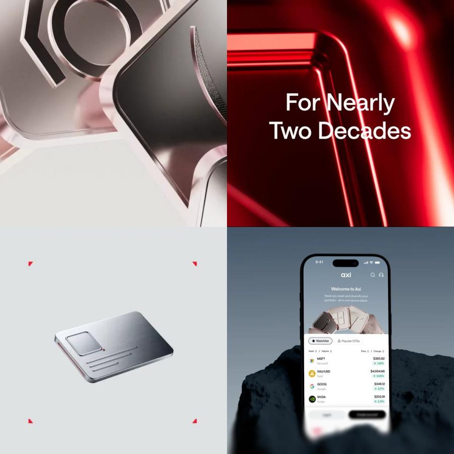
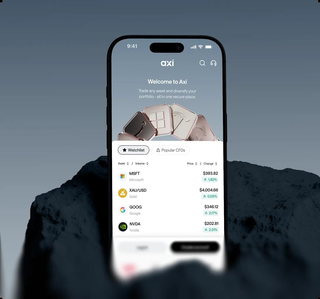
Where the system gets interesting is the 3D layer. Axi trades forex, shares, indices and commodities, and each category got its own dimension: chrome tiles with brand logos embossed, metallic lockpads and checkmarks, gold and copper bars for commodities. These were rendered through generative workflows instead of weeks of traditional 3D work per asset, and in motion each category reads at a glance.
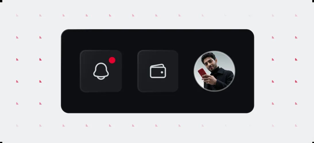
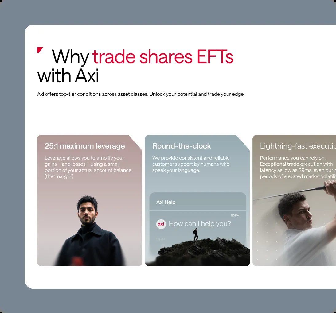
The same asset logic drives the campaign side. Regional personas, built through a custom AI workflow and refined by hand, step from a banner into an animation into a new market without a reshoot. A phone render over dark rock, an onboarding card, a help chat tile: everything repeats the same red ticks, the same corner radius, the same card logic, so the system holds from the 150-page website down to a watchlist row.
See more from Properly Studio on their case study page.