Inside Charline GROEN’s Branding for Galopain
Charline GROEN crafts the medieval-inspired branding for Galopain, a warm-bread tavern built around ancient flours and illuminated initials.
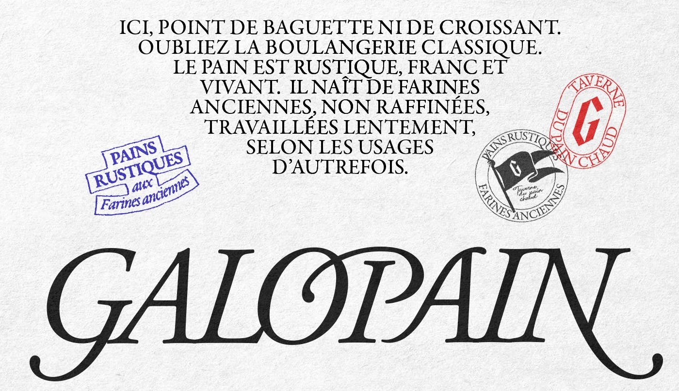
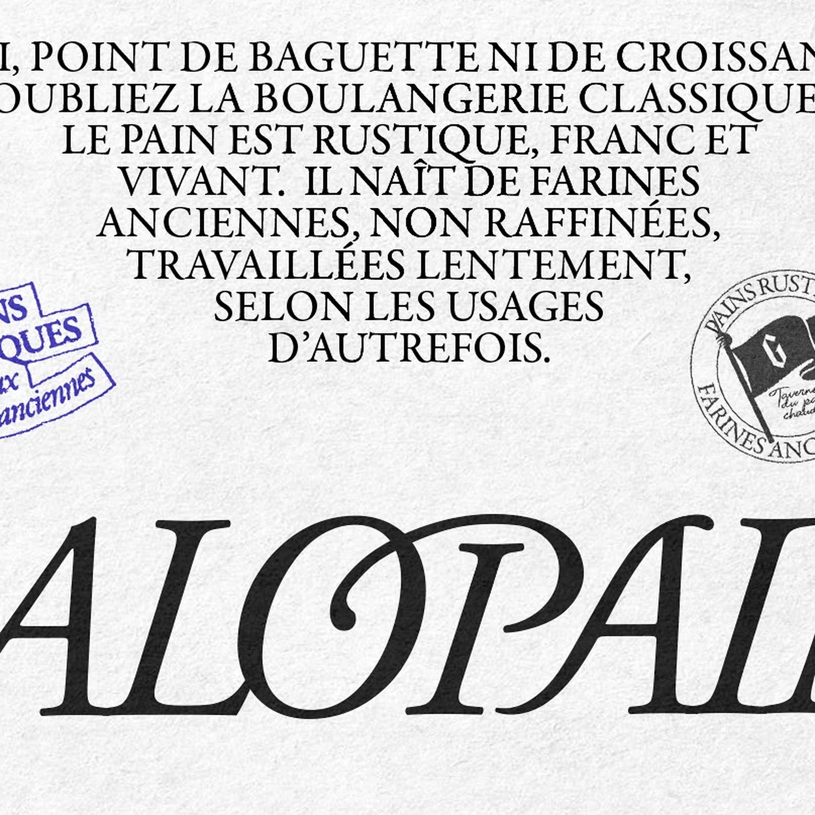
Forget the classic French boulangerie. At Galopain, there's no baguette or butter croissant sitting on the rack. Styled as a "Taverne du pain chaud" (warm-bread tavern), the bakery treats slow-fermented country loaves made from unrefined ancient flours as the main event. To match that stripped-back baking philosophy, designer Charline GROEN looked past polite café minimalism and built the identity around medieval manuscripts, battlefield pennants, and royal ink seals from an era when bread anchored daily life.
Medieval Manuscripts and Custom Bakery Branding
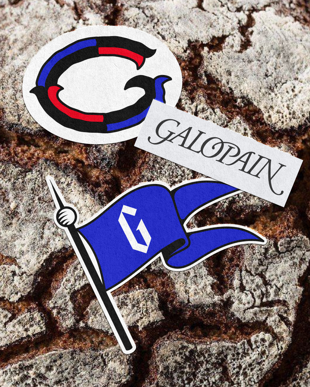
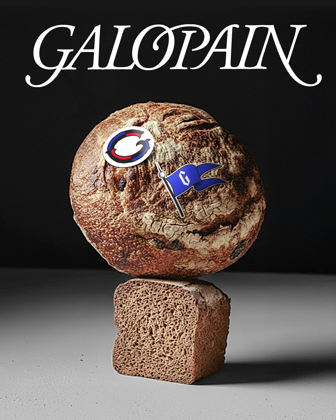
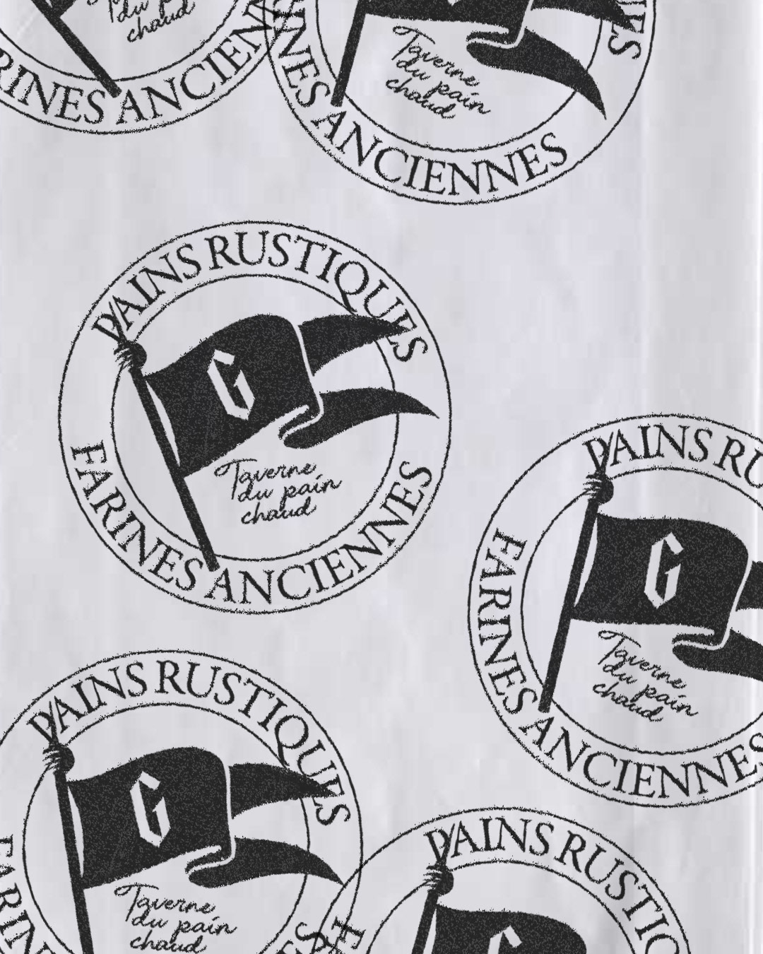
Every mark carries weight. The custom italic serif wordmark for Galopain leans forward with sharp calligraphic tension — kicking off with a deep looping tail on the initial G, curling the inner counter of the O directly into the crossbar of the P, and finishing with a long descending swash on the N. Alongside the full logotype, GROEN drew two distinct medieval emblems that anchor the branding across print and packaging. The first is an ornate illuminated initial G divided into interlocking black, crimson, and cobalt-blue ribbon segments with thorn-like gothic serifs, while the second shows a gloved hand gripping a spear with a forked swallowtail battle flag stamped with an angular blackletter G.
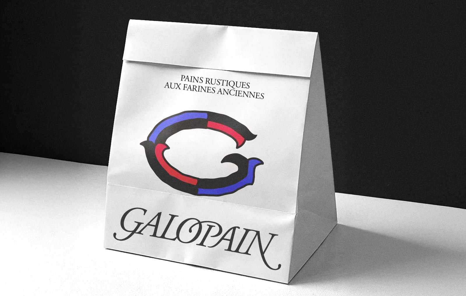
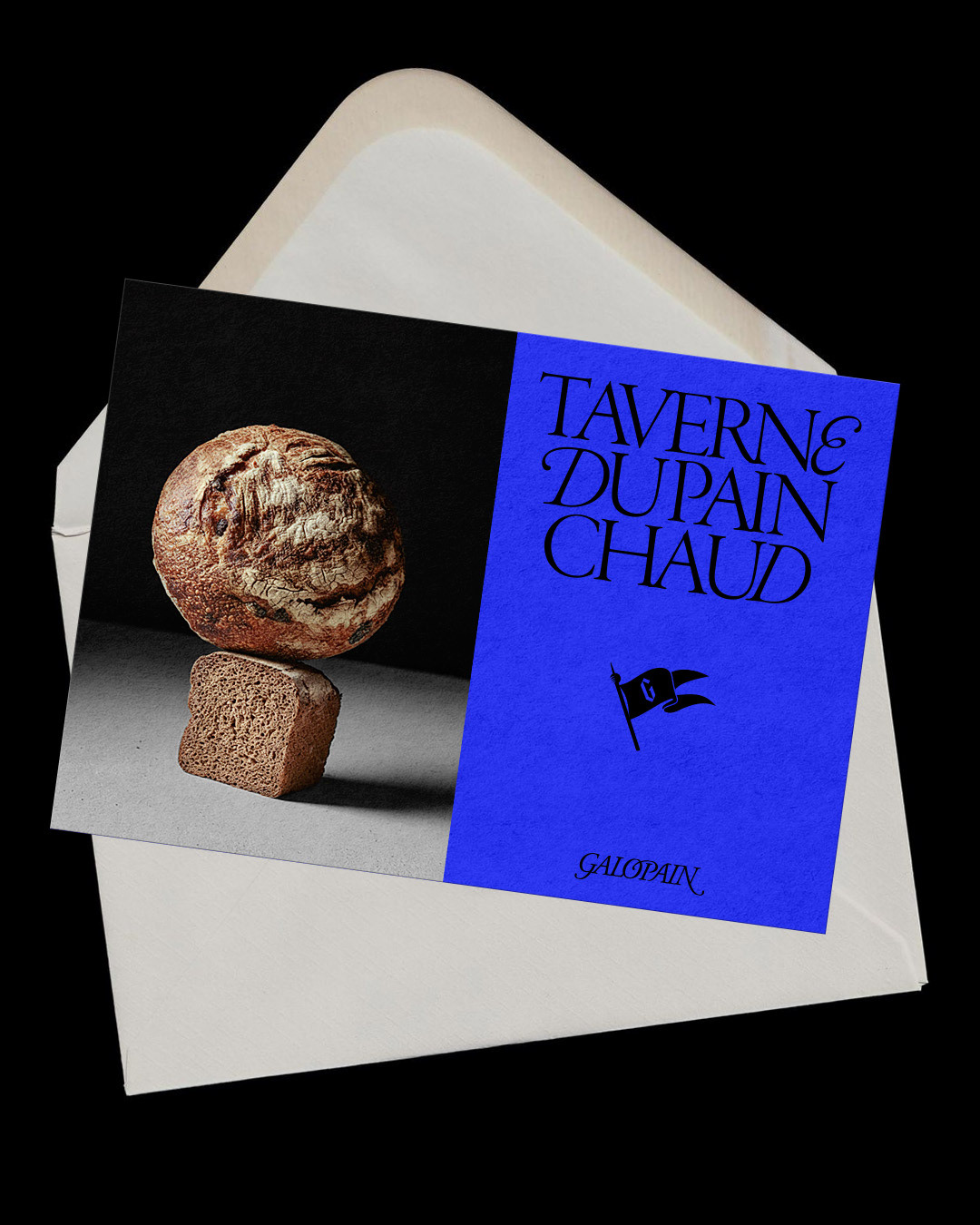
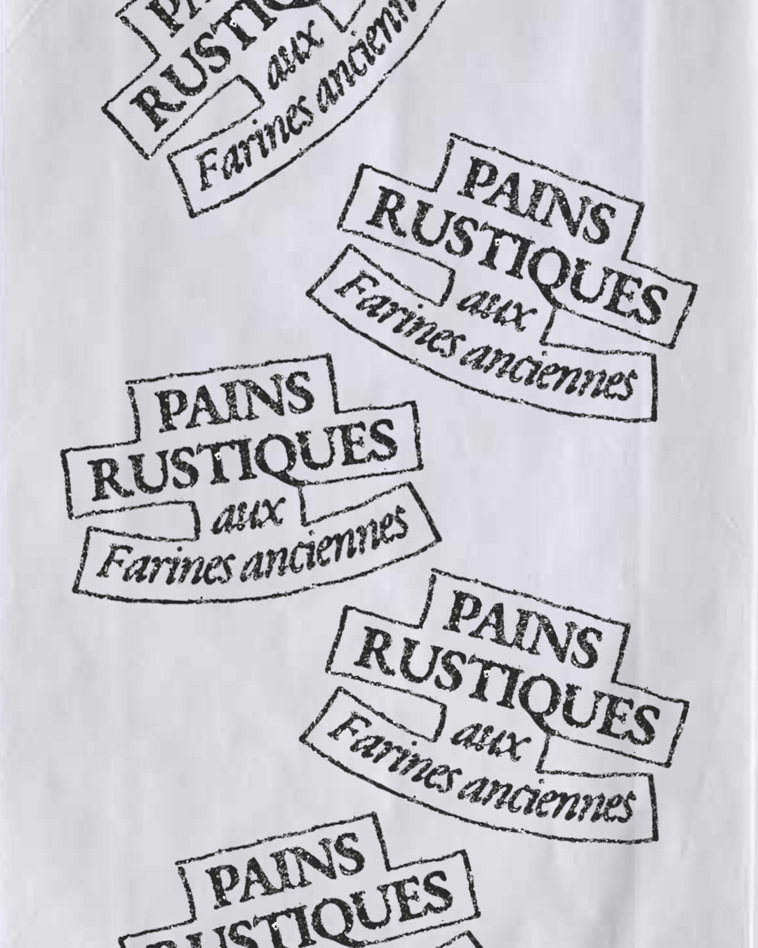
The color palette stays tight. On the white gusseted paper bread bag, the tricolor illuminated G sits squarely between the two-line serif header "PAINS RUSTIQUES AUX FARINES ANCIENNES" and the wide italic wordmark across the bottom fold. Instead of hiding the graphics on outer boxes, GROEN presses die-cut oval and battle-flag stickers straight onto the blistered, flour-dusted crust of a round country boule balanced atop a dense square loaf. That same stacked-bread still life shares a split-panel postcard with an ultramarine blue block where "TAVERNE DU PAIN CHAUD" stacks in tall black serifs with a looping calligraphic E, backed by white wrapping paper stamped in grainy black, red, and blue ink seals.
See the full project by Charline GROEN on Behance.