Brand Identity: Rothfield by Studio Julius
Studio Julius builds a calibrated brand identity, custom 16-unit icon system, and tactile studio tools for Australian partner Rothfield.
Working behind the scenes rarely gets the spotlight. For decades, Australian marketing execution partner Rothfield grew from traditional print management and promotional products into an end-to-end procurement, production, and logistics operation supporting major national brands. When the company needed a visual language that matched the actual scale of its business, Melbourne-based Studio Julius teamed up with Stake Reputation on strategy and Josh Le Good on motion design. They didn't reach for generic corporate logistics tropes. Instead, the team anchored the entire identity in calibration, measurement, and physical drafting precision.
Calibrated Grids in a Brand Identity
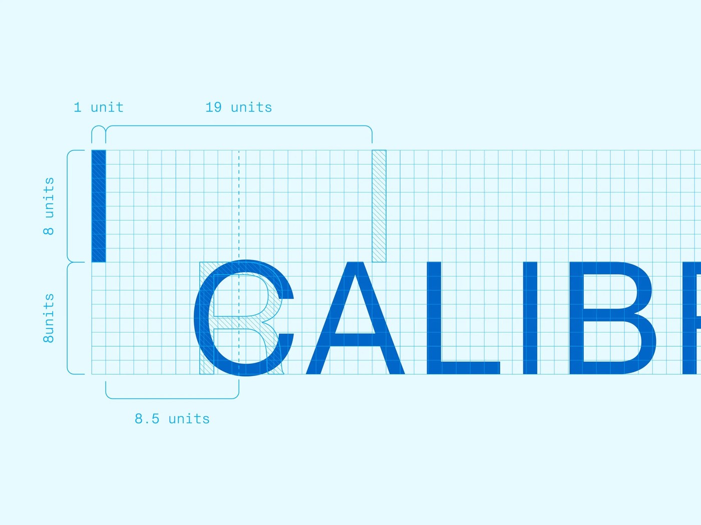
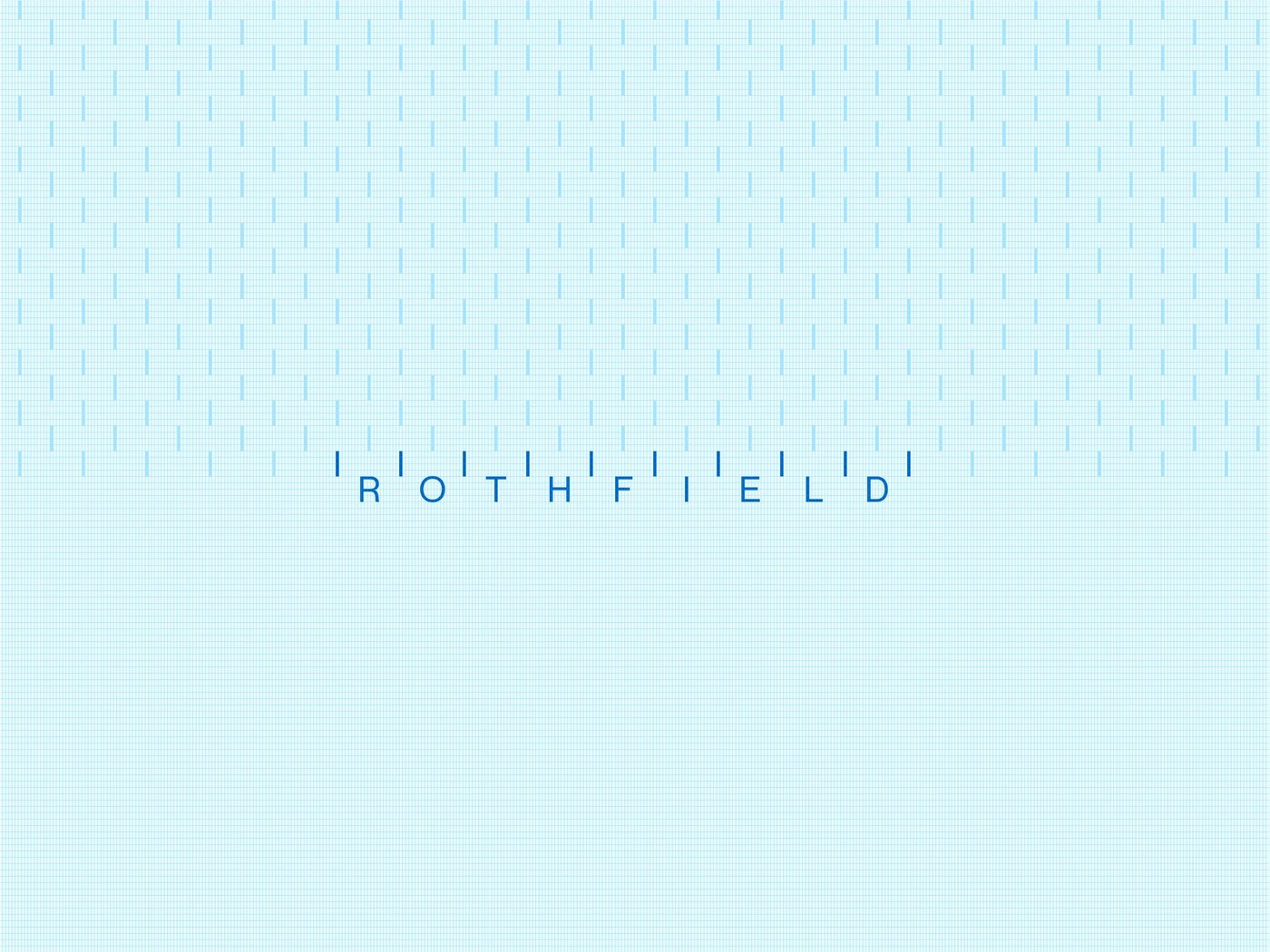
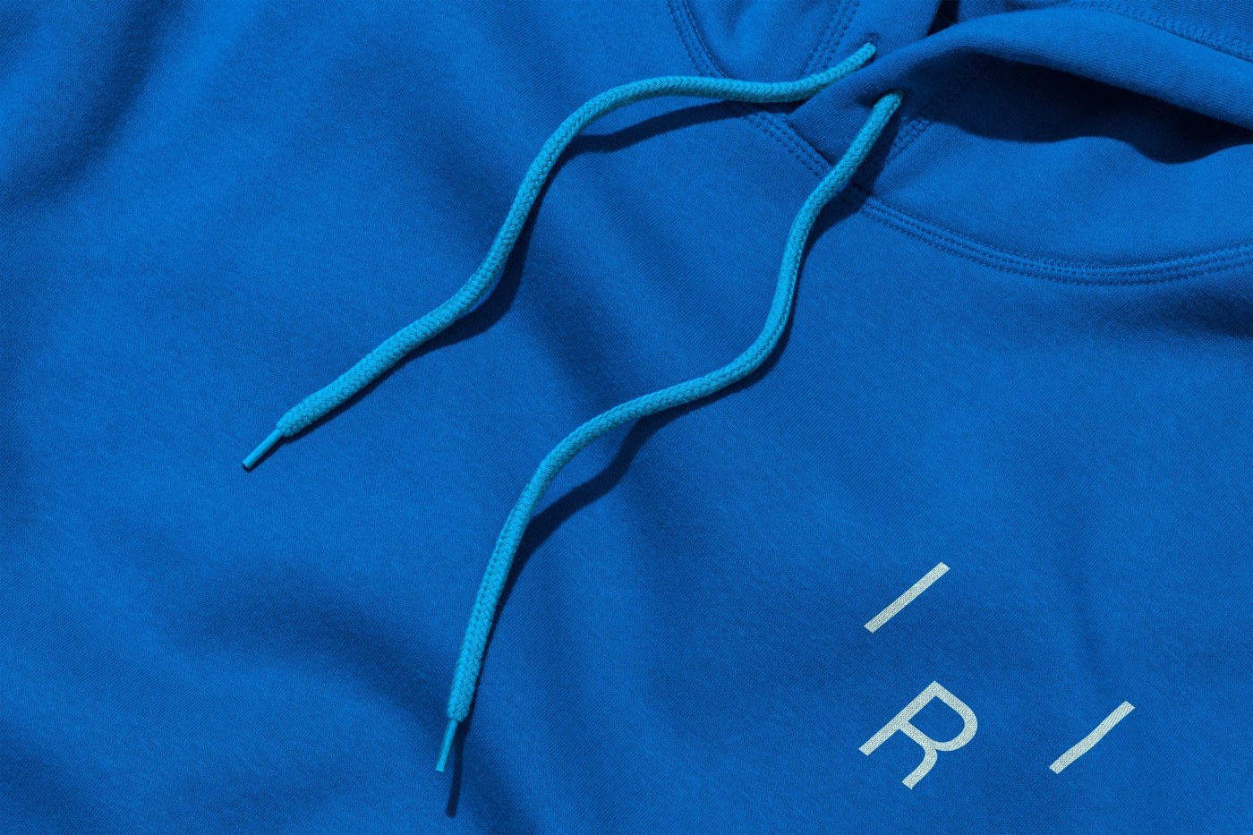
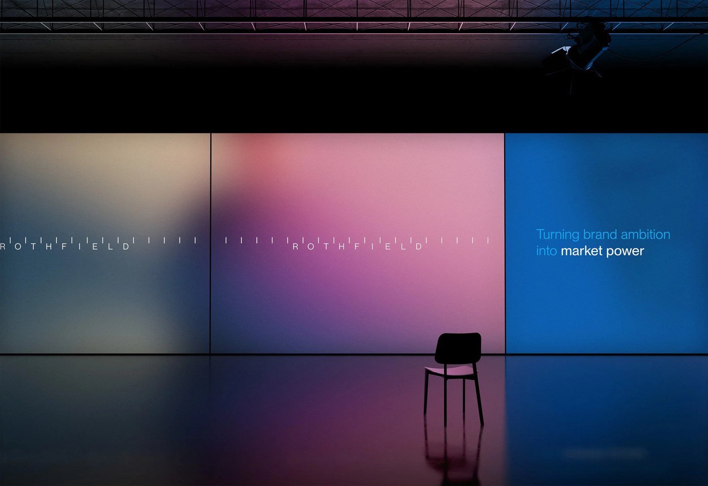
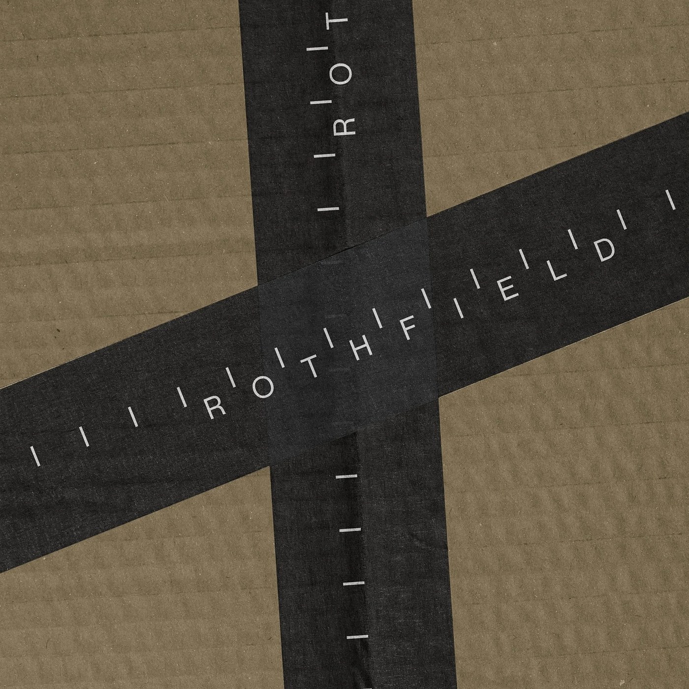
Look closely at the wordmark first. Clean geometric sans-serif letterforms sit between raised vertical tick marks, spaced across strict unit intervals of 1, 8, 8.5, and 19 units. It's a sharp typographic move that immediately evokes architectural scale rulers, crop marks, and press registration guides. When space gets tight on apparel tags or favicons, that full mark collapses neatly into a compact | R | monogram framed by two vertical ticks. To keep all that technical geometry from feeling cold, the studio paired the rigid tick marks with People in Motion — a photographic direction where softly blurred silhouettes and warm gradient shifts represent the unseen human specialists keeping client campaigns moving.
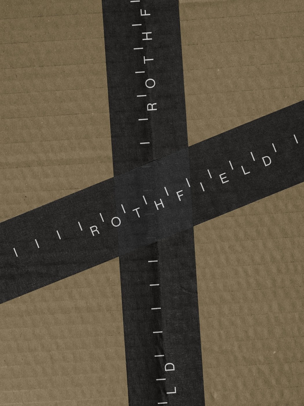
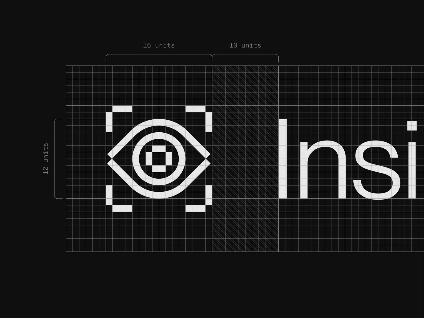
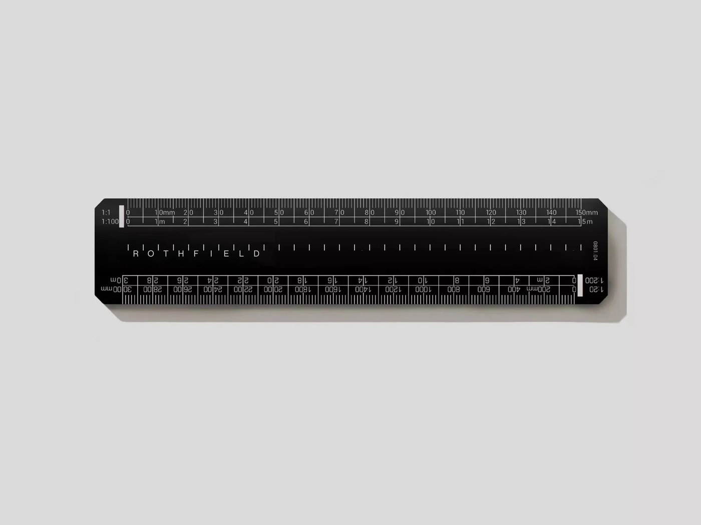
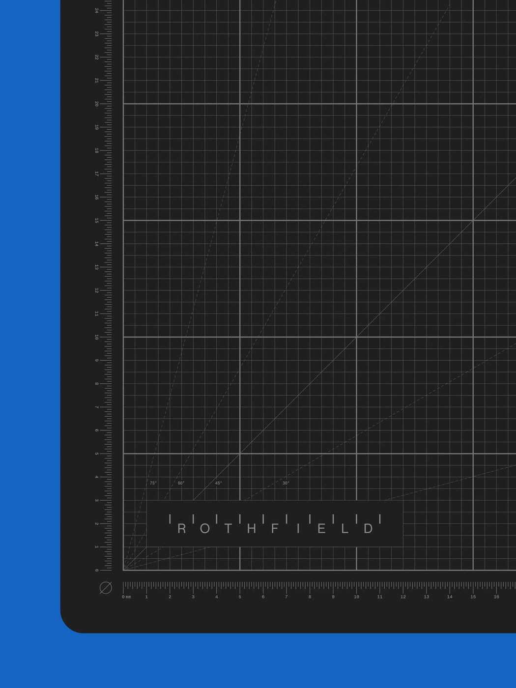
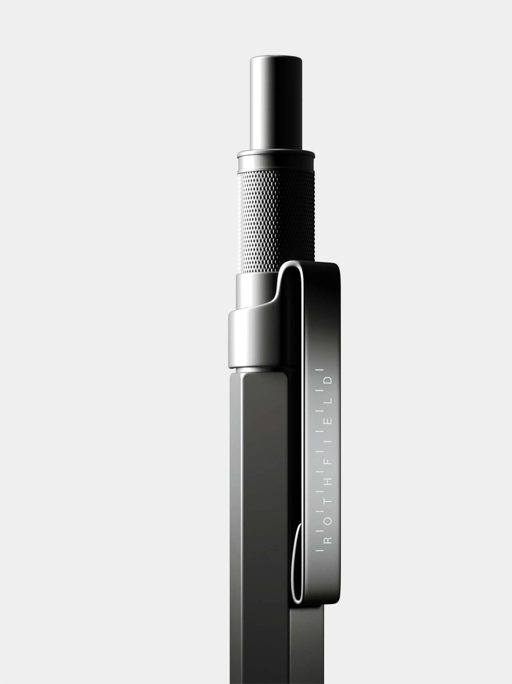
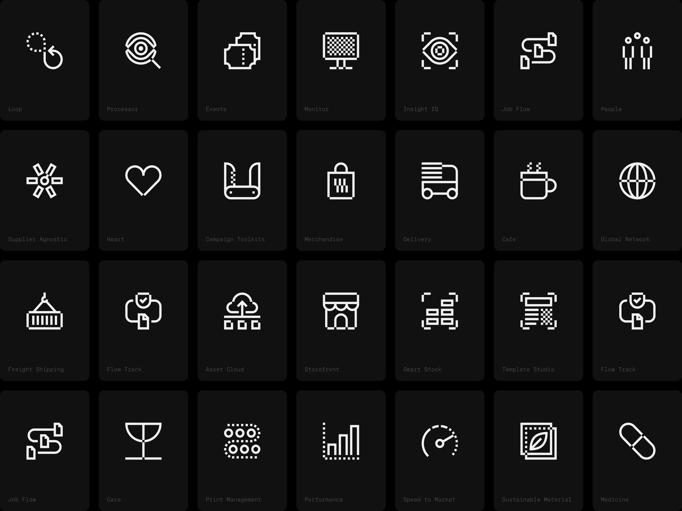
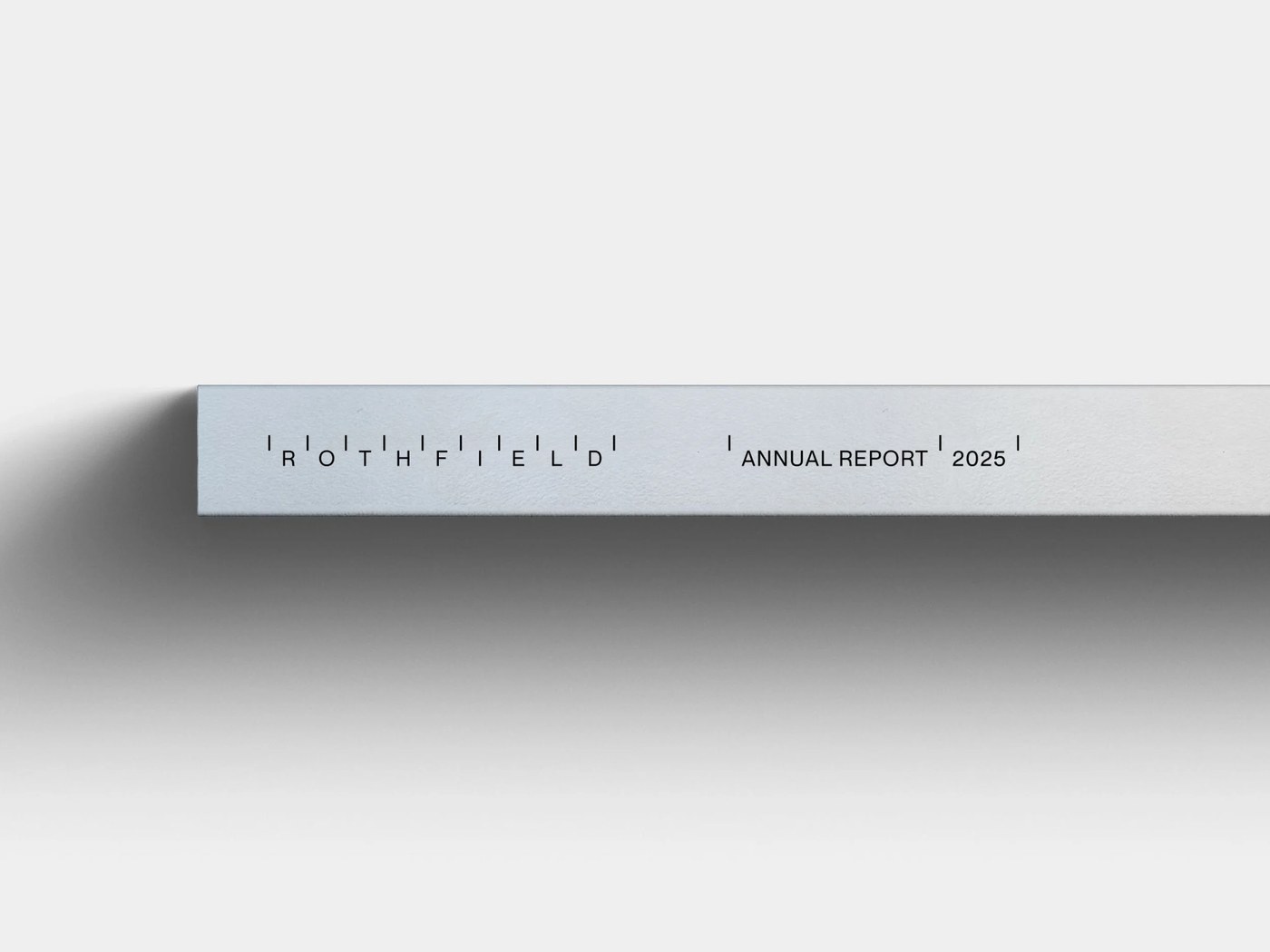
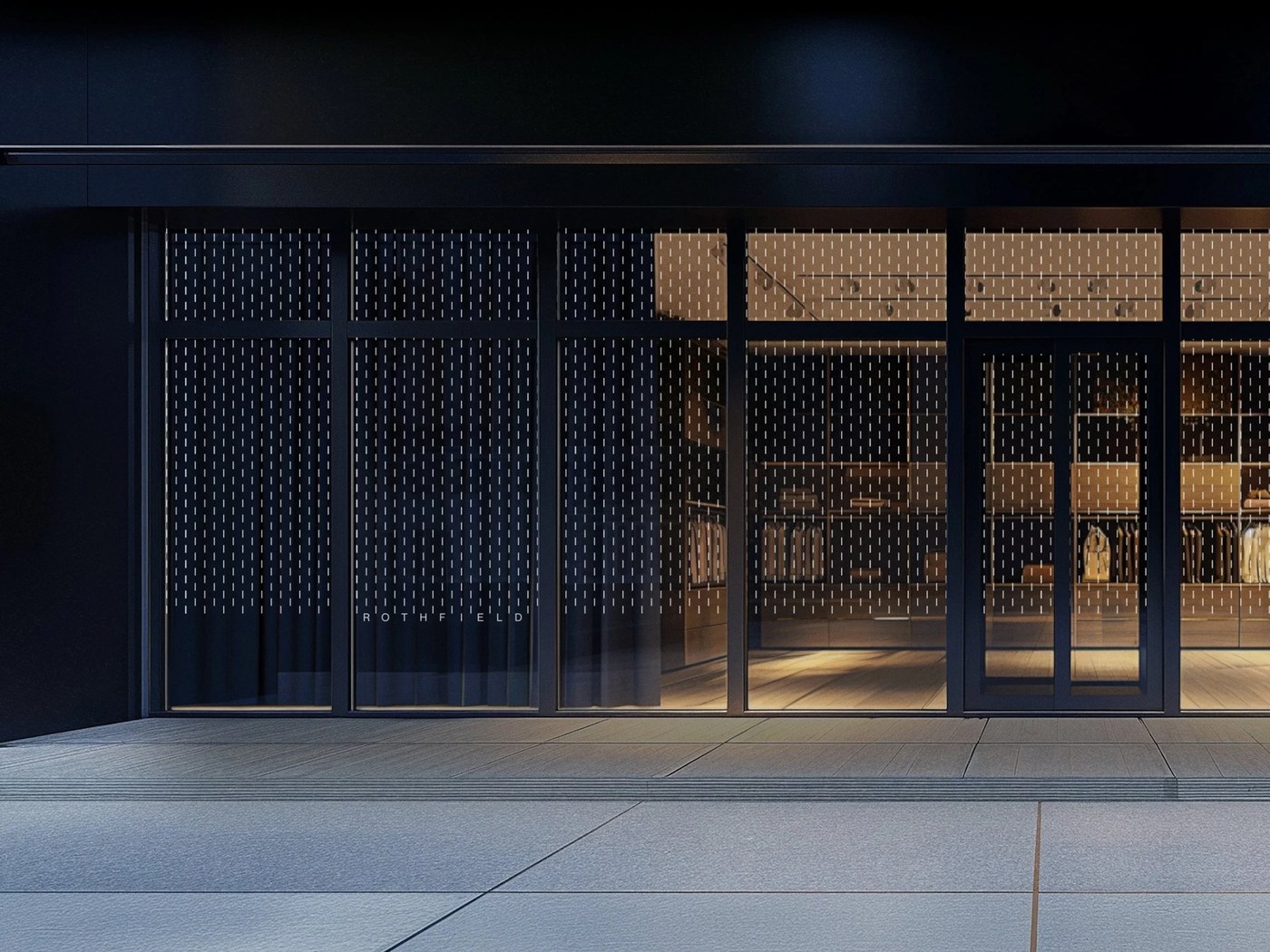
What makes this system sing is how thoroughly those unit grids translate into software and physical tools. For the Rothfield Connect platform, the designers built a 28-tile icon family on a 16-unit grid covering modules like Print Management, Freight Shipping, Smart Stock, and Insight IQ. Then come the physical artifacts. You get a black anodized architectural scale ruler etched with 1:100 millimeter graduations, a dark drafting cutting mat marked with 30-to-75-degree angle guides, a knurled matte-black metal pen, and reinforced kraft packing tape on corrugated cartons. Even the Annual Report 2025 spine, cobalt blue embroidered hoodies, and frosted shopfront glazing carry those same rhythmic ticks.
See the full brand identity project by Studio Julius on their portfolio.