Atlas Garden's lichen-green editorial identity | Mindsparkle
Ofform Studio
Mindsparkle Mag

Atlas Garden editorial identity inspired by gridded paper & archives
Atlas Garden is an independent editorial platform about contemporary gardens, landscapes and outdoor objects. It gathers projects and stories from around the world and looks at outdoor space through the overlap of nature, architecture and design. Its identity has to work like a well-kept archive: calm enough for long reads, with enough character to hold its own next to photography of planting and stone.
Paris-based Ofform Studio built the system on a sturdy serif wordmark, ATLAS.GARDEN, and a compact A.G monogram. The full stop in the name does real work, separating the platform's two ideas and returning as the hinge of the monogram. Old survey maps, gridded paper and envelope systems give the brand an archival backbone, as if every garden were a file waiting to be catalogued.
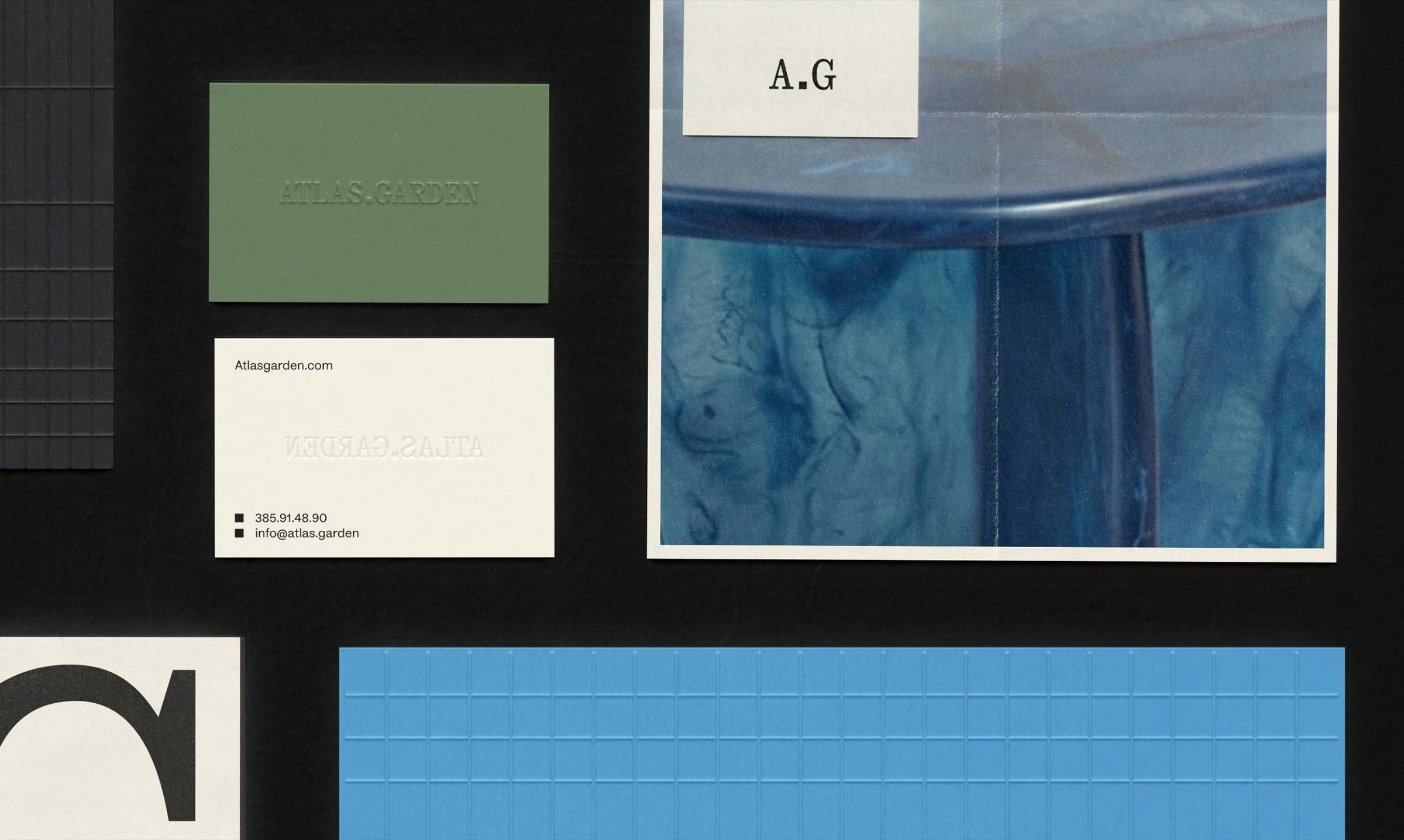
Colour comes straight from the subject. The core shade is a muted lichen green, specified on one swatch card as #64785A, set against warm off-white and black. Business cards, envelopes and an app icon complete with a notification badge show the same green and serif carrying from print onto the phone.
Photography does as much brand-building as the logo. A green chair beside a flower-shaped blue side table, blue asters in deep shadow and planted terraces set a tone that is quiet, specific and slightly playful. Green volumes titled A Collection of Gardens, Objects and Ways stand with numbered spines, which positions the platform as something to keep rather than scroll past.
Typography carries the voice. Large serif headlines such as Gardens, objects and stories worth keeping and Exploring gardens, objects & ways run tight and confident across posters and social tiles. Smaller lines like Not everything belongs indoors let the brand speak in a warmer, conversational register over blurred greenery.
Out in the street, the identity moves onto a row of poster panels standing in front of planting. One poster shows a pale-blue flower cut-out against tree bark, a shape that turns up across the system as a recurring graphic object. A green canvas tote hung in the branches of a tree keeps the merchandise tied to the outdoors it describes.
The digital side mirrors the print work closely. Instagram stories and an app screen use the same off-white panels, serif headlines and garden photography, with the A.G monogram held large on a phone floating against the sky. The closing line, Gardens, gathered., sums up an identity that treats a garden publication as a collection worth tending.
The best of the week. Every Friday.
Includes freebie bundle, unseen BTS insights and more.
We respect your inbox.