Inside the Craft of Module: Brand Identity by FAST Studio
FAST Studio crafts a disciplined brand identity for Riyadh architecture firm Module, balancing geometric order and human-scale engineering.
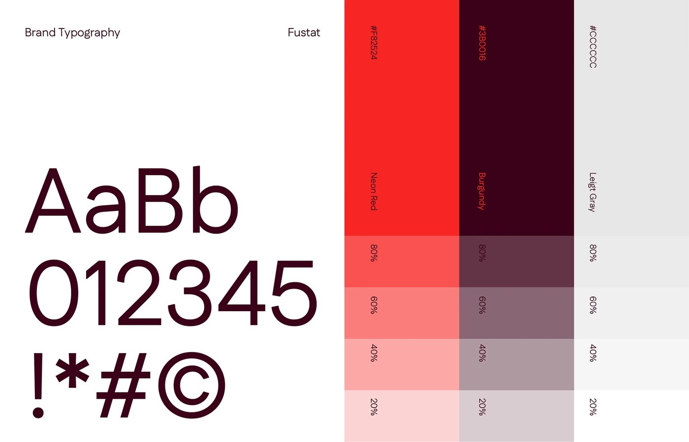
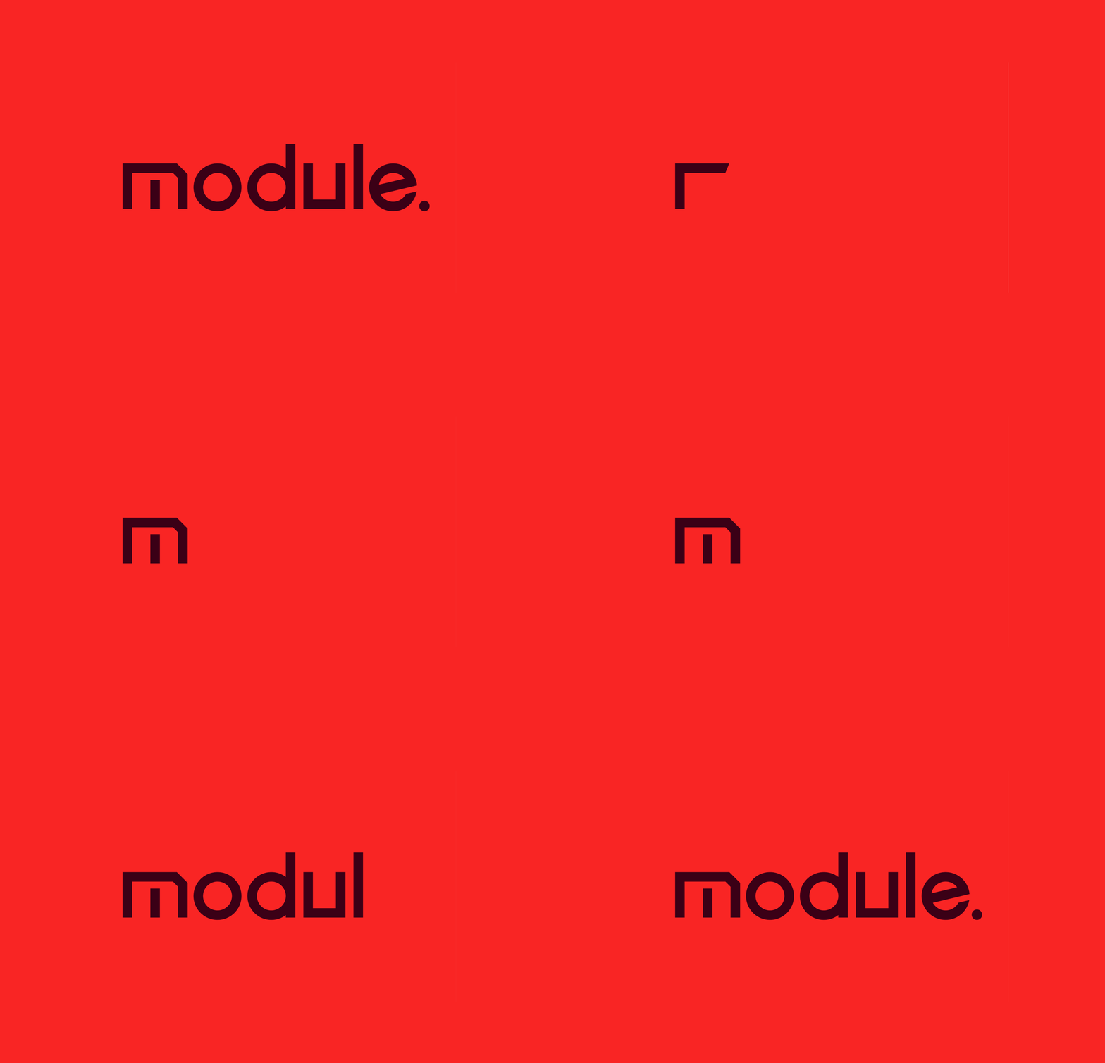
Module approaches architecture as enduring cultural infrastructure. Based in Riyadh, the studio conceives built environments that align structural permanence with human scale. FAST Studio translated this philosophy into a disciplined brand identity. Rather than adopting typical neutral tones, the team established visual tension through acute chromatic contrast. Deep burgundy anchors the foundation, evoking solid foundation walls and tectonic weight. Striking neon red cuts through the dark backgrounds with electric clarity, symbolizing energy and technical precision. Light gray surfaces provide breathing room across layouts, mirroring raw limestone and concrete surfaces. This dynamic balance bridges monumental construction with approachable warmth.
Architectural Geometry and Modular Brand Identity
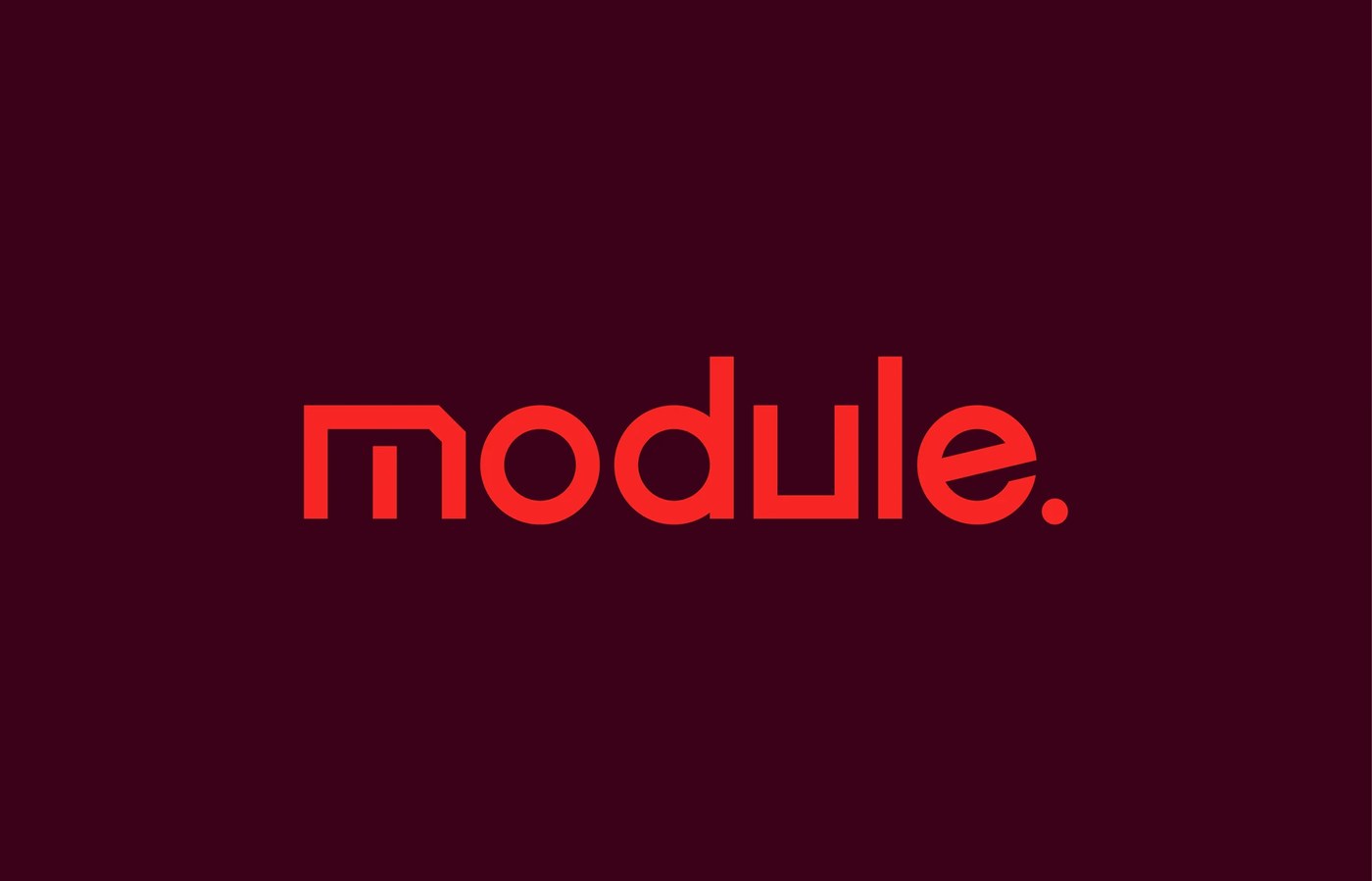
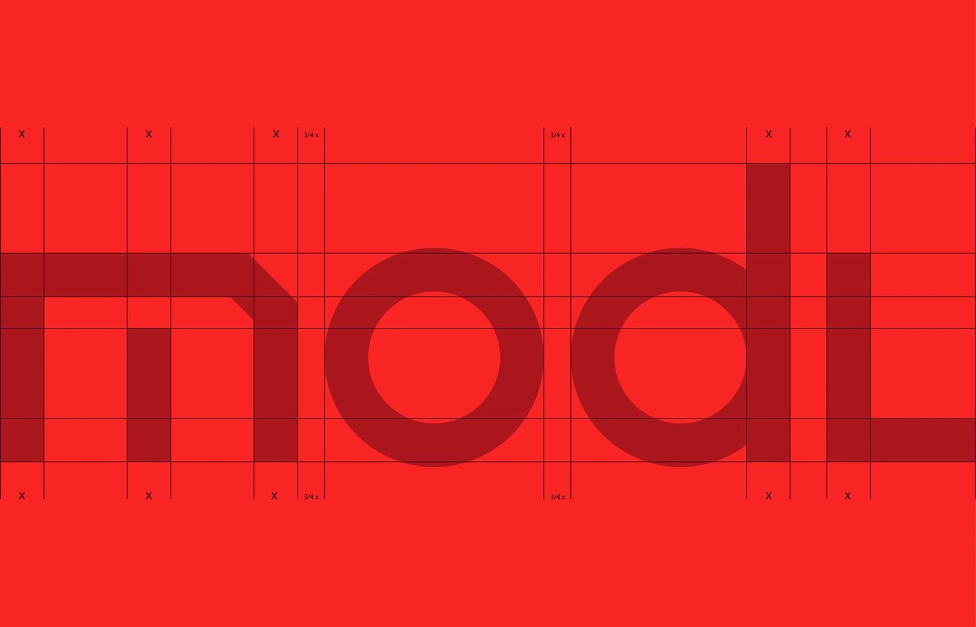
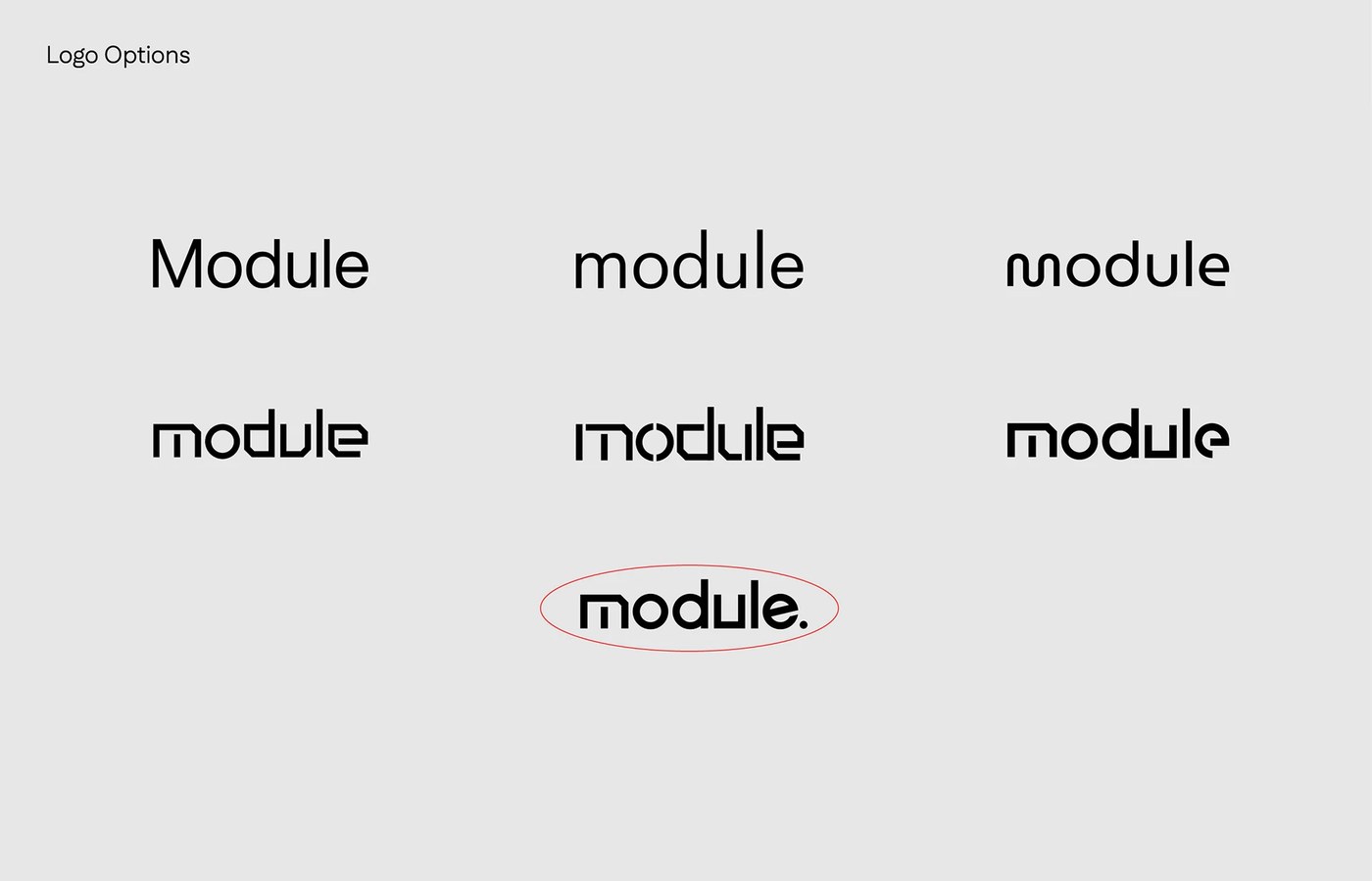
The core wordmark is constructed on a rigorous mathematical grid. FAST Studio engineered custom lowercase glyphs based on modular stem widths. The letter m features a chamfered outer shoulder, echoing architectural lintels and cantilevered stone facades. Perfectly circular geometry defines the counters of o and d, while the u and l stand as vertical structural columns. The composition finishes with an angled crossbar on e and a definitive terminal period that anchors the brand identity mark. For secondary typography, the system deploys Fustat. The geometric sans-serif brings crisp apertures and rational proportions to technical project documentation. The typeface handles both headline hierarchies and micro-scale metadata with effortless clarity.
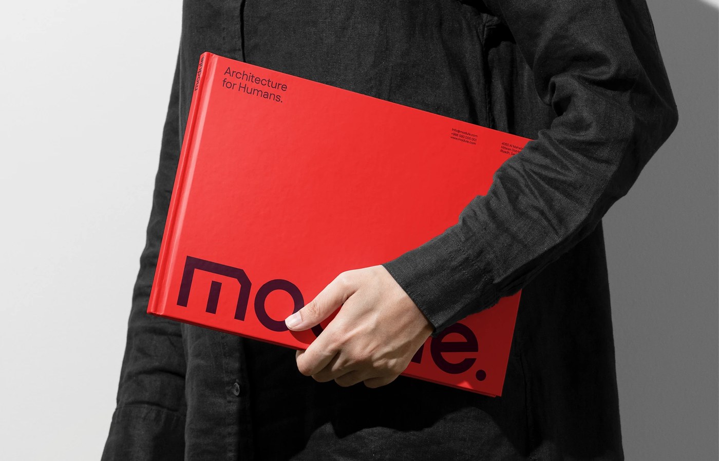
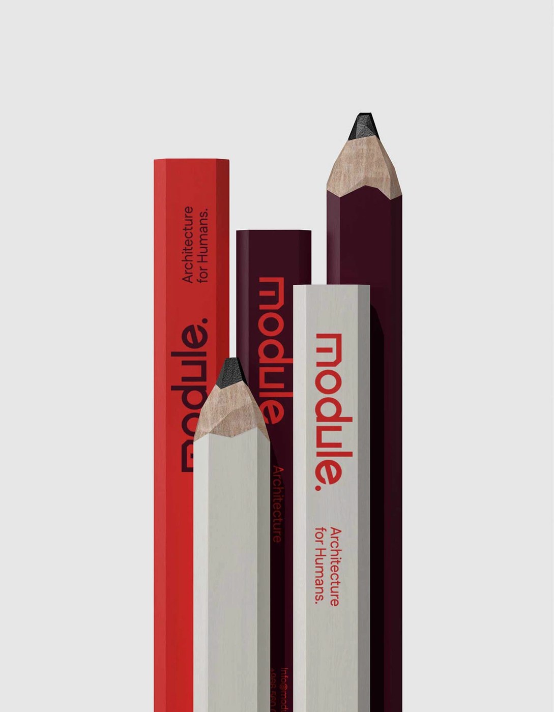
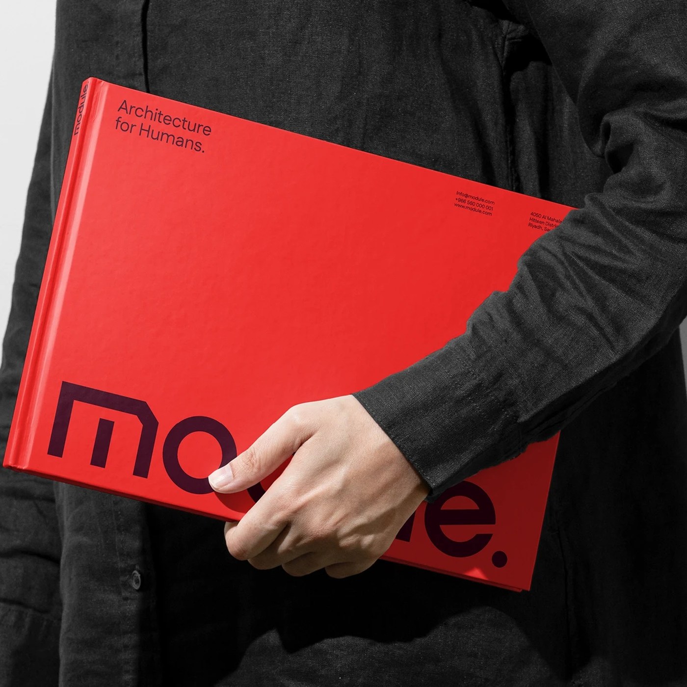
Physical applications ground the visual language in tangible material craft. A large-format hardcover monograph presents the studio portfolio under a bright crimson cover. The deep purple wordmark spans the lower trim, asserting bold editorial scale against a black linen sleeve. Hexagonal wooden drafting pencils carry silkscreened signatures across neon red, burgundy, and light gray facets. Presentation folders and site signage apply high-contrast framing to technical blueprints and site drawings. In digital motion sequences, the letterforms disassemble into architectural modules before locking back into unified alignment. This cohesive brand identity equips Module with an enduring presence across physical construction sites and digital touchpoints.
See more from FAST Studio on Behance.