Berlin Museum rebrand echoes the city’s rich visual language
The organisation’s new logotype system incorporates signage from local businesses, historical buildings and even the world-famous U-Bahn
In hopes of refreshing its image and bringing in more visitors from near and far, the Stiftung Stadtmuseum Berlin has rebranded as Berlin Museum, following a close collaboration with local creative agency Stan Hema.
After realising that it was commonly viewed as a ‘dusty’ place, stuck in time, the team at the museum connected with Stan Hema to, as the agency’s brand consultant Gabriel Punkenhofer recalls, “open this traditional cultural institution and transform it into a place for everyone who lives and visits Berlin.”

In response to the brief, Stan Hema first chose to engage members of the public, to get a deeper insight into local perceptions of the museum, and to understand what they wanted to see as part of the new rebrand. They were surprised to find that many Berliners were not even aware of the museum’s existence, let alone the more than 4.5 million objects it holds in its collections.
With the Stiftung Stadtmuseum Berlin serving as the parent organisation for a mix of private and public venues across the city, including the Märkisches Museum and the Nikolaikirche, Stan Hema realised the need for a new name to unify these locations, and bring them under a single, more cohesive brand identity – hopefully leading to a greater awareness among locals.
Key to this was also the development of a new wordmark that could represent the newly-established Berlin Museum, and forge a stronger connection between the organisation and the city itself. This has come in the form of a fully-fledged logotype system that draws inspiration from signage found around the capital.
From the iconic U-Bahn and various historical buildings, to currywurst stands and other quintessential Berlin businesses, the city’s visual language has been worked into the Berlin Museum logo. These found letterforms and typefaces can be changed and adapted to suit different use cases, and to reflect the complex, contradictory nature of the city and its history.
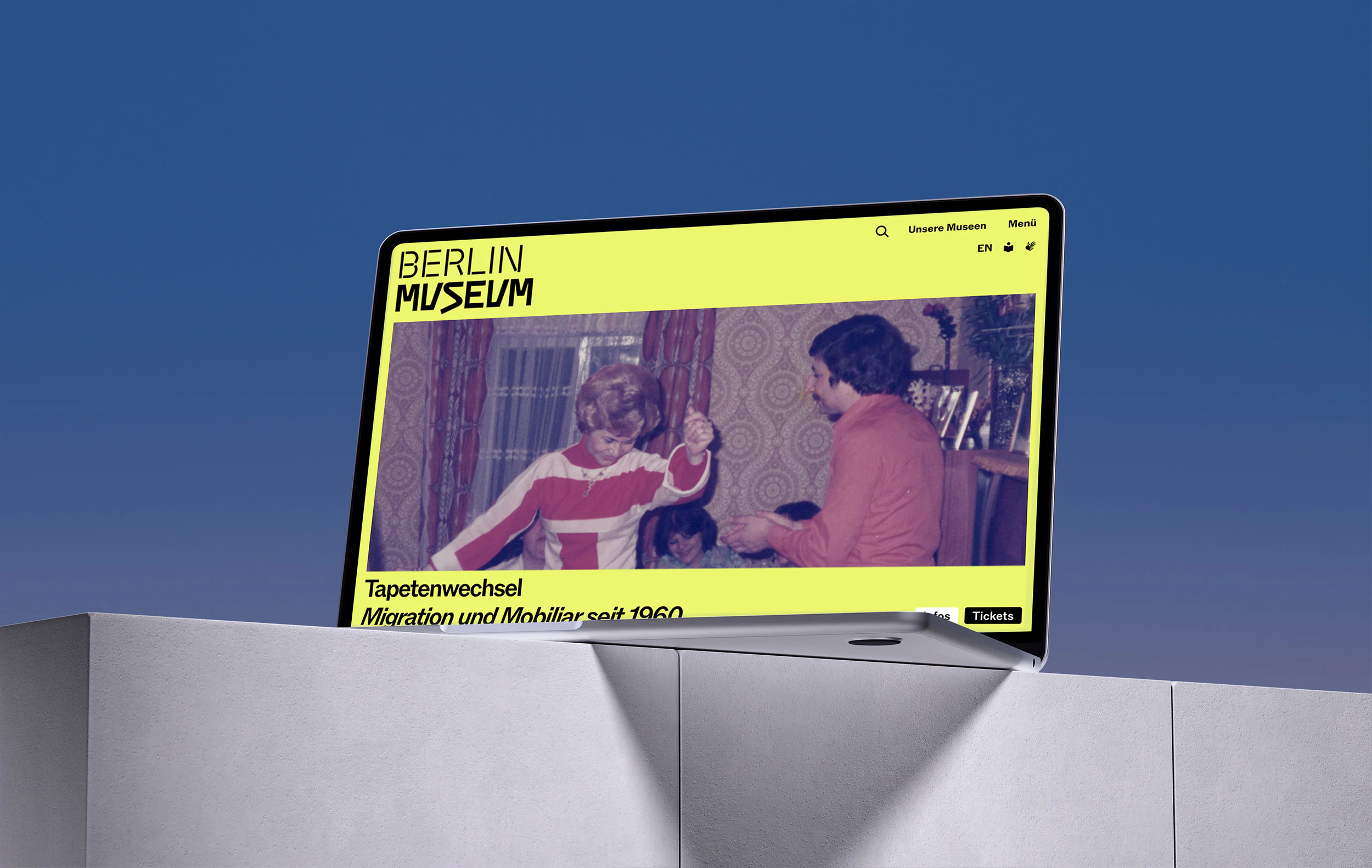

“For us, the wordmark is the identity-defining element of the museum,” explains André van Rueth, designer and typographer at Stan Hema. “It is directly connected to the reality of our city.” Lisa Geisler, brand strategist at Stan Hema, adds: “Berlin challenges and fascinates. The Berlin Museum should feel like Berlin itself – direct, a bit stubborn, and always open to people and new perspectives.”
Across the identity, this playful logotype is complemented by other equally contrasting visual elements, including imagery of age-old, ornate paintings that are set against a bold, modern colour palette. In doing so, the Berlin Museum’s vast collections are brought into constant dialogue with contemporary design and culture that is in turn inspired by the visual history of Berlin itself.
Commenting on the work, Mathias Illgen, managing director at Stan Hema, notes: “The new Berlin Museum brand is a warm invitation to everyone who lives in and visits Berlin. And if the new brand translates the warmth, intelligence, and passion of the people working in this ‘house’, then we have achieved a great deal.”