How Span Reimagined the Nature Museum Identity
Span gave Chicago's Nature Museum a prairie-grown identity: a Tonka wordmark, a butterfly icon, and prairie colors that bloom across the brand.
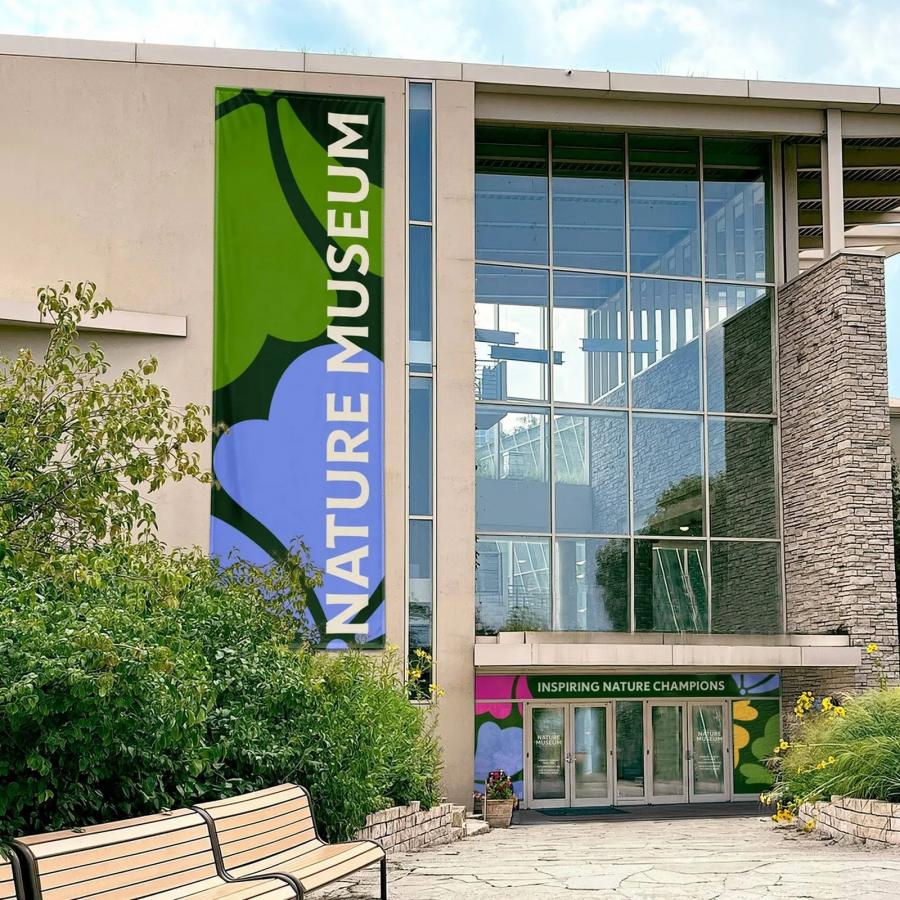
The Peggy Notebaert Nature Museum has connected Chicagoans with nature and science since 1857. After a new strategic plan, it asked Nick Adam's team at Span to evolve an identity that had barely moved in twenty years. The answer is drawn from native Illinois prairies: confident, warm, and built to speak to weekend visitors and research scientists at once. The entrance says it best: a giant vertical NATURE MUSEUM banner in milkweed cream on catalpa green, the icon's looping petals behind it, with INSPIRING NATURE CHAMPIONS running over the doors.
The Nature Museum identity grows from prairie color and Tonka type
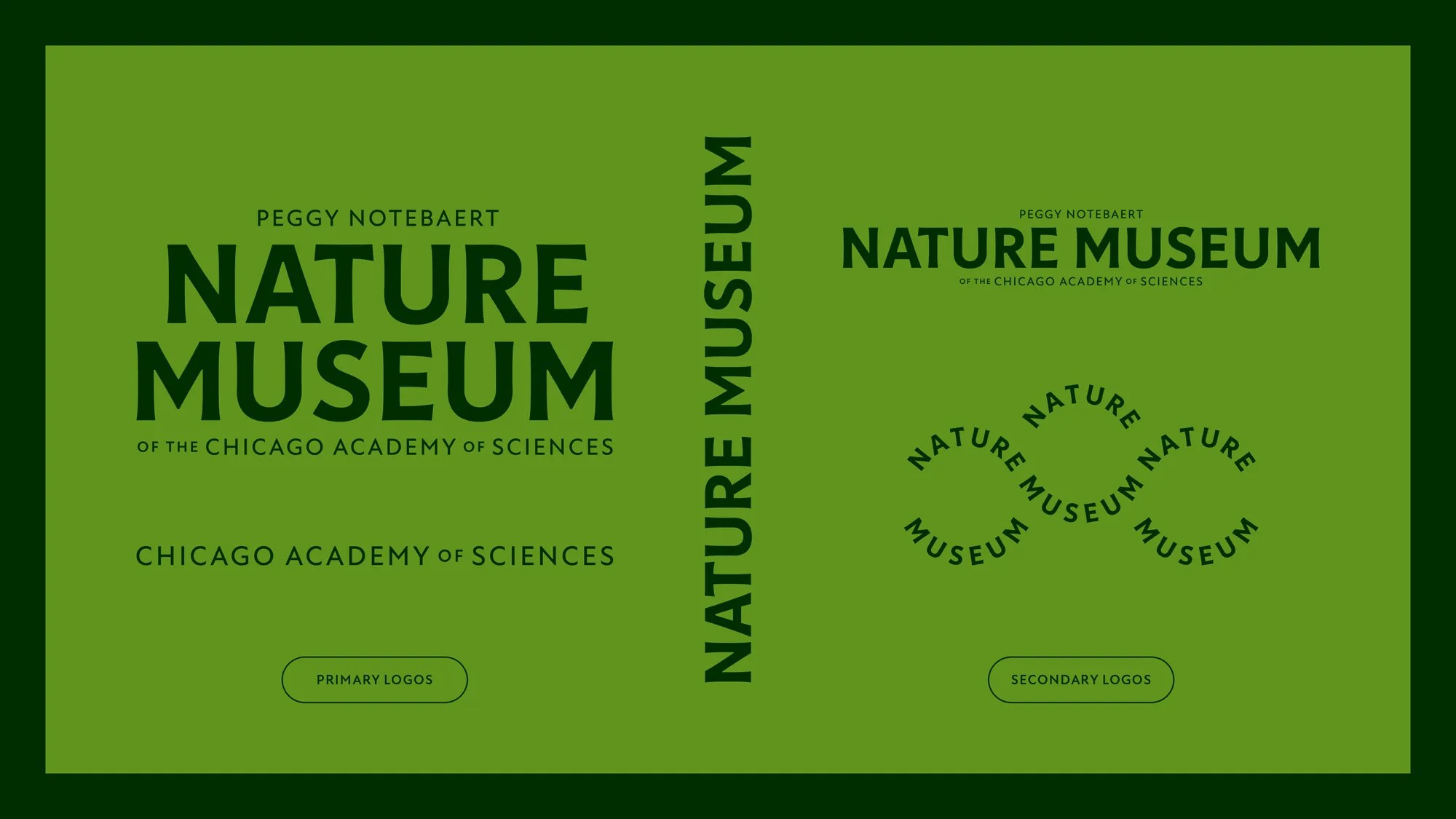
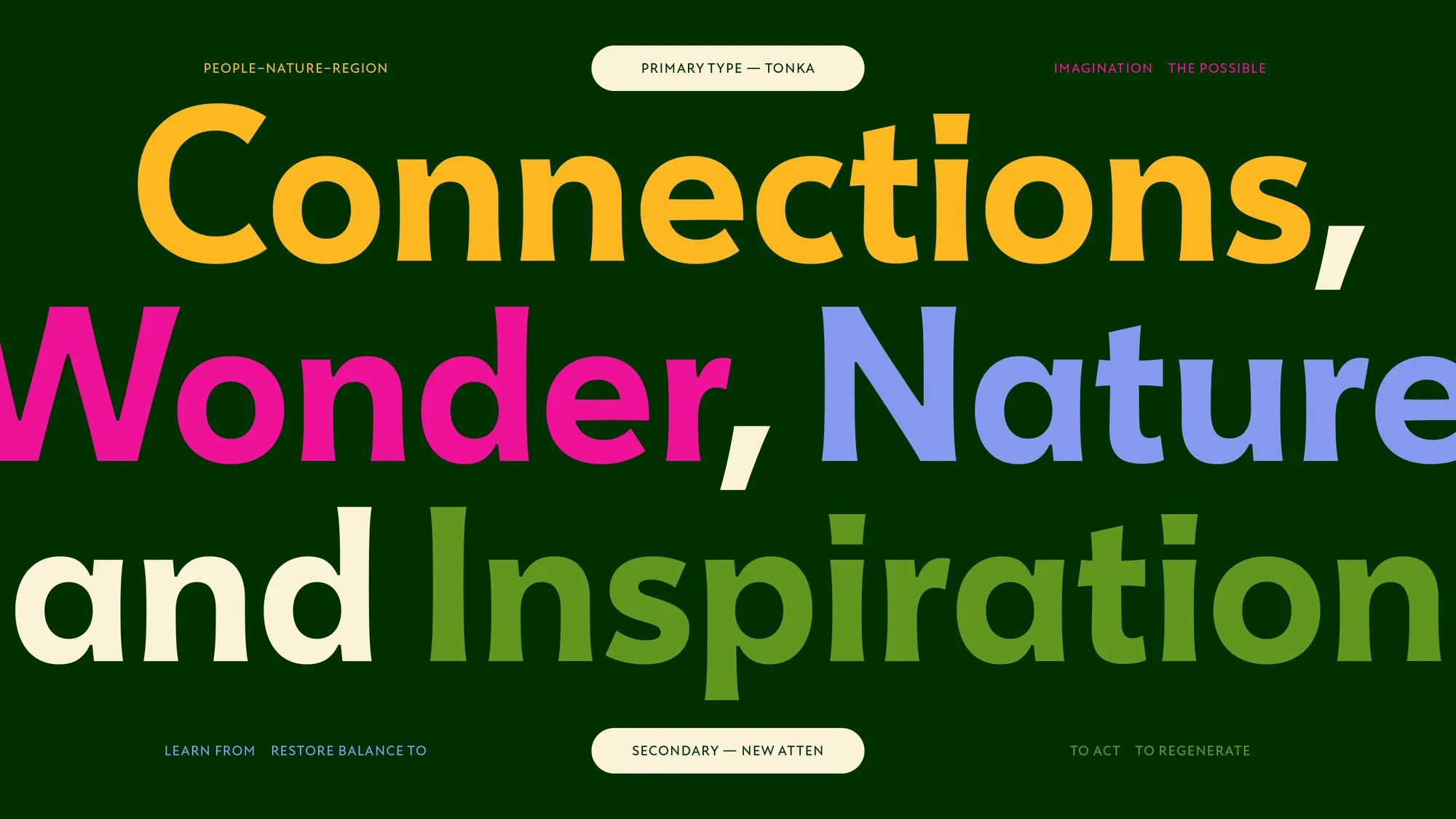
The wordmark is set in Tonka by Céline Hurka, whose flaring stems give the name a historic, organic voice. "PEGGY NOTEBAERT" rides above stacked NATURE MUSEUM, with "OF THE CHICAGO ACADEMY OF SCIENCES" anchoring the lockup. The pairing face is Miles Newlyn's New Atten, a humanist sans named for the voice of Sir David Attenborough; the type board sets "Connections, Wonder, Nature and Inspiration" large in Compass, Columbine, Aster, and Catalpa on deep Evergreen. Best detail: the circular NATURE MUSEUM stamp, set on a curve around the butterfly icon like a field-station seal.
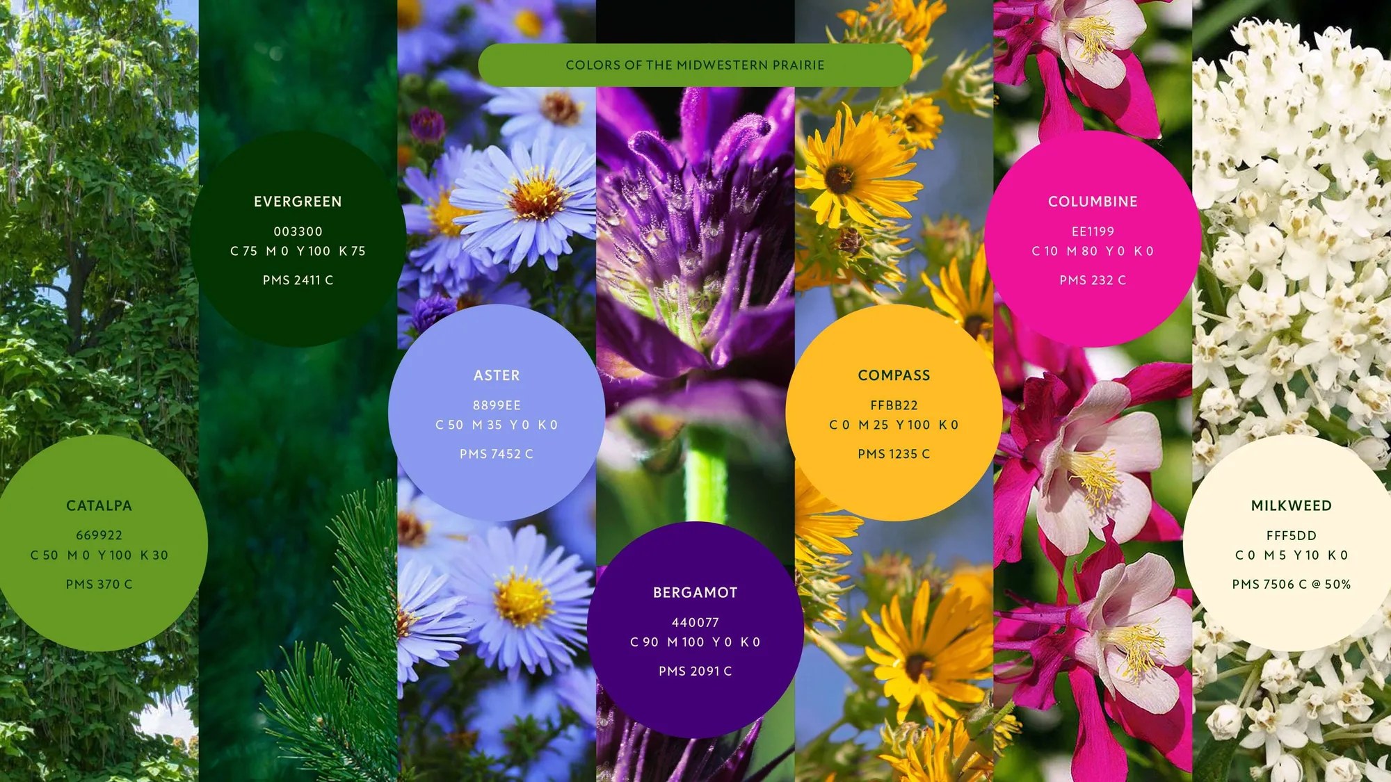
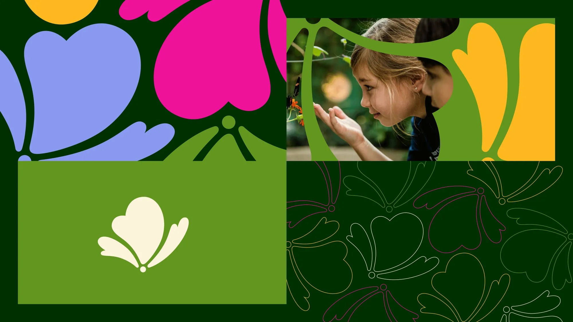
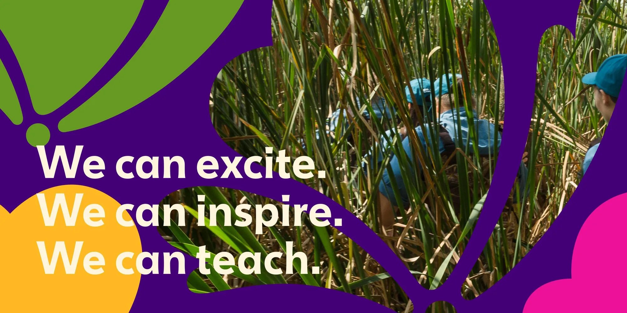
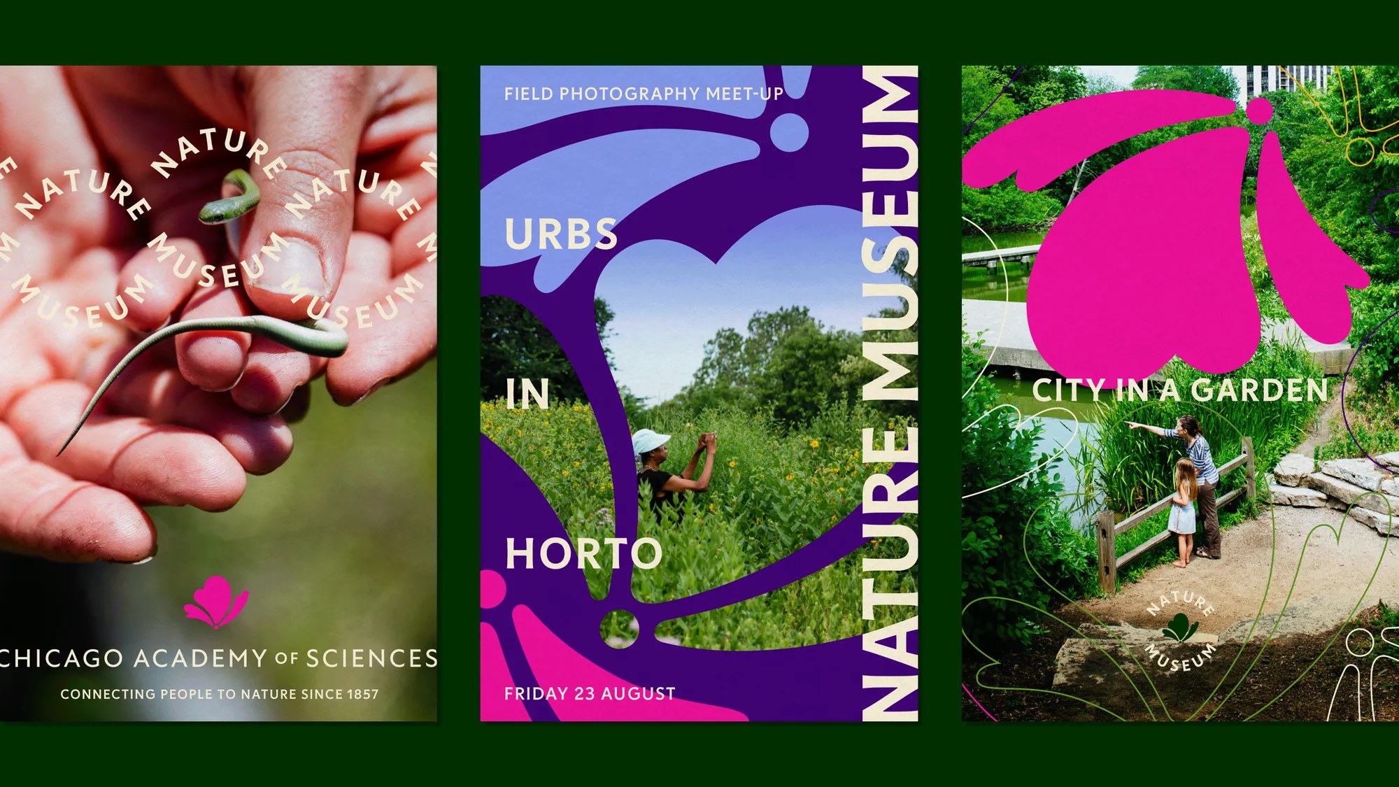
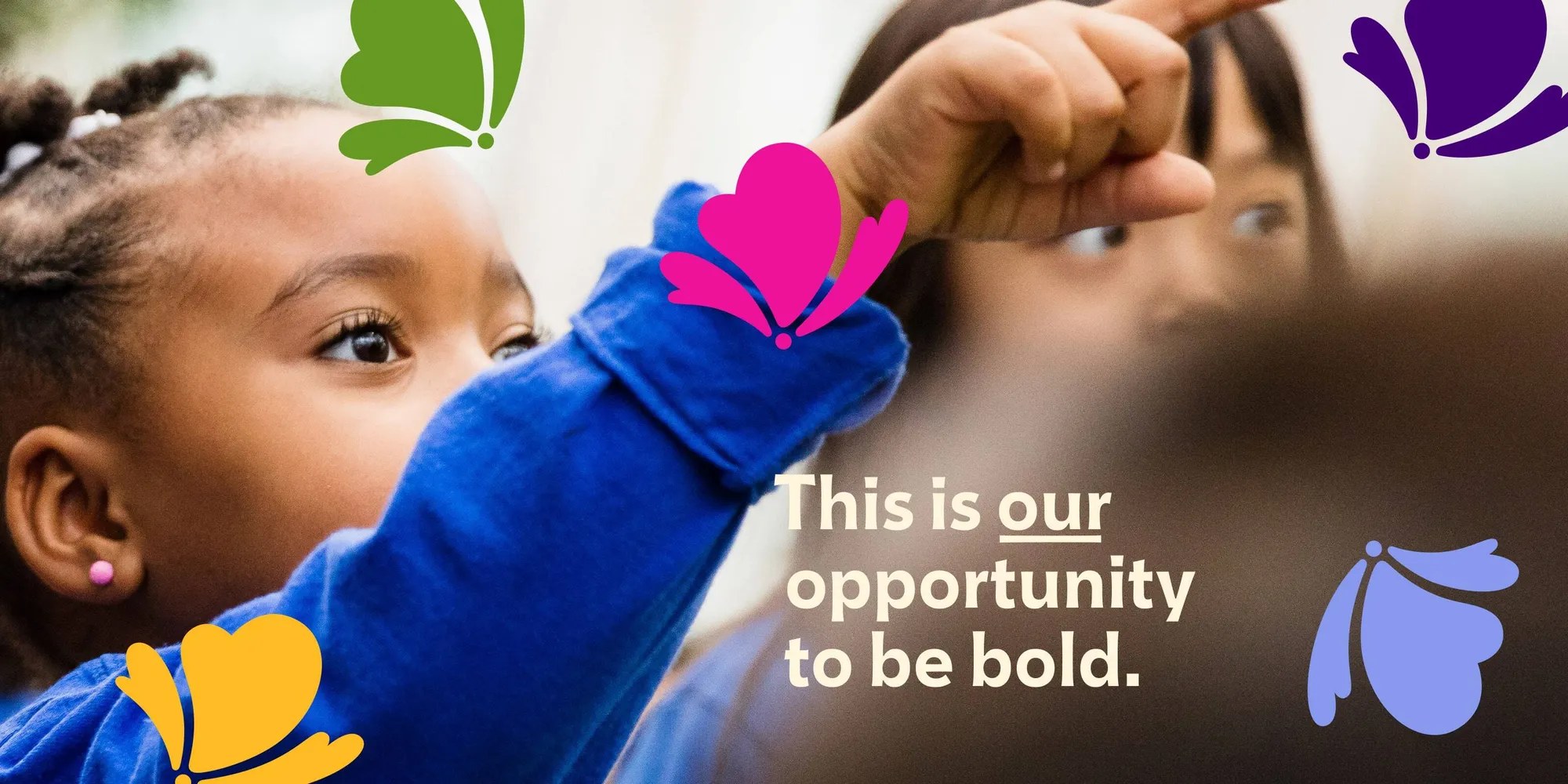
The palette is the real star: seven swatches named for prairie flora, each spec'd with PMS values on the system board. Catalpa and Evergreen hold the structure while Columbine pink, Aster blue, and Compass yellow do the shouting, and Milkweed cream keeps the type legible on top of it all. The icon reads as butterfly, flower, or cloud, and works three ways: a standalone mark, a lens cropping into photography, and a pattern field that the studio says "instills a sense of positive activity." Beyond the identity, Span redesigned the museum's website, signage, and store collateral, and the case study shows the system stretching across all of it. Campaign graphics stack punchy lines, "We can excite. We can inspire. We can teach." and "This is our opportunity to be bold.", over marsh photography framed by the icon. The poster trio runs from a hand cradling a skink, stamped "CONNECTING PEOPLE TO NATURE SINCE 1857," to an "URBS IN HORTO" field photography meet-up dated Friday 23 August, to a "CITY IN A GARDEN" scene by the pond. President and CEO Erin Amico frames the ambition plainly: the museum is "more than a repository of history," and the identity "now takes a transformative step forward to match the Museum's dynamic evolution." It is rare to see an institutional rebrand this willing to be loud. The prairie gave Span the excuse, and they took it.
See more from Span on their case-study page.