Studiogusto Unveils the Michelangelus Typeface
The Michelangelus typeface decodes Michelangelo's handwriting into a humanist serif, commissioned by the Vatican and shipping with Microsoft 365.
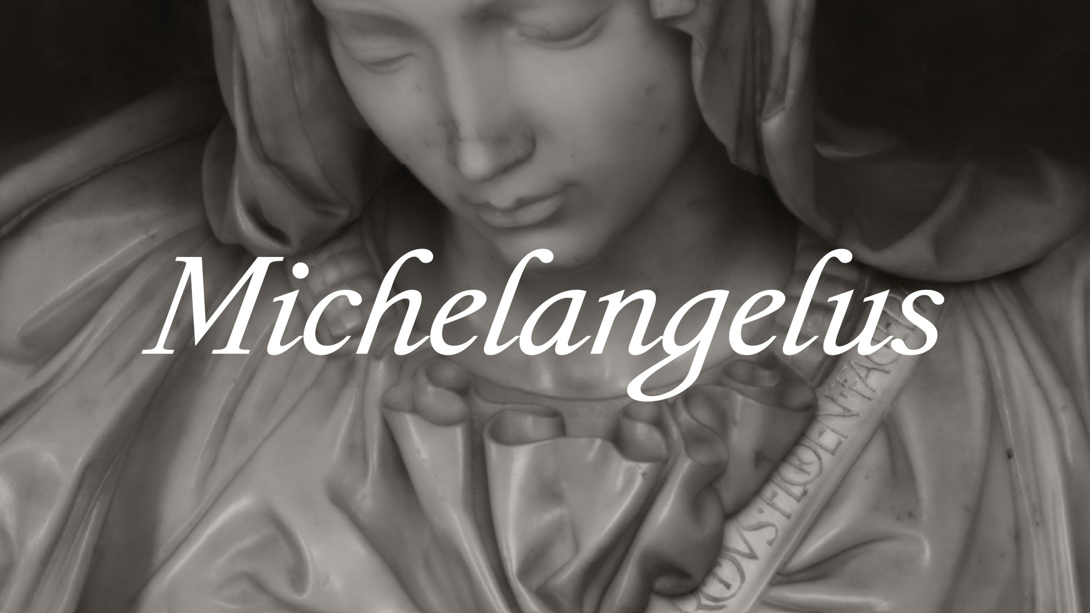
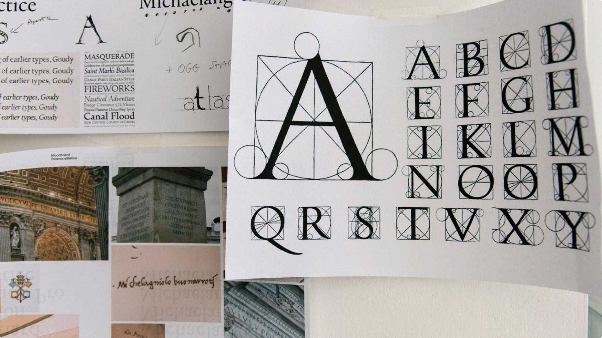
The family reads like the Renaissance itself, hand-inked and set down four centuries late. Lowercase letters keep the quill's logic: a wide-countered o that billows, an ink drop pooled in the bowl of the b, and every terminal ending in a gestural sweep instead of a hard stop. The capitals belong to another hand entirely, the chisel's. Studiogusto drew the uprights from Roman letterforms Michelangelo carved into stone, the sash of the Pietà, the inscriptions of St. Peter's Basilica, the Sistine Chapel. They run narrower than a Garamond without ever reading condensed, which keeps the two halves of the family in quiet tension: the scribe's hand below, the mason's above.
The Michelangelus typeface treats letters as modular architecture
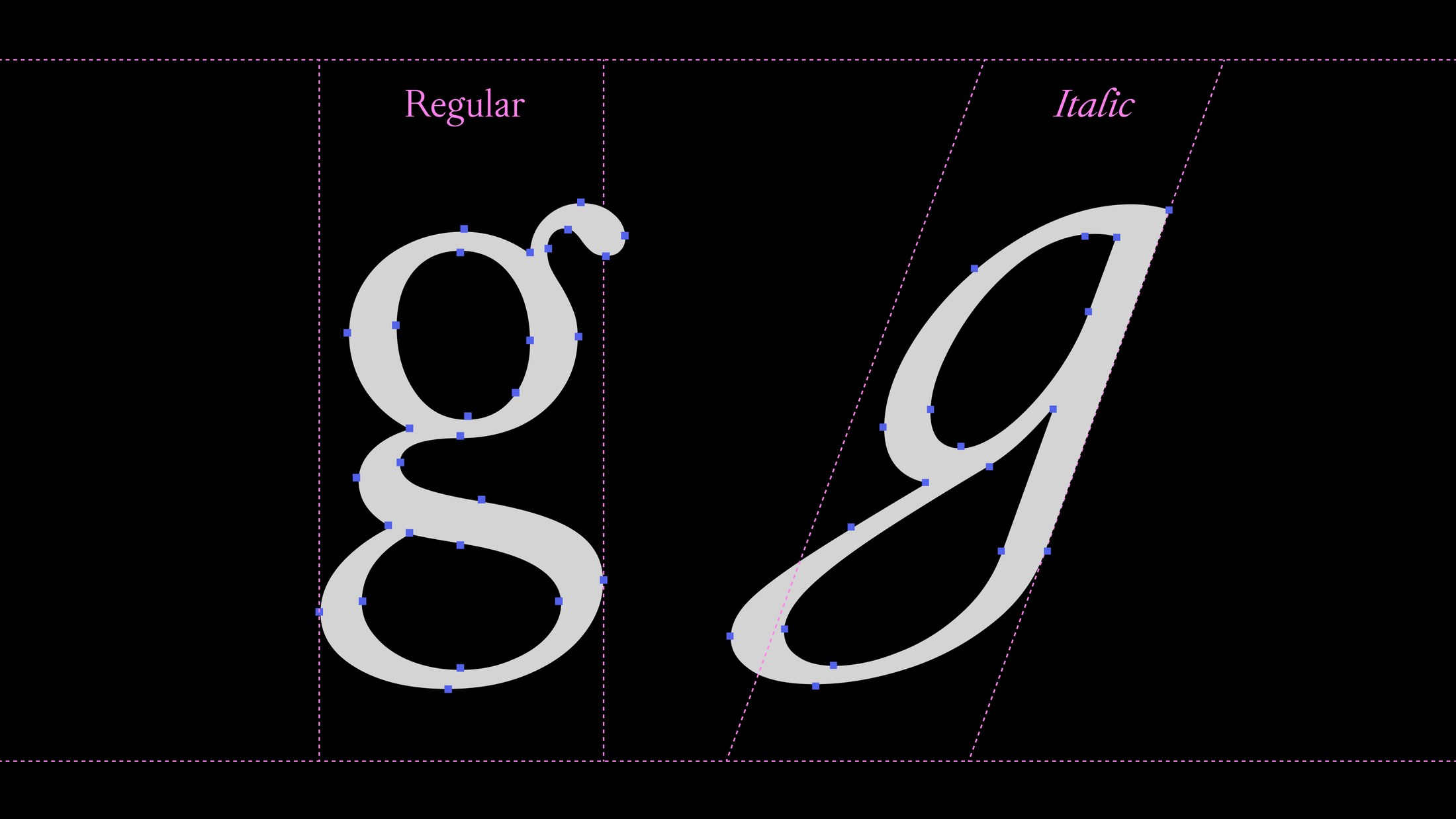
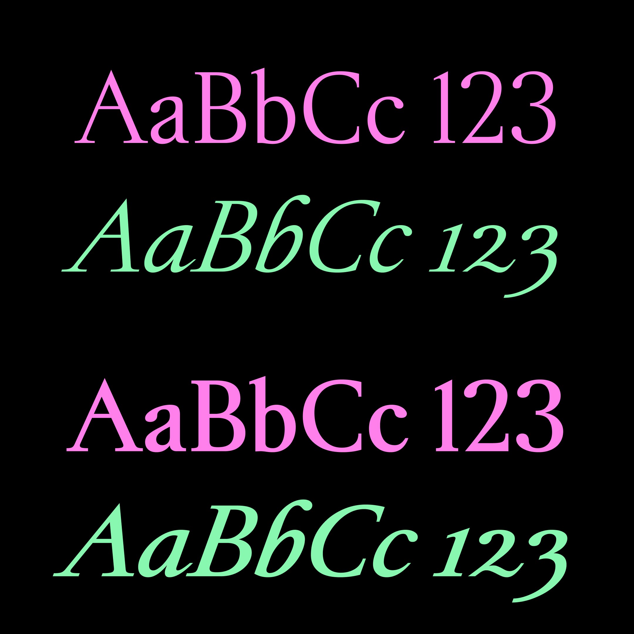
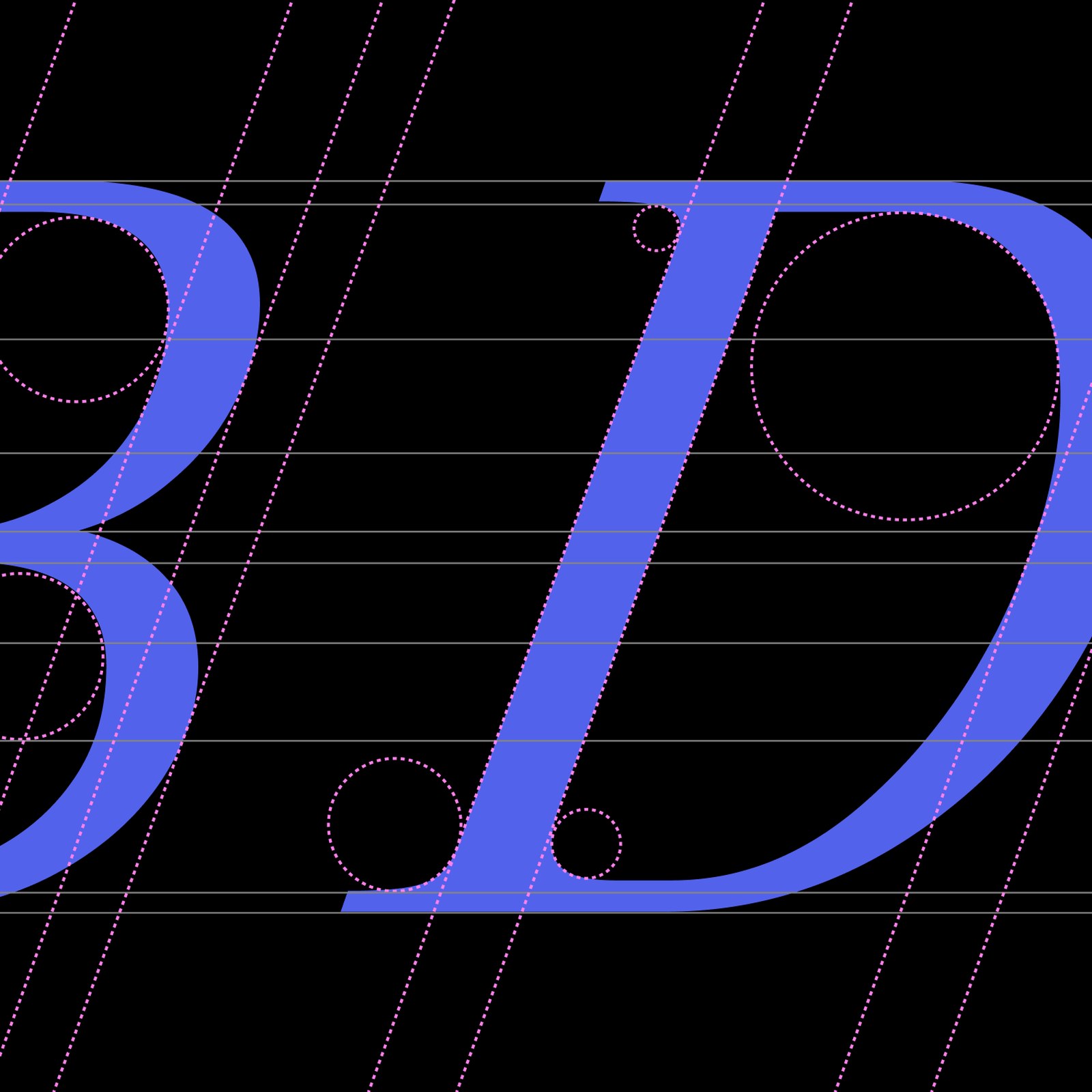
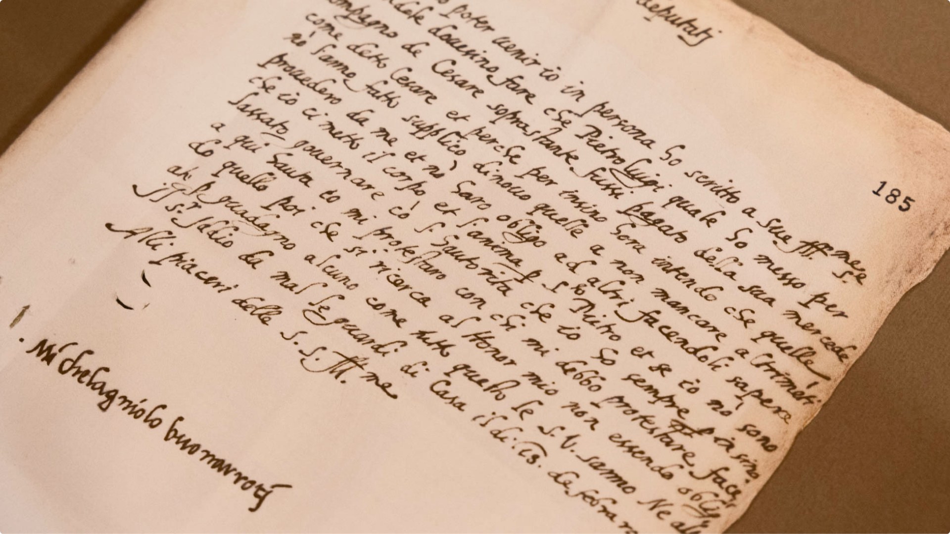
Grid first, always. Studiogusto's boldest decision was its first: do not imitate Michelangelo's handwriting. "Our first decision, probably the most important one, was not to emulate and perfectly imitate Michelangelo's handwriting," said founder and creative director Stefano Caliandro. Instead the studio decoded the hidden order inside it, the invisible grid the architect in Michelangelo laid under every line, and rebuilt the letters as modular elements with clear boundaries. The build ran italic-first, the way the period actually wrote, since no complete alphabet survived and the lowercase g alone took a week, a double-stacked regular set against an italic drawn straight from the master's signature. In the specimens, blue letterforms sit inside pink circles and slanted guidelines: B, D and E carry internal spatial pressure, the T's crossbar spreads like wings, and the vertex of the N cuts through the baseline.
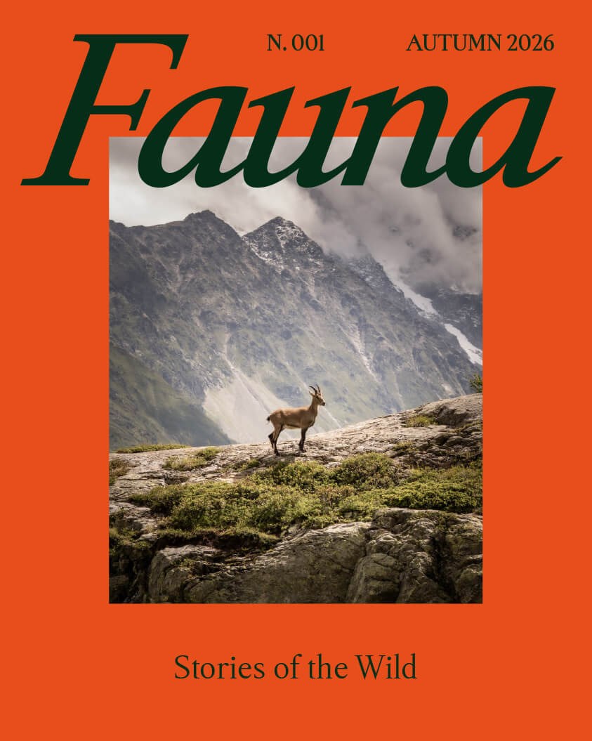
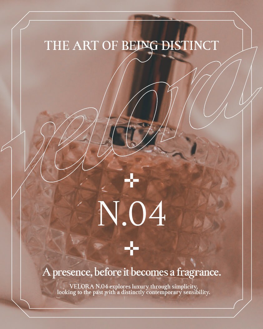
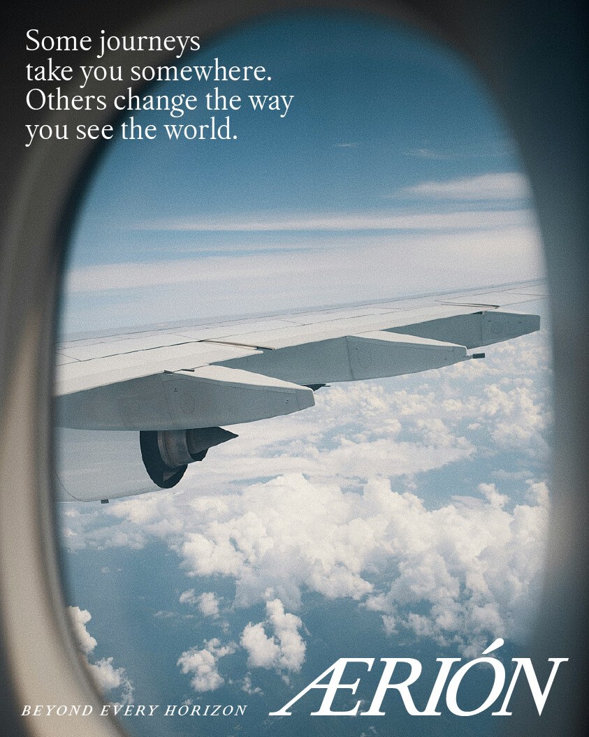
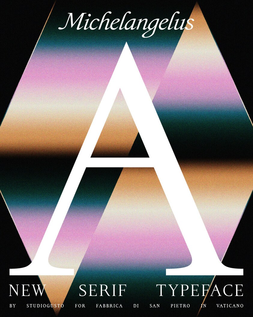
As a tool, Michelangelus wants to be everywhere. It is free to download now and ships with Microsoft 365 at year's end, which puts a Vatican-commissioned serif into Word documents and presentation decks by the millions. The studio's own posters show where the family shines: a magazine cover set in orange and forest green, a fragrance campaign drawn in outlined script, an airline ad stretched across an airplane window. Marble and manuscript sit behind all of it, the Pietà's stone and the Vatican's archives, and the typeface holds its own in both registers, equally at home in the everyday and the monumental.
See more from Studiogusto on the official Michelangelus site.