How EVERLAND Reimagined Urban Kind Branding
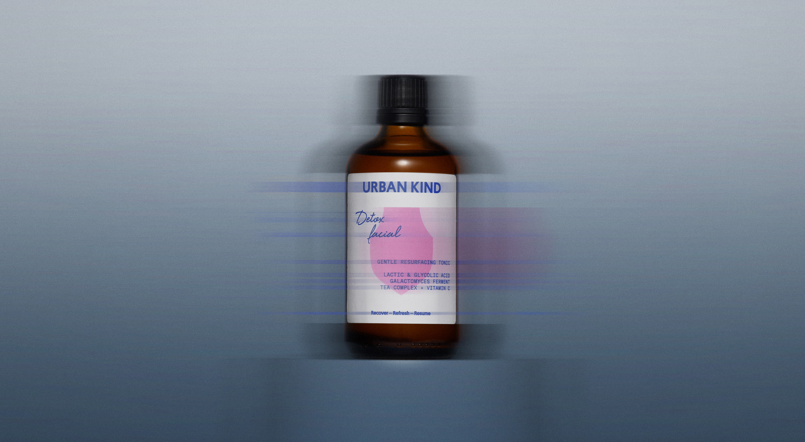
EVERLAND built Urban Kind branding on a single device: the shield. Saturated color, script product names, and raw amber-glass packaging.
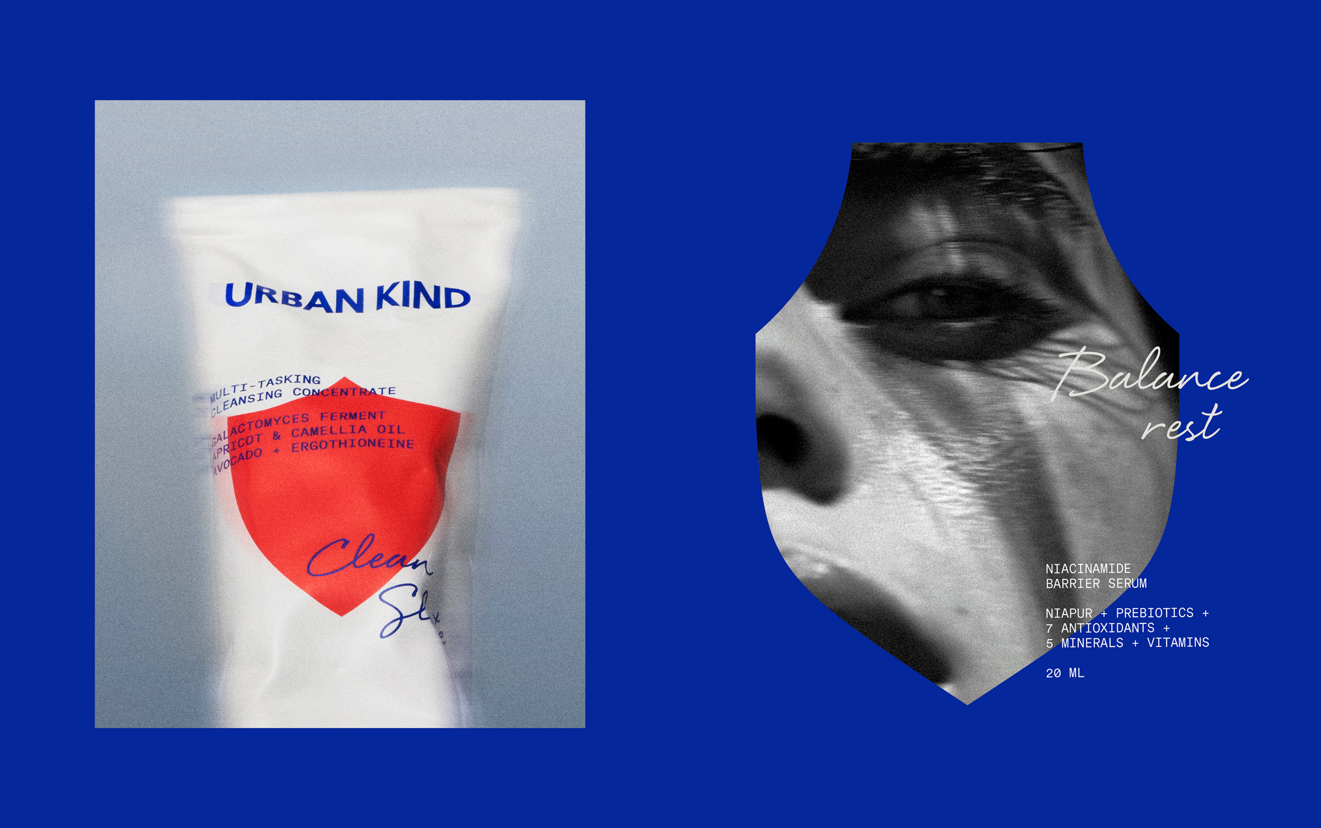
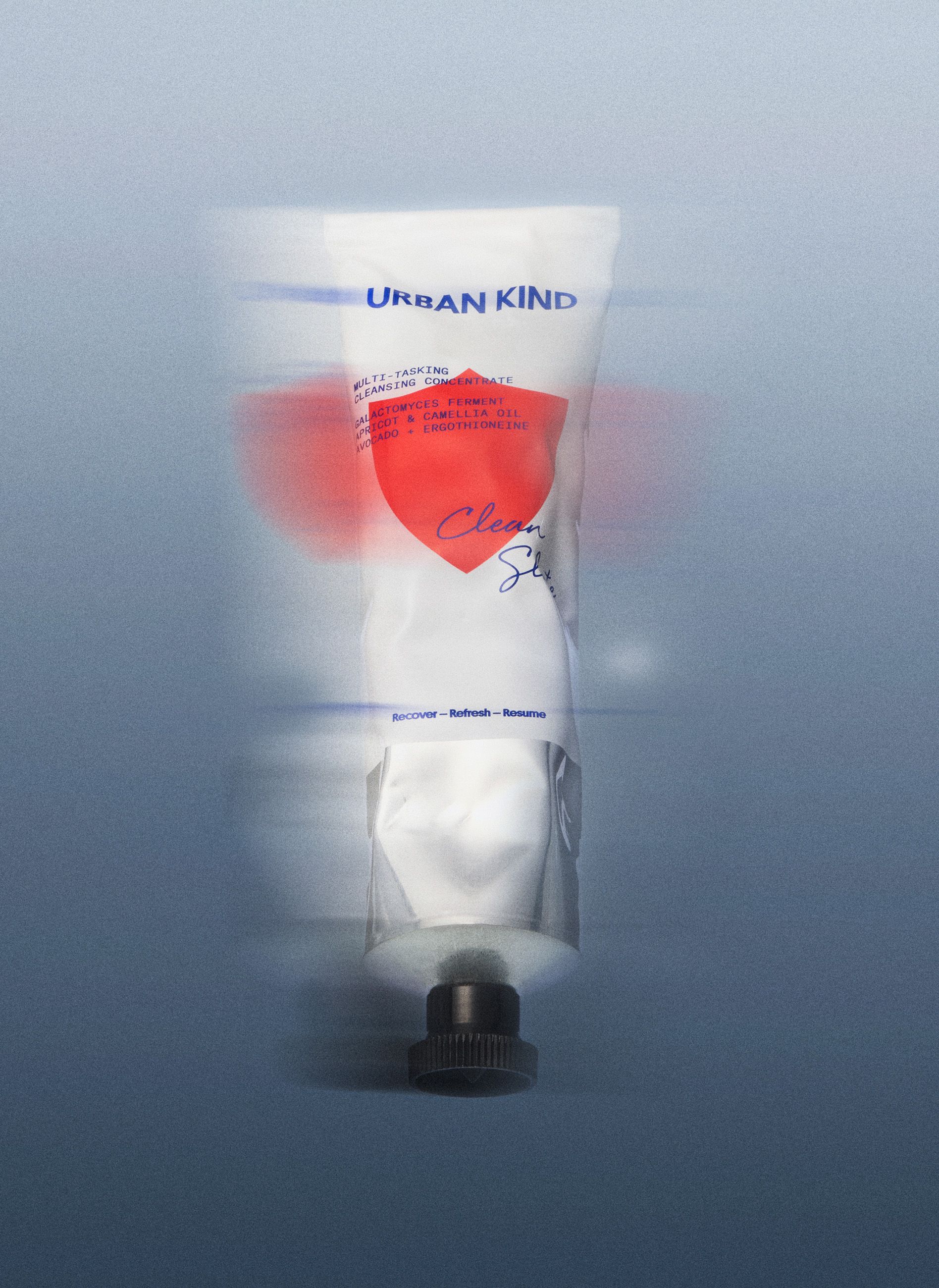
Skincare is a crowded shelf, and most of it whispers. EVERLAND went the other way for Urban Kind, the vegan brand founded by Peter Ternström: one loud, unmistakable shape repeated until you can spot it across the store. The shield is the whole idea, a universal icon the studio chose to visualise protection, and every product in the range wears a different one, cut in a different saturated color. Hot pink, acid green, signal red, tangerine. The color is the navigation. You learn the routine, preparing skin for a new day through settling in for the night, by following the shields across the shelf.
The shield system behind Urban Kind branding
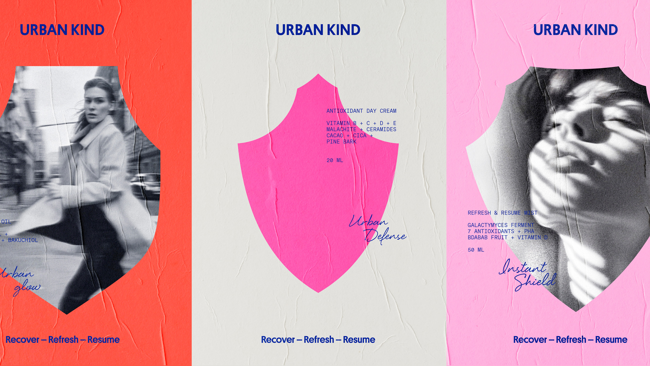
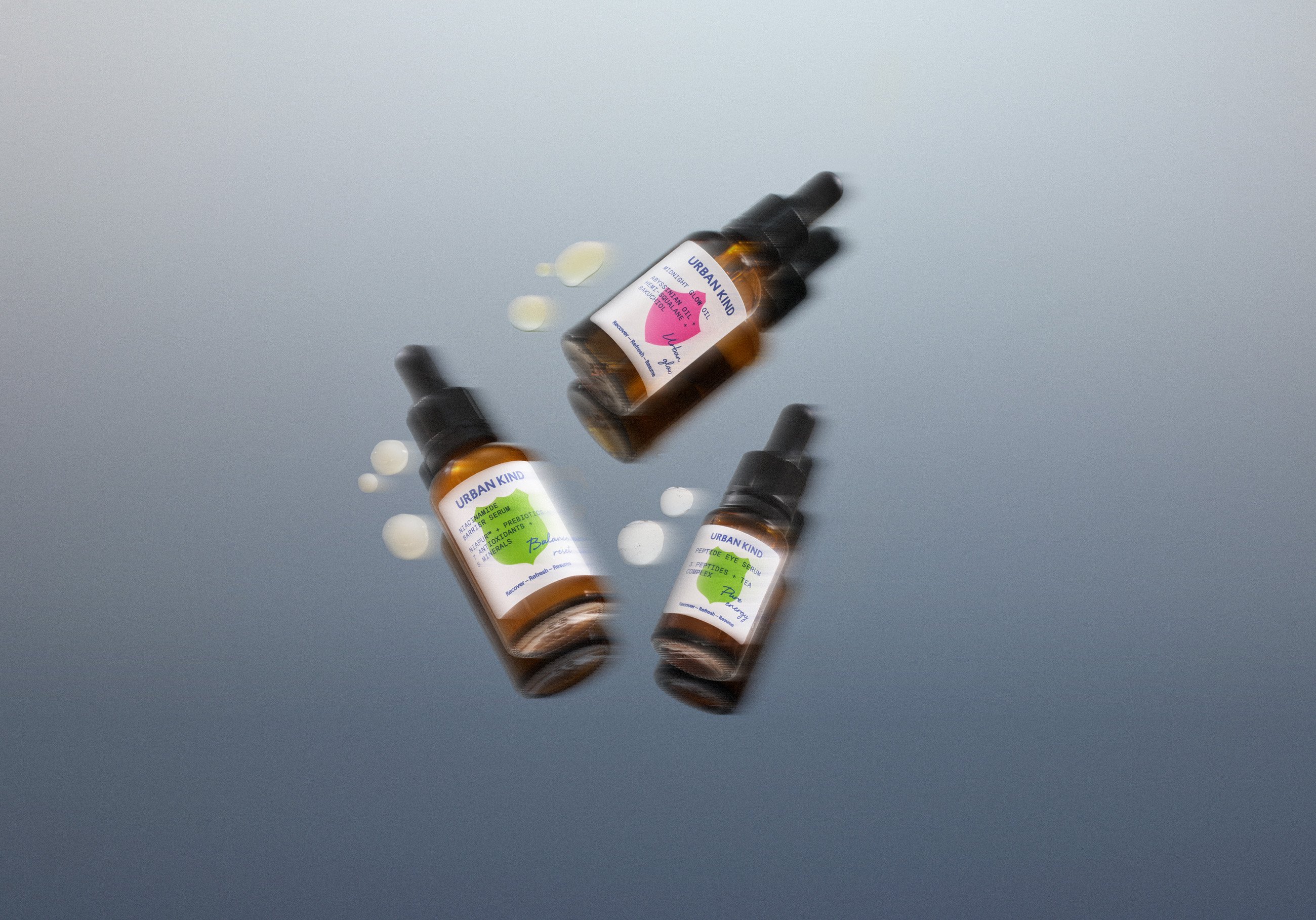
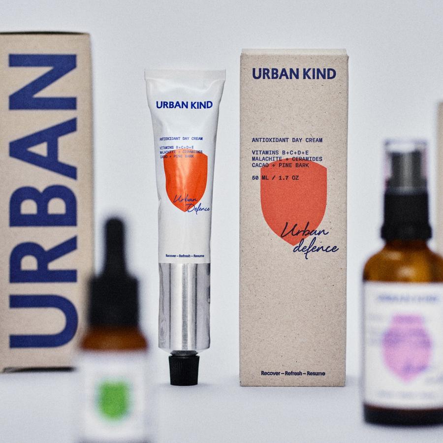
Three type voices share the work, each with a fixed job. The wordmark is a blunt blue grotesk, URBAN KIND set straight and loud, carrying headlines and the oversized vertical type that runs down the kraft cartons. Under it, a handwritten script gives every product an emotional name: Urban glow, Balance rest, Urban Defense, Instant Shield, Detox facial. Then the clinical register: mono caps listing ingredients like a formula sheet, NIACINAMIDE BARRIER SERUM, niapur plus prebiotics plus seven antioxidants. Blunt, intimate, clinical. The tension between the three is what makes the system feel designed rather than decorated.
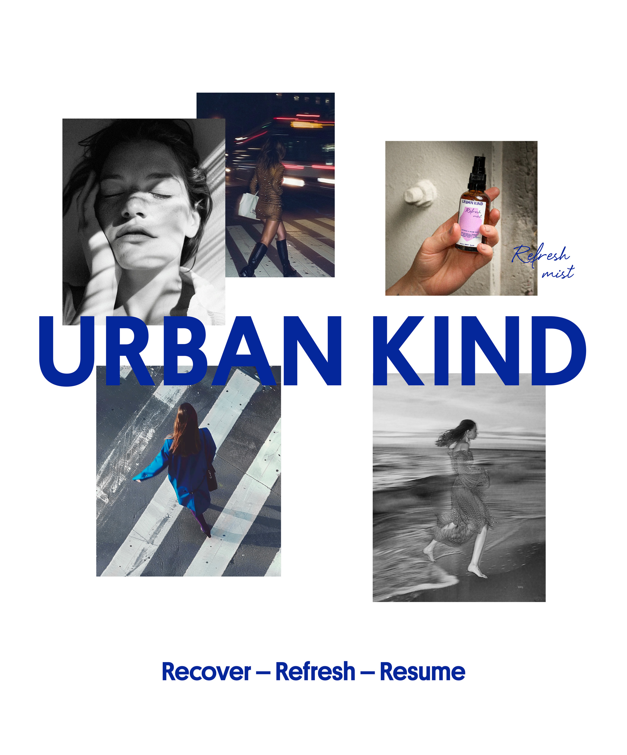
The materials are deliberately honest so the color can shout. Amber glass droppers, aluminium tubes, uncoated kraft cartons with exposed grain, the kind of raw substrates that read as transparency in the hand. The saturated shield palette does the shelf standout and stretches unchanged across social, web, and out-of-home. And through everything runs the ritual line, Recover - Refresh - Resume, stamped on packs, posters, and cartons until it reads as the brand's signature.
See more from EVERLAND on the studio's website.
The same case page carries Urban Kind's sister brand, Raw Perfection, from the same founder: vegan skincare drawn from Nordic nature, an LL Circular logotype, intentionally imperfect illustrations, and circular stamp-of-approval text patterns on glass and aluminium packs in FSC-certified recycled paper. Two brands, one founder, and the same belief that raw materials carry the message.