Brand Identity: CØDA MASON by Mate Arvai
Mate Arvai creates a fluid brand identity for DJ CØDA MASON, using kinetic typographic systems to break autopilot listening.
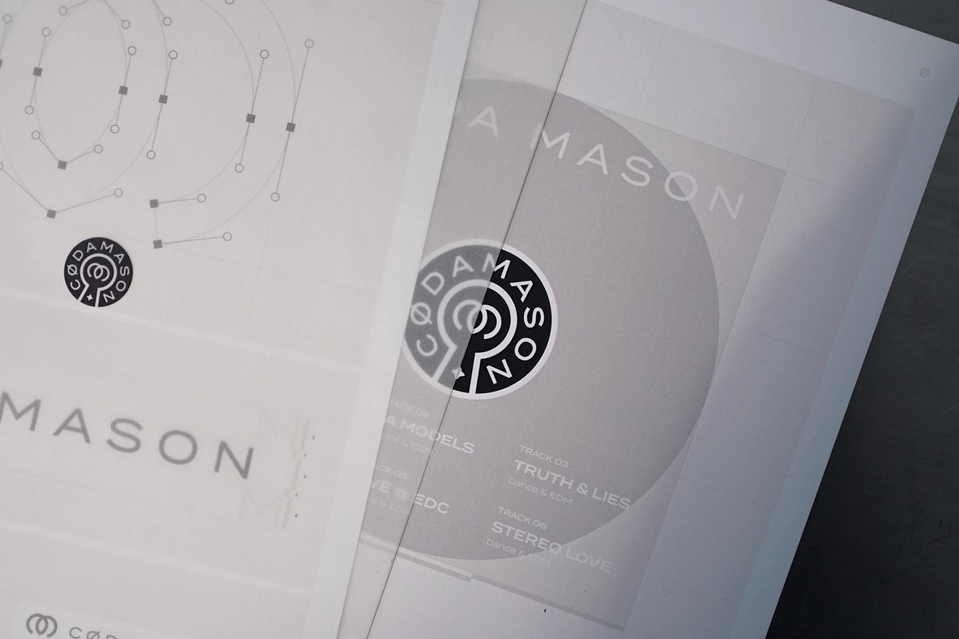
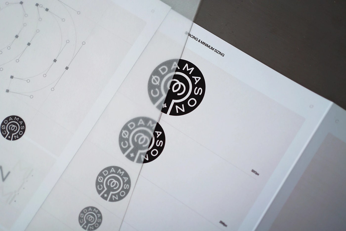
Budapest-based graphic designer Mate Arvai developed a systematic brand identity for Los Angeles DJ and electronic music producer Javier, known professionally as CØDA MASON. Designed to disrupt repetitive digital scroll culture, the visual language relies on monochromatic visual tension and variable typography. Rather than relying on traditional static logos, Arvai constructs a flexible mark that deforms, stretches, and reassembles across screen dimensions. High-contrast black and white surfaces dominate the visual field, anchored by harsh layout boundaries and raw industrial aesthetics. Every asset operates within an evolving visual world built to accompany live performances and audio releases.
Kinetic Motion in Modern Brand Identity
The underlying layout framework uses structural grid discipline to balance aggressive type distortions. Arvai employs heavy grotesk letterforms set against tight margin containers, giving individual typographic elements room to expand. Contrast comes through scale shifts where oversized logotype characters clip against edge boundaries, juxtaposed with technical metadata set in clean monospaced subheadings. This strict structural cohesion across the brand identity ensures that whether glyphs undergo extreme horizontal stretching or rapid frame changes, the visual hierarchy remains legible. Spatial pacing between typography and negative space prevents visual clutter despite high-frequency motion sequences.
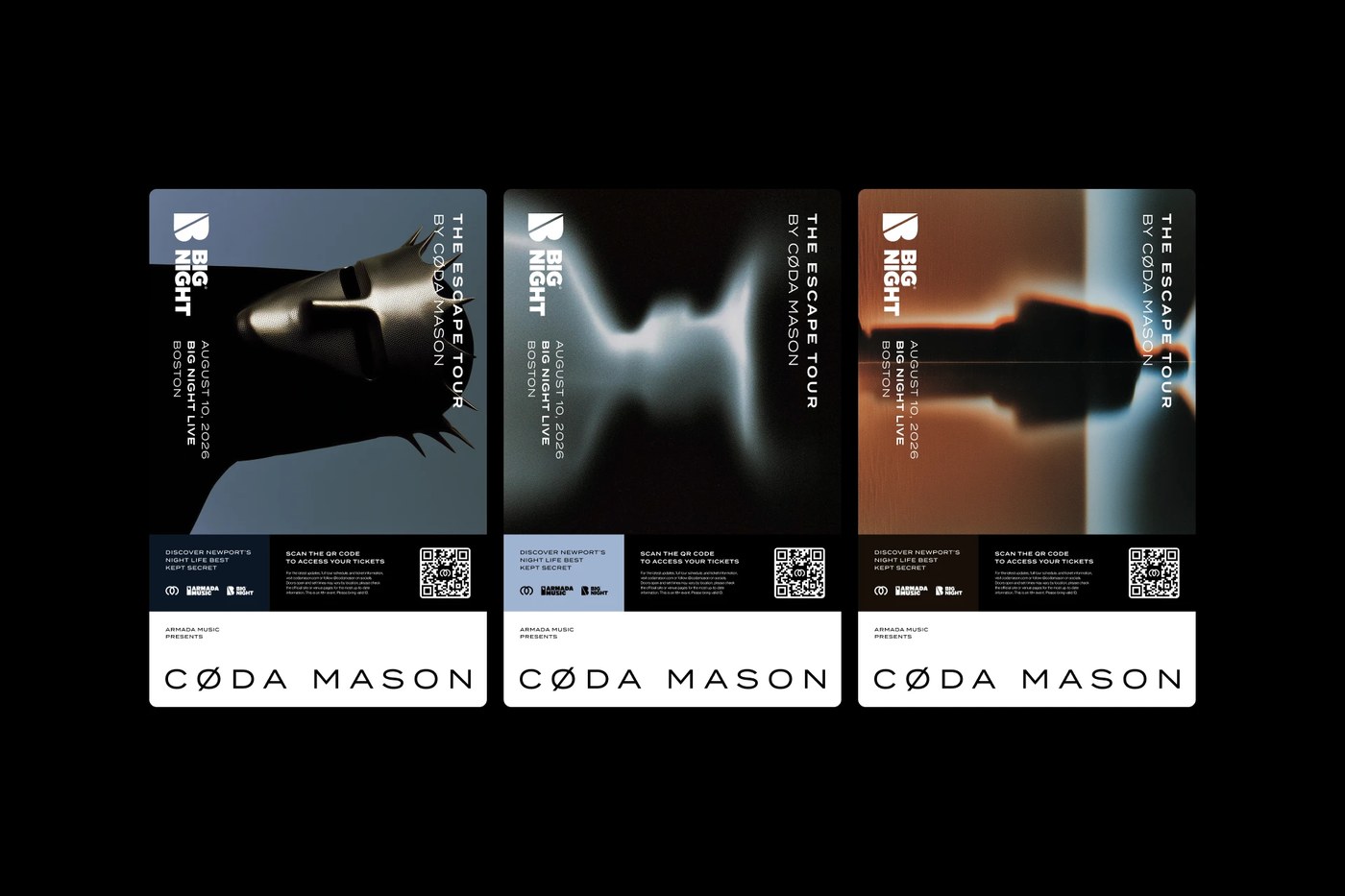
Beyond motion graphics and digital screen telemetry, the versatile brand identity framework translates cleanly into physical artifact applications. Arvai extends the identity across concert tickets, cassette packaging, apparel prints, and ambient stage projections. Silkscreened posters utilize dense black ink on uncoated stock, emphasizing paper texture alongside crisp vector edges. Micro-details like stamped batch numbers, venue coordinates, and raw grid lines bridge the gap between digital performance spaces and tactile objects. By maintaining strict material restraint, the system demonstrates how electronic music branding can sustain long-term visual intrigue without relying on decorative trends.
See the complete project by Mate Arvai on Behance.