Brand Identity: Lloyds by Wolff Olins
Wolff Olins' brand identity for Lloyds turns a 330-year-old bank into a living system, starting with the black horse, finally taught to move.
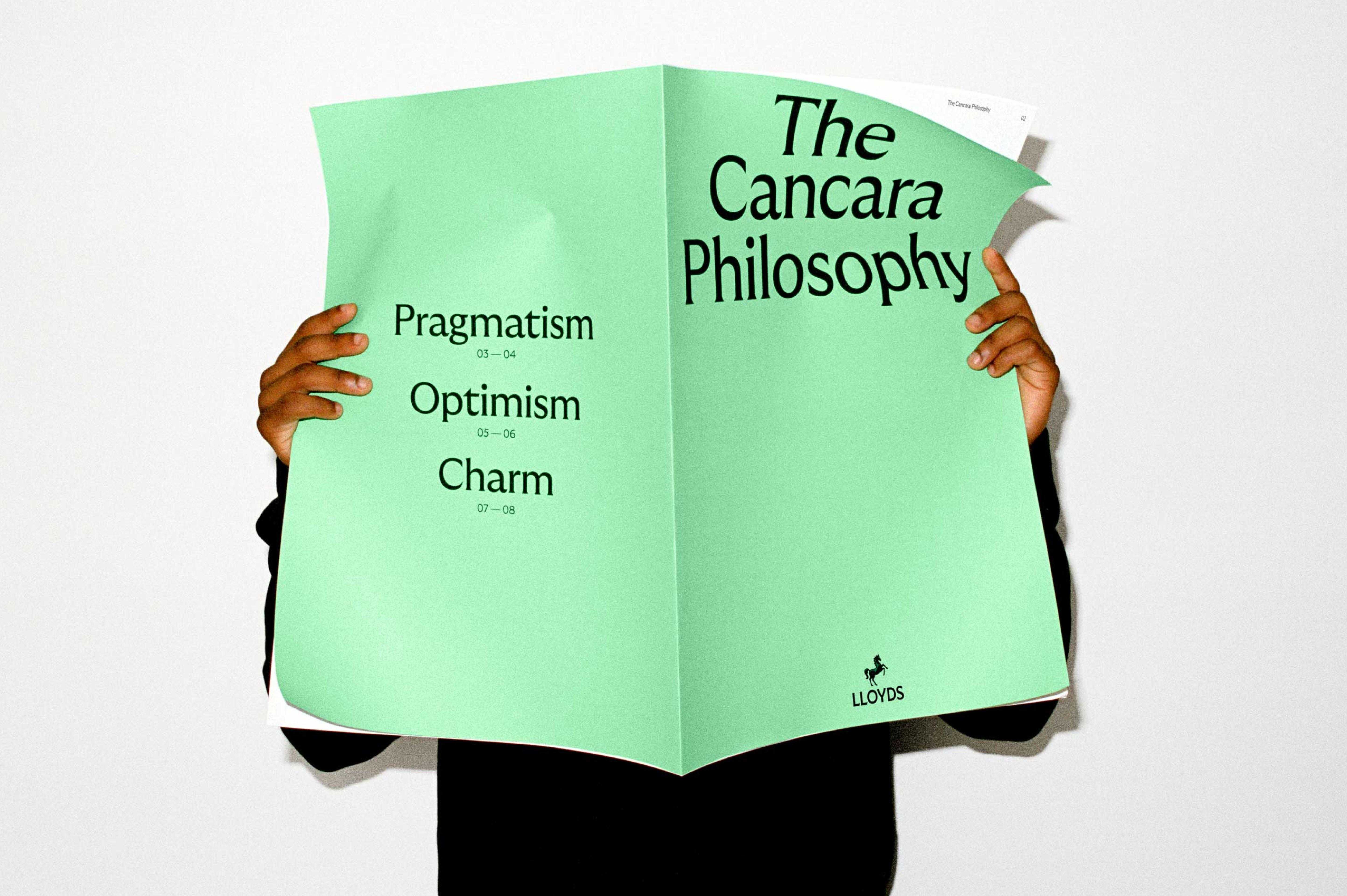
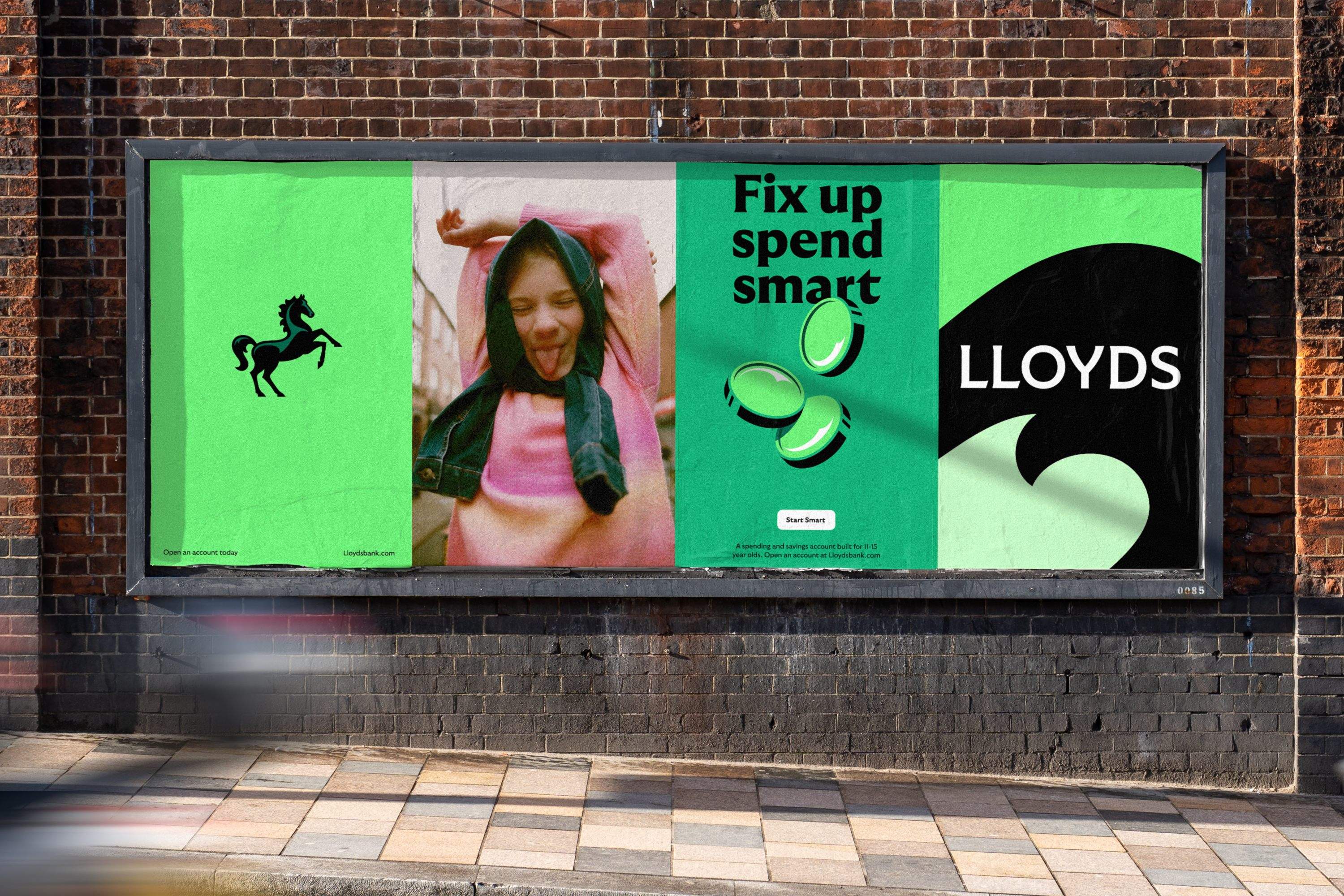
The heart of the project is the Cancara Philosophy, named for the original Lloyds black horse. Wolff Olins consulted an equine expert to get the stylized anatomy right, then translated classic horse movements into motion behaviors, so the horse stops being a static emblem and becomes an interactive element woven through the customer experience, from everyday interactions to transactions. It is a bank treating its heritage mark like a living creature instead of a stamp. The repositioning started from Lloyds' corporate purpose, Helping Britain Prosper, sharpened into a flexible line for business and consumer banking alike: Lloyds moves everyone forward. The brief, set after Suresh Balaji joined as Chief Marketing Officer in 2023, demanded a digital-first brand for a market reshaped by the 2008 crisis and the pandemic years.
Inside the Lloyds Brand Identity
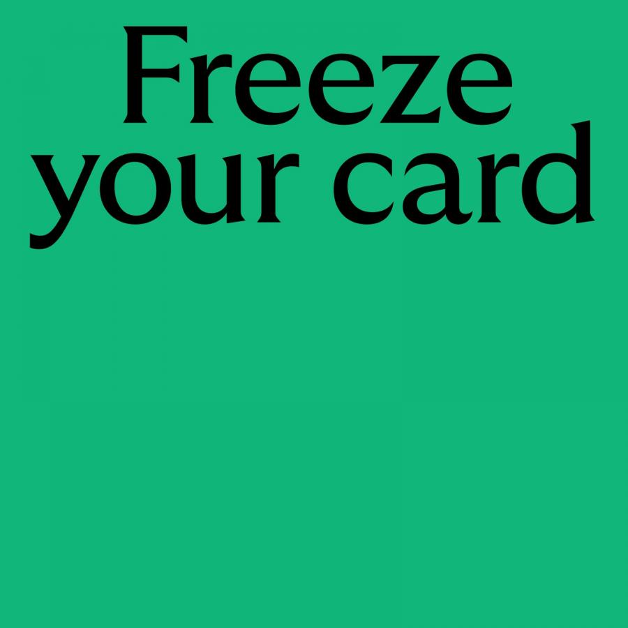
The type system carries the same confidence. A customized GT Ultra, inspired by early 20th century British typefaces, renders dynamically across weights and shaping, filling posters edge to edge with lines like "Freeze your card." The palette reclaims the classic Lloyds green with new ownership, nodding to the greenery of the British landscape, while an updated tone of voice and a photography style holding a mirror to contemporary culture keep the whole thing grounded and present.
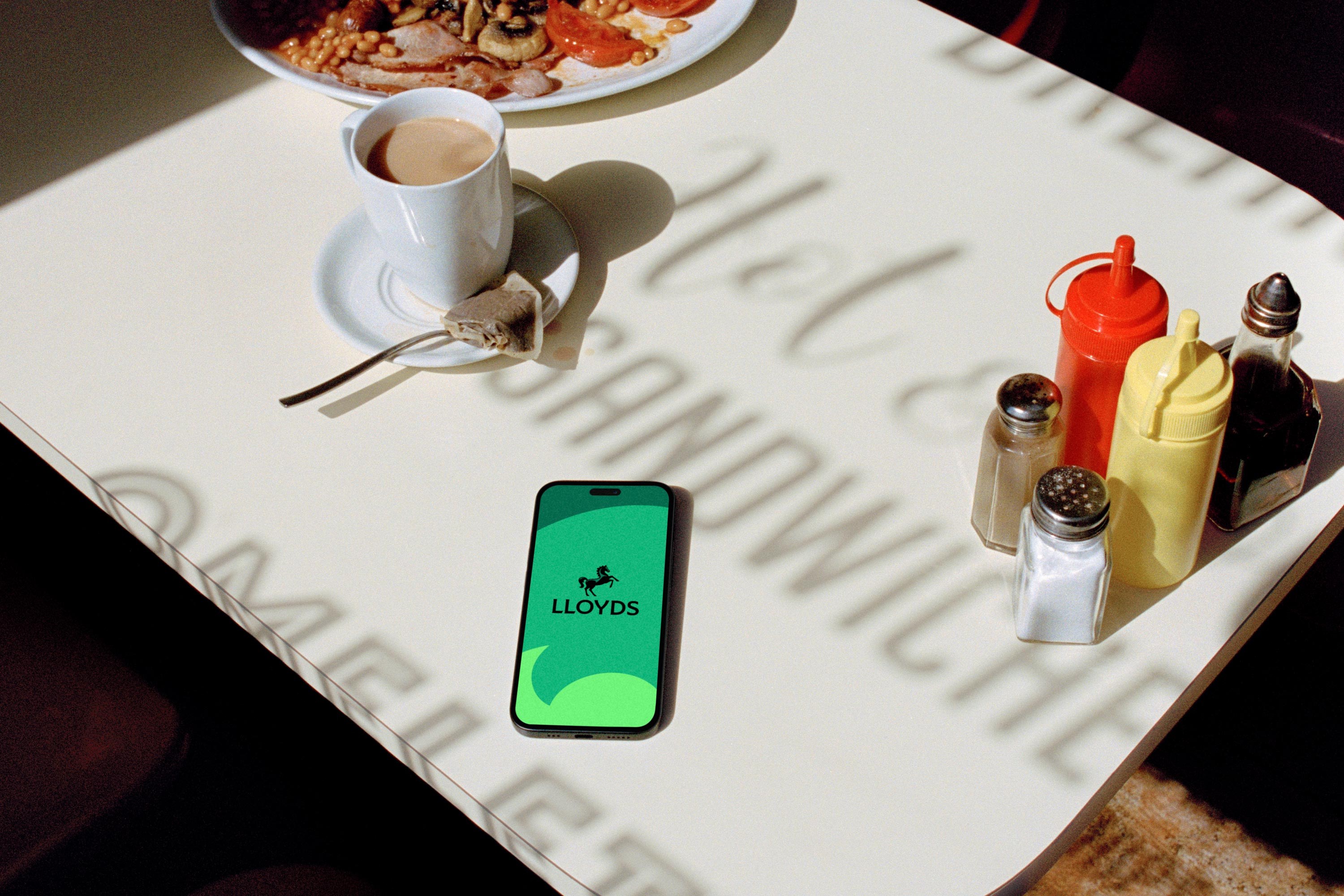
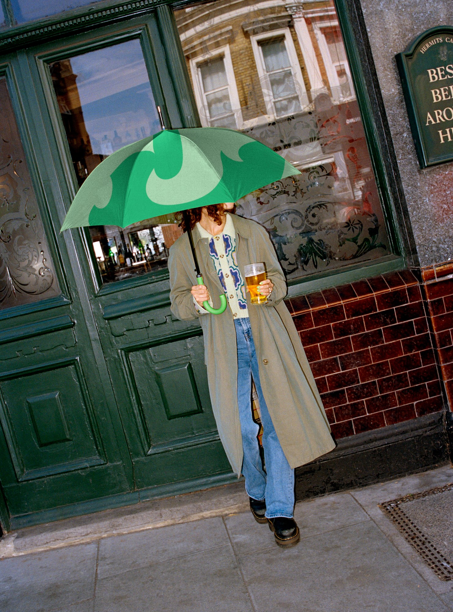
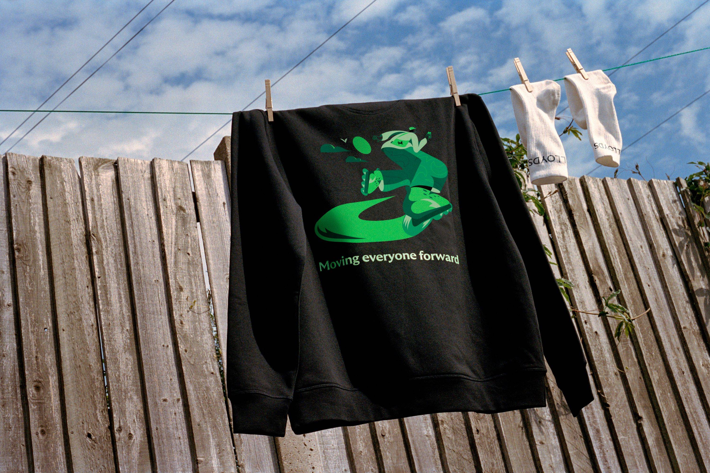
Wolff Olins built the work as a brand operating system rather than a fixed identity, designed to iterate the way tech products do. It stretches from the app and the branch to a magazine, an umbrella, a hoodie and street-level OOH, every piece tuned to the same pragmatic positioning: Lloyds moves everyone forward. Three centuries of heritage, rebuilt to behave like it was born yesterday.
See the full case study from Wolff Olins.