Sociotype Foundry Unveils Gestura Typography Design
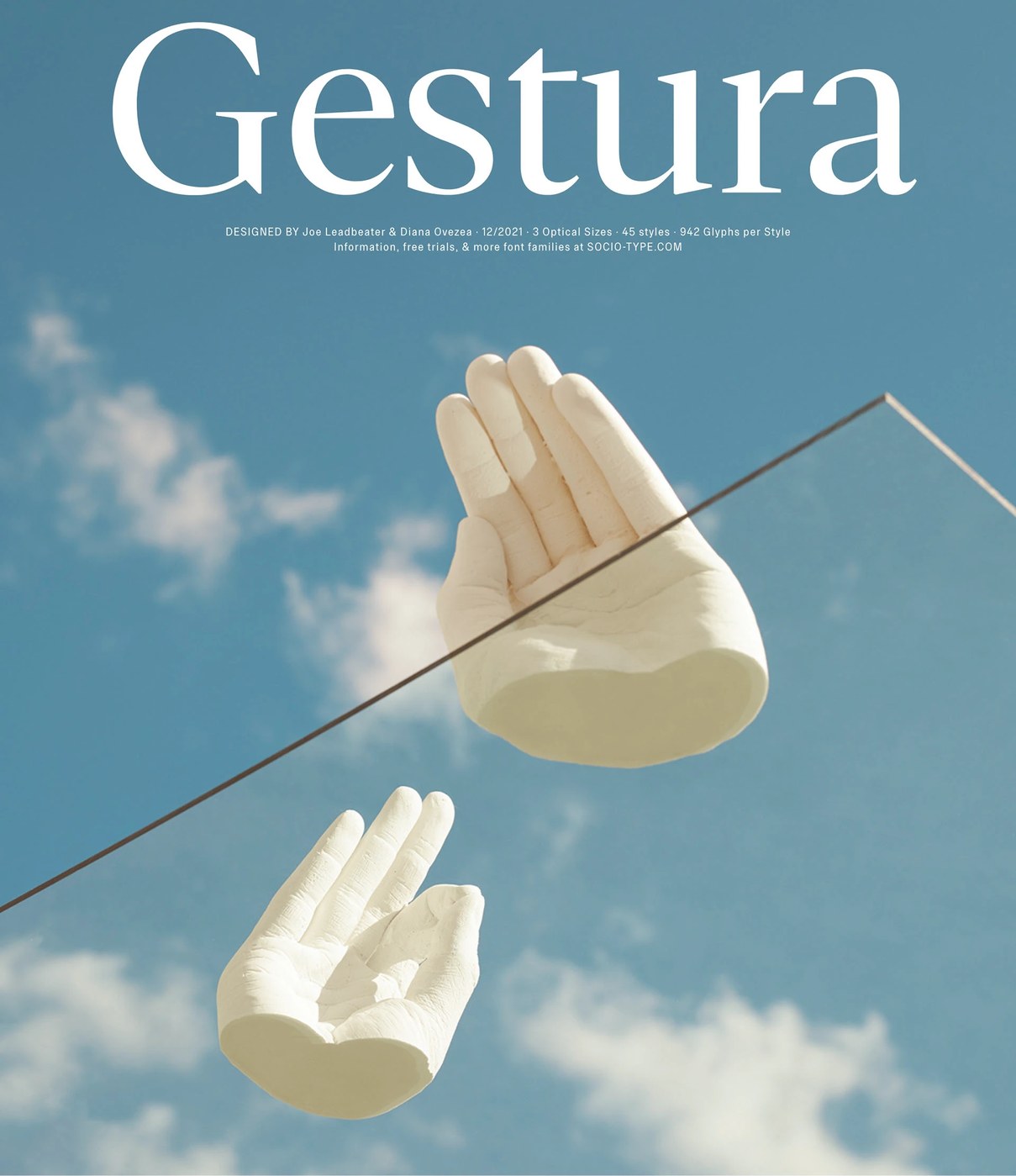
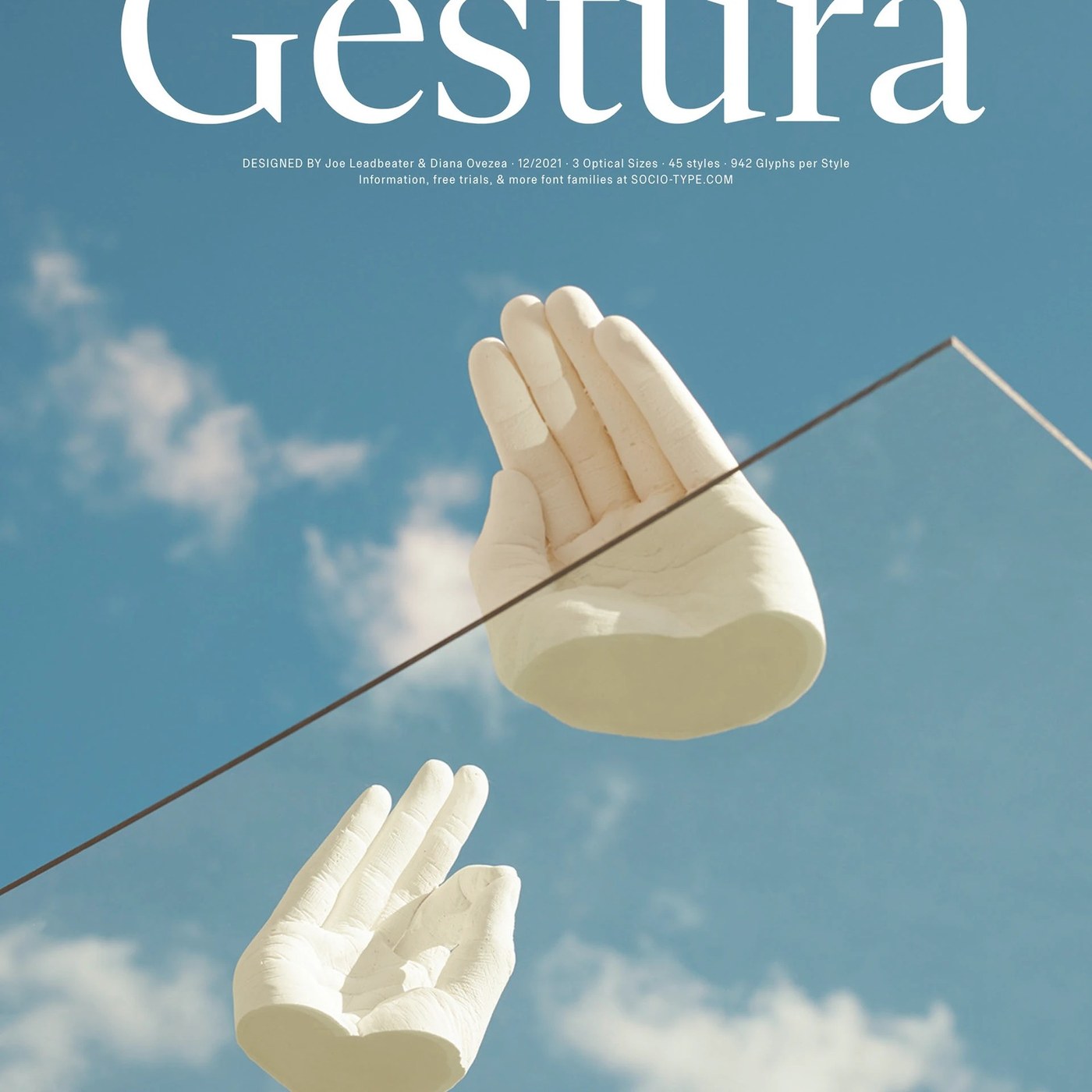
Sociotype Foundry unveils Gestura, a modern serif superfamily exploring typography design through old-style roots and calligraphic warmth.
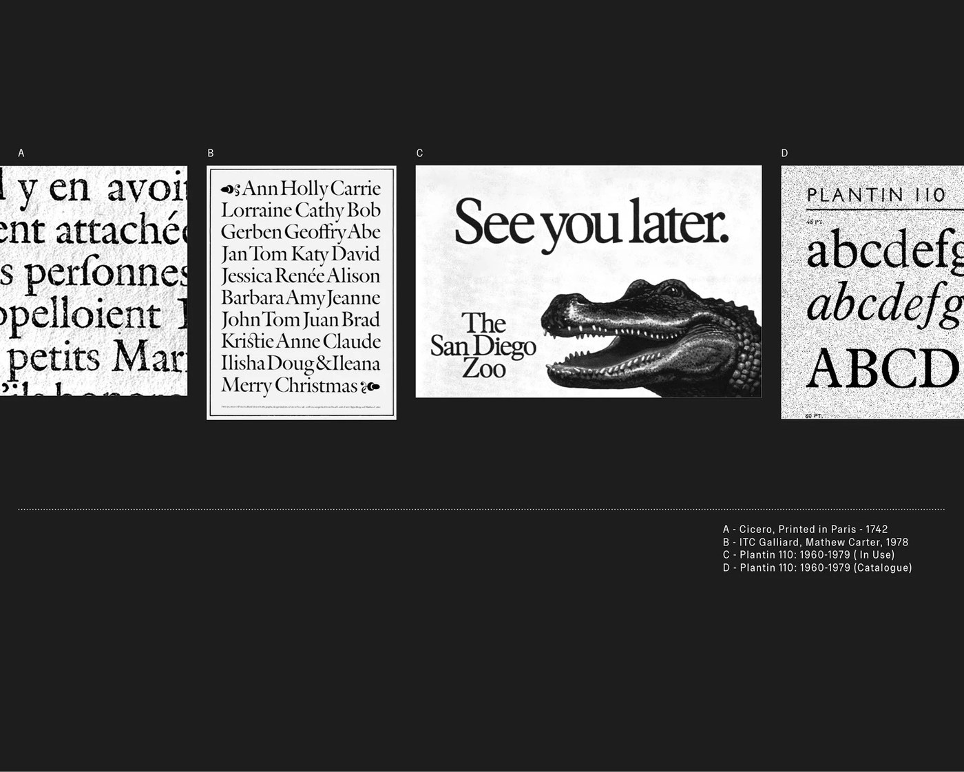
Sociotype Foundry approaches typography design with a deliberate tension between historical scholarship and fresh graphic expression. Designed by Joe Leadbeater and Diana Ovezea, Gestura anchors its letterforms in the sixteenth-century old-style tradition of Robert Granjon’s Gros Cicero. The design looks to later historic revivals, referencing Matthew Carter’s Galliard and the compact efficiency of Monotype’s Plantin. Rather than assembling a nostalgic facsimile, the foundry injects a distinctly modern friction. Generous counter proportions mirror Granjon’s punchcut models, while sharp reductive details draw directly from Plantin’s rational architecture. The resulting serif system feels grounded yet unpredictable, balancing formal editorial discipline with human character across every printed spread.
Balancing Old Style History with Modern Typography Design
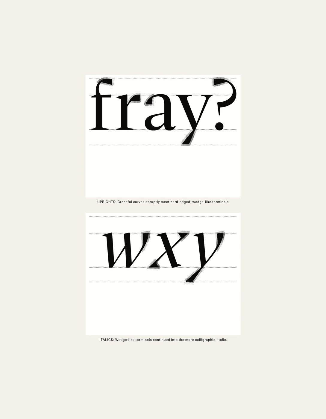
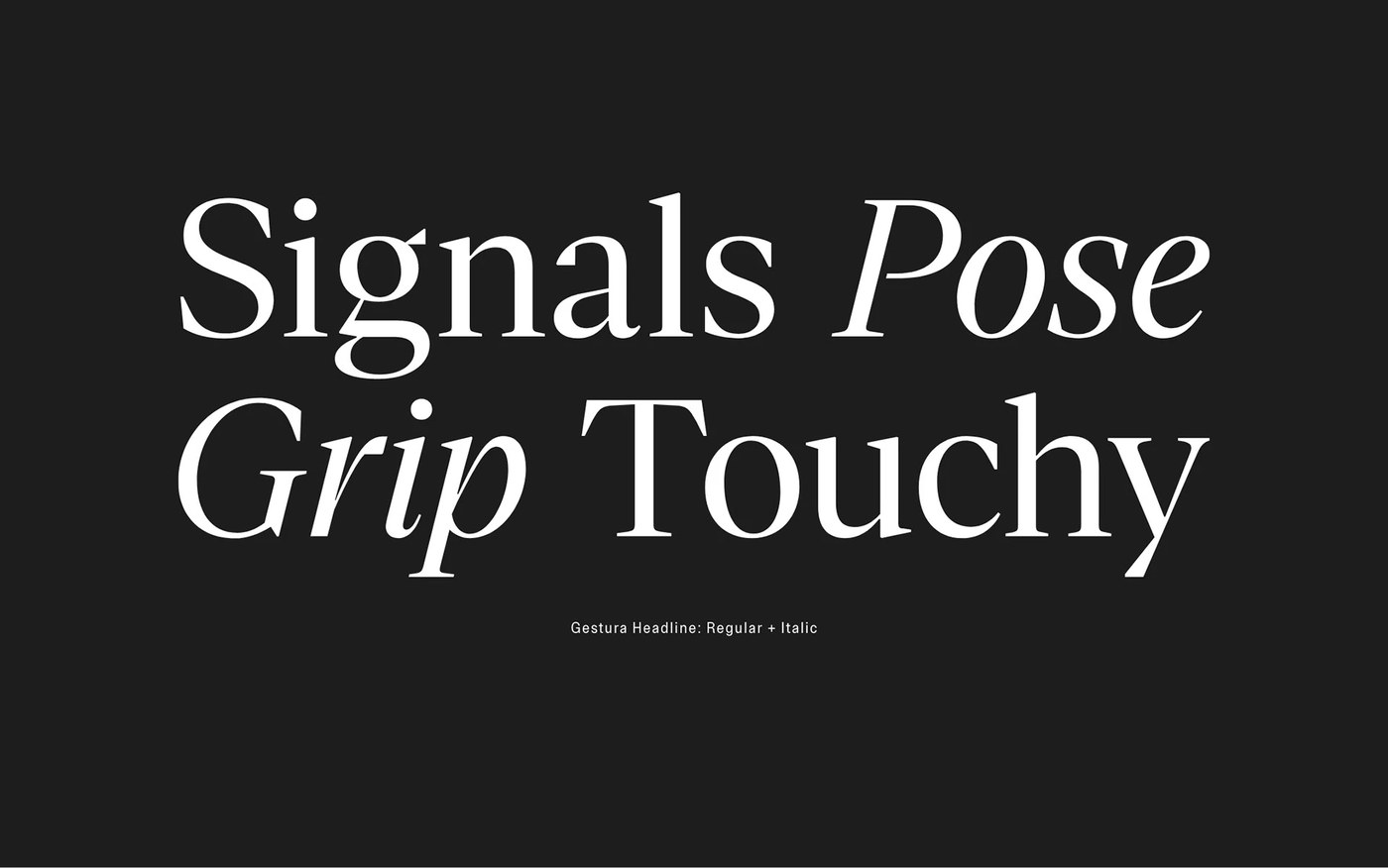
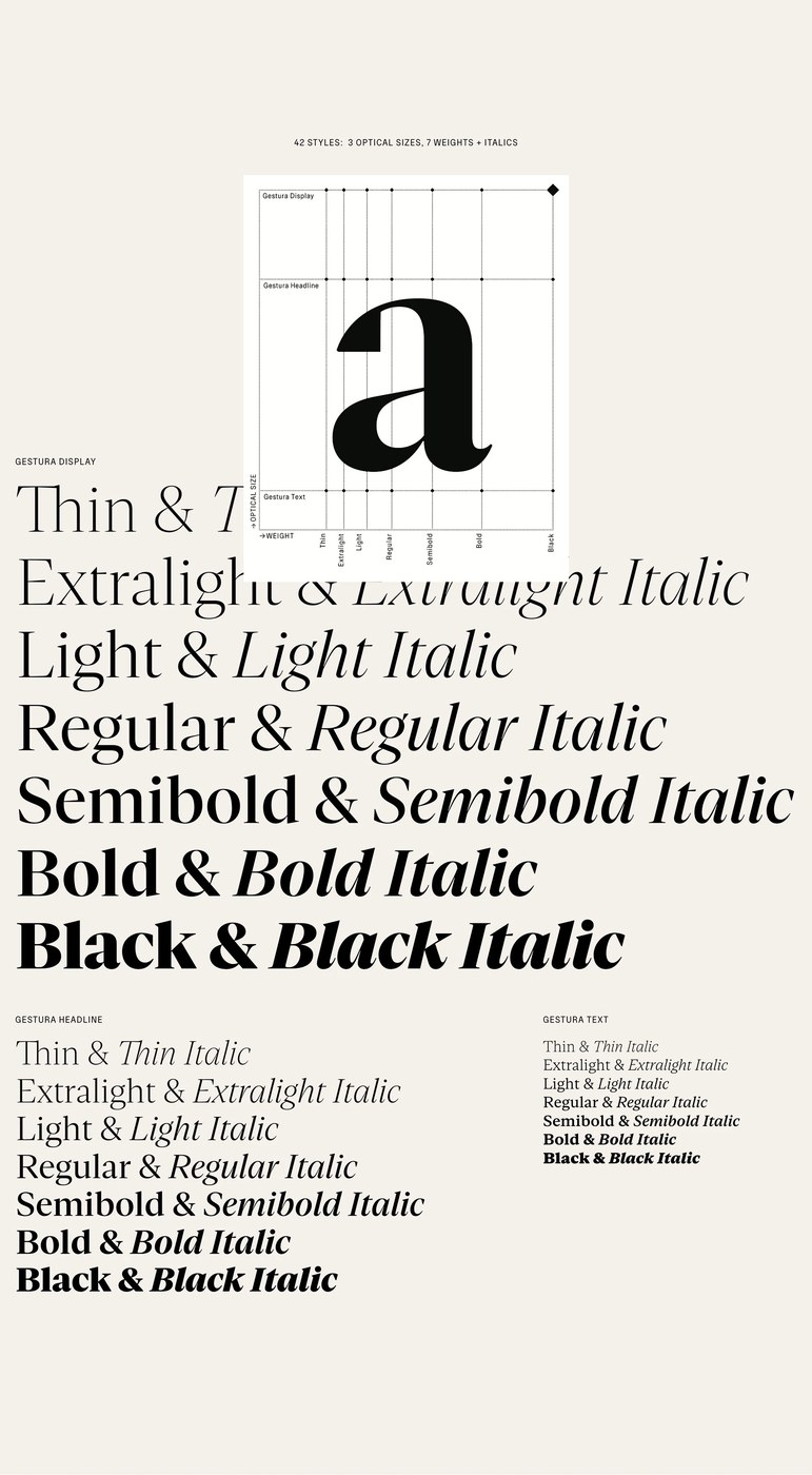
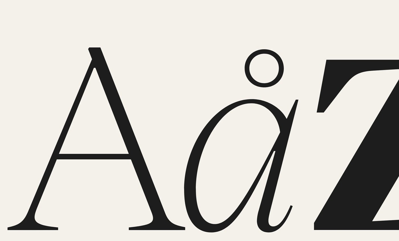
The technical architecture of Gestura spans three distinct optical sizes: Display, Headline, and Text. Across forty-two styles and seven weights from Thin to Black, each cut contains over nine hundred glyphs engineered for complex publishing systems. In the upright weights, graceful curves meet hard-edged, wedge-like terminals that slice cleanly through negative space. When shifted into italics, the structural geometry yields to the fluid dynamics of broad-nibbed pen calligraphy. Here, the wedge terminals grow sharper, giving text lines an active rhythmic velocity. The Display optical size emphasizes extreme stroke contrast and razor-sharp serifs, while the Text grade reinforces robust stems, calibrated x-heights, and open apertures for clear long-form reading.
Gestura took shape alongside Sociotype Journal, serving as a live platform to test the type under rigorous editorial conditions. In dense critical essays, bilingual captions, and pull quotes, the superfamily moves fluidly between scholarly quiet and visual impact. The foundry demonstrates how high-contrast display cuts command attention on book jackets and posters, while the text styles maintain steady legibility across thousands of words. By pairing classical proportions with sharp calligraphic incisions, Sociotype Foundry expands the possibilities of editorial typography design. The foundry proves that historical type forms remain malleable raw material when guided by sharp eyes and exacting craft.
See more from Sociotype Foundry on Behance.