How KIND Reimagined the Osland Rebrand
KIND's Osland rebrand grows from biology: circular forms inspired by trout roe, DNA and the fish itself, set in coral reds and marine blues.
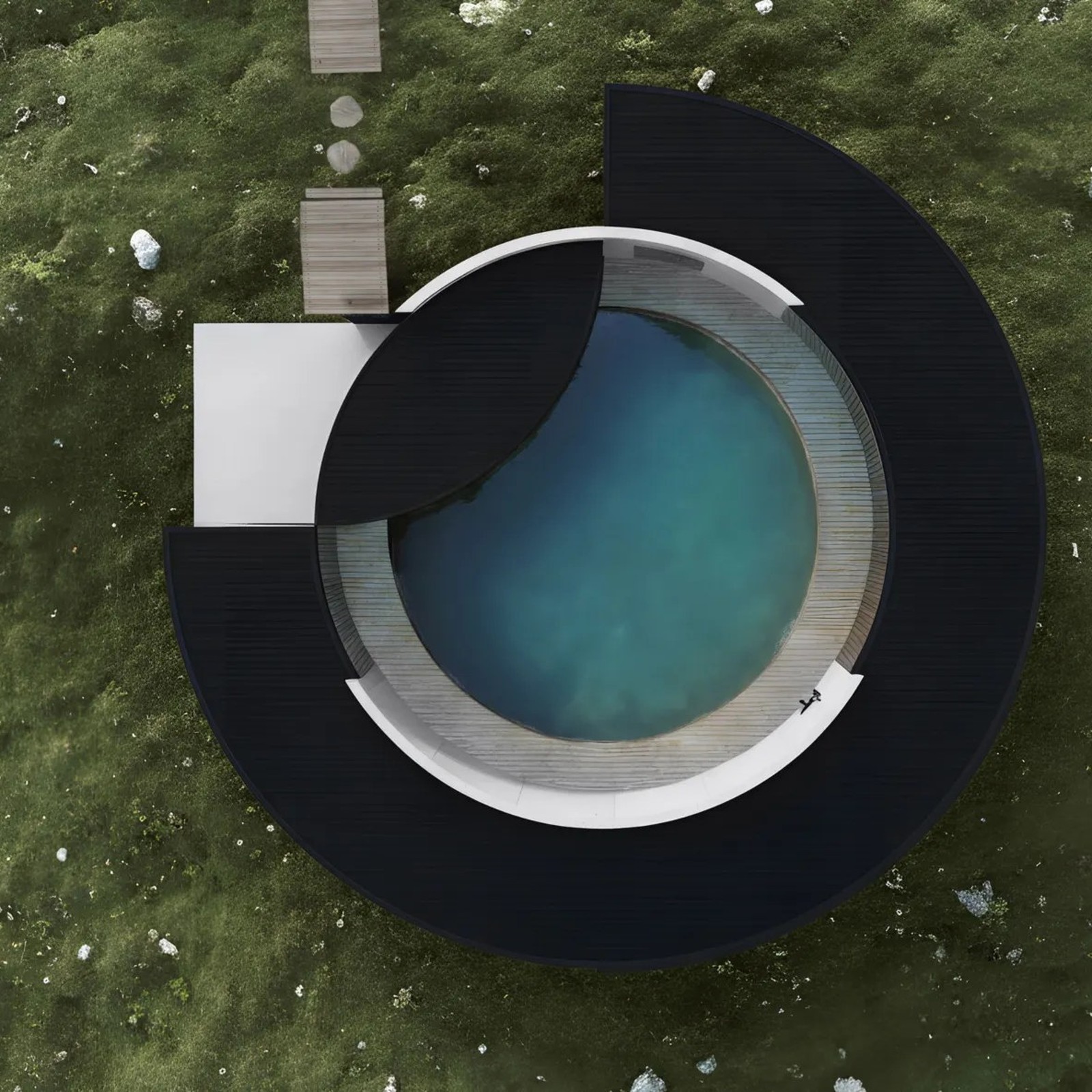
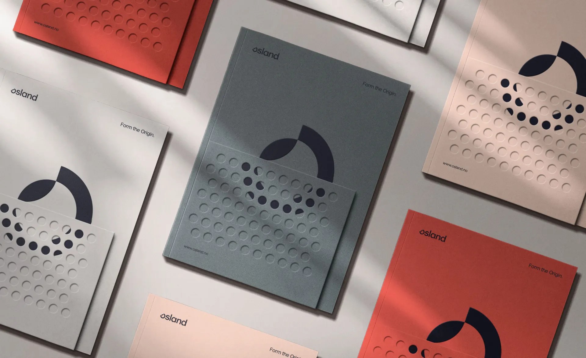
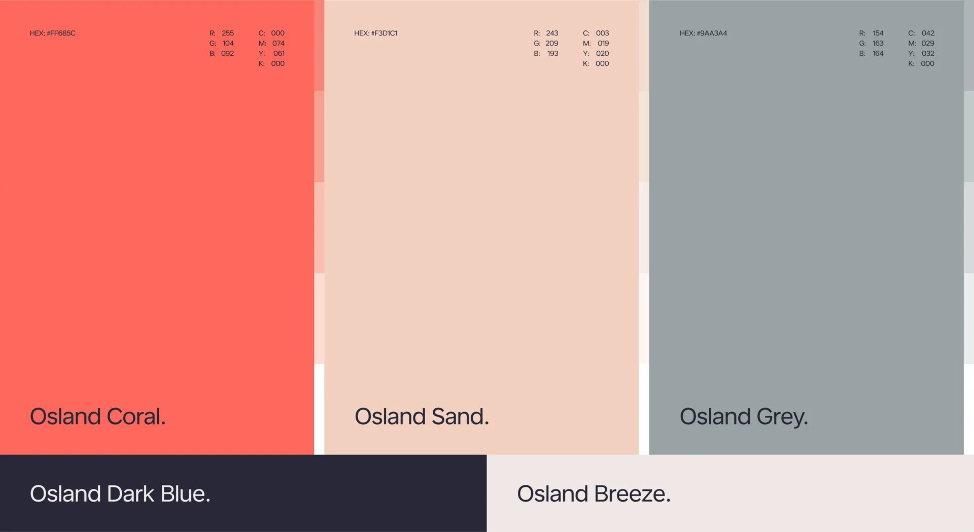
The mark is a circle that behaves like a living thing: an open arc crossed by a second curve, trailed by a scatter of dots like roe drifting from a single egg mass. KIND repeats the same circle at every scale, as the mark itself, as a dotted field marching across folder covers, and as the curve of the fjord-side facility seen from the air. Coral and warm reds carry the biology, deep marine blue carries the water, and a quiet sand-and-grey register keeps the system clinical instead of romantic. Osland has bred trout since 1963 and keeps Norway's oldest pedigree trout broodstock, so the identity had to speak science and scale at once. It took Gold in Rebranding Projects at the 2026 European Design Awards.
Osland Rebrand: From Becomes Form
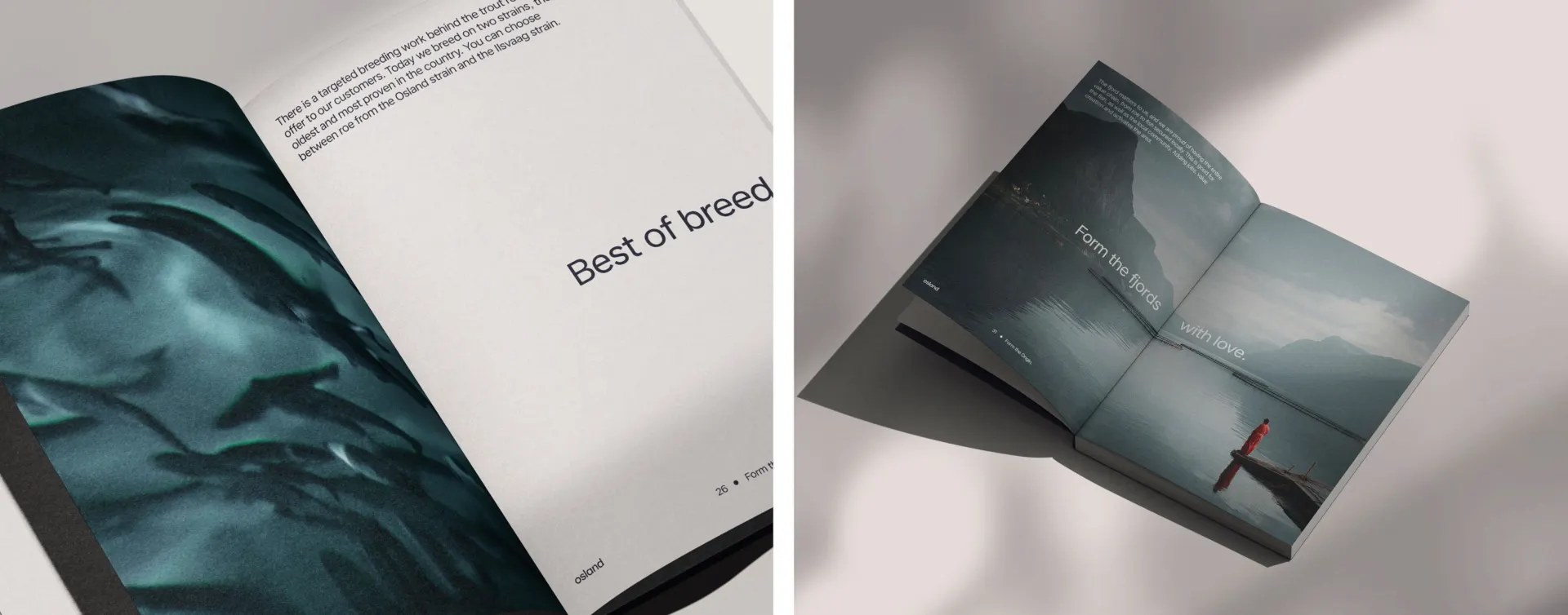
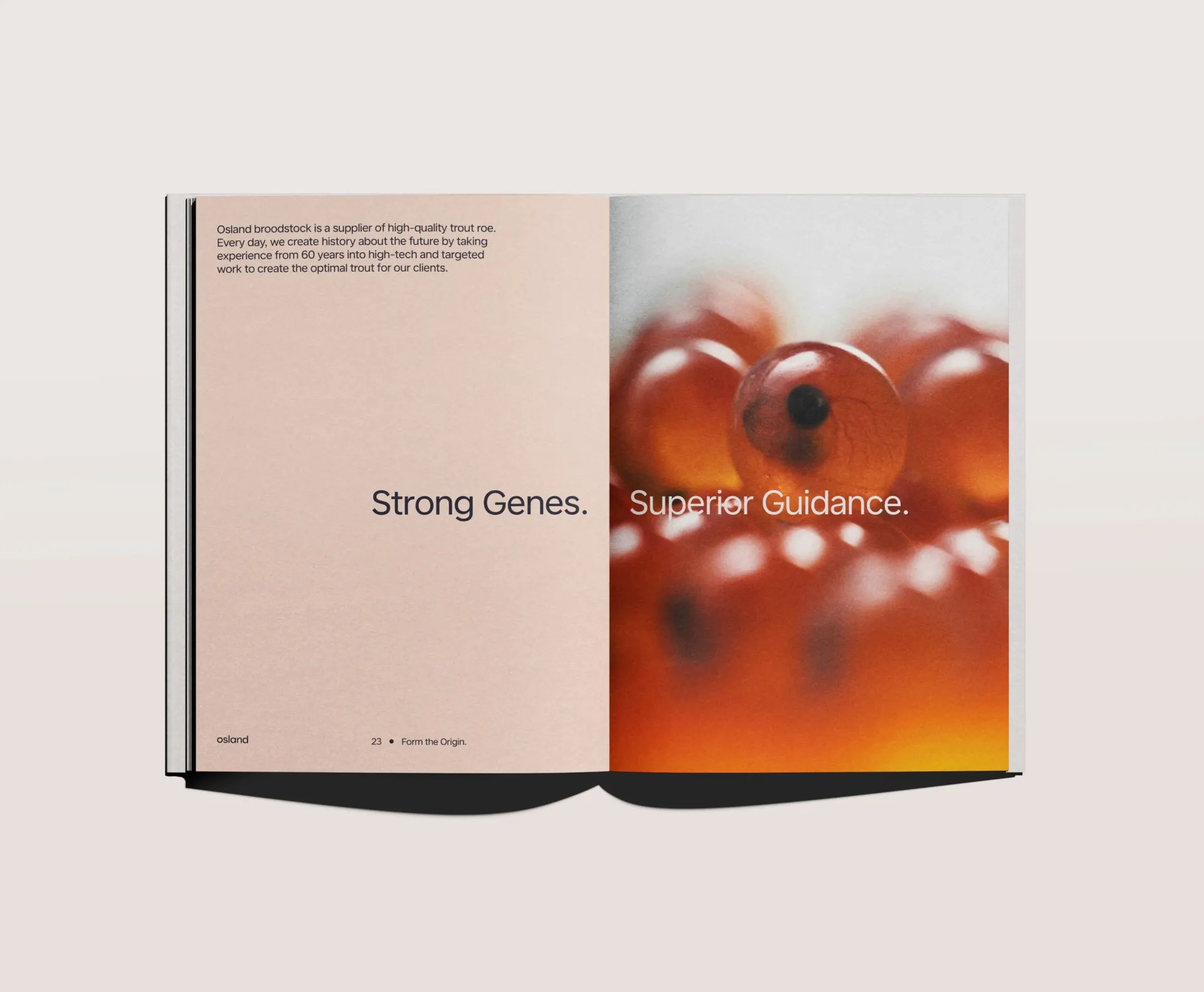
The wordmark is a lowercase grotesque with an engineered calm, set small and tight wherever it appears, osland, in the same weight as the body copy, never shouting. It shares the frame with the mark rather than competing with it. On the cards it is blind-embossed, so it reads as texture before it reads as type. The editorial voice follows the same discipline: short declarative lines like Strong Genes. and Superior Guidance., and the project's central idea stated as a wordplay, From becomes Form, turning deep inherited expertise into future value.
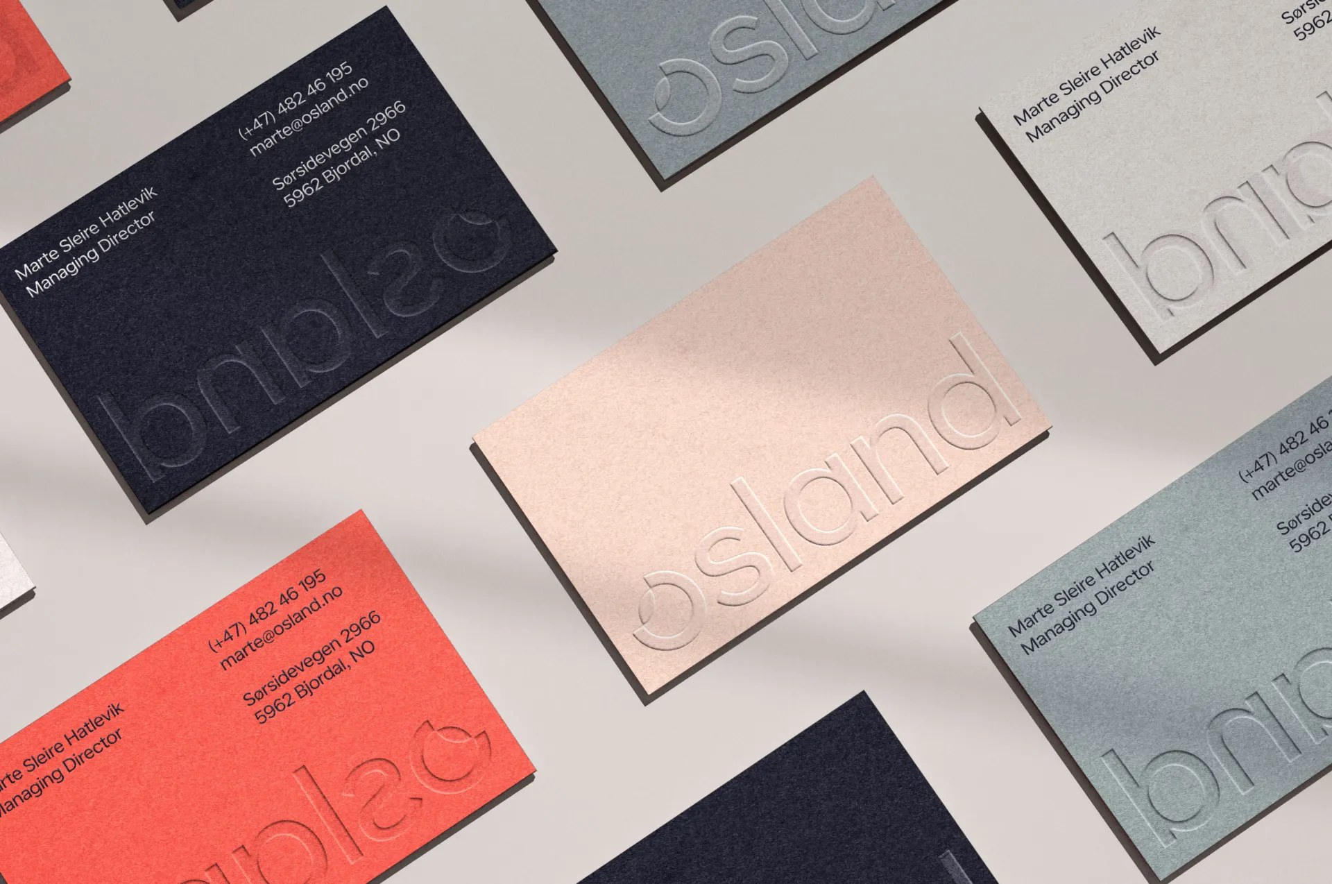
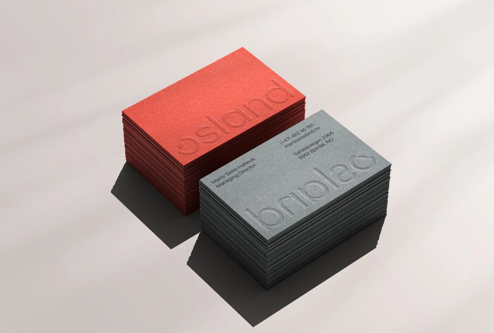
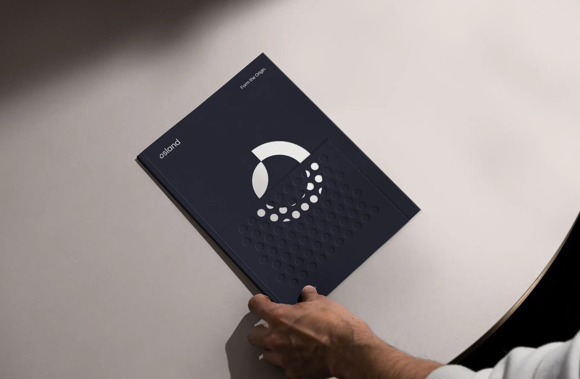
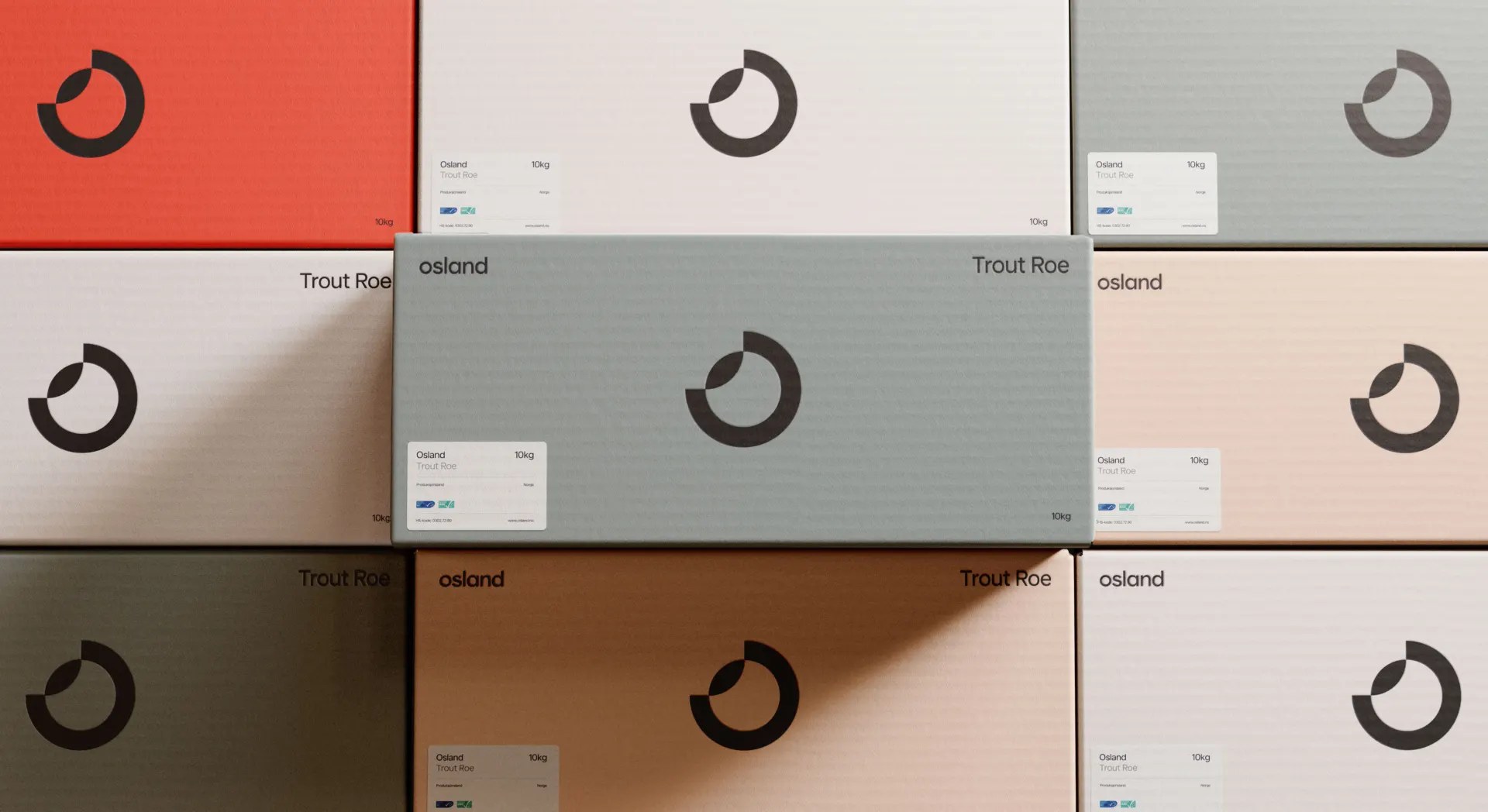
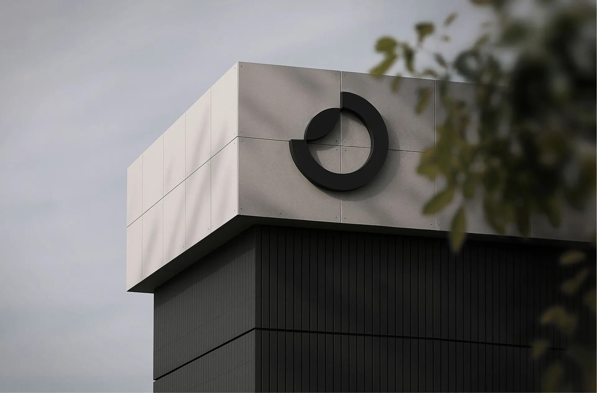
Production discipline is where the system earns its keep. Cards in Osland Coral, Sand, Grey, Dark Blue and Breeze carry the wordmark embossed without ink, so the stock does the talking. Folder covers run the roe-dot pattern as a field of fine debossed points. Trout roe boxes stack the mark in a hard grid across packaging, and signage scales the circle up to architectural size on concrete. The same language fills the website, where coral macro photography of roe opens the story of how life takes form, from egg to fjord, micro to macro. KIND worked from the inside out, sharpening the business strategy and the market role before drawing a single lockup, and the result reads as one organism across every touchpoint.
See more from KIND on Behance.