Inside Varley Art Gallery: Branding by Underline Studio
Explore the Varley Art Gallery of Markham branding by Underline Studio, built around a deconstructed VA monogram and bold print system.
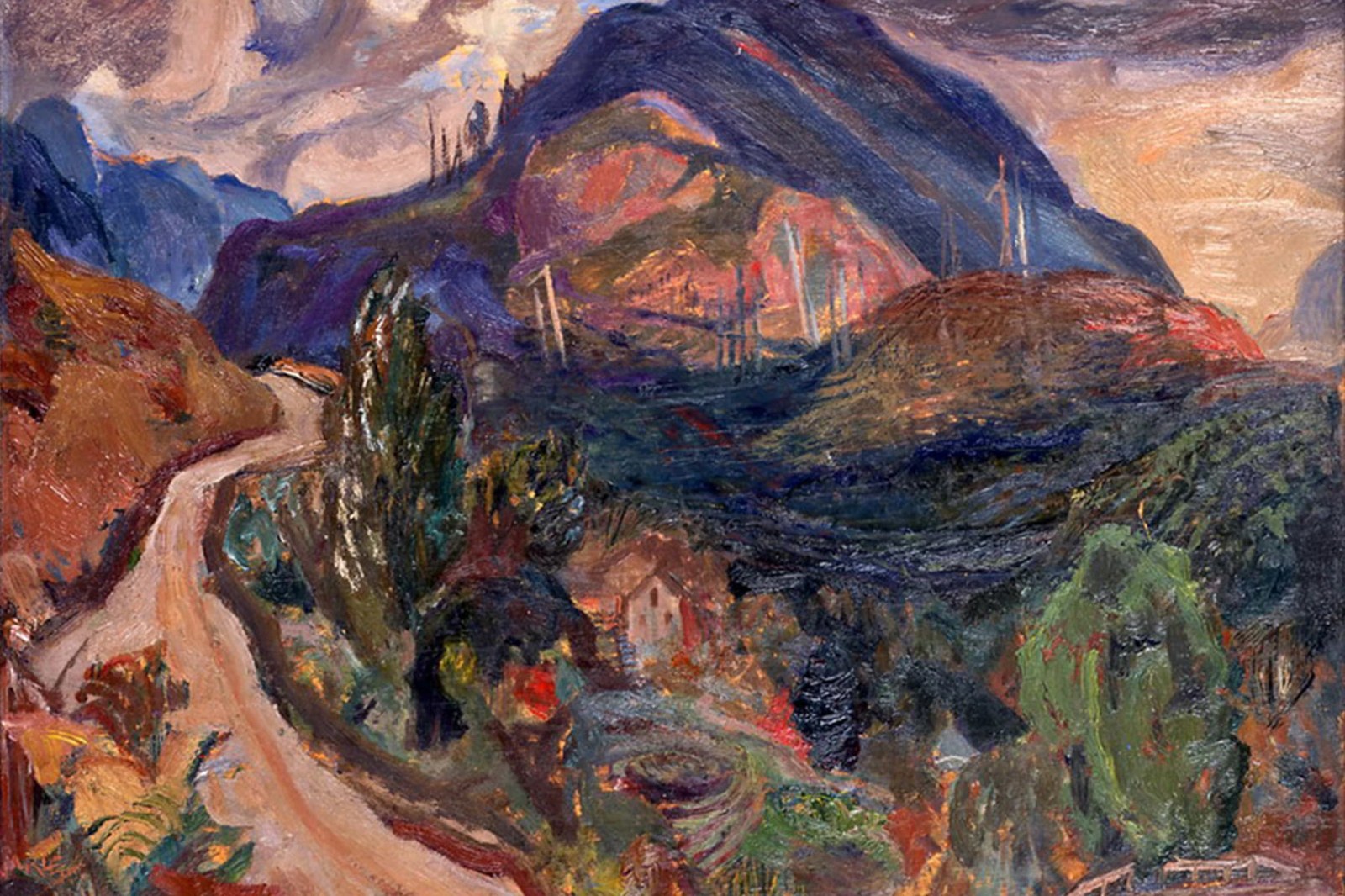
Regional art museums often trap themselves in quiet, neutral grey templates. Named after Group of Seven painter F.H. Varley at 216 Main Street Unionville, the Varley Art Gallery of Markham houses a major collection of Canadian paintings while running packed studio classes and seasonal community workshops. Toronto-based Underline Studio took a far more direct route for the institution's branding. They looked straight at the deep indigos, cadmium reds, ochres, and forest greens sitting on the gallery's canvases, then paired that painter's palette with a geometric three-stroke monogram built from the initials V and A. It's a deceptively simple move. Two angled bars meet at a crisp bottom vertex to form the V, while a third parallel diagonal stroke sits right beside the right stem to suggest an open, crossbar-free A alongside the three-line geometric sans-serif lockup.
Deconstructed Initials in Museum Branding
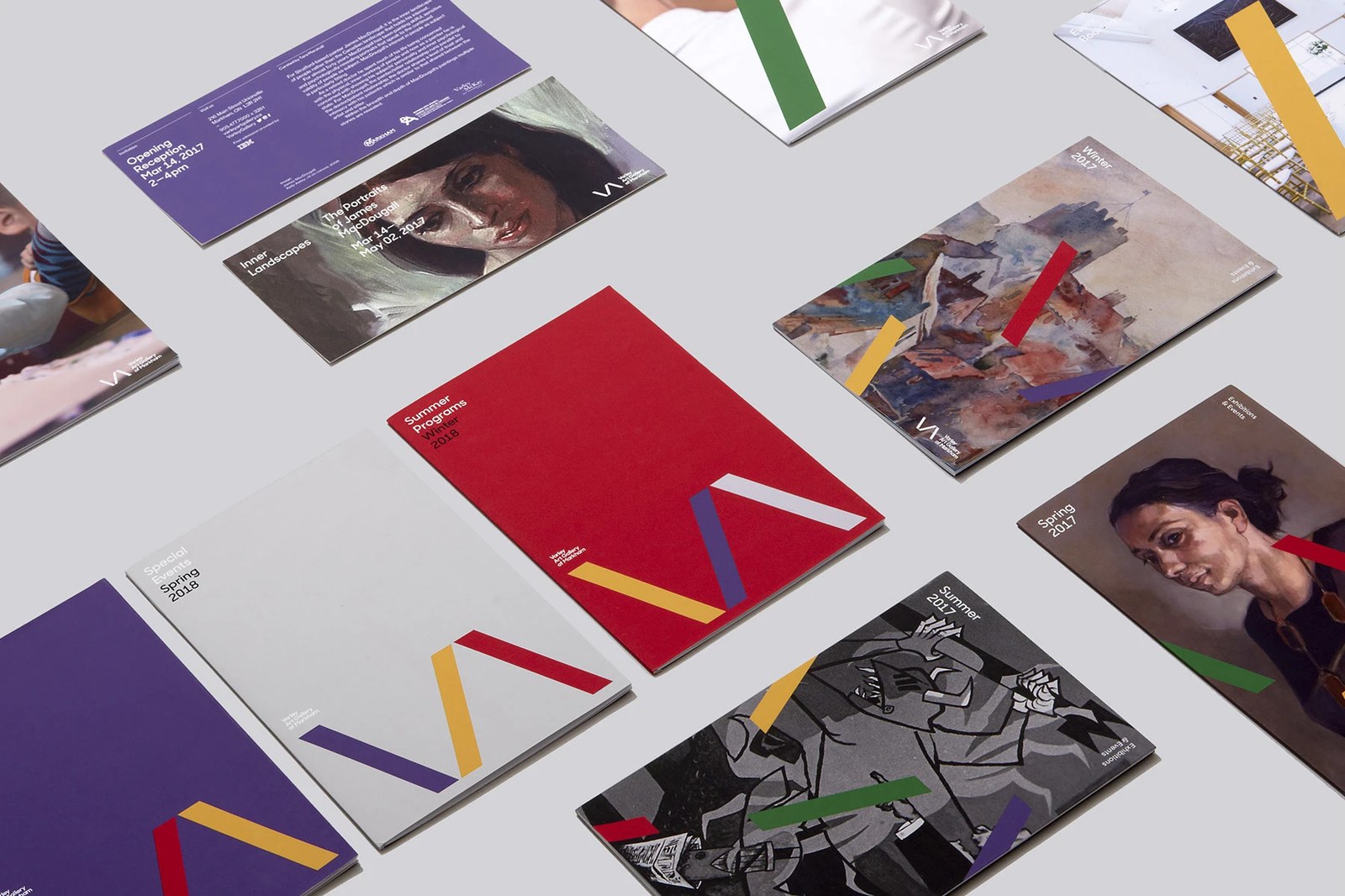
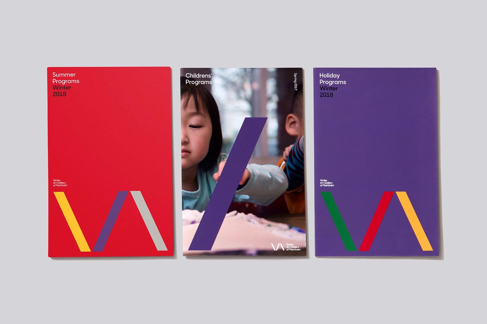
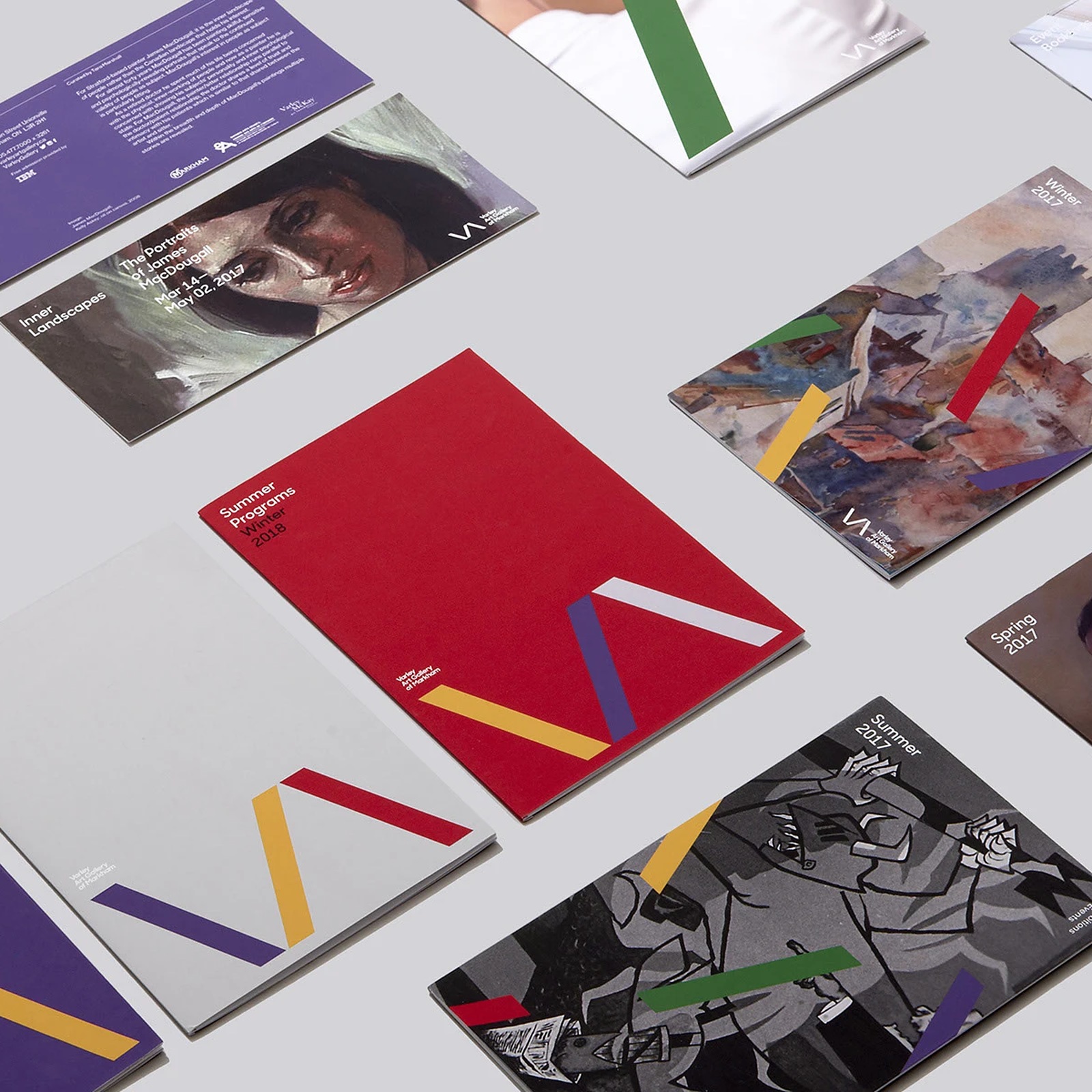
That three-bar mark doesn't just sit politely in a corner. Because the logo is constructed from three independent diagonal vectors in Illustrator, Underline Studio breaks those strokes apart and scatters them across exhibition print collateral as active graphic framing devices. Look at the isometric flat lay of booklets for the Winter 2017, Spring 2017, and Summer 2017 Exhibitions & Events guides, or the brochure for Inner Landscapes: The Portraits of James MacDougall curated by Tom Smart. Individual yellow, crimson, green, and violet bars slice right across historical oil portraits and contemporary illustrations. On the Childrens' Programs Spring 2017 cover, a single wide purple diagonal slash cuts from the bottom margin across a close-up photograph of a young student painting. Nothing feels static on the table.
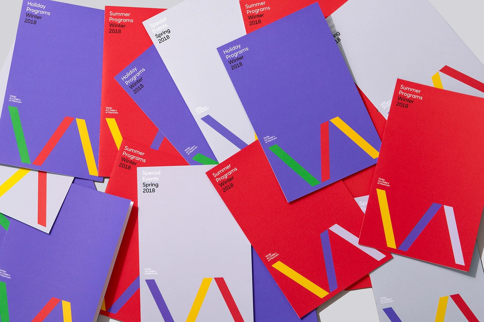
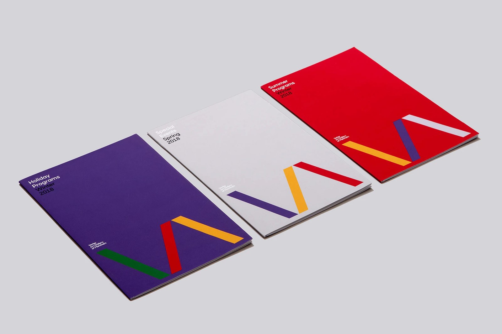
For recurring seasonal guides, the system tightens up in InDesign. Across the uncoated covers for Summer Programs Winter 2018, Special Events Spring 2018, and Holiday Programs Winter 2018, the full VA monogram locks to the bottom edge at oversized scale — shifting from ochre, purple, and cool grey on a red cover to green, crimson, and yellow on deep violet. Small left-aligned title type in the upper corner keeps the layout clean and legible. Good institutional branding should invite the neighborhood inside, and this print system does the job with real confidence.
See the full project by Underline Studio on Behance.