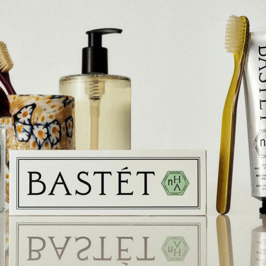
Bastét: Inside Wedge's New Oral Care Branding
Wedge puts toothpaste on the beauty counter with this oral care branding for Bastét: a carved-serif wordmark, one green badge, zero clichés.
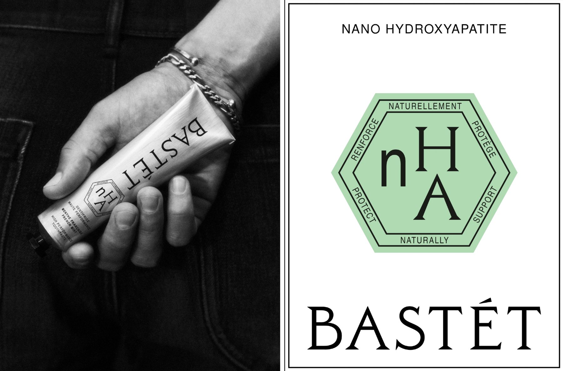
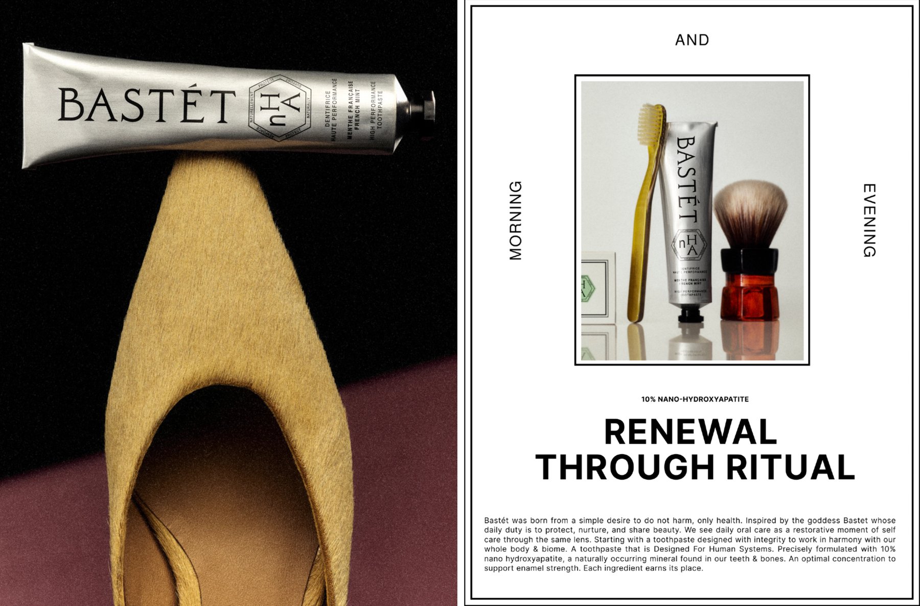
The first thing you notice is what is missing. No red, white and blue. No open smile. Instead: an unlined aluminium tube, cool and industrial, printed in off-black; a palette of silver, black and off-white; and exactly one accent, a small green hexagonal badge stamped with nHA. Wedge, the Montréal and Los Angeles studio, built the whole brand world for Bastét, from naming and strategy to visual identity, packaging and guidelines. The brief from the founders was simple: make a premium, high-performance oral care company that earns its place on the beauty counter. The answer treats brushing as a ritual of renewal, where rigor meets pleasure.
Oral care branding built like a monument
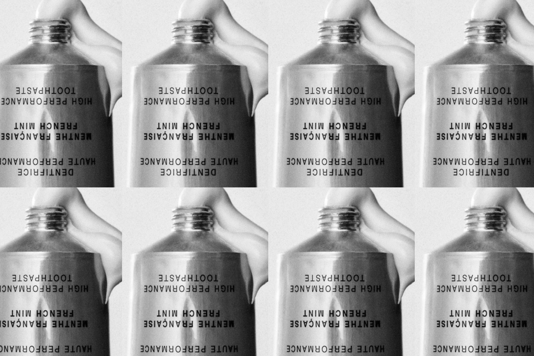
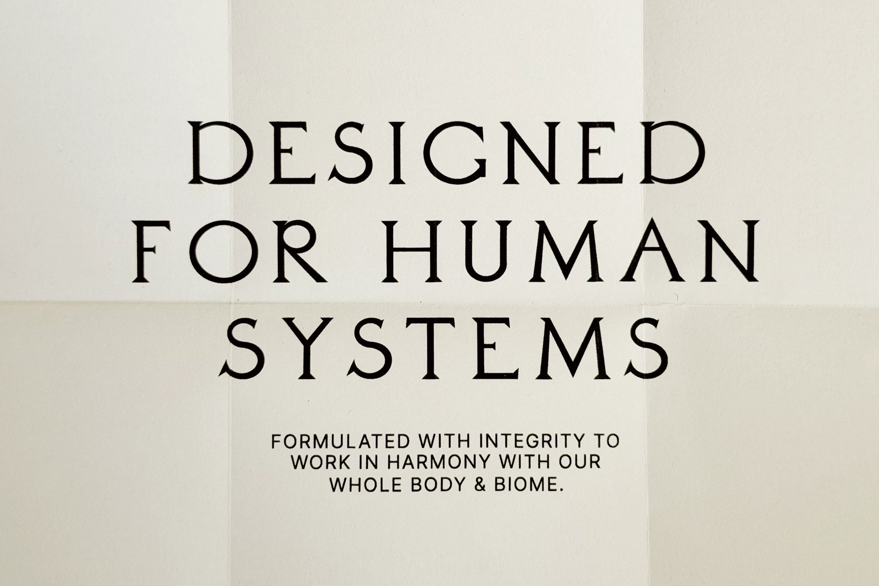
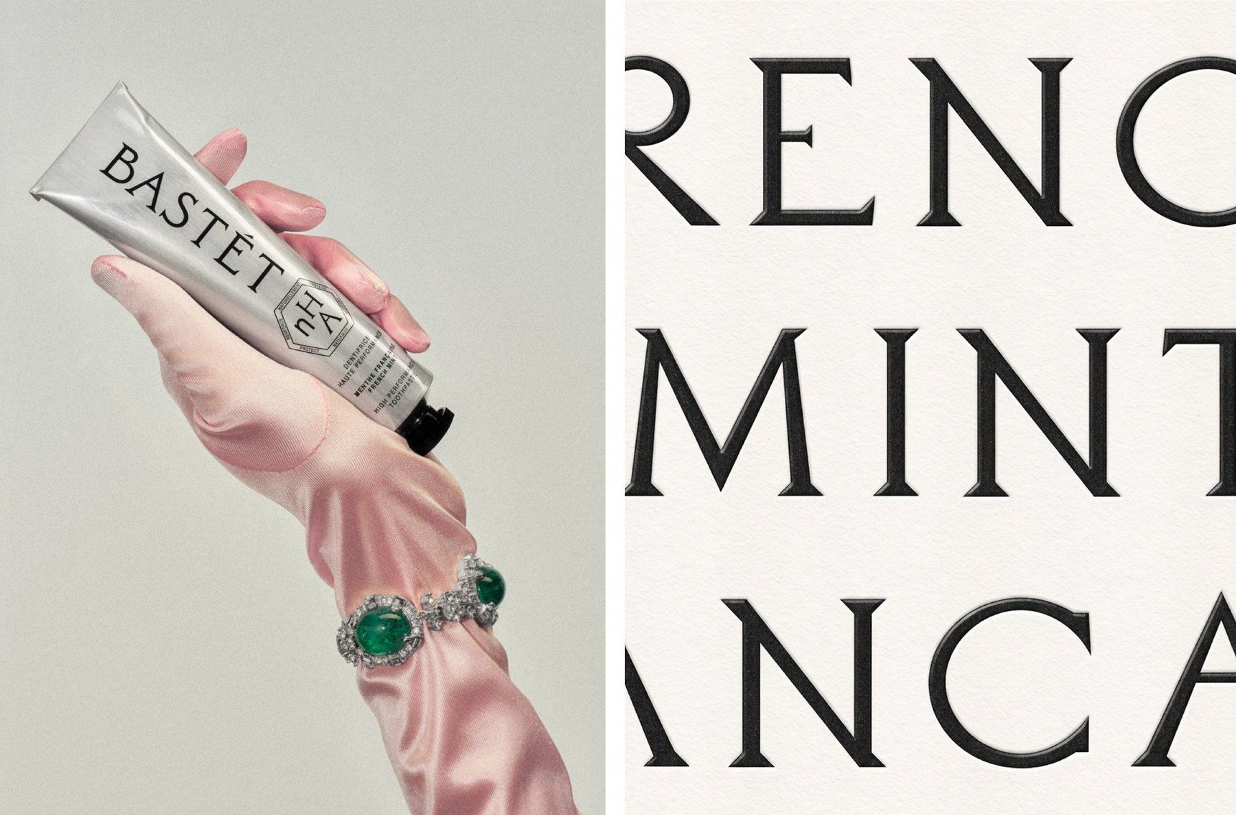
The wordmark is drawn, not typeset. Wedge took its forms from the stone-carved lettering on the facade of the Grande Galerie de l'Évolution at the Paris Natural History Museum, completed in 1889: unusual terminals, narrow joins, sharp apertures, a monumentality meant to signal trust and rigor. The brand's primary typeface extends the idea. Daubenton, by Olivier Dolbeau of the Velvetyne foundry, is a high-contrast serif in the Didot lineage, all strong vertical stress and crisp, unbracketed serifs. For everything small, the system drops to Nimbus Sans in Regular and Condensed, neutral enough to set a bilingual ingredients list at tiny sizes. French and English share every panel: a fully branded face, a side panel per language for story, instructions and ingredients, and a bilingual front of pack. Saying everything twice forces the edit down to what is actually worth saying.
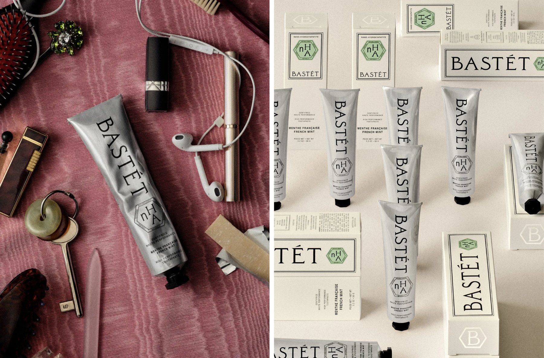
Materially, the system splits in two. The box is built for the retail shelf; the tube is built for the beauty counter. That tube is unlined aluminium, and it shows: the metal catches the light and dents softly, closer to an artist's paint tube than anything in the dental aisle. The green badge carries the ingredient story alone. nHA, nano hydroxyapatite, is the hero, a mineral found naturally in human teeth that supports enamel protection, so the hierarchy stays blunt: the name, then the proof. Wedge kept a few category conventions on purpose. The No List stays, and so do the brushing instructions, because with nHA the method is part of the performance: spit, don't rinse. The art direction stages the feeling of clean instead of the literal smile: still lifes in the spirit of Irving Penn's Clinique years, a tube balanced on a suede shoe, a silk-gloved hand heavy with jewels, the day's bag spilled across pink silk. Morning and evening, four minutes at a time.
See more from Wedge on their site.