New oral care brand Ozen aims to disrupt the sector
The new brand is created in partnership with Mother’s startup incubator Broody, with an identity by Mother Design
“Oral care is one of those sectors where playing it safe has become the riskiest move of all,” says Mother Design’s creative director Jo Tulej, whose team recently unveiled a refreshing new identity for challenger brand Ozen.
A new oral care brand founded by NHS maxillofacial surgeon Dr Niall Kent, Ozen has launched into the UK consumer market nationwide in Boots and features the first new patented sensitivity technology to enter the category in almost 30 years.
To devise the new brand, Ozen worked closely with startup incubator Broody, which sits in-house at global communications agency Mother, while Mother Design crafted a thoughtful visual identity to help it stand out in the sector.

The result is a brand that hopes to combine the credibility of scientific rigour with the design-led approach of new challengers in the category. The founding narrative of Ozen involves Dr Kent collaborating with his Royal Academy-trained sculptor brother to explore how bone graft materials could be used for oral care, resulting in the AeroGraft technology that sits at the heart of the brand.
“What made Ozen so compelling was the story behind the science,” explains Cecilia Serafini, design director at Mother Design. “The technology itself emerged from the intersection of art and experimentation, so we wanted the identity to reflect that tension.”
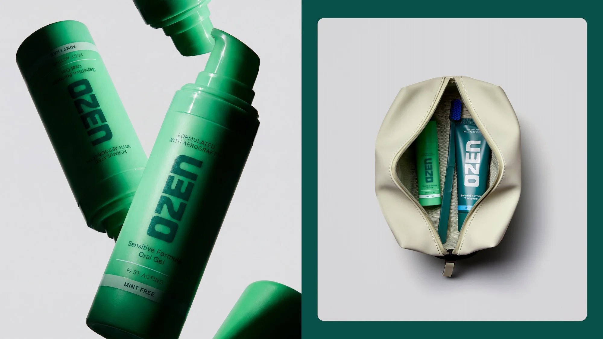
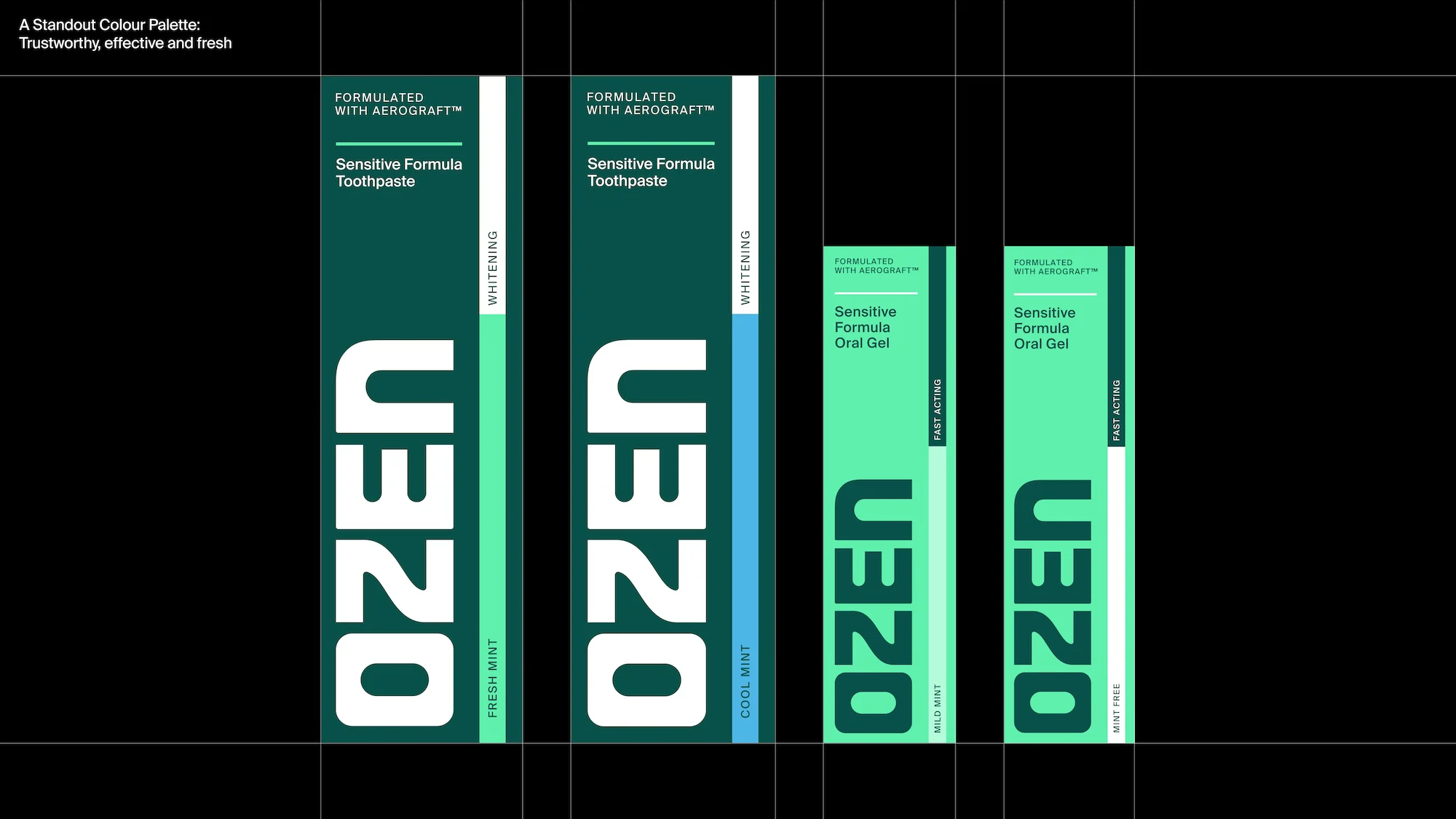
This is most prominent in the Ozen logo, which takes the shape of a bold, tactile wordmark featuring carved counterforms which reflect the brand’s origins and aim to evoke a sense of trust and reliability. Across the identity, this logo is complemented by geometric sans-serif typefaces.
The science also comes into play through the brand’s graphic elements, including structural lines on the packaging that draw on medical symbolism, without the cold and clinical feeling present across many category competitors.

This is helped by Ozen’s strong colour palette, which features a deep green that “adds a more premium presence”, and a brighter, punchier green that “retains the freshness cues consumers expect from oral care”. This aims to help the brand stand out on the shelf, where most brands opt for blues and whites.
“Every design decision was carefully calibrated,” says Serafini. “The sculptural logo, the use of green, the structural graphic language and the restrained typography all work together to create something that feels both clinically credible and unexpectedly human. In a category full of visual noise and familiar conventions, we wanted Ozen to feel confident, clear and genuinely new.”