Mother Design Unveils Fhirst Packaging
Mother Design's Fhirst packaging is maximalist by design: a Motter Regatta wordmark, animal mascots and loud gradients on every can.
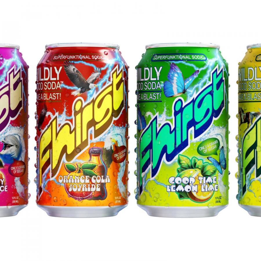
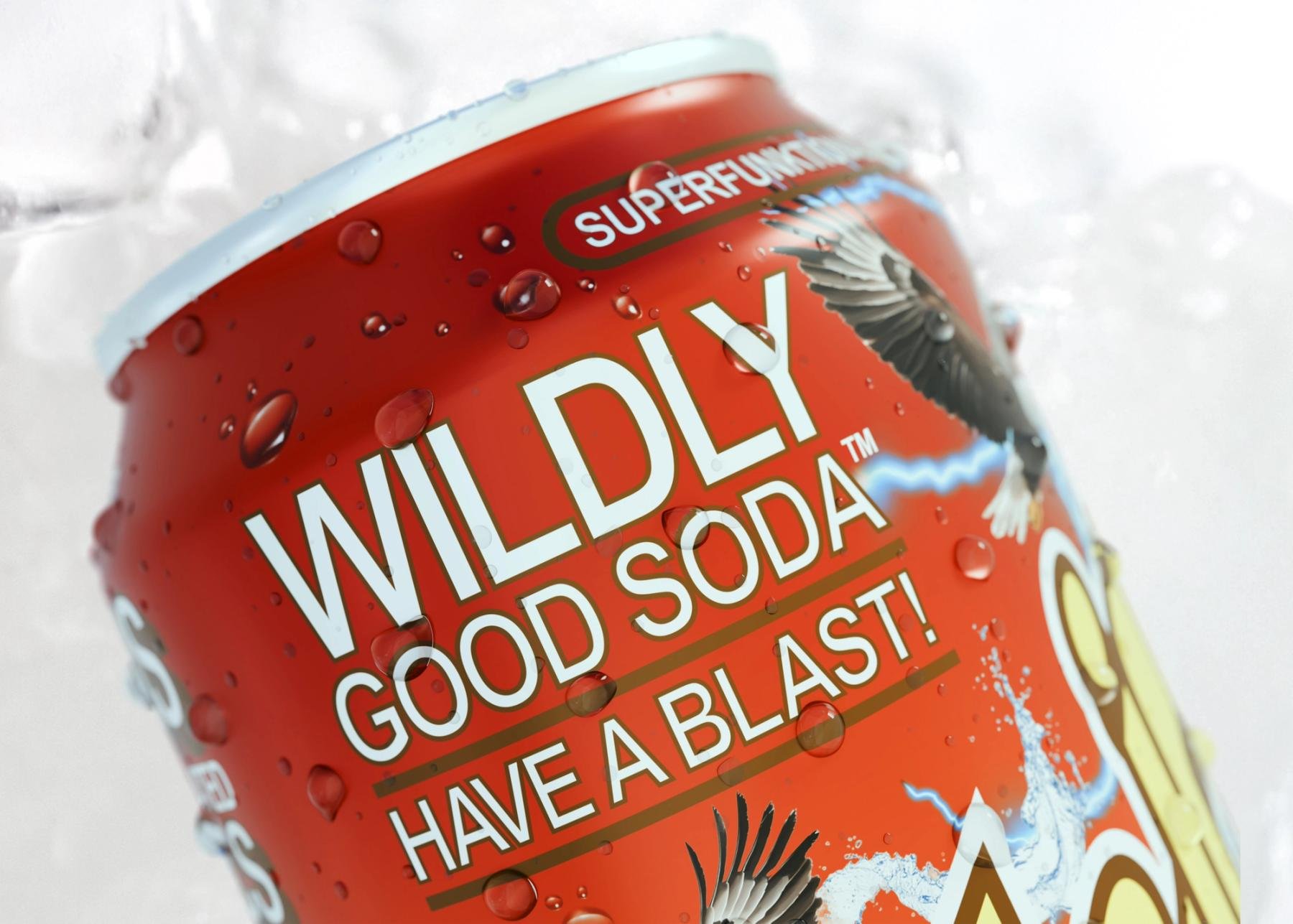
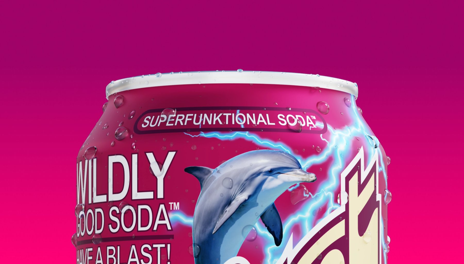
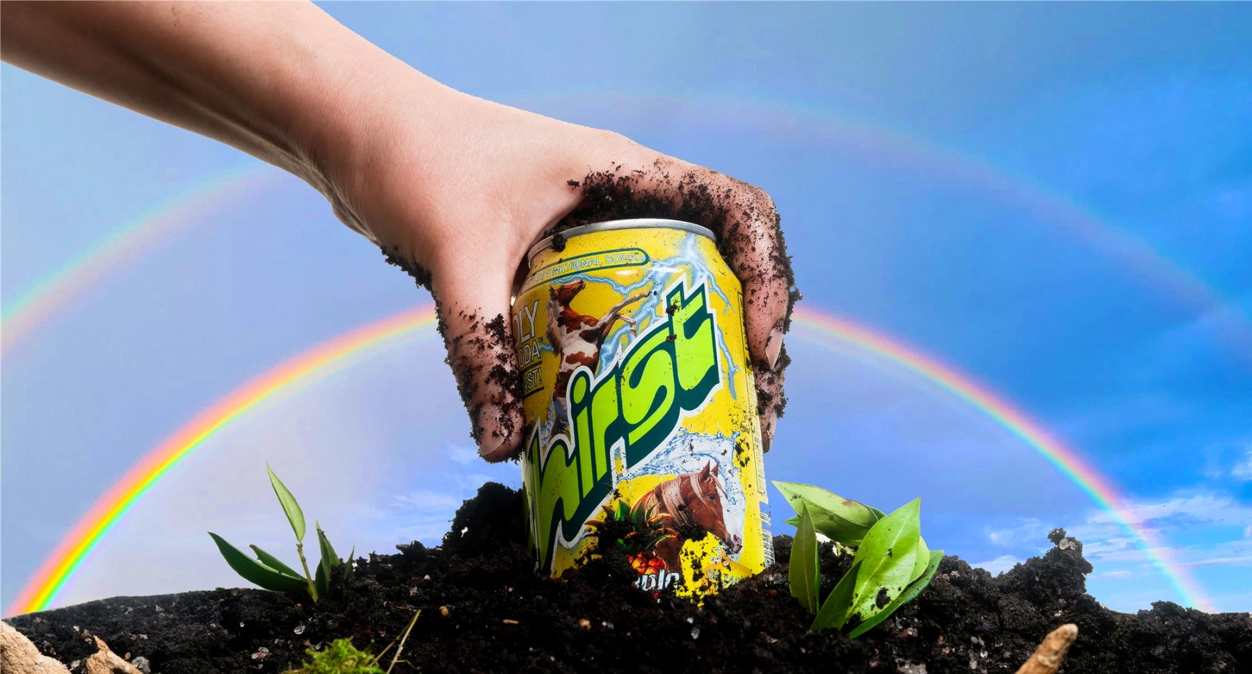
Fhirst is a probiotic soda, and Mother Design refused to dress it like one. The four cans in the range do not whisper about health. They shout. A diagonal wordmark cuts across each can in a gradient that shifts hue as it climbs, with lightning bolts, splashing water and a wild animal behind it. The dolphin rides the pink Dr. Cherry Happy Place can, the eagle rides the red Orange Cola Joyride can, the butterfly rides the green Good Time Lemon Lime can, and the horse rides the yellow Pineapple Yuzuphoria can. Small spec lines at the foot of each can state the sugar grams and the 12 FL OZ fill. In a category crowded with calm, pale, better-for-you cans, Fhirst chose the opposite seat: the loudest one, and it holds it with a system rather than a single joke.
Fhirst packaging turns the volume up
The type does most of the talking, and it talks in several voices at once. The wordmark is an homage to the Motter Regatta typeface by Austrian designer Othmar Motter, drawn to balance timeless charm with expressive energy, and Mother Design sets it large, tilted and outlined in white so it reads across a crowded shelf. Above it sits a pill-shaped lockup reading SUPERFUNKTIONAL SODA, a coinage that fuses super, funky and functional into the brand's positioning line. The secondary voices come from familiar faces Mother Design names outright: Papyrus, Frankfurter, Blackmoor and Beesknees, the kind of typefaces once seen on 90s health-food store signage. Flavor names get their own treatments, while front-of-pack lines like WILDLY GOOD SODA and HAVE A BLAST run in condensed capitals above the wordmark.
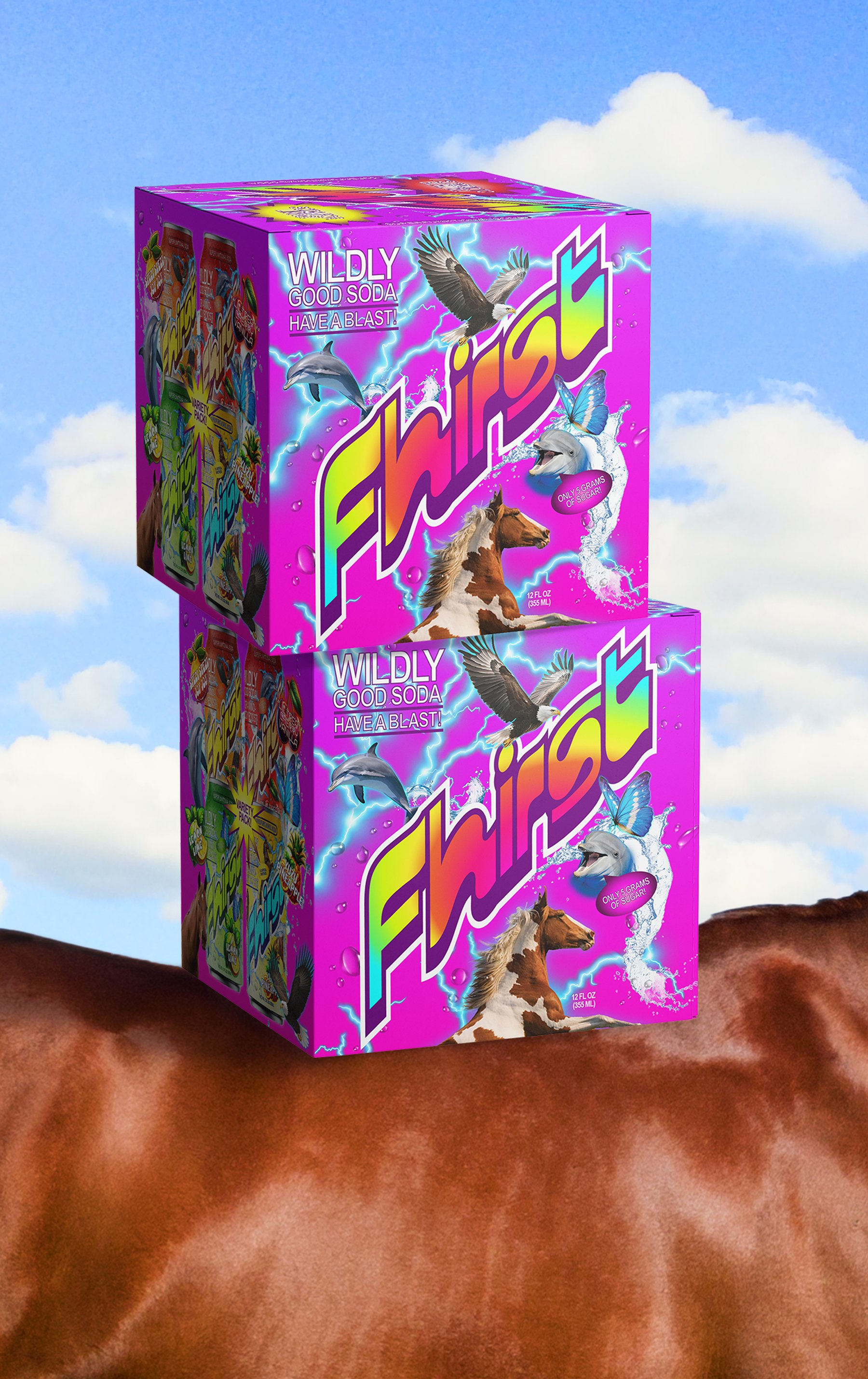
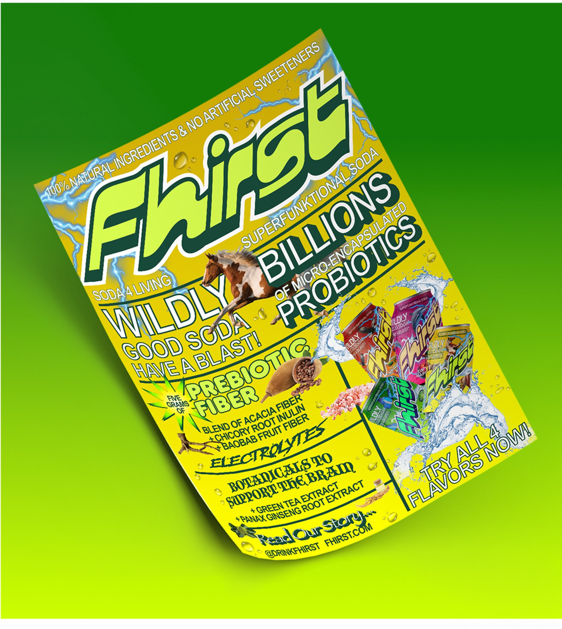
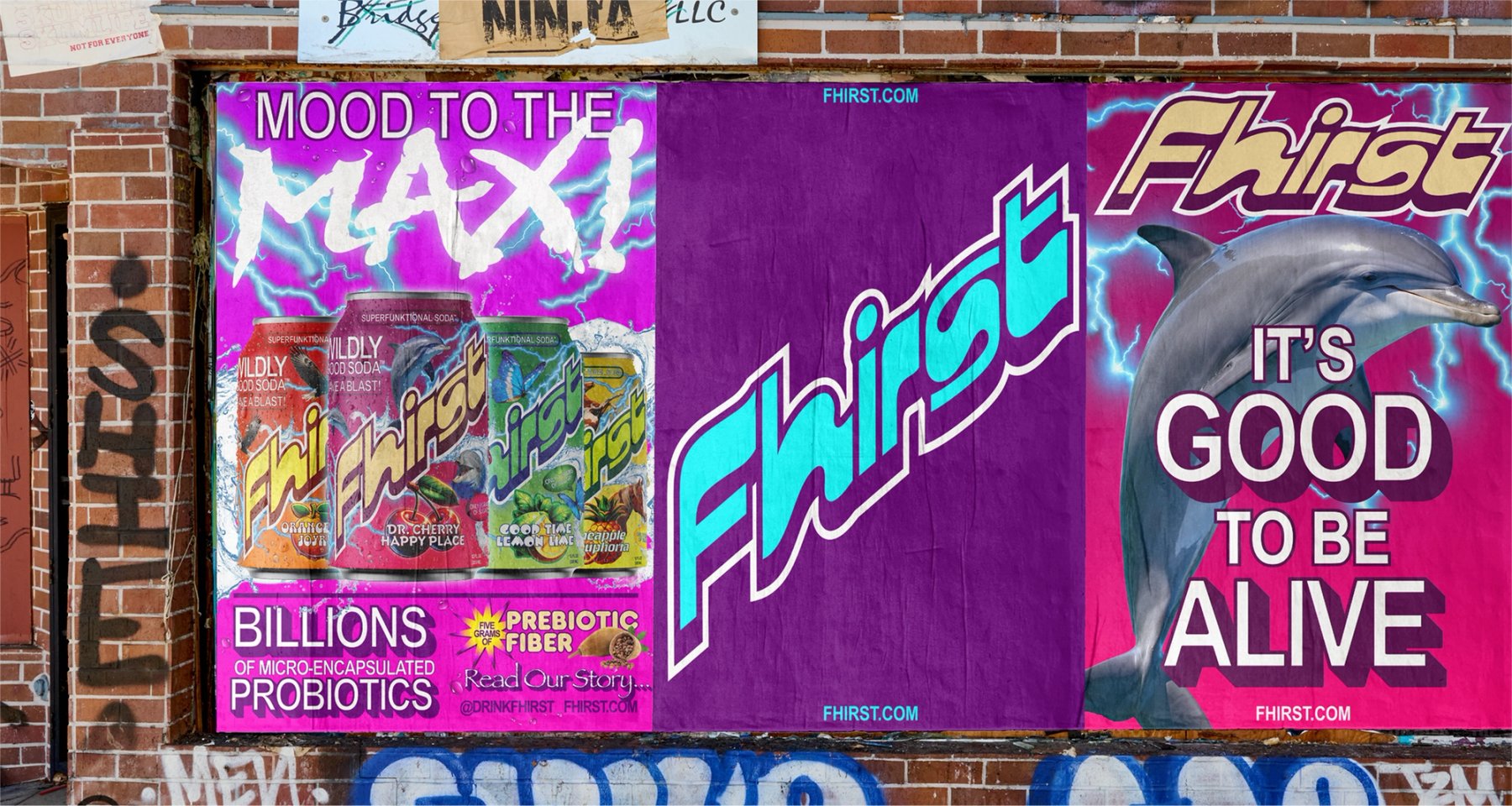
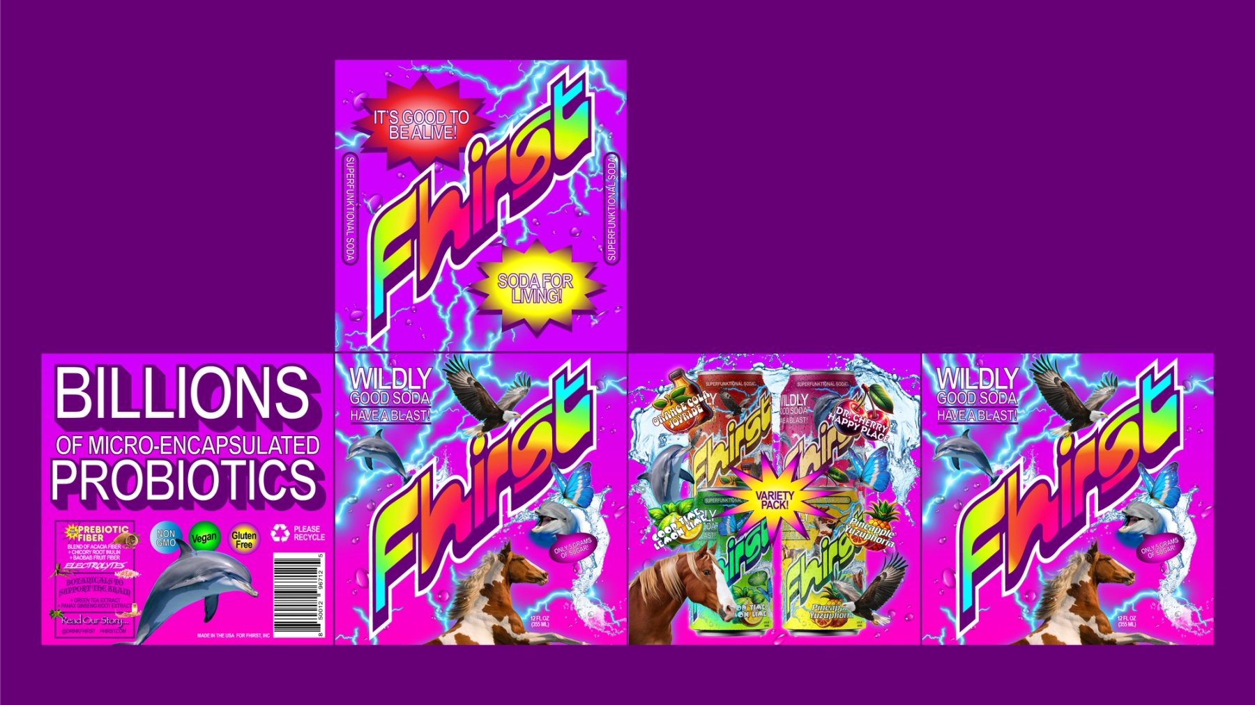
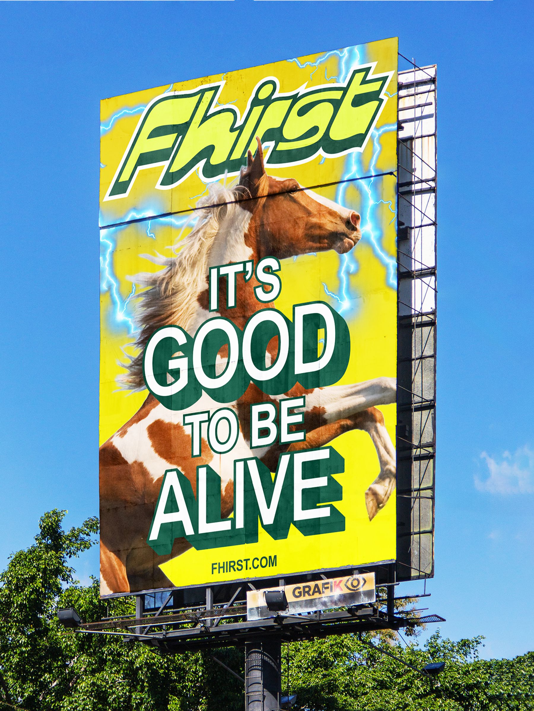
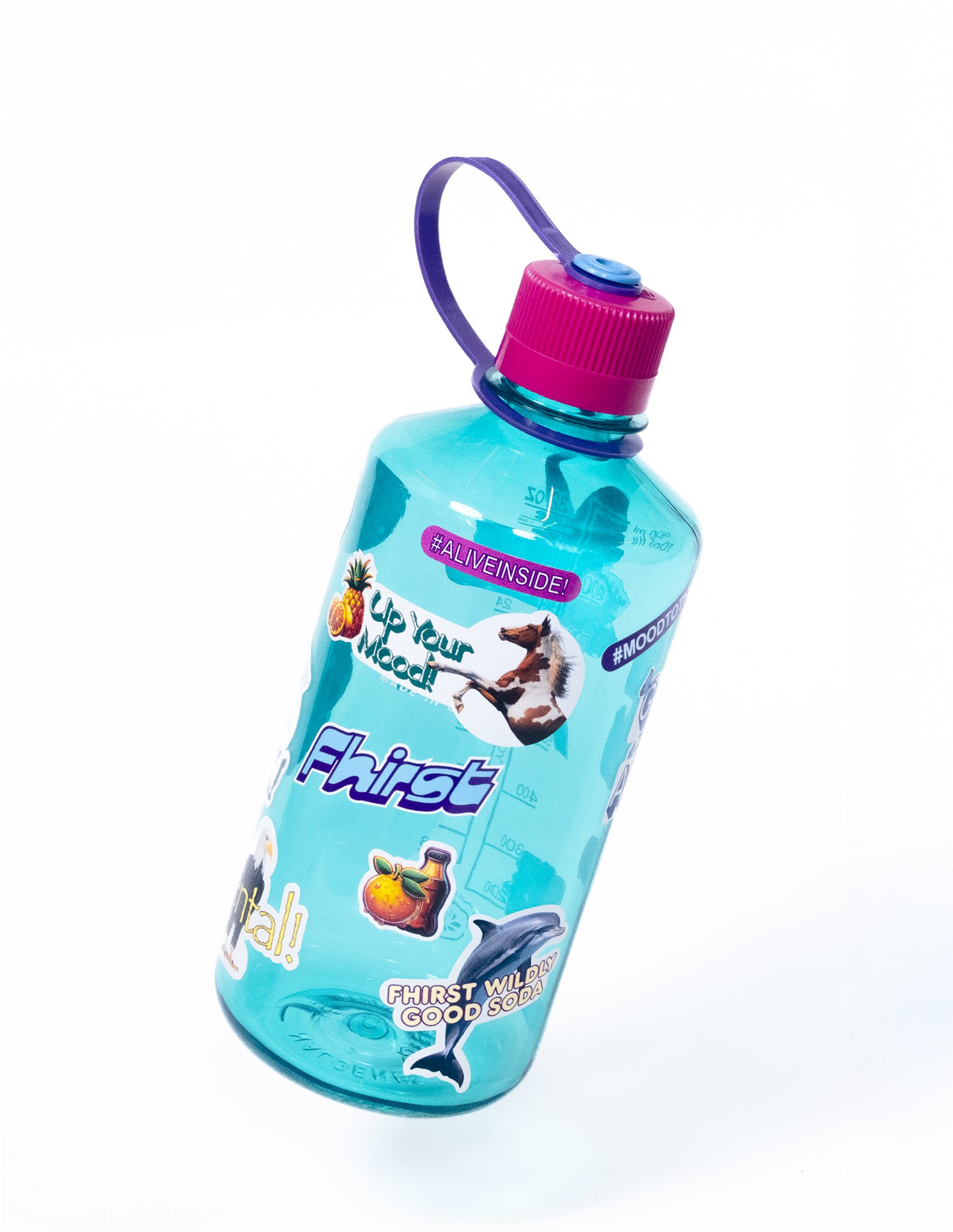
The system holds together because every flavor follows the same recipe. Mother Design gives each flavor one gradient, one bright color and one darker color, so the range reads as a family even when the hues clash across the shelf. A high-contrast primary gradient anchors the brand, supported by Fhirst cyan and Fhirst purple, and the same structure repeats on the variety pack boxes, where the wordmark, animals and lightning fill every panel. The flyer pushes the same material further, stacking the wordmark, the BILLIONS OF MICRO-ENCAPSULATED PROBIOTICS claim and the flavor lineup on a single yellow sheet. Posters and a billboard carry the voice lines, IT'S GOOD TO BE ALIVE! and MOOD TO THE MAX! in block capitals beside the dolphin and the horse. Even the water bottle wears the system, with the wordmark and animal graphics printed on clear plastic.
See more from Mother Design on their site.