Mostai Padel Club Is a Masterclass in Leisure Branding
andstudio built Mostai padel club a 1970s Mediterranean identity: bold vintage typography, warm colors, and an M mark that swings like a racket.
The first thing you notice is the temperature. Mostai's identity runs warm: tomato red, marigold yellow, deep court green, clay orange. The palette comes straight from padel's origin story, a leisure game born in 1960s Mexico that found its social form on Spain's Costa del Sol in the 1970s. andstudio leaned into that sunlit history instead of the cold minimalism sports clubs usually reach for. The result feels like a holiday postcard that learned how to play: nostalgic two-tone illustrations, patterns pulled from 1970s leisure culture, and color that stays inviting across posters, merch, and the club interior. Even the name plays along. Mostai is a casual Lithuanian expression for a racket swing, chosen for its effortlessness and ease.
The Mostai padel club identity runs on vintage sports-poster type
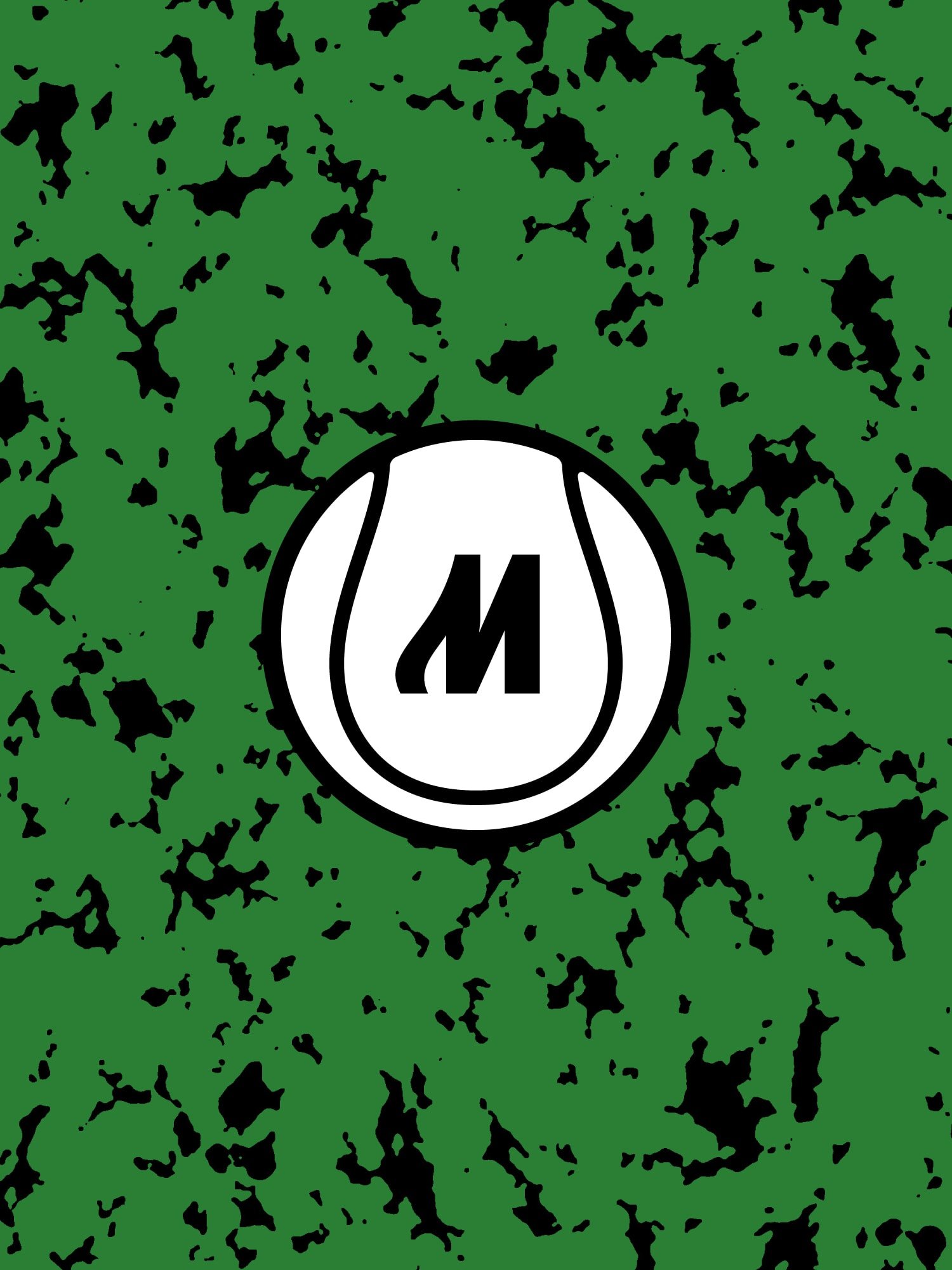
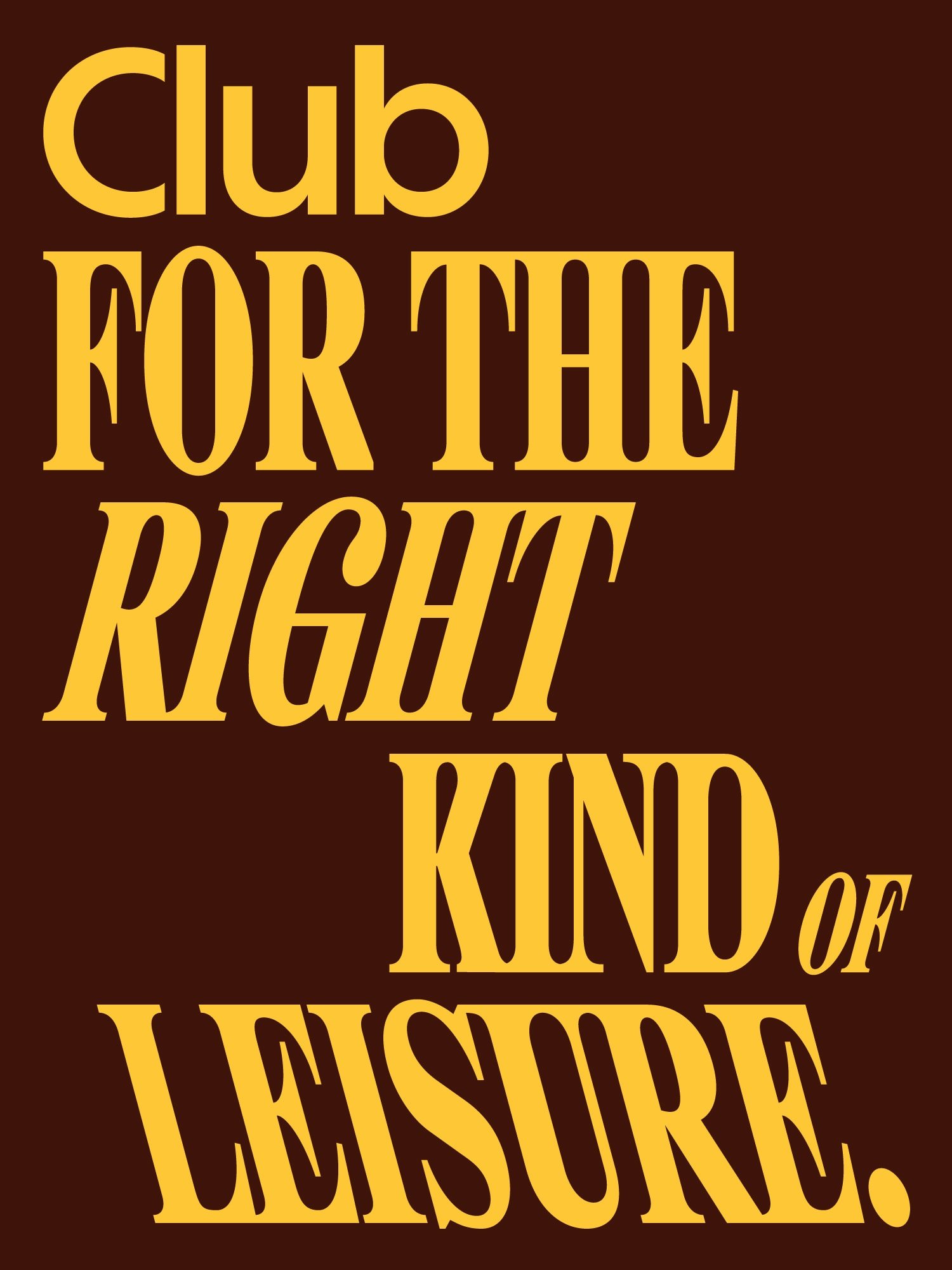
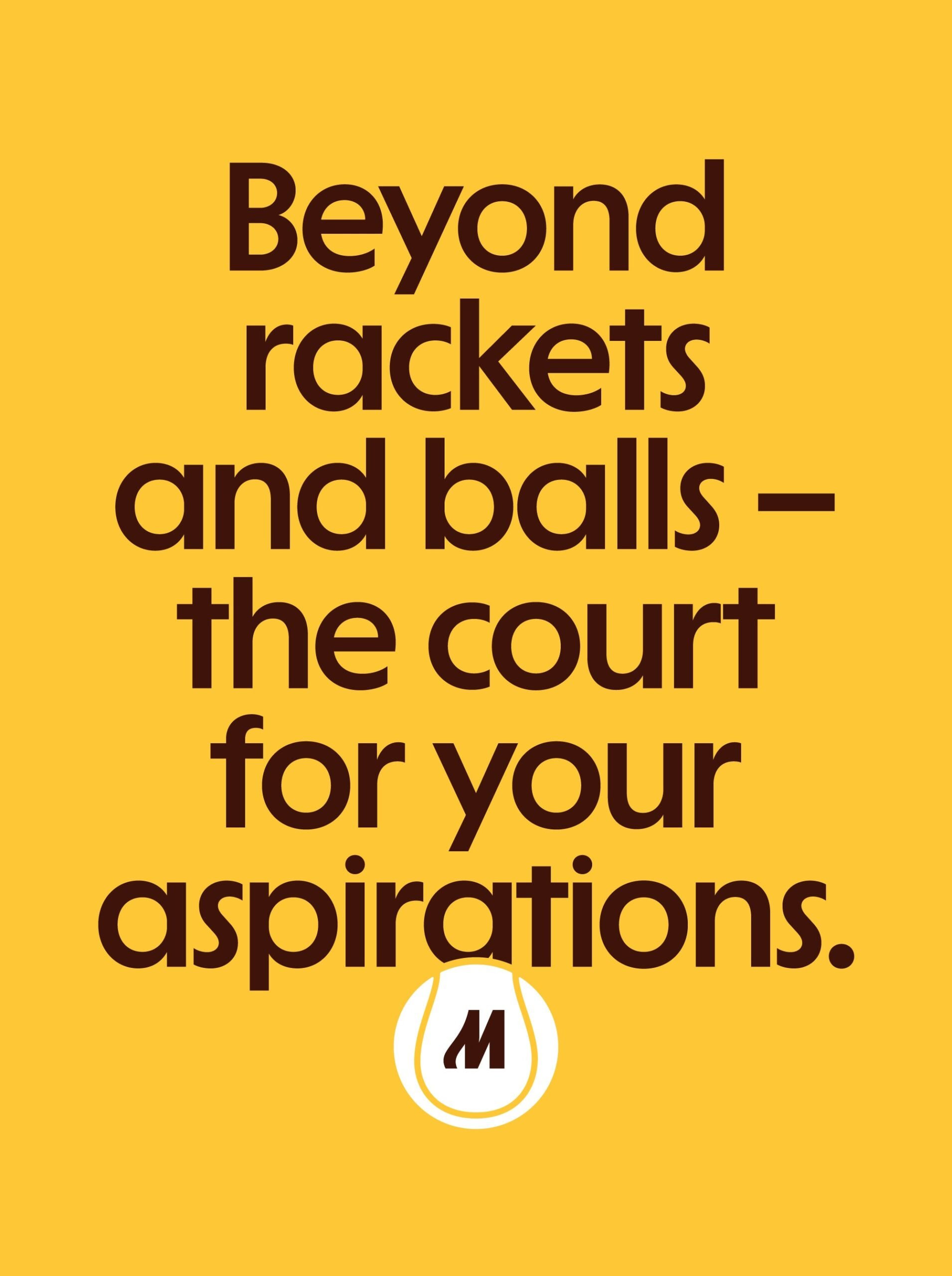
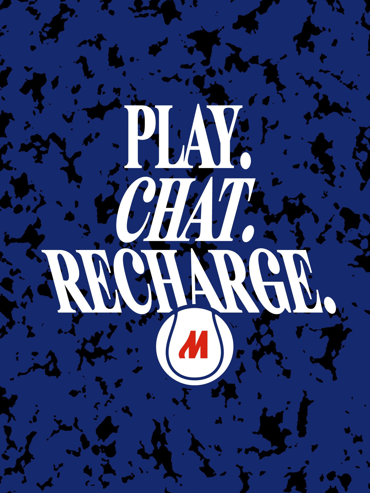
The wordmark does the heavy lifting. Set in bold, tightly packed lettering with a soft vintage drawl, MOSTAI reads like a badge pulled from a 1970s sports poster. The real move is the M. Its strokes extend into lines that suggest a racket mid-swing, so the initial carries the sport's whole gesture in a single letter. andstudio pairs it with typography that recalls holiday postcards and old tournament posters, stacking condensed headlines against generous color fields. PLAY. CHAT. RECHARGE. runs white on blue. Beyond rackets and balls, the court for your aspirations sits brown on marigold. The layouts stay simple on purpose: one message, one color, maximum contrast. Nothing competes with the type because the type is the image.
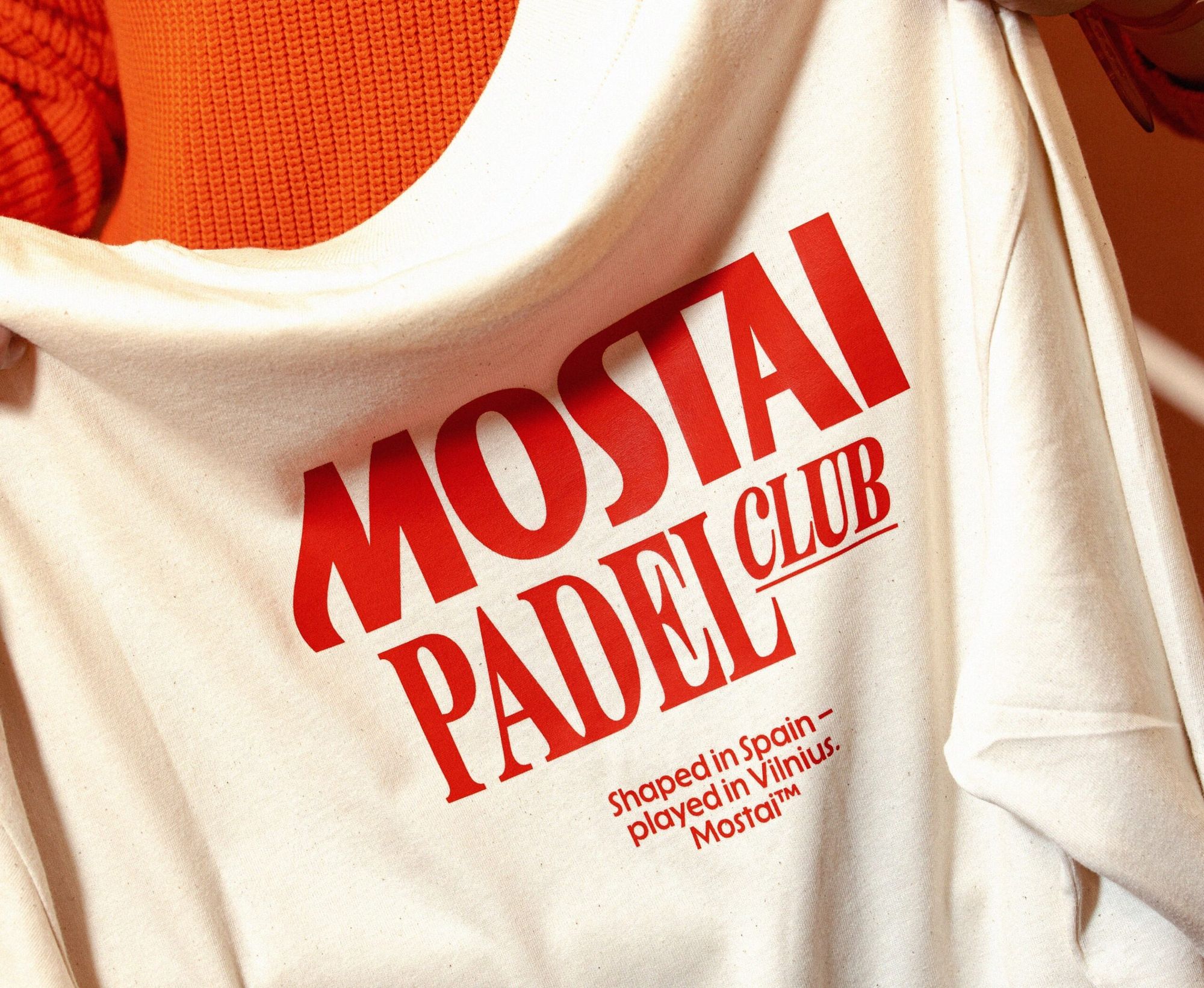
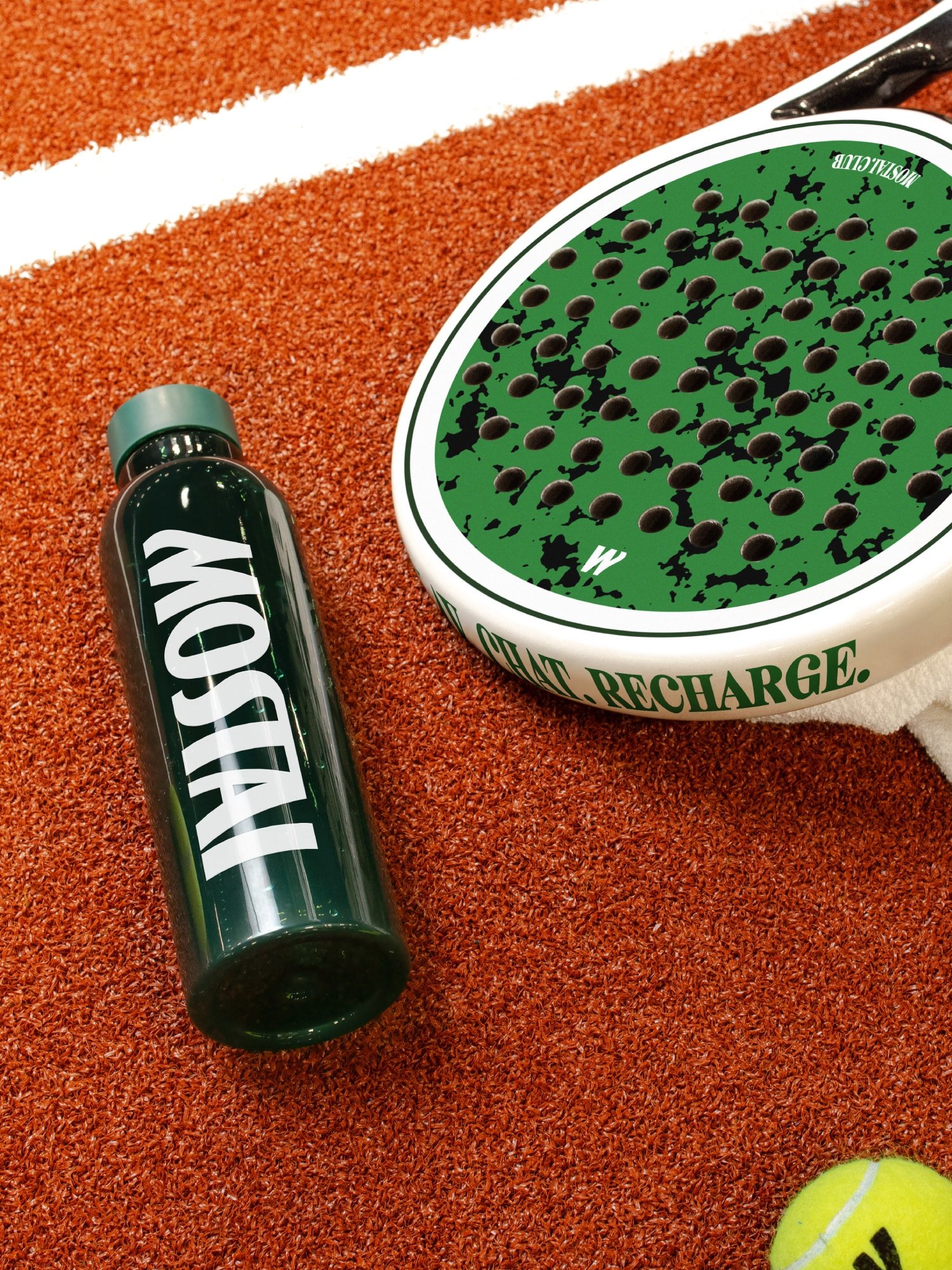
The system holds up in the physical world. The identity stretches across court signage, a poster series, t-shirts, a drinks menu, juice bottles, an enamel pin, a keychain, and the club interiors, where earthy tiles, plants, and southern club motifs carry the same warmth. Two-tone illustrations and flat color keep production simple and the look consistent whether it is screen-printed on cotton or wrapped around a bottle on the clay. One tee pairs the wordmark with the line shaped in Spain, played in Vilnius. The club itself mixes courts with a kids academy, physiotherapy, film evenings, and degustation dinners. Copy lines like Time together is the greatest win make the social pitch explicit: this is a club that sells belonging first and sport second.
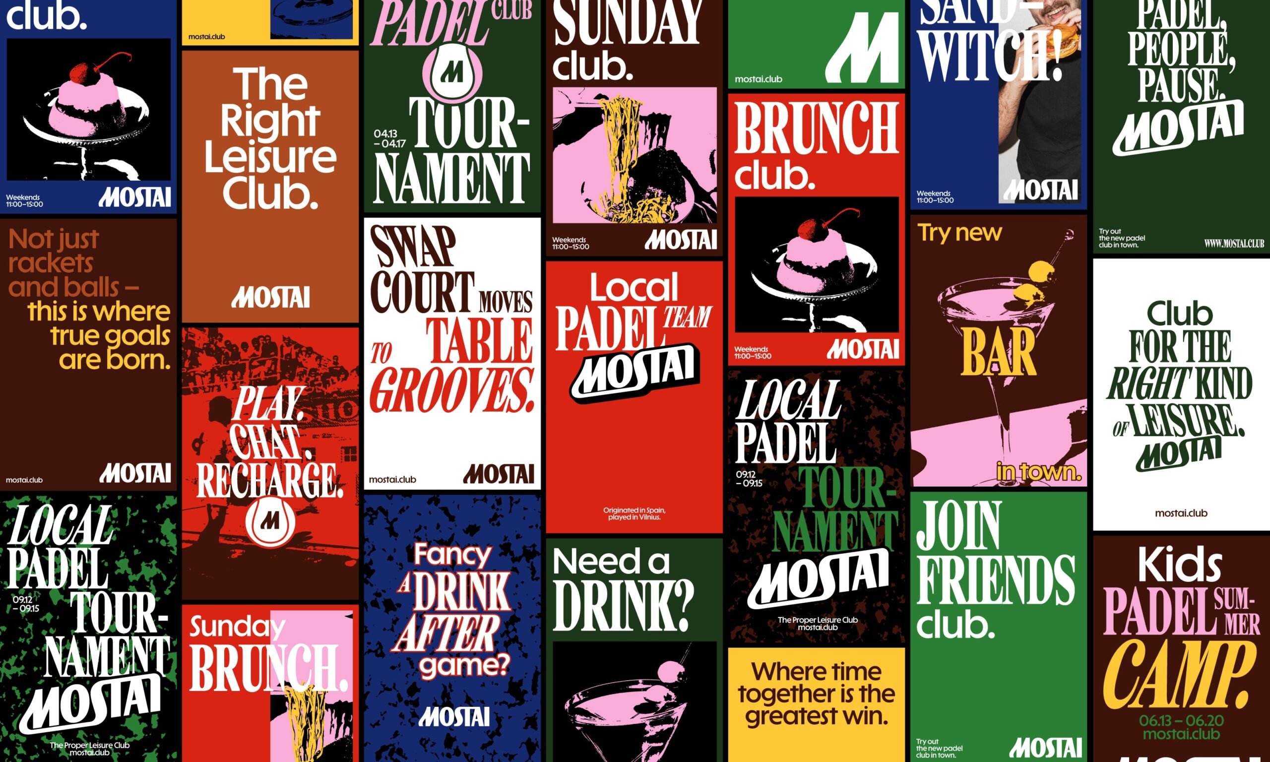
See more of the Mostai identity from andstudio.