Studio Marcus Kraft Unveils Klangwelt Toggenburg Rebrand
Studio Marcus Kraft built the Klangwelt Toggenburg rebrand around a dynamic typeface whose letters expand and scatter like sound in the Alps.
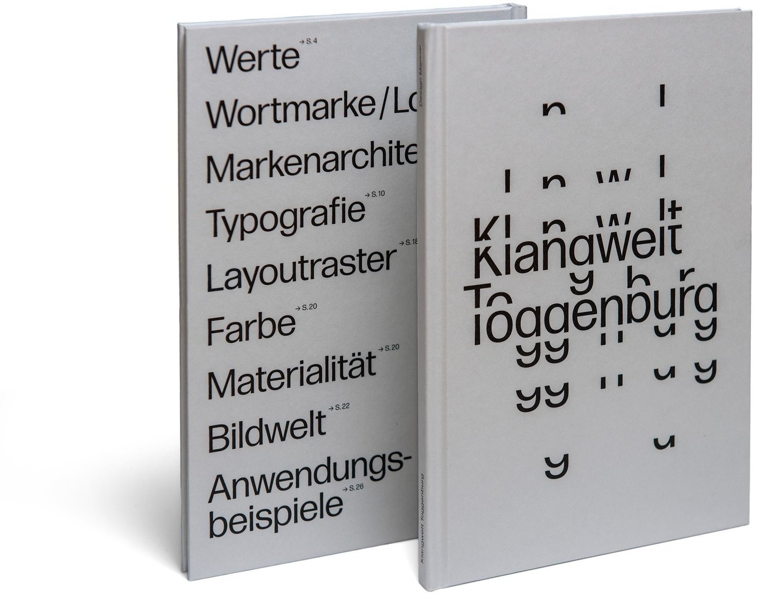
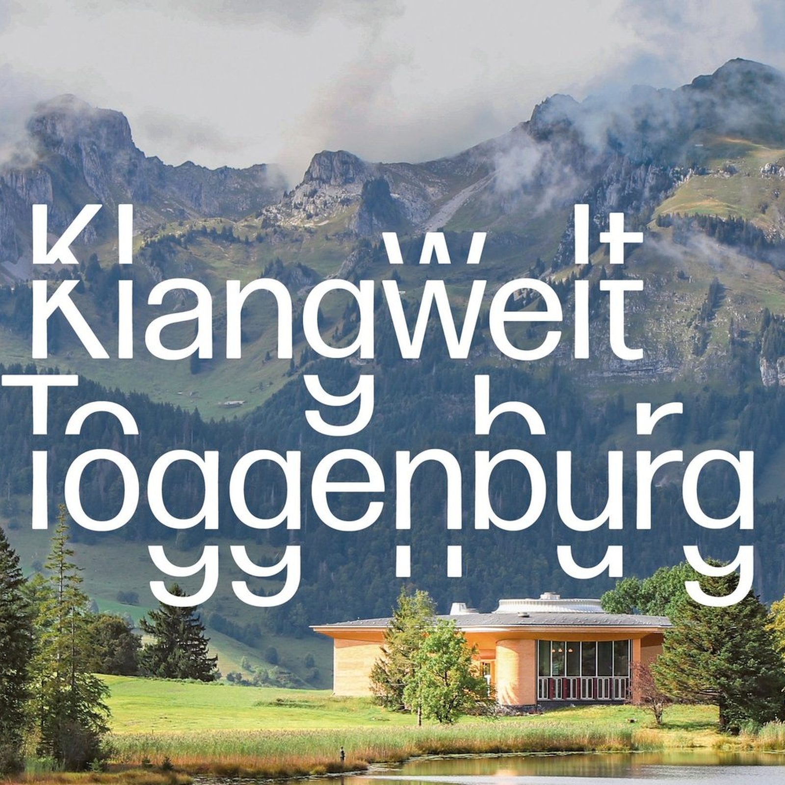
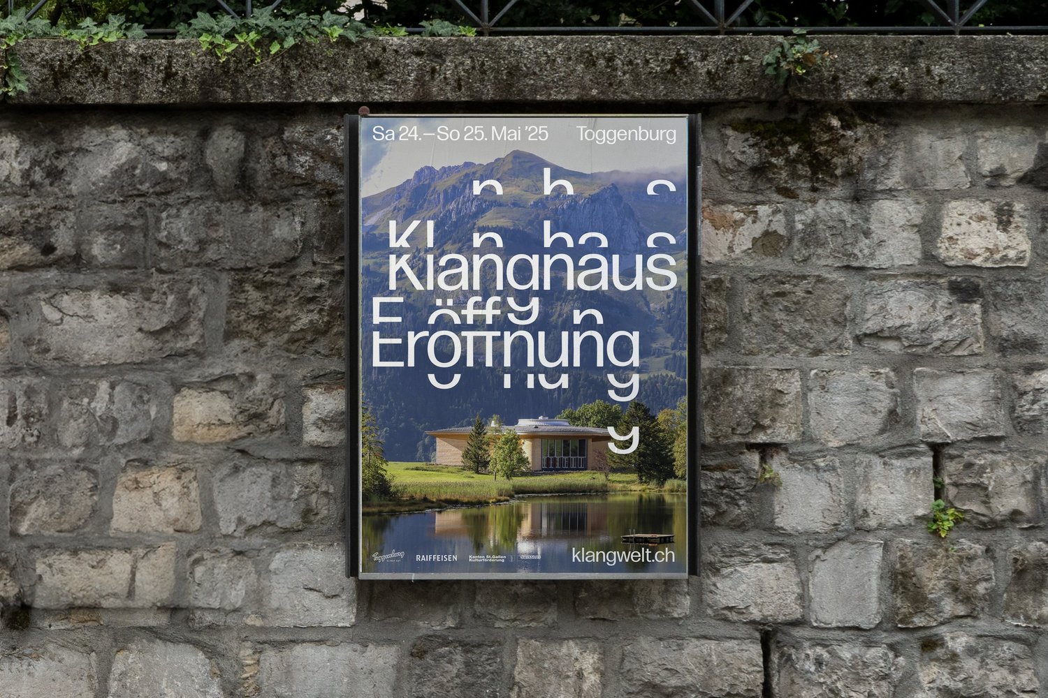
The key visual says everything in one frame: the wordmark set huge in white over the Toggenburg valley, its letters breaking into repeating fragments that drift apart like overtones. Studio Marcus Kraft calls it typographic resonance, and the metaphor holds across the whole system. Sound frequencies, harmonics, the contour lines of the terrain, all of it lands in how the letters behave. The palette stays out of the way: black type on white paper, photography carrying the greens and rock greys of the valley. The work picked up Silver at the 2026 European Design Awards, ADC Switzerland Silver and a TDC Tokyo Certificate.
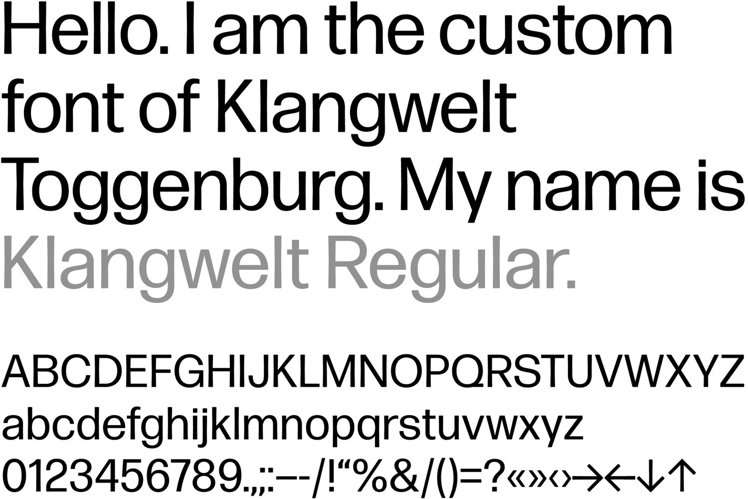
A Dynamic Typeface for the Klangwelt Toggenburg Rebrand
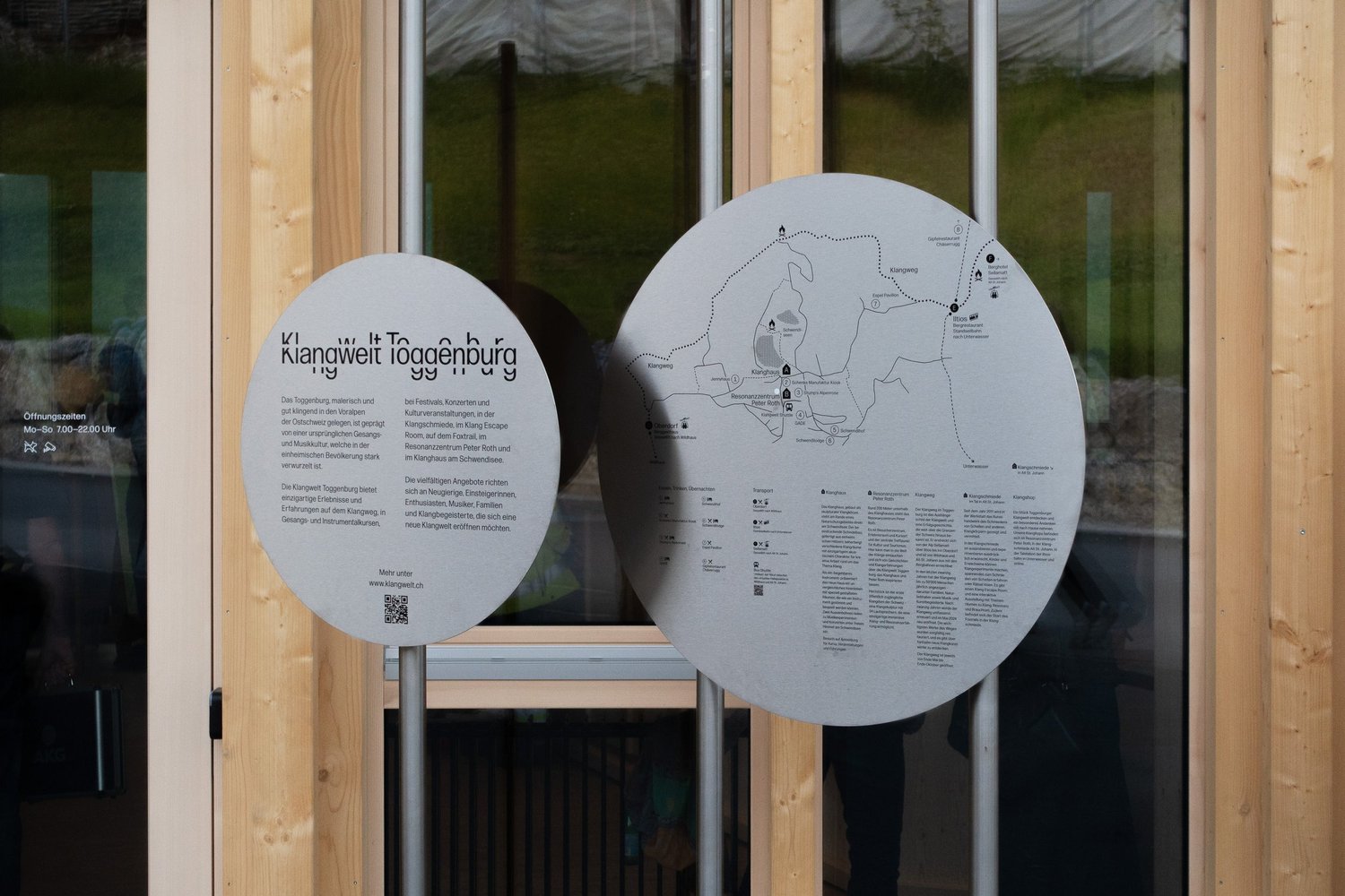
The face introduces itself in the specimen: "Hello. I am the custom font of Klangwelt Toggenburg. My name is Klangwelt Regular." Font engineering came from David Jonathan Ross, and the construction shows. A compact grotesque with tight apertures, set large enough that stroke ends read as physical mass. The modular trick is the repeating letter elements: fragments of K, g and y detach and scatter, so headlines can stretch, compress and dissolve while staying legible. The same logic drives the wordmark, the wayfinding discs on the Klangweg trail and the animated trailers. Layout principles, grids included, are codified in the design manual.
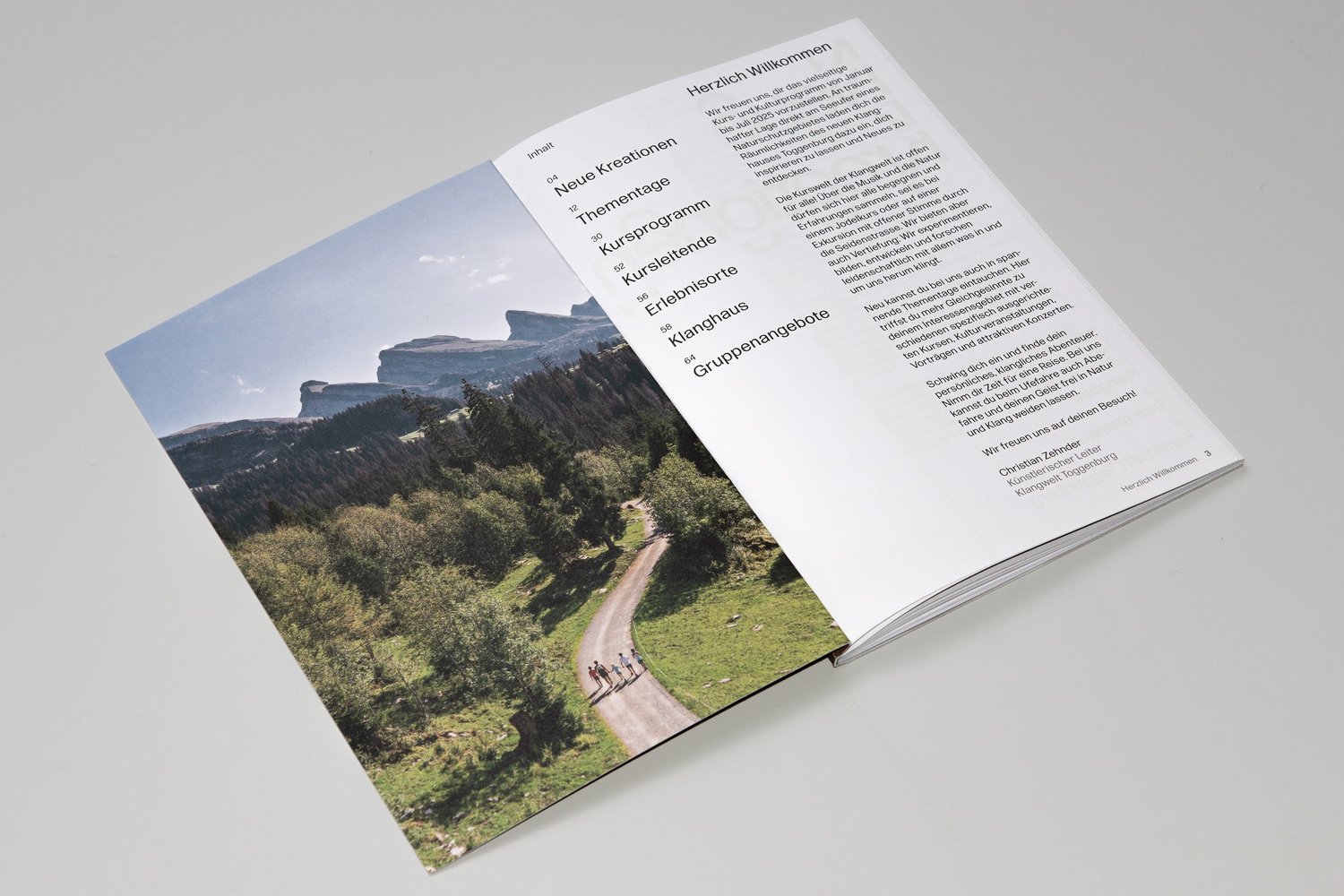
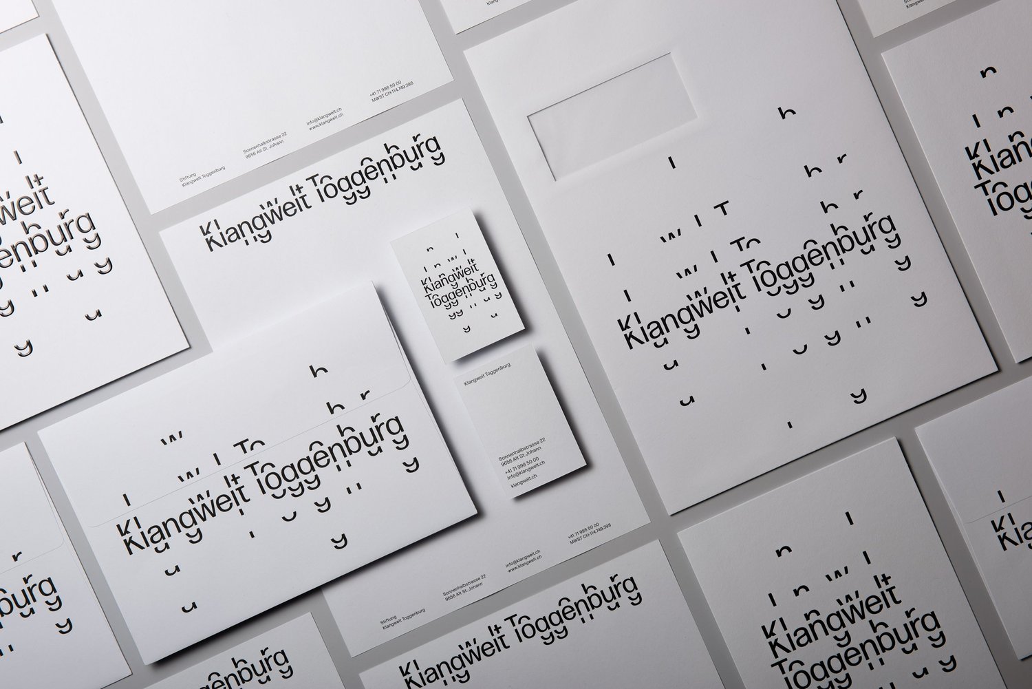
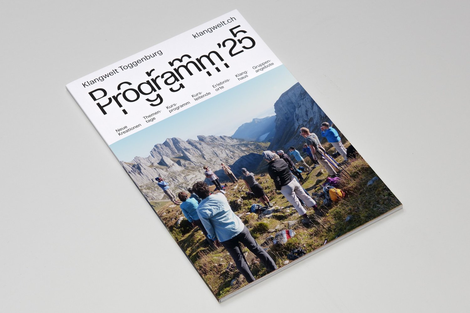
Everything physical sits on white. The stationery suite, letterheads, cards and envelopes, runs the scattered wordmark across uncoated stock with an even, catalog-like light. Two bound volumes make up the design manual, its table of contents reading like a syllabus: values, wordmark, brand architecture, typography, grid, color, materiality. The Programm '25 brochure pairs the broken-apart headlines with full-bleed valley photography, and the steel wayfinding discs carry the system out onto the trail itself. A new website by vitamin 2, animation by Miriam Palopoli and a sonic logo by Christian Zehnder complete the rollout, which began with the Klangweg reopening in 2024 ahead of the Klanghaus opening in 2025.
See more from Studio Marcus Kraft.