Best of the Week: Custom Serifs, Fluted Glass, and Print
Our curated roundup of the best of the week covers custom typefaces, fluted glass packaging, and tactile books from ISO week 2026-W42.
Good design doesn't hide behind glossy mockups. Across the studio projects we looked at over the past seven days, the strongest work came down to physical paper weight, custom glass molds, and disciplined letterforms that hold up at any scale. Whether it's a 36-style display family built around a ninety-year-old lightning bolt or a set of 1900 type specimen borders redrawn for a mountain lavender farm, these projects earn their keep through real craft.
Best of the Week: Design and Branding Picks
Plom by Brand Brothers
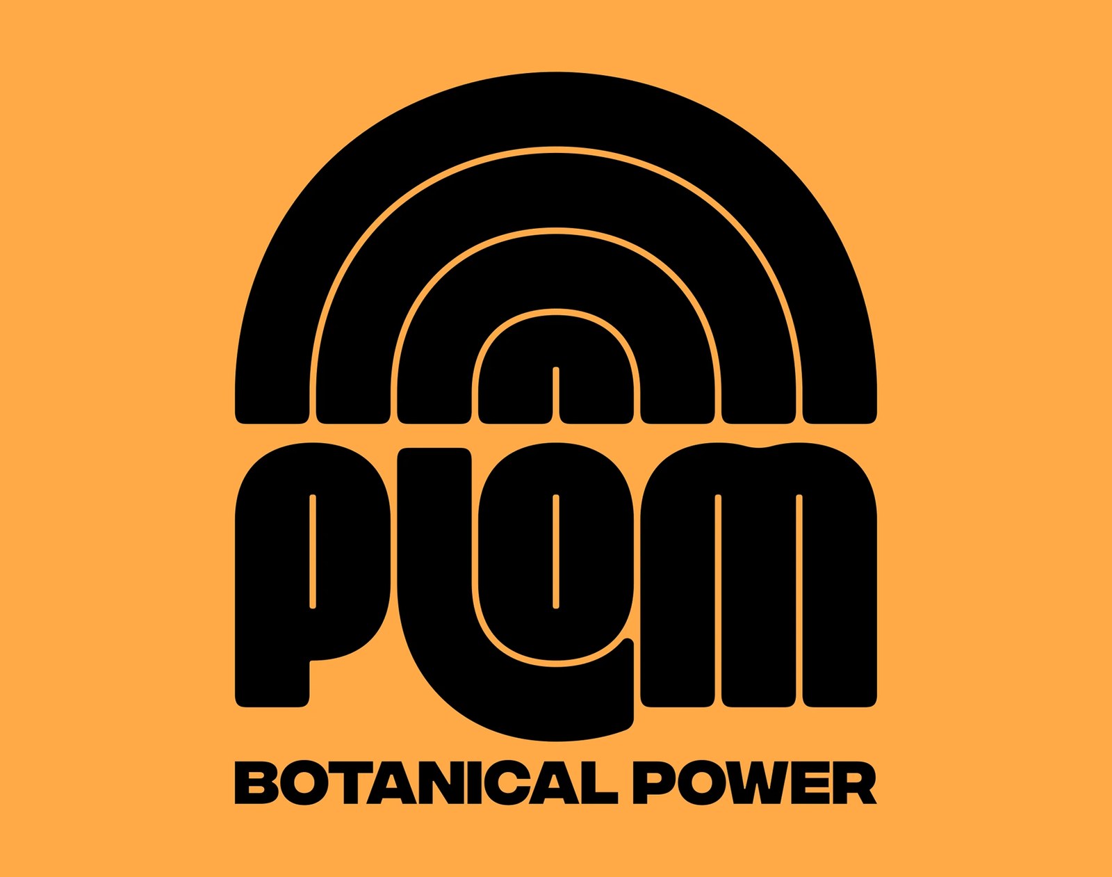
Sports recovery drinks usually drown in neon lightning bolts or sterile pharmacy clichés. Paris and Toulouse studio Brand Brothers took a completely different route for Plom, a post-workout beverage made with Gers-harvested hemp and oat milk. The identity leans on a heavy, custom-cut wordmark and concentric arch geometry that locks into aluminum cans and shipping crates with zero visual clutter.
View Feature on Abduzeedo · See the project by Brand Brothers on Behance
TT Rationalist by TypeType Foundry
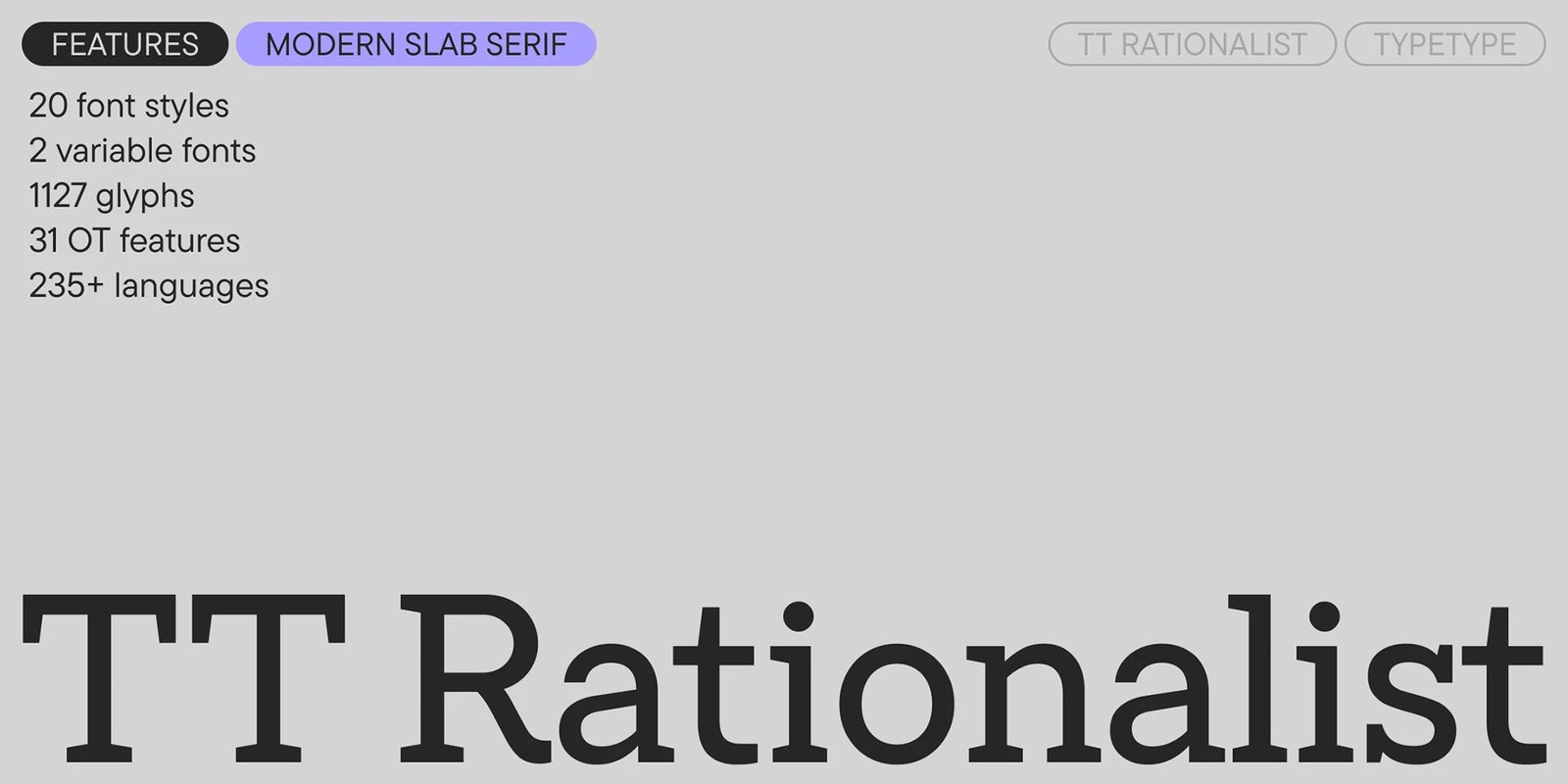
Slab serifs can easily feel clunky in dense body copy. In version 1.100 of TT Rationalist, TypeType Foundry trims away that heavy Victorian weight by pairing subtle trapezoidal serifs with warm teardrop terminals across 22 styles. The type does the heavy lifting here. It reads cleanly at tiny footnote sizes while keeping enough crisp structural bite for large magazine mastheads.
View Feature on Abduzeedo · See the project by TypeType Foundry on Behance
Shake-it Mixer by OlssønBarbieri
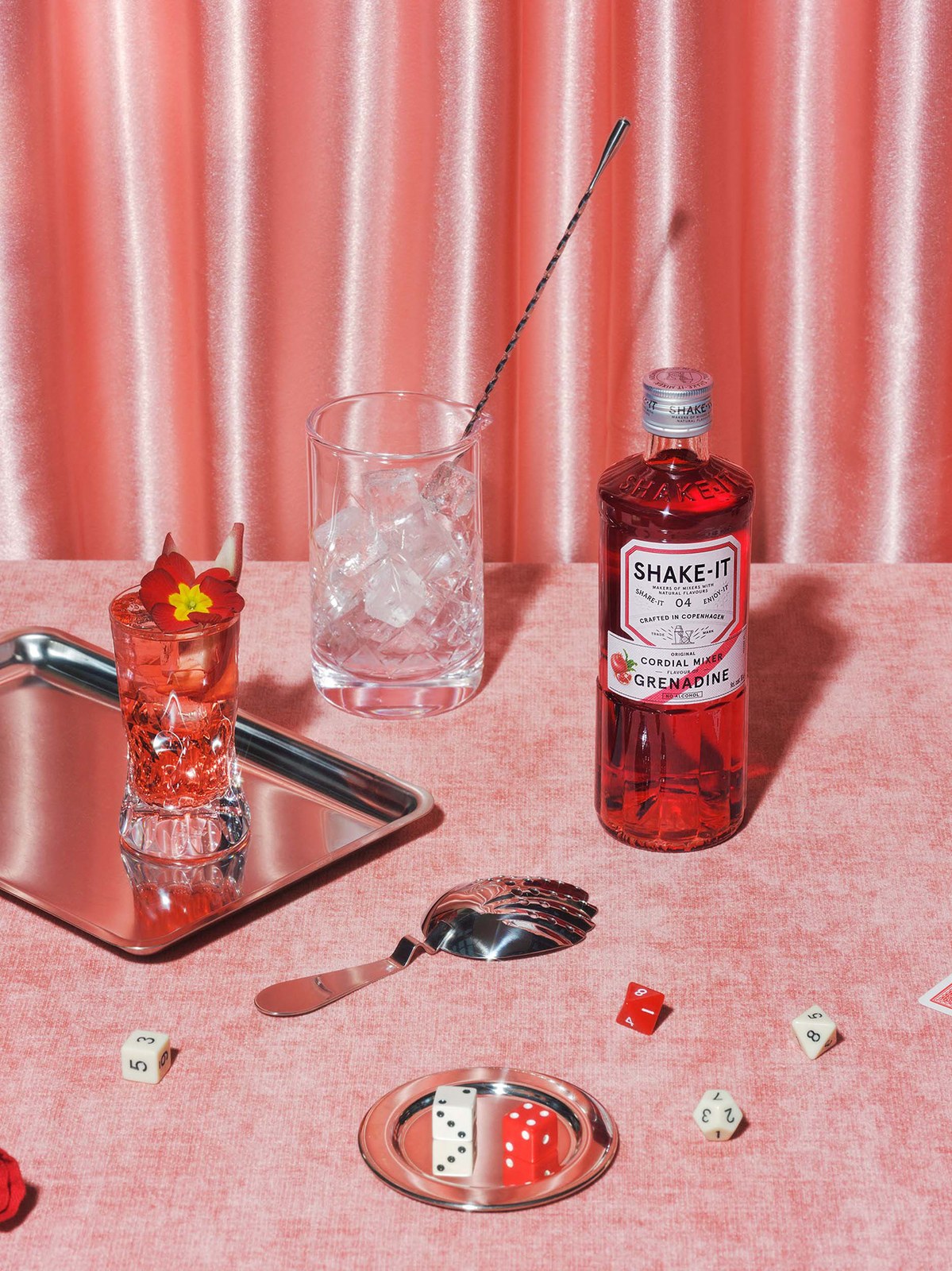
Most bar mixers come in forgettable plastic jugs that bartenders hide under the counter. Oslo and London studio OlssønBarbieri gave Danish cordial range Shake-it Mixer a custom fluted glass bottle inspired by 19th-century apothecary decanters and soda fountains. Those vertical glass ridges catch the light and provide a sure grip during fast service, while uncoated paper labels and copper foil details bring classic bar rituals back to the home shelf.
View Feature on Abduzeedo · See the project by OlssønBarbieri on Behance
Pause Between Thought and Action by Lundgren+Lindqvist
It works on paper first. Gothenburg studio Lundgren+Lindqvist designed this monograph for Swedish artist Erik Gustafsson around a series of 40 abstract darkroom luminograms that were first wheat-pasted on public billboards in Stockholm. The book's pacing mirrors that chemical process through tactile uncoated stocks, exposed binding mechanics, and spare grotesk captions that leave plenty of quiet margin around the silver-gelatin tones.
View Feature on Abduzeedo · See the project by Lundgren+Lindqvist on Behance
Postcard by Robot Food
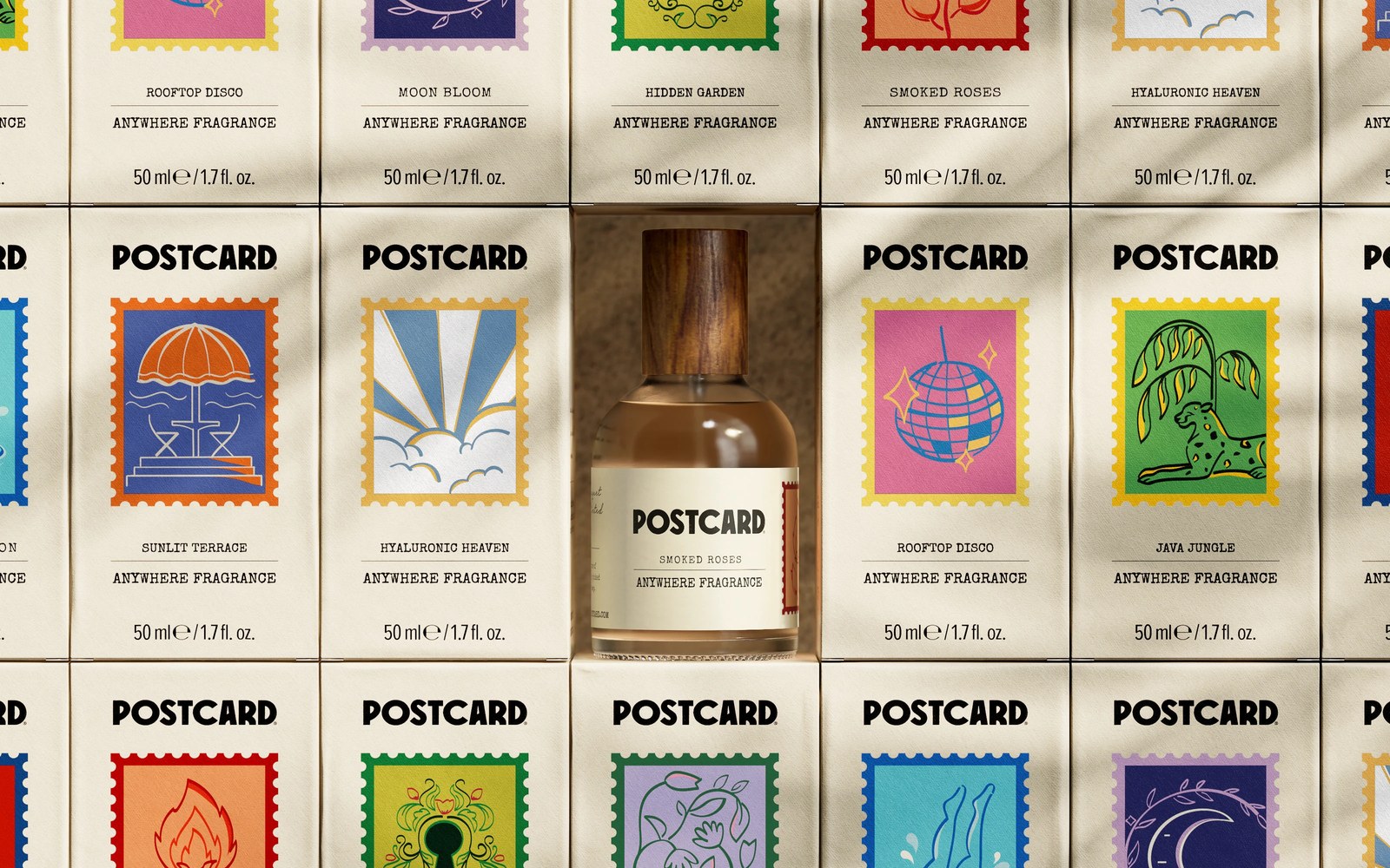
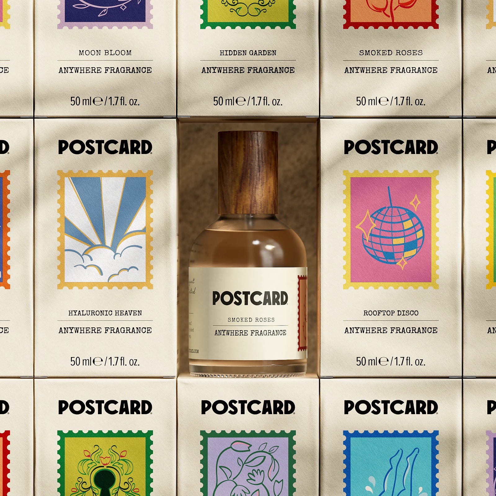
When Singapore's Oasis Beauty Kitchen asked Robot Food for a global rebrand, the brief called for less farmers market and more retail punch. The agency renamed the waterless skincare line Postcard, building the packaging design around vintage postage stamp graphics, warm climate color coding, and sculpted solid cleansing bars that replace multi-step plastic bottles. Every box feels like a piece of correspondence worth keeping.
View Feature on Abduzeedo · See the project by Robot Food on Behance
Nescau Display by Plau Design
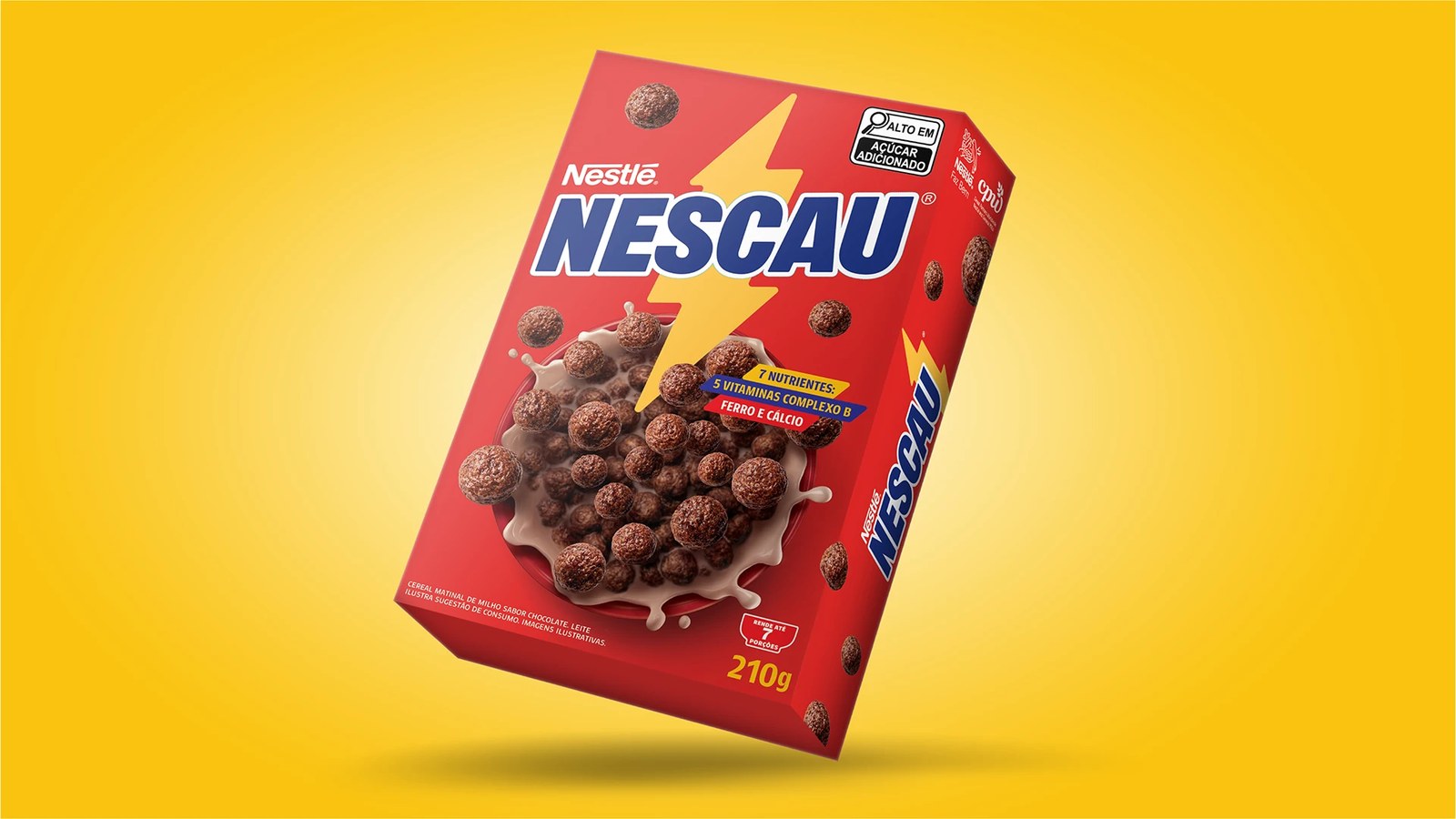
Every household in Brazil recognizes the yellow lightning bolt on a tin of Nescau. Working alongside FutureBrand São Paulo, type studio Plau Design turned that sharp diagonal cut into a 36-style custom typeface system spanning condensed display cuts and compact nutrition weights. Nothing in the grid feels forced. Even the exclamation marks and uppercase G counters carry the brand's signature electric angle without hurting legibility.
View Feature on Abduzeedo · See the project by Plau Design on Behance
Google Go North by Underline Studio
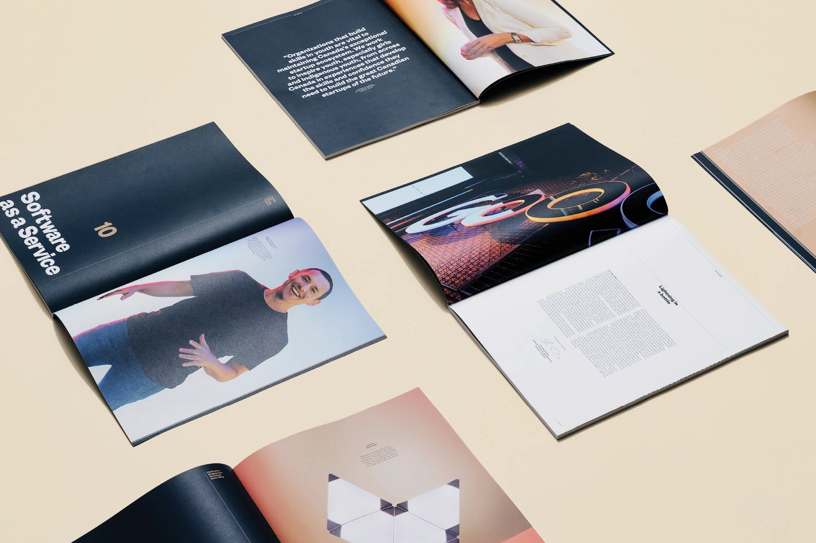
Tech industry reports usually end up gathering dust in a desk drawer. Toronto practice Underline Studio teamed up with VICE and Google Canada to turn Go North into a hardbound editorial book documenting Canadian startup founders across Waterloo, Montreal, and Vancouver. Matte black covers with wireframe contour lettering open into high-contrast chapter dividers, crisp Swiss data tables, and full-bleed studio portraits.
View Feature on Abduzeedo · See the project by Underline Studio on Behance
Galopain by Charline GROEN
Forget the polite pastel café aesthetic. For Parisian warm-bread tavern Galopain, designer Charline GROEN built a medieval-inflected identity rooted in ancient unrefined flours and wood-fired sourdough loaves. Illuminated display initials, woodcut-style emblems, and unbleached kraft bread bags give the bakery an honest, rustic presence that feels pulled straight from an old guild workshop.
View Feature on Abduzeedo · See the project by Charline GROEN on Behance
Vermont State Tourism by DNCO
London and New York agency DNCO drove over 400 miles across 14 New England towns to build Vermont's first dedicated consumer tourism identity. The system pairs Sociotype's Meso typeface with a custom library of woodcut-inspired road-signage icons illustrated by Alyssa McCabe and a flowing script wordmark refined by Rob Clarke. That restraint pays off. Instead of generic autumn leaf clichés, the identity captures the state's dense community of independent writers, makers, and small farms.
Explore the full feature on BP&O
Salt Lick on Salt Creek by Order
Brooklyn studio Order dug deep into print history for Salt Lick on Salt Creek, a high-elevation lavender farm tucked in the Colorado mountains. The identity combines Lineto's Medium and Commercial Type's Caslon Ionic with over 50 modular typographic borders digitized directly from the 1900 American Type Founders specimen book. Paired with moody monochrome photography by Kyle Johnson, those intricate rules frame everything from botanical body oils to printed menus.
Explore the full feature on BP&O
Two Tribes Brewing by All Purpose
London studio All Purpose jolted craft brewery Two Tribes out of predictable beer-aisle minimalism with an acid-yellow and black palette anchored by a twisting five-ribbon circular seal. The typographic pairing does serious work across cans and taproom signage, pitting the rational geometry of Kimera's Melange Grotesk against the technical, machine-readable rhythm of Maxitype's monospaced OCR-X.
Explore the full feature on BP&O
We'll be back next Sunday with another look at the studios and independent designers pushing print, type, and digital interfaces forward. For more daily inspiration, browse our latest features on Abduzeedo.