Four Squares Cafe Is a Masterclass in Cafe Branding
Studio Moara gave Four Squares Cafe a chunky four-square wordmark, a line-drawn blob mascot, and a warm green-and-rust identity for lingering.
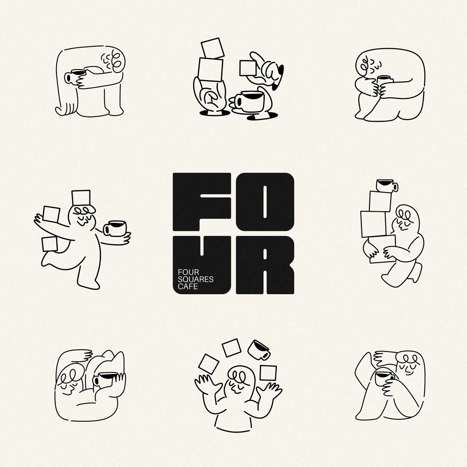
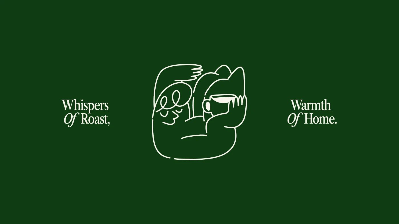
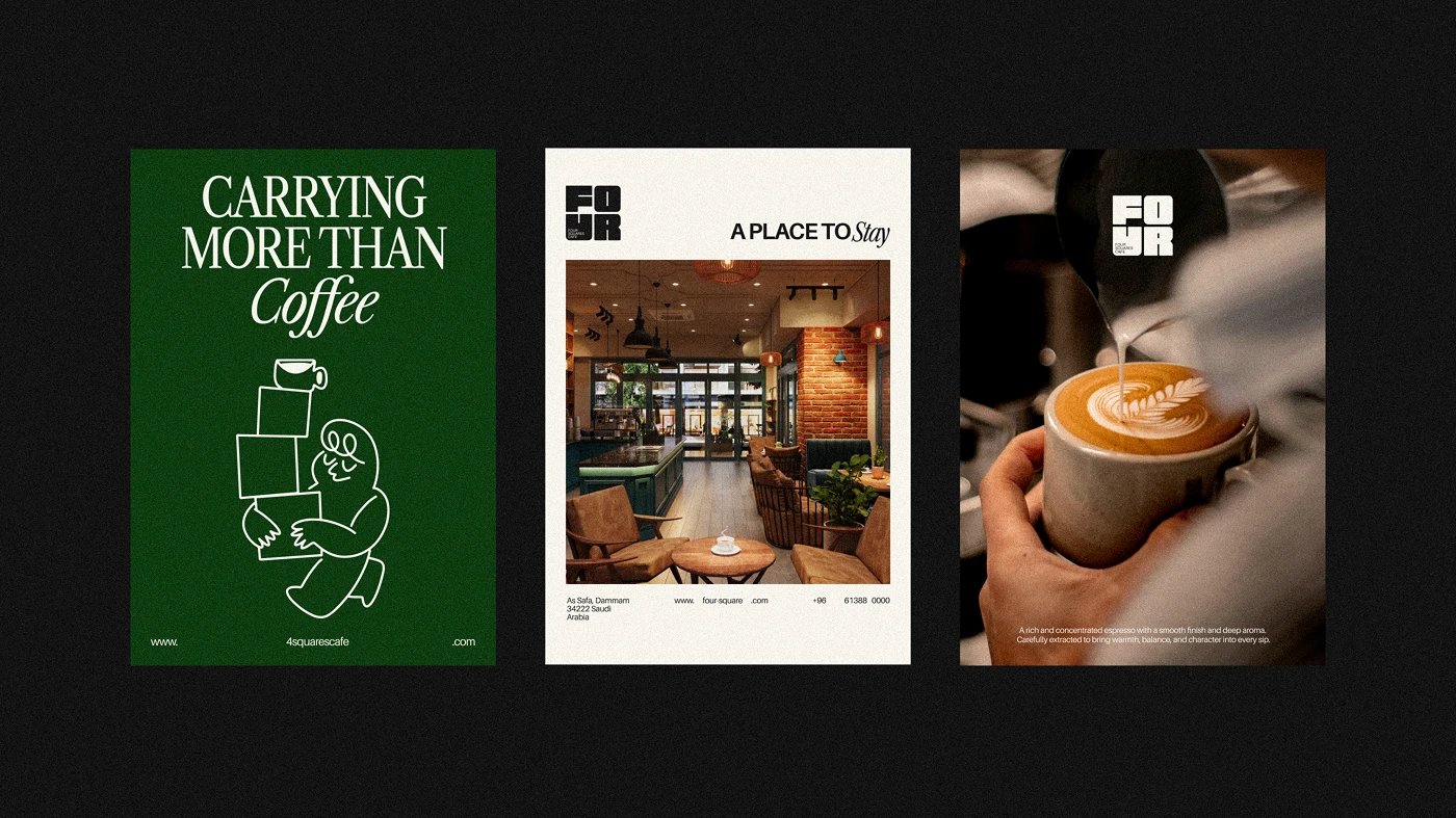
Most cafe identities choose between type and character. Four Squares Cafe takes both and makes them share a grid. The wordmark stacks F-O-U-R into a literal two-by-two square of fat, custom block letters, each filled with its own pattern, so the name doubles as a floor plan for the brand. Next to it sits a soft line-drawn blob of a mascot, hugging a coffee cup, drawn with one continuous wobble that undercuts the type's architectural weight. Deep green, brick rust, and golden ochre do the talking over cream and oat milk grounds, and the system reads as warm without going heavy. It is an identity built for the Saudi cafe's whole promise: coffee as a reason to connect and stay a while.
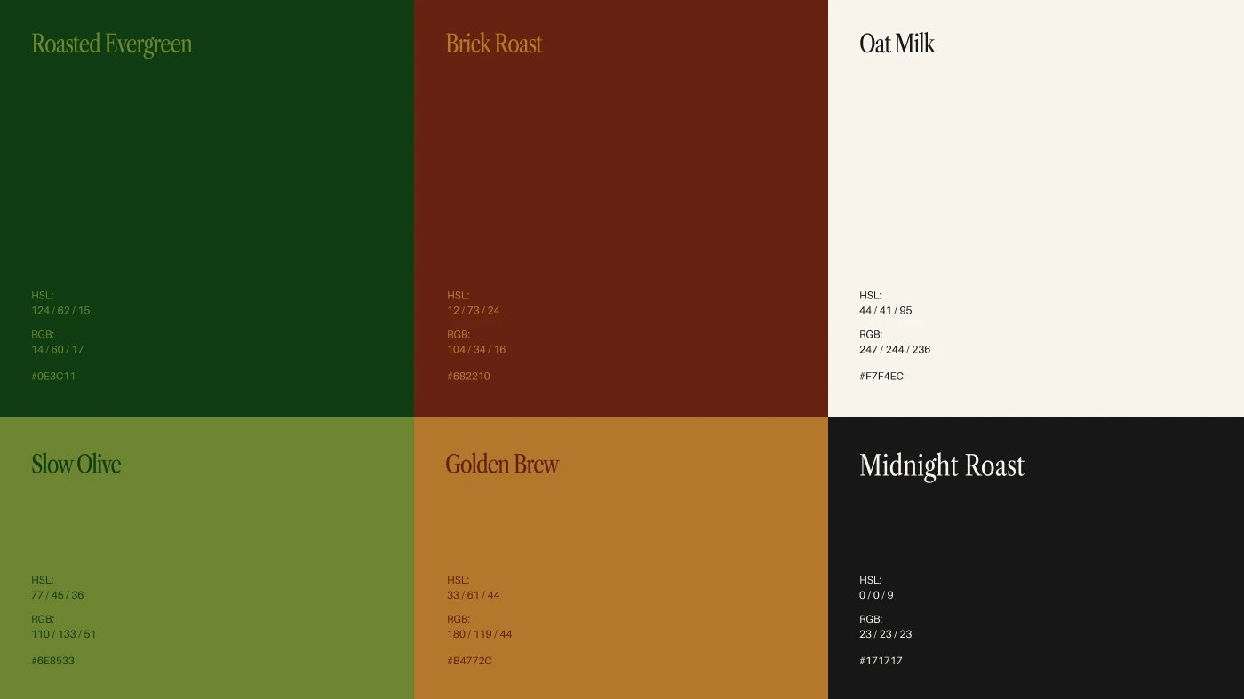
Four Squares Cafe: a wordmark built like a floor plan
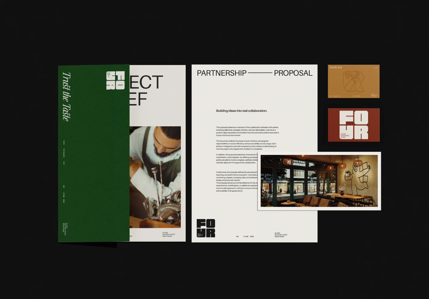
Typography is the system here. The blocky FOUR anchors signage, cards, and packaging at architectural scale, while a quieter layer of italic serif accents ("for STAYING," "for COMFORT") and small-caps microcopy ("Since 2016," "Made to be enjoyed, not rushed") gives the voice its warmth. The mascot earns its own specimen sheet: the blob pours, carries, waves, and naps across a grid of poses, which proves the character works as a repeatable drawing system instead of a one-off doodle. Nothing is decorative for its own sake; every mark carries the comfort brief.
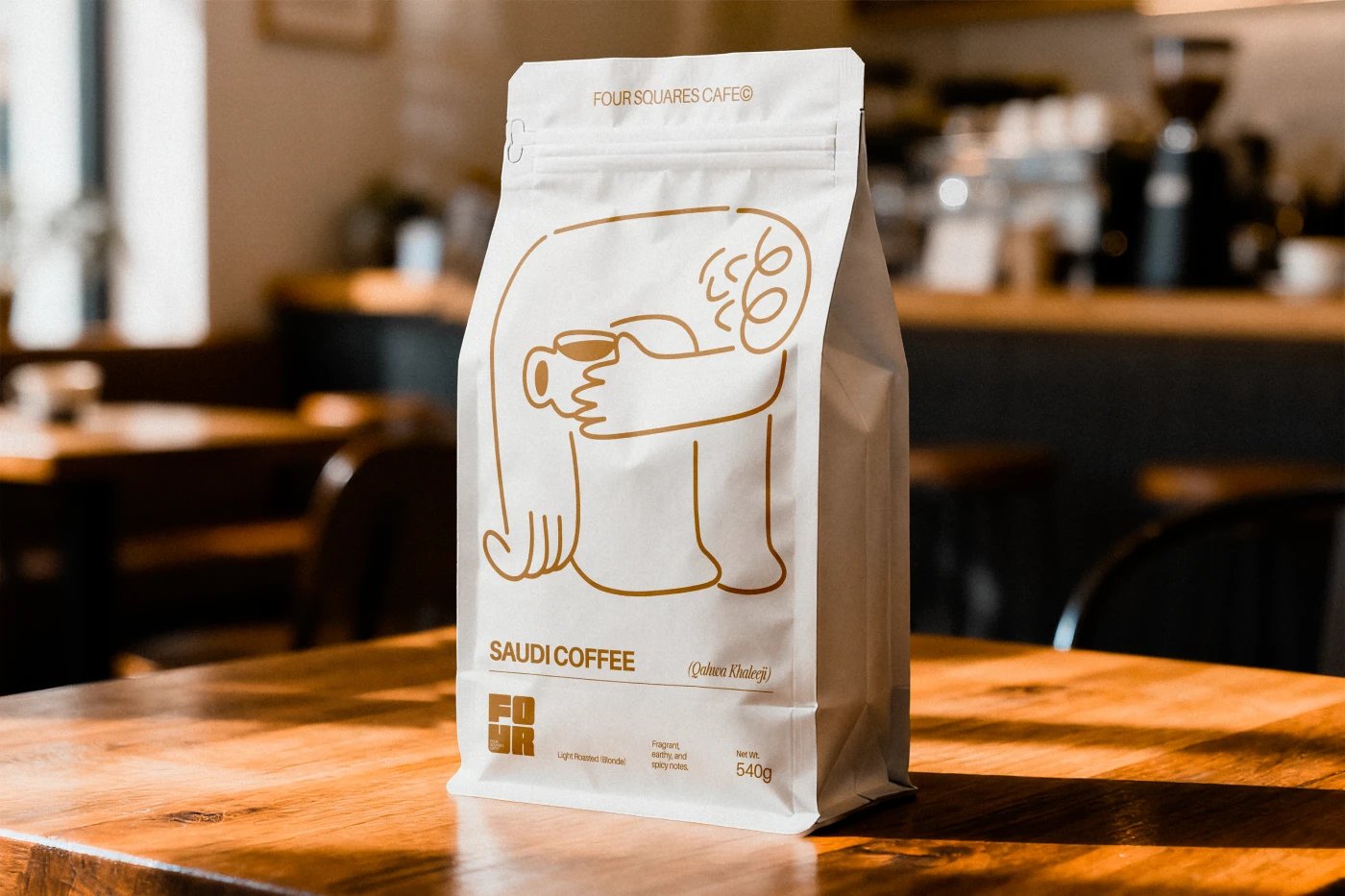
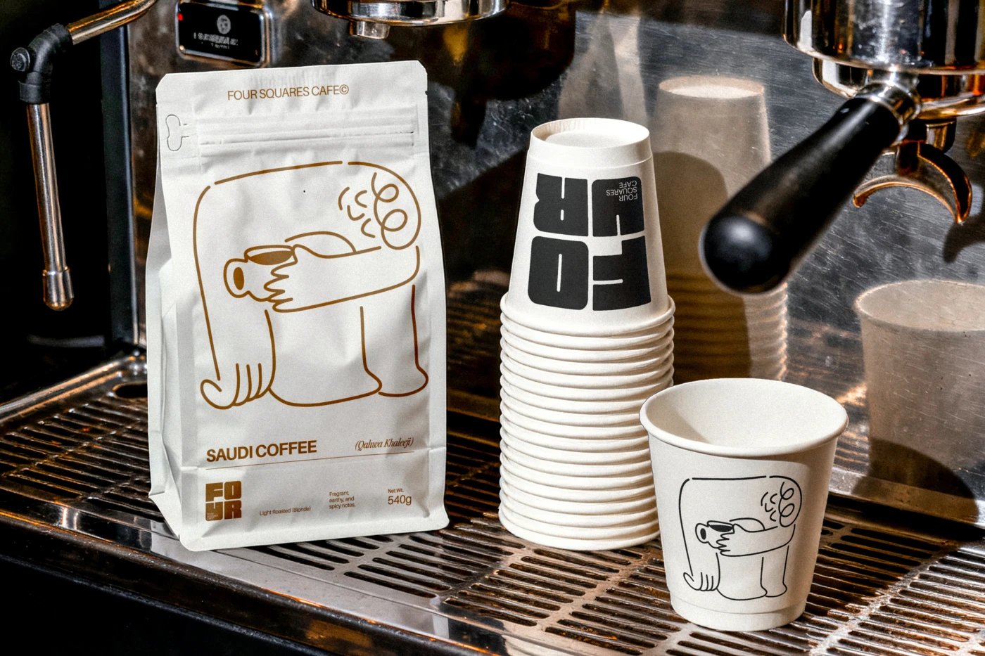
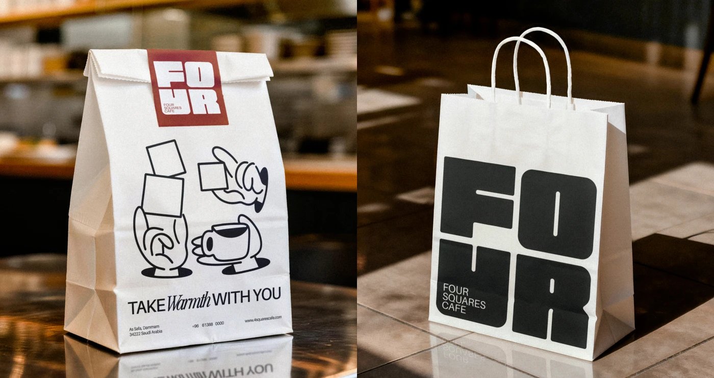
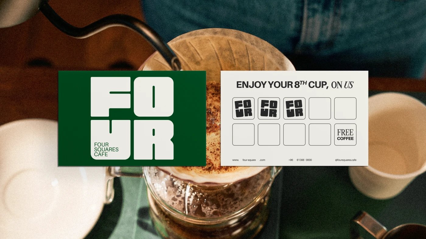
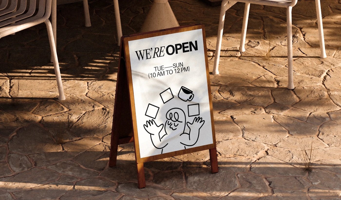
Packaging carries the identity into the hand. White retail bags wear the mascot as a full-wrap line drawing, takeaway cups stack the blocky FOUR against cream sleeves, and a kraft carrier holds the pair for the trip home. The loyalty card keeps the same economy: a cream card stamped with the four-square mark and a promise of the eighth cup free. Out front, a cube sign and an illustrated A-frame take the mascot onto the sidewalk, so the system reads from the street all the way to the saucer.
See more from Studio Moara on Behance.