Oslo Tennisklubb: Brand Identity by Garcy Studio
Oslo Tennisklubb by Garcy Studio is a brand identity uniting 125 years of tennis heritage with expressive typography and web design.
Oslo Tennisklubb has been part of the city since 1900. Garcy Studio took on the challenge of giving that 125-year history a sharper expression without wiping away what members already love. The original emblem stayed at the center. Its crossed rackets, tennis ball, and 1900 founding year were redrawn with cleaner proportions and linework so the badge holds up everywhere from court nets to tiny mobile icons. Pairing a heavy, expressive “Oslo” with a lighter “Tennisklubb” gives the wordmark real visual tension. Nothing feels dated.
Brand Identity and Multi-Typeface System
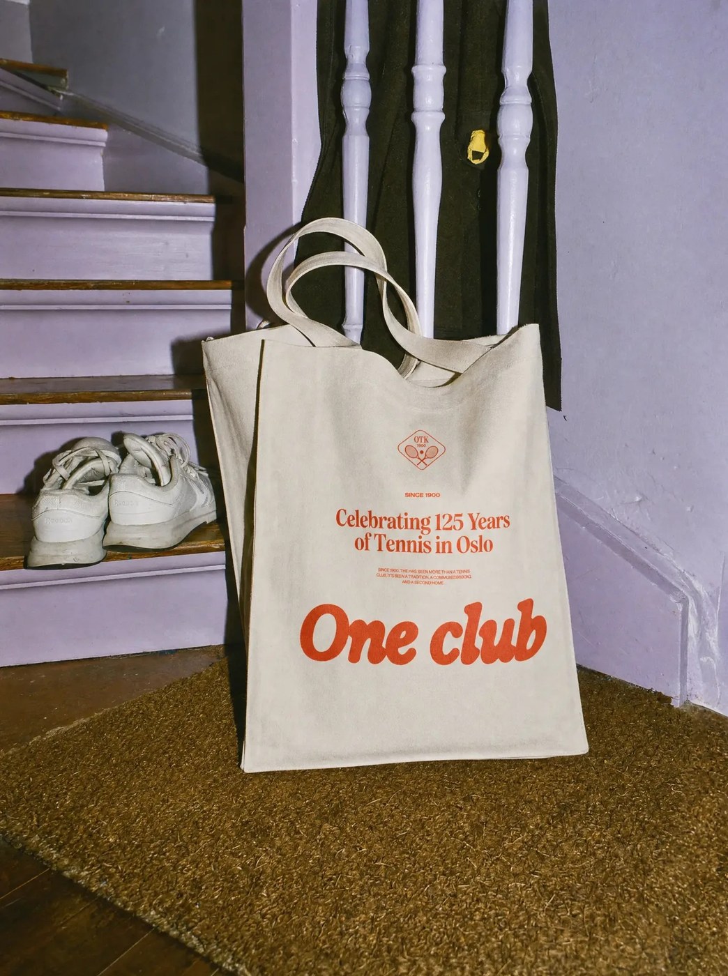
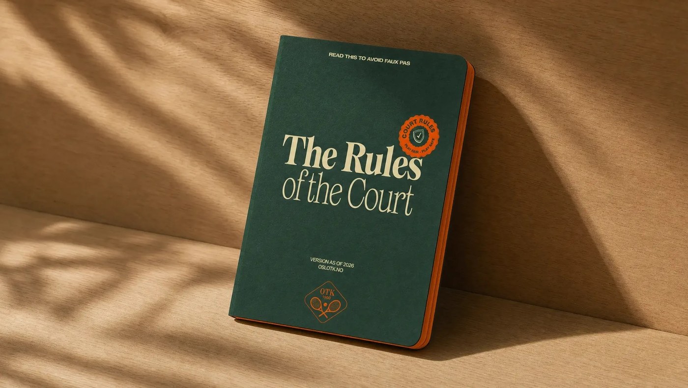
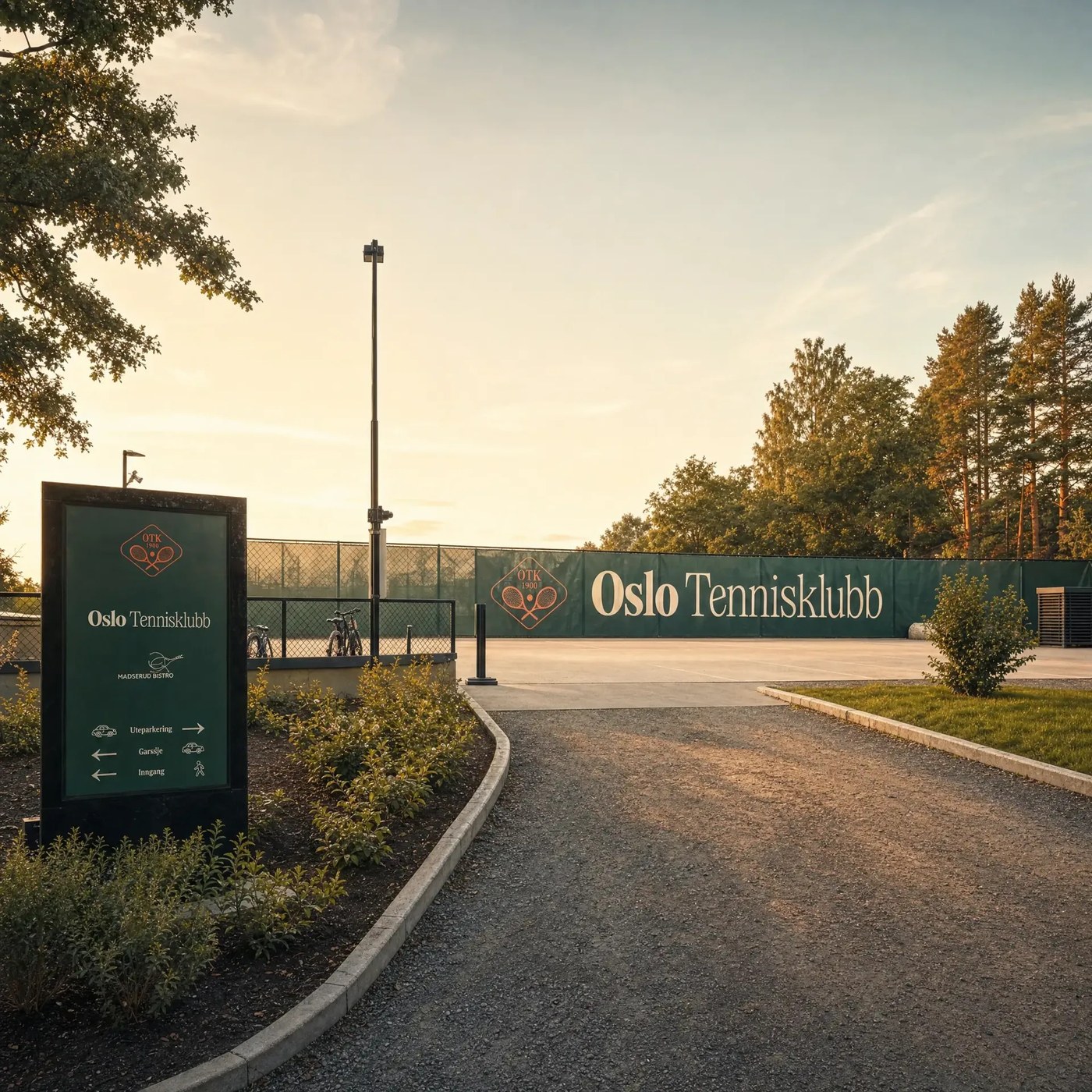
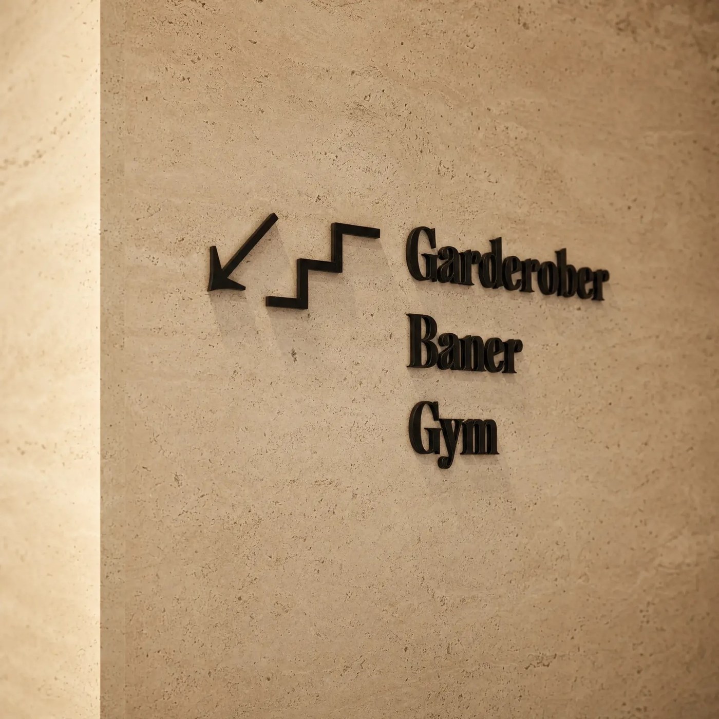
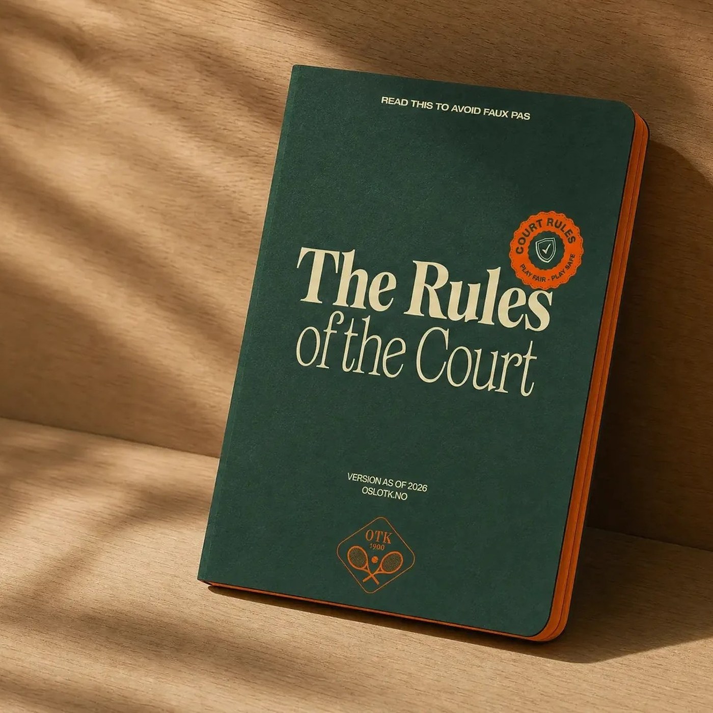
One font rarely does every job well. Garcy Studio built this brand identity around four distinct typefaces, each assigned a specific role across print, merchandise, and digital screens. Helvetica Extended brings structure and confidence, Tartuffo carries the institutional heritage weight, Restart adds an expressive contemporary voice, and Exposure Italic introduces human movement. You can see that interplay right away on the dark green and orange-edged The Rules of the Court booklet, the “One club” canvas tote bag, the outdoor facade banners, and the stone directional signage for the changing rooms, courts, and gym.
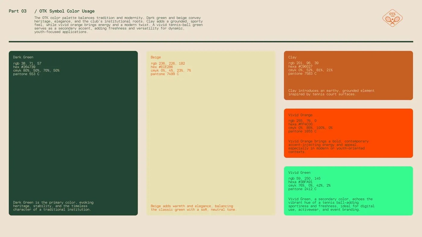
The color palette anchors the brand identity in heritage Dark Green (#264739) and warm Beige (#ECE2B6), then punches it up with earthy court Clay (#C96027), Vivid Orange (#FF4C00), and tennis-ball Vivid Green (#3BFA91). A comprehensive brand manual turns those tokens, hand-drawn illustrations, stickers, and motion rules into a practical system that creates freedom for partners rather than rigid templates. That same spirit drives the new club website, where each page acts as a flexible canvas that shifts tone for longtime members, families, and first-time players discovering the club.
See more from Garcy Studio on their official website.