Inside COLLINS’s Branding for Crane Stationery
Explore the Crane branding by COLLINS, pairing 250 years of American cotton papermaking with engraved crests and cloth-bound keepsake boxes.
Paper has real weight here. Stephen Crane founded his Massachusetts paper mill in 1770, selling sheets to Paul Revere for the American colonies' very first paper currency before becoming the official banknote supplier to the U.S. Treasury in 1801. Two and a half centuries later, even with digital messages dominating daily communication, demand for heavyweight cotton correspondence hasn't vanished. Still, European luxury houses like Smythson and Montblanc were steadily eating into Crane's retail shelf space. Crane brought in COLLINS to sharpen its prestige and rethink how physical paper lives in a modern home, framing the entire effort around etiquette in society, business, politics, and personal correspondence.
Engraved Craft and Tactile Branding for Modern Correspondence
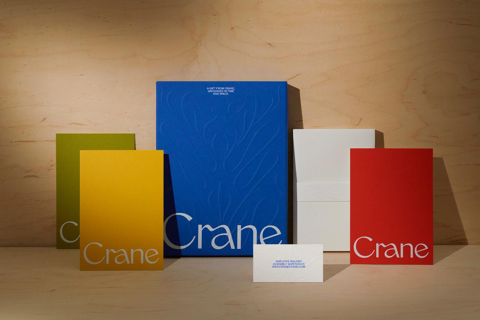
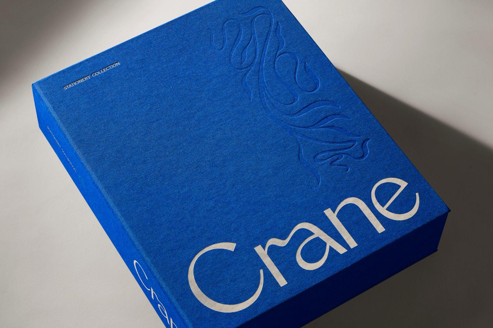
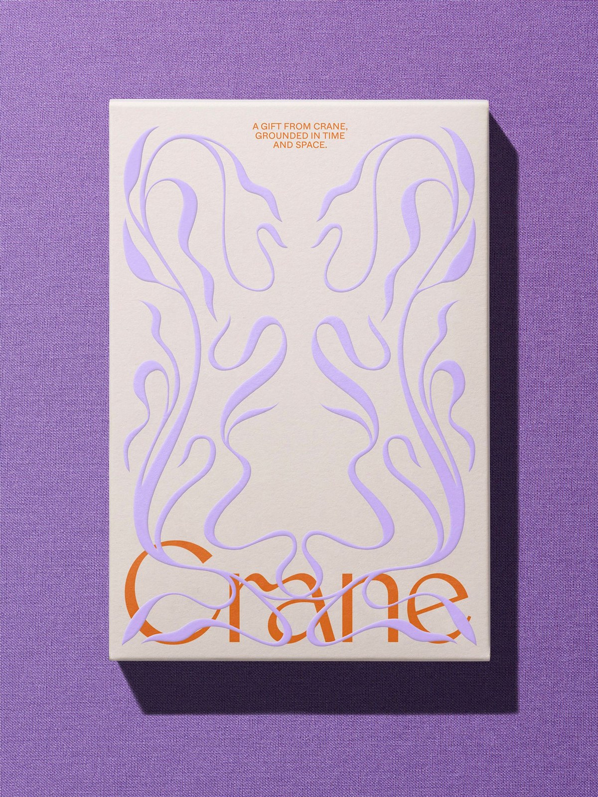
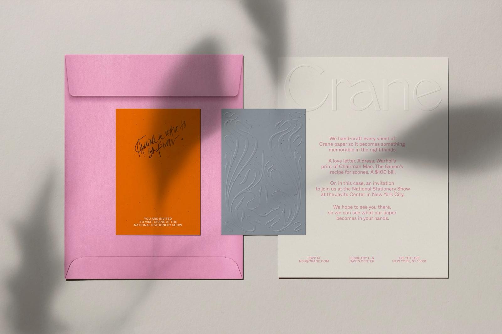
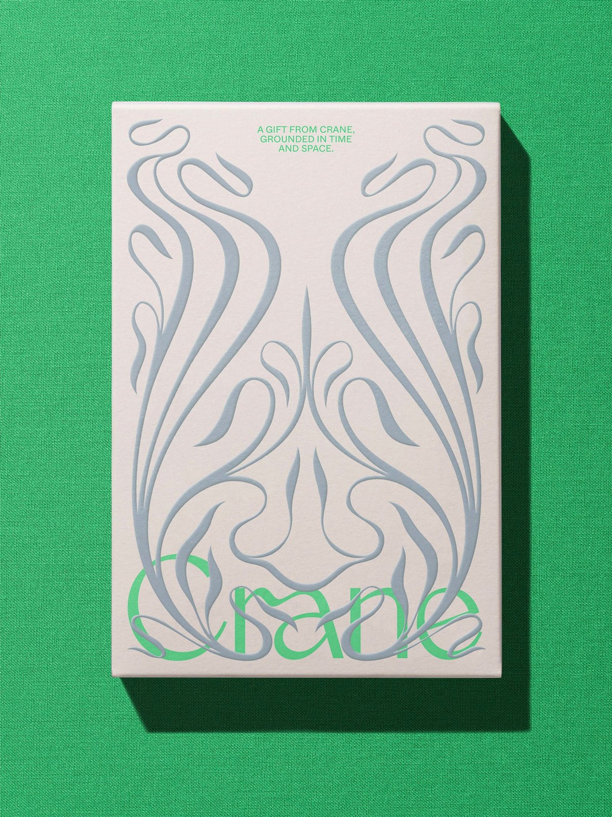
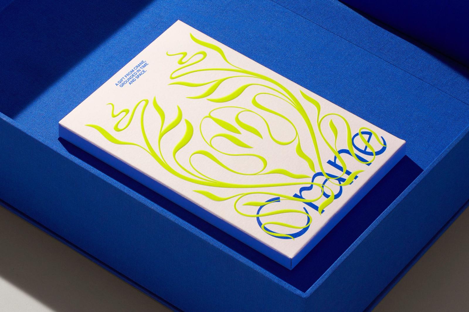
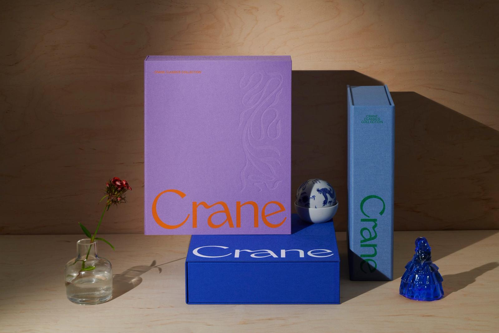
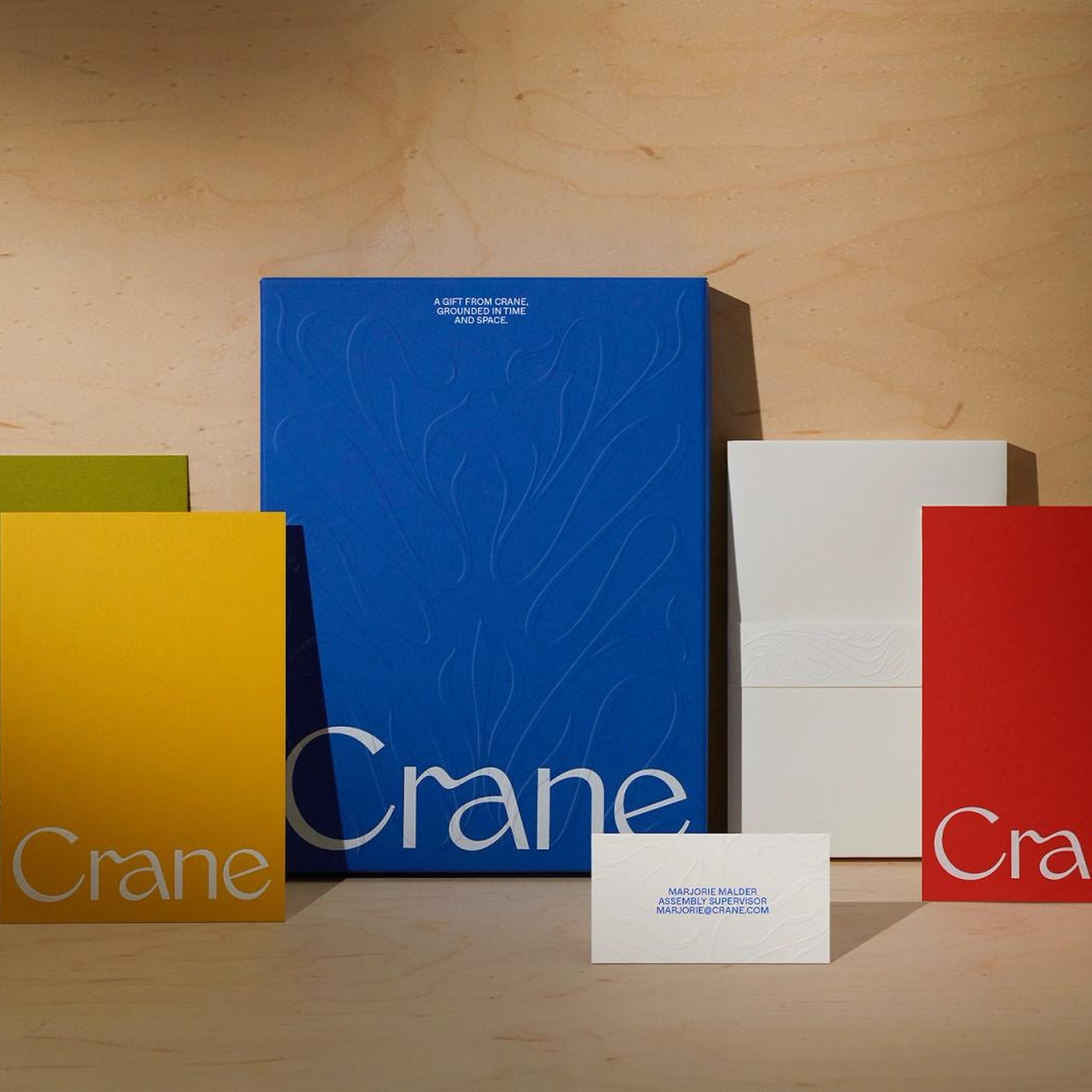
The type does the heavy lifting right away. COLLINS drew a high-contrast serif wordmark anchored by a fluid, ribbon-like ligature that loops the arch of the lowercase r directly into the bowl of the a. It feels classic without looking dusty. Set flush along the bottom edge of the boxes in InDesign, the logotype gives the upper two-thirds of every surface room to breathe. Across the inner sleeves and National Stationery Show invitations, billowing botanical scrollwork refined in Illustrator rises in thick, sculptural relief, looping directly through the letterforms in acid chartreuse, pale lilac, and slate blue.
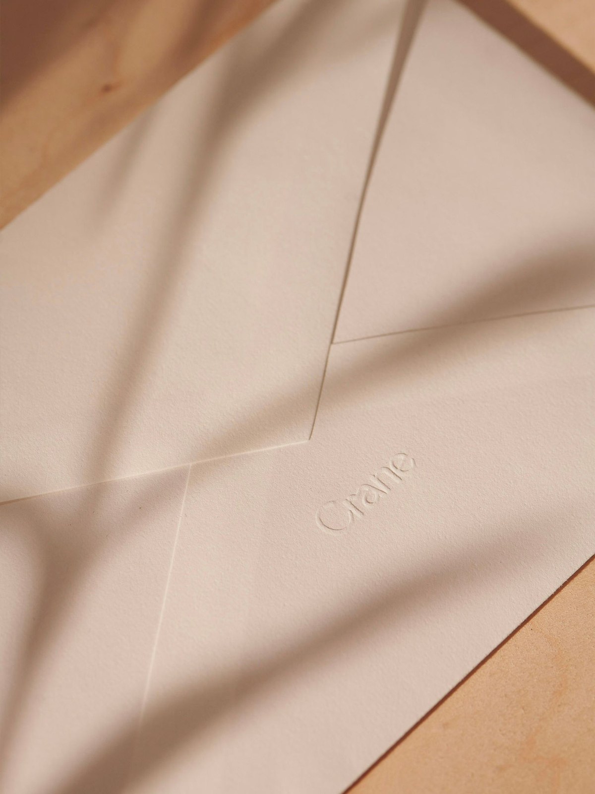
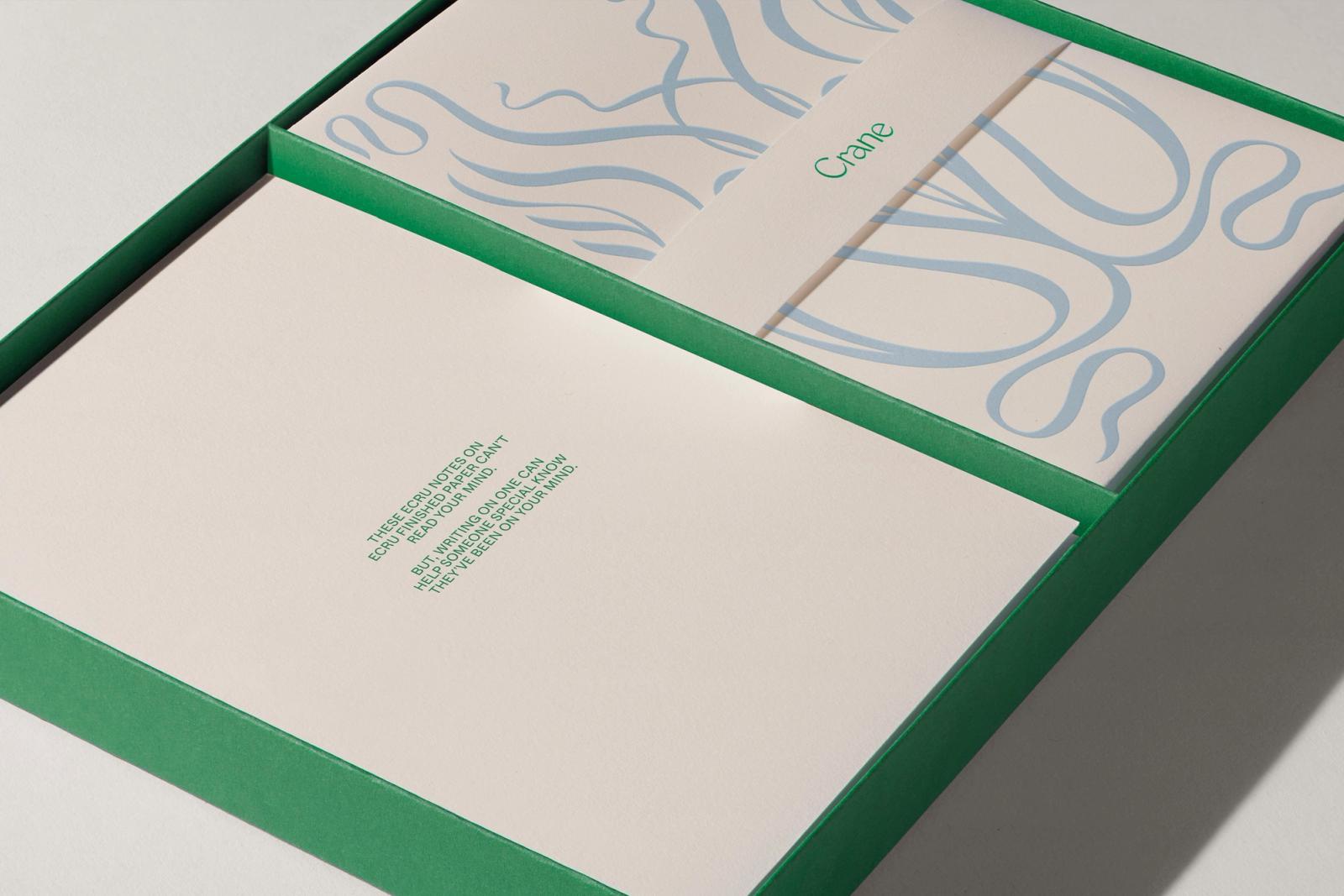
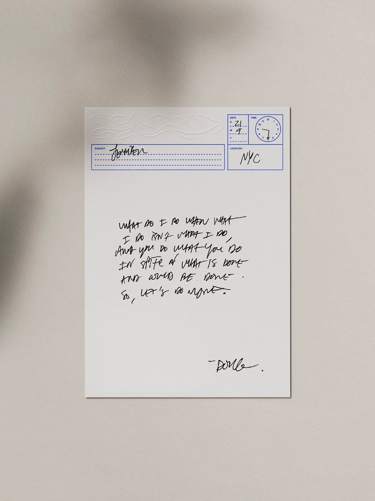
Most stationery boxes end up hidden in a desk drawer. COLLINS wanted these out on the coffee table. They kept the signature Crane blue — dialing up its cobalt saturation across woven bookcloth, and paired it with unexpected combinations of violet and burnt orange, slate and forest green, plus saffron and crimson folders. Inside the trays, ecru cotton note sheets feature playful blue utility stamps with an analog clock face to log the exact date, time, and city of a handwritten note, while blind-debossed envelopes open to reveal metallic silver and lavender linings.
See the full project by COLLINS on COLLINS.