Typography: PP Altera Variable Typeface by Pangram Pangram
Explore PP Altera, a shapeshifting variable typeface and typography system by Pangram Pangram Foundry with 9 families, 3 axes, and 72 styles.
Picking a typeface usually means locking yourself into a single mood early on. If you start a layout in a clean neo-grotesk and suddenly need a sharp, high-contrast flare or a warm editorial text cut, you end up hunting for a second font family and praying the x-heights play nice together. With PP Altera, the team at Pangram Pangram Foundry built a single variable system that mutates across all of those roles without ever breaking its underlying skeleton.
Typography Built on Mythological Metamorphosis
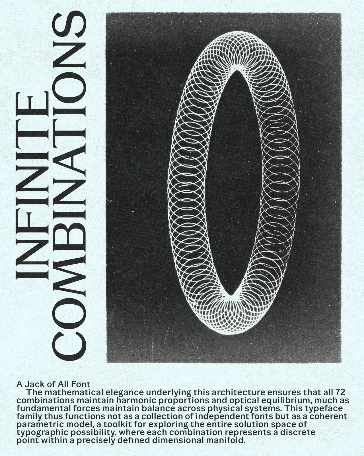
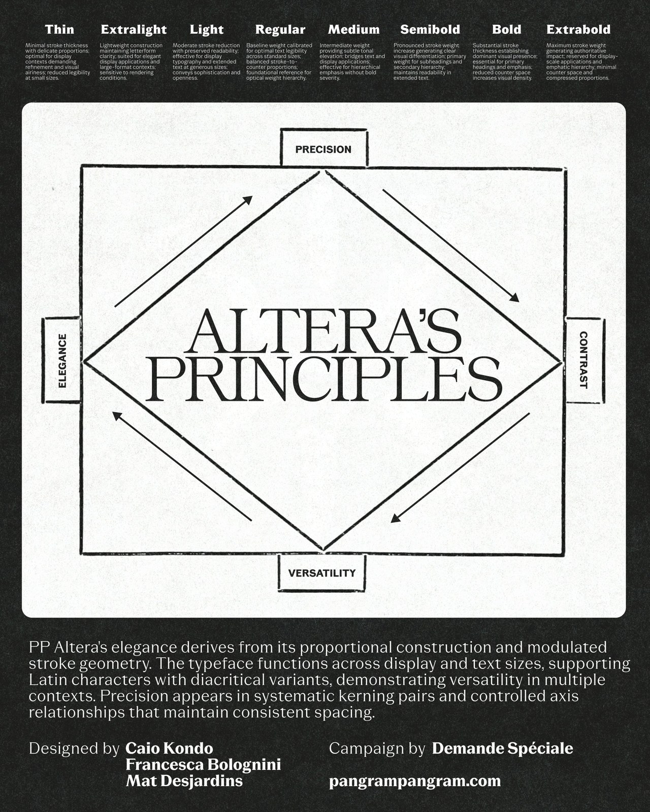
Drawing its concept from the constant shapeshifting of Greek mythology and the Latin word alter ("other" or "another"), PP Altera treats letterforms like fluid identities rather than fixed statues. Designed by Caio Kondo, Francesca Bolognini, and Mat Desjardins, the release packs 3 variable axes, 9 distinct sub-families, and 72 total styles (510 glyphs per cut) onto one shared metric structure. Because every cut shares the same foundational proportions and systematic kerning pairs, you can jump from a utilitarian body paragraph to an extravagant display header without your grid shifting by a millimeter.
Nine Families, Three Axes, and a Vintage Scientific Campaign
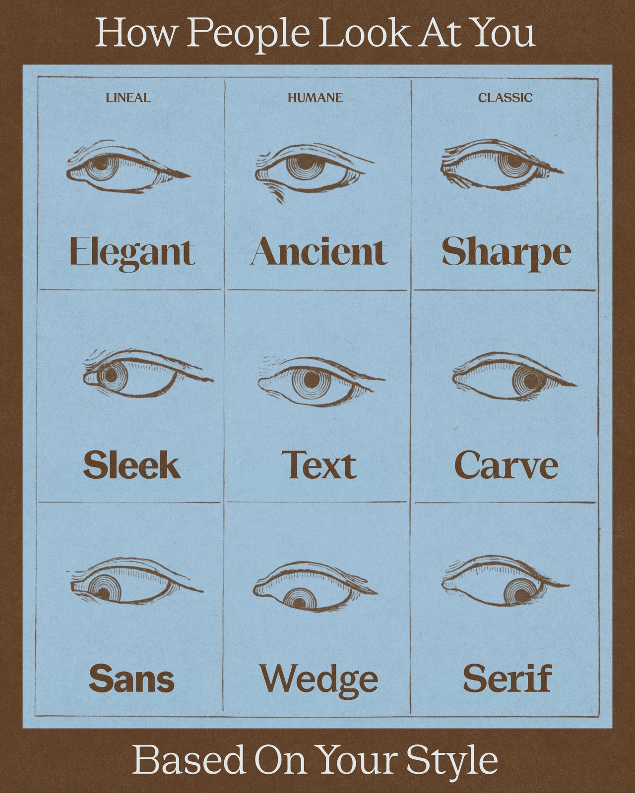
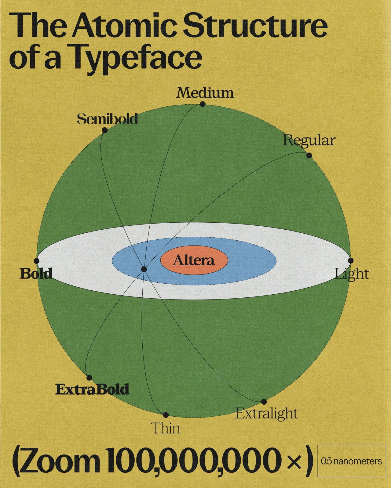
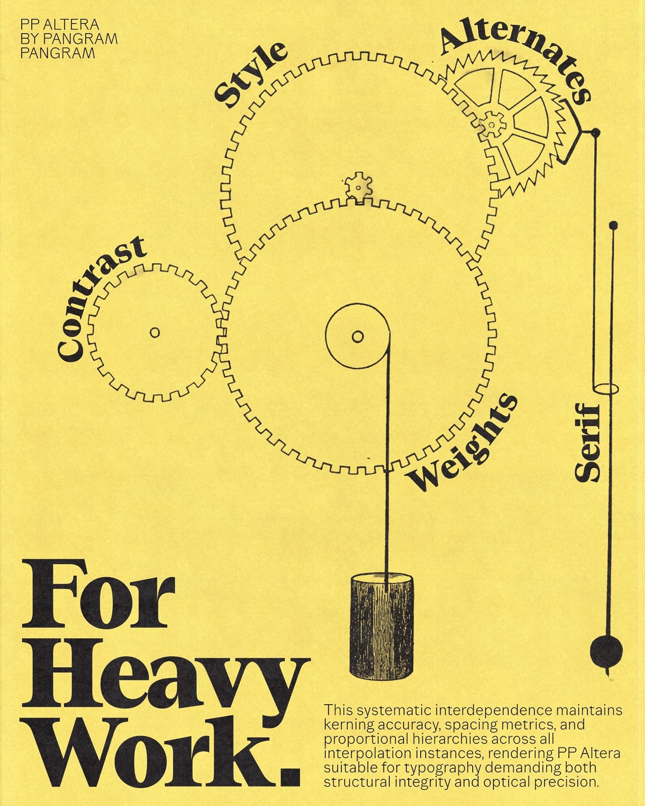
Look at the nine voices mapped out across the system's three primary columns. The Lineal group houses Elegant, Sleek, and Sans; the Humane column spans Ancient, Text, and Wedge; and the Classic lineage introduces Sharpe, Carve, and Serif. Each of those nine cuts runs through eight calibrated weights from Thin to Extrabold. Sliding across the variable axes lets you dial in exact stroke modulation, terminal sharpness, and serif presence on the fly.
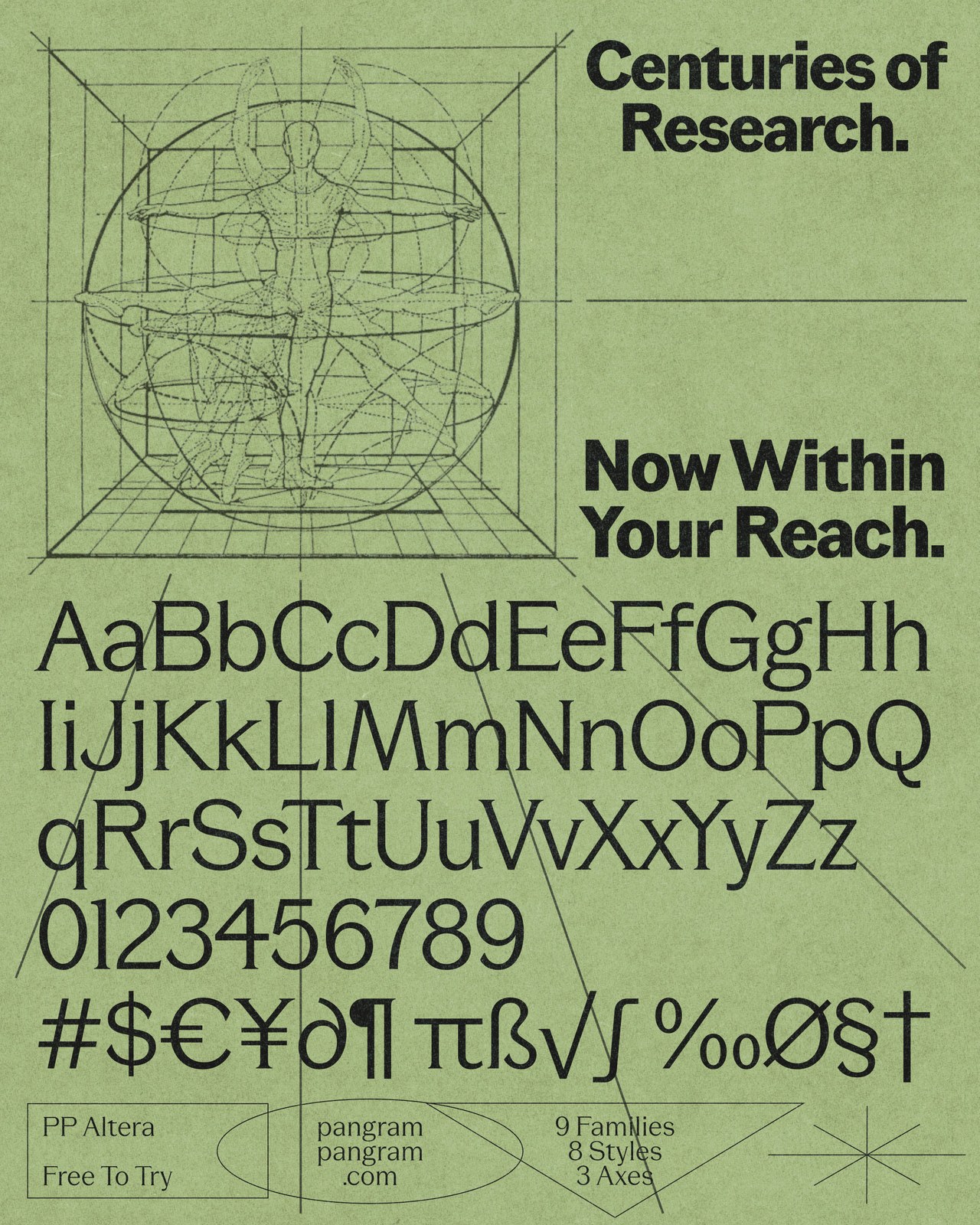
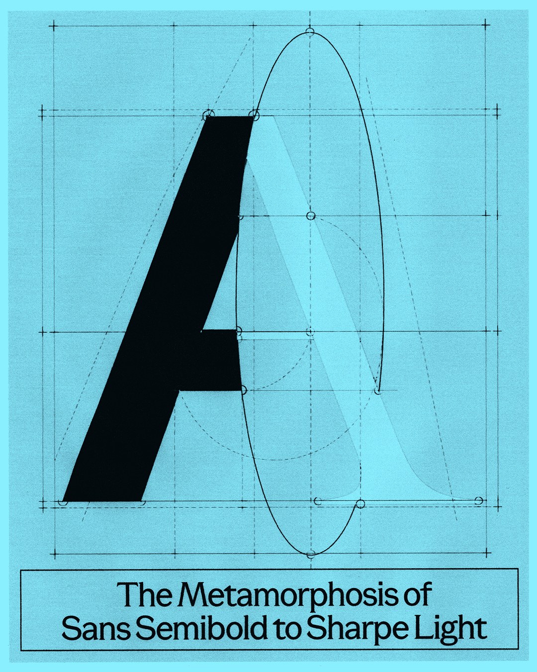
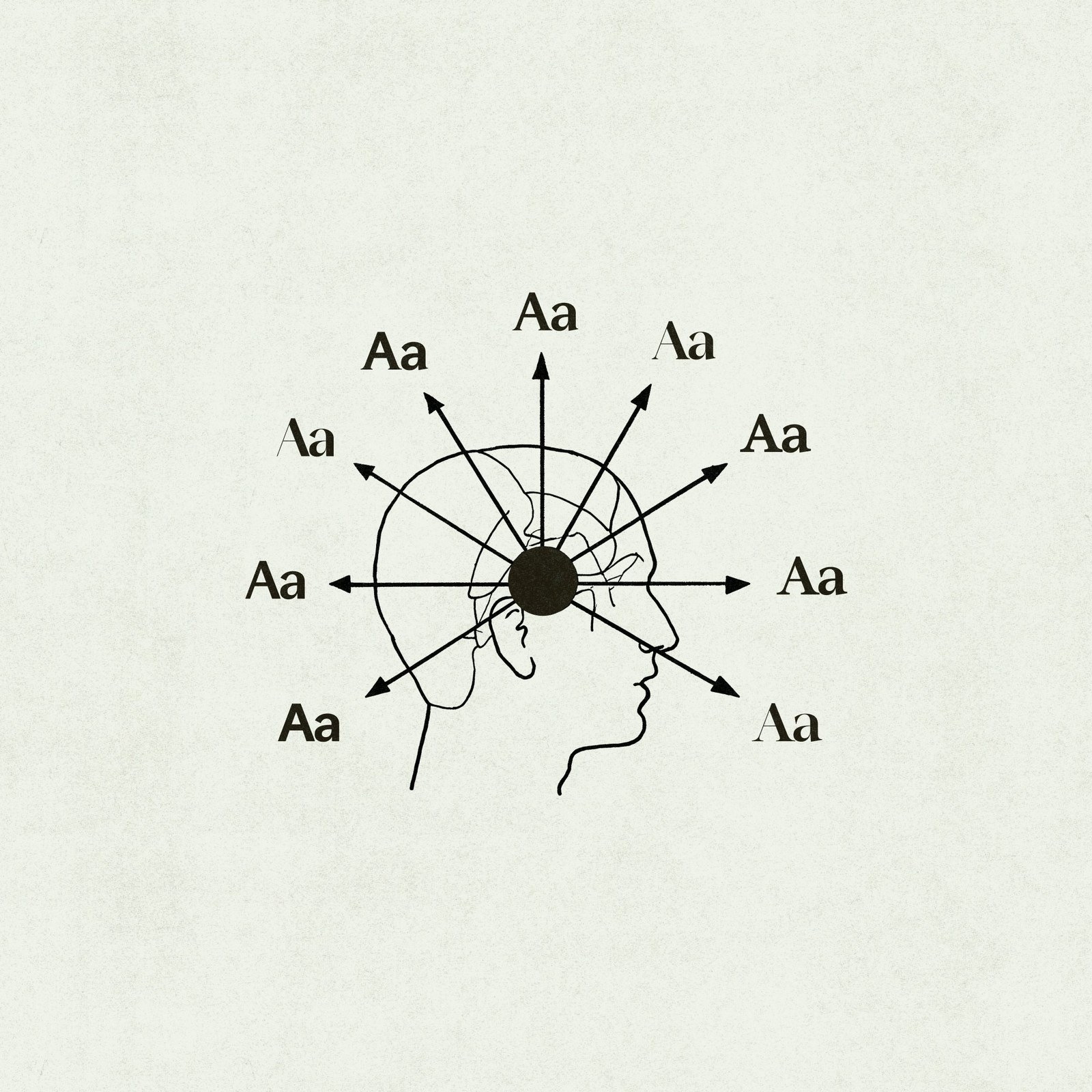
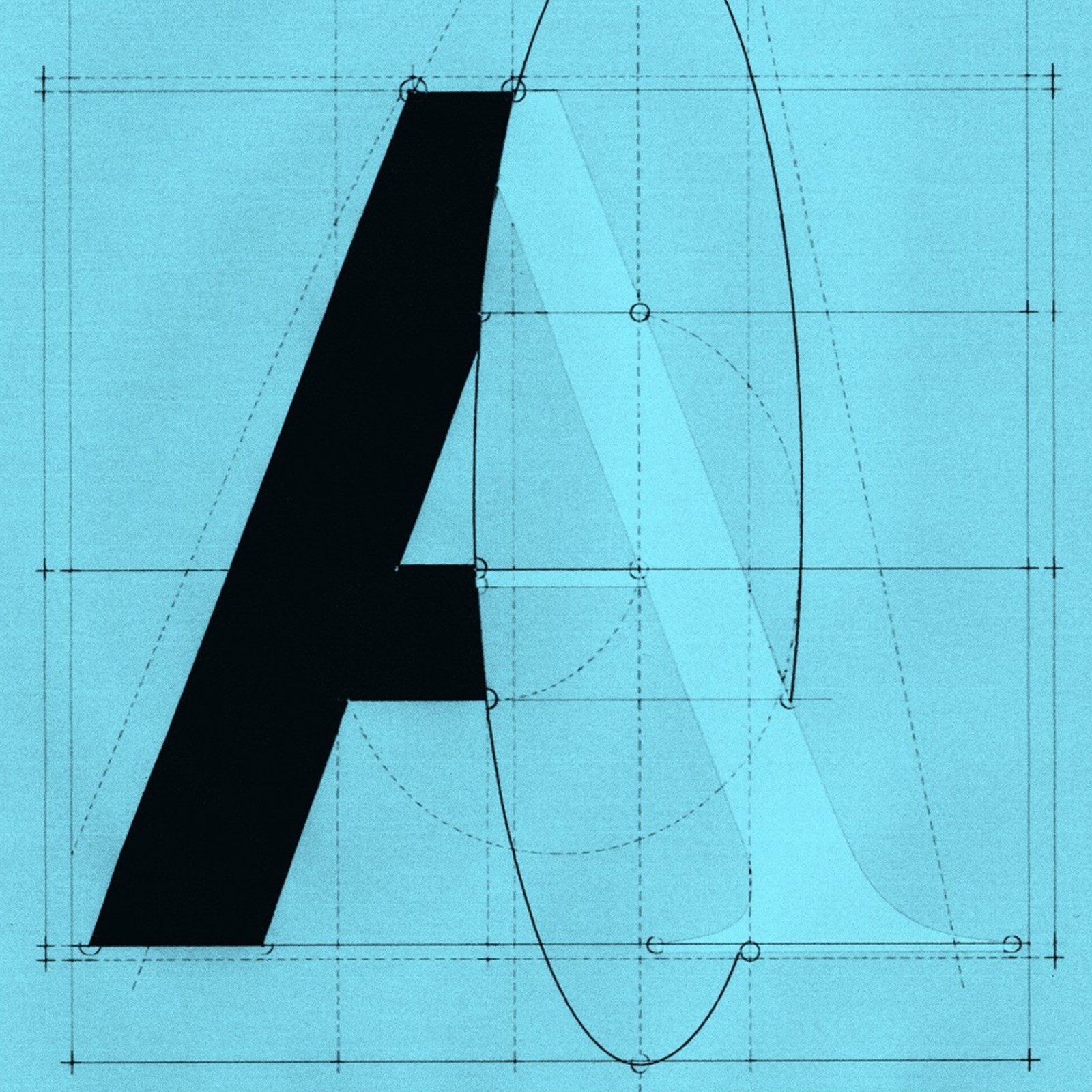
To launch the release, creative studio Demande Spéciale crafted a series of tactile, mid-century scientific specimen posters that make the math behind variable typography feel tangible. Diagrams of interlocking brass-era gears, orbital atomic weight rings zoomed in at 100,000,000x, and Vitruvian proportion grids break down how Sans Semibold morphs cleanly into Sharpe Light. It is a rare super-family that adapts to the project in front of you instead of forcing your layout to bend to its rules.
See the full project by Pangram Pangram Foundry on their website.