Riserva Brasitália Specialty Coffee Branding and Packaging
Riserva Brasitália explores specialty coffee packaging, blending detailed line art, gold foil crests, and rich color systems.
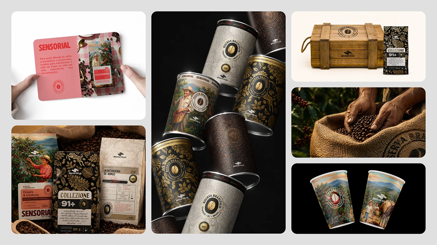
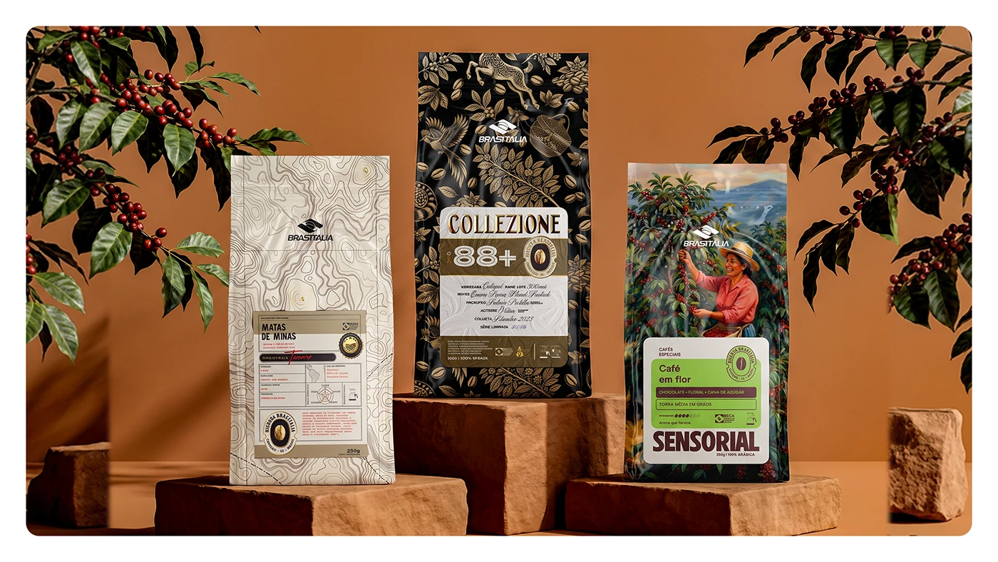
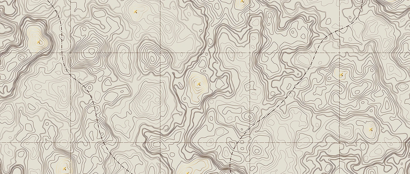
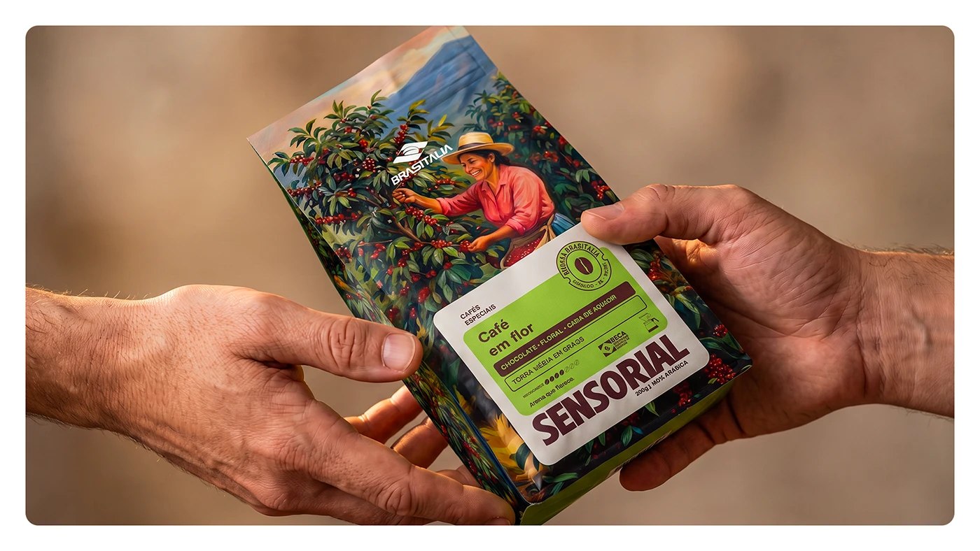
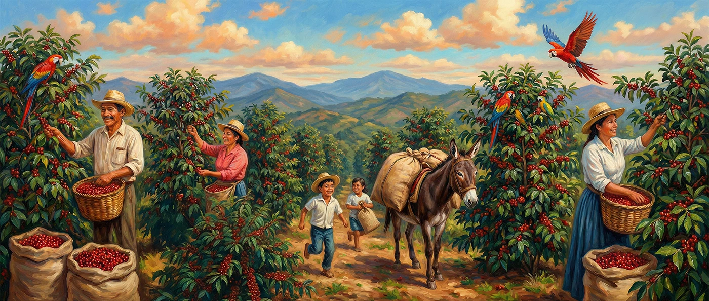
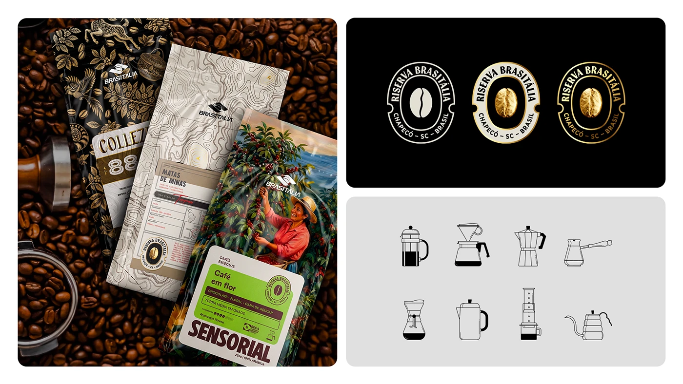
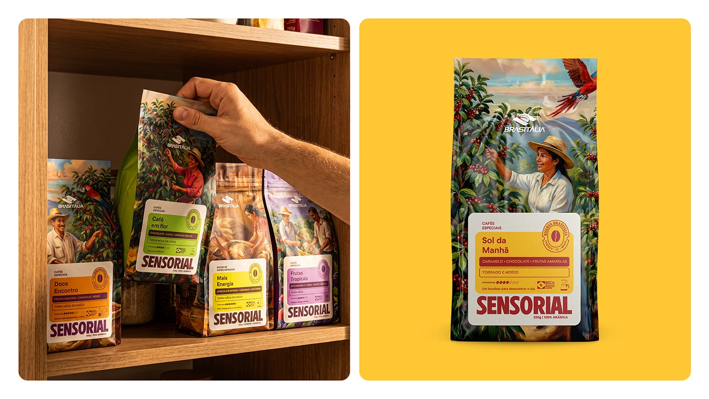
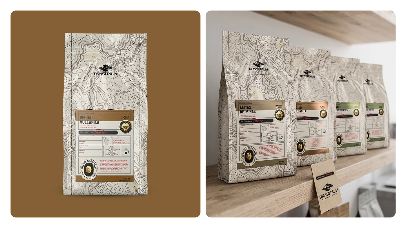
Designed by Pablo Eduardo Frandoloso, Chaminé Branding, Matthew Corseuil, and Lamaisson Marques dos Santos, the work divides coffee into three clear coffee lines. Each coffee line uses distinct art themes to show bean origin and flavor. The Sensorial set highlights bright floral art and warm color fields. The Terroir line features topography maps printed on clean paper bags. The Collezione set displays dark botanical art with gold foil seals. Clean fonts keep origin details, roast levels, and tasting notes easy to read. Each bag design guides customer choice with clear label placement. Small icon badges show farm height and farm steps.
Systemic Architecture in Specialty Coffee Packaging
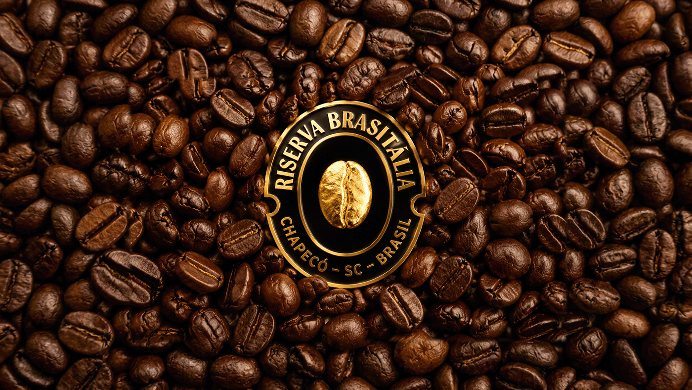
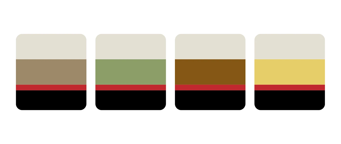
The visual grid relies on clear order across every bag, tin, and crate. Gold foil crests mark premium coffee tins and wood shipping boxes. Each coffee packaging layout pairs bold art with functional text placement. Color code bands mark flavor notes on front labels. Smooth paper bags contrast with gold foil stamps to create soft depth. Custom badges and seals give each roast a distinct feel. The grid structure keeps text clear across small gift tins and large shipping crates. Each detail reflects care for the coffee bean.
By uniting brand strategy with fine print work, the system reveals the unique value of every harvest. The specialty coffee packaging balances rich farm heritage with clean modern design. Custom label rules maintain clear order across all three coffee lines. Gold seal details and fine line maps turn daily coffee bags into memorable objects. Explore the full project gallery by Pablo Eduardo Frandoloso, Chaminé Branding, Matthew Corseuil, and Lamaisson Marques dos Santos. This series stands as a fine study in coffee design and modern packaging.