Voluta: Inside Tiago Araujo's New Visual Identity
Tiago Araujo crafts an architectural visual identity for Voluta, merging Brazilian modernist furniture restoration with modular cobogó geometry.
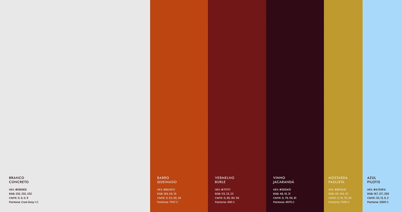
Voluta operates on a clear premise: Brazil is bound for modernism. The studio restores mid-century furniture and curates handcrafted ceramics. Designer Tiago Araujo built the project around this design legacy. He anchors historic preservation directly into modern living. This visual identity celebrates authentic Brazilian material culture. Visual tension emerges as concrete forms meet warm organic textures. Araujo rejects sterile gallery tropes. Instead, he introduces a palette honoring national design history. The system features Branco Concreto, Barro Queimado, and Vermelho Burle, named after Roberto Burle Marx. It also integrates deep Vinho Jacarandá, Mostarda Paulista, and soft Azul Pilotis.
Architectural Geometry and Modernist Visual Identity
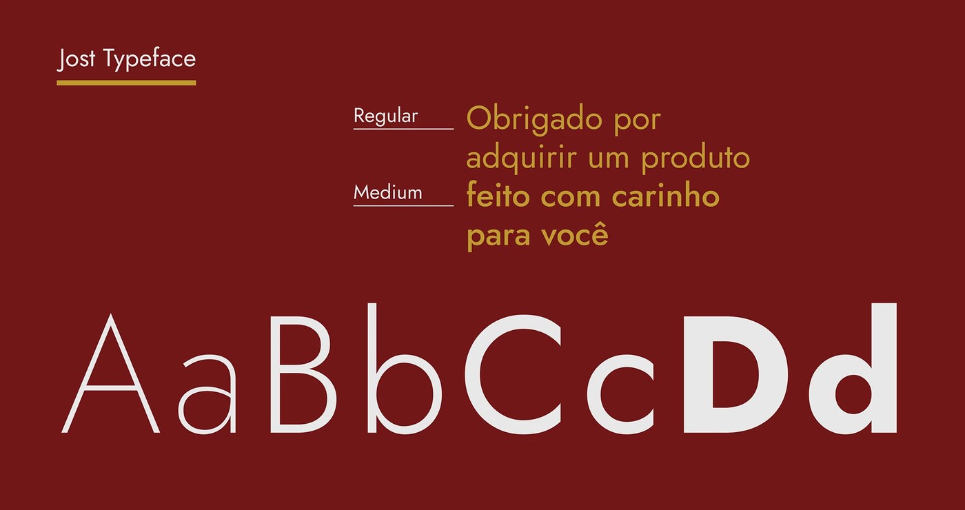
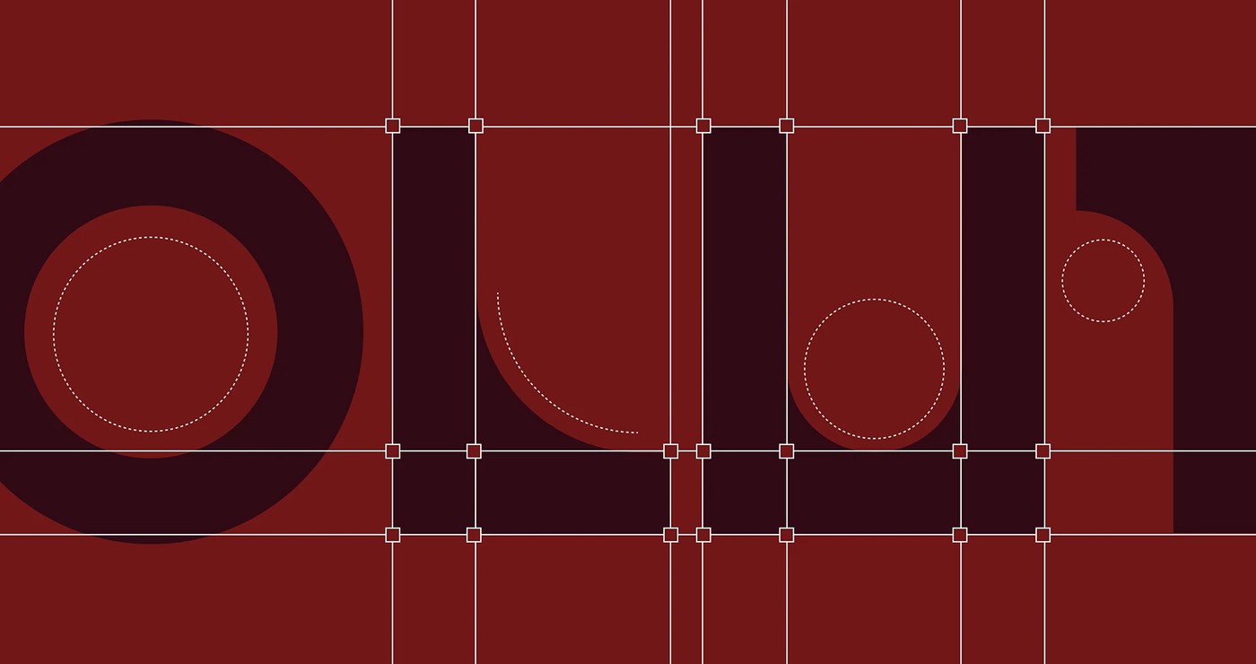
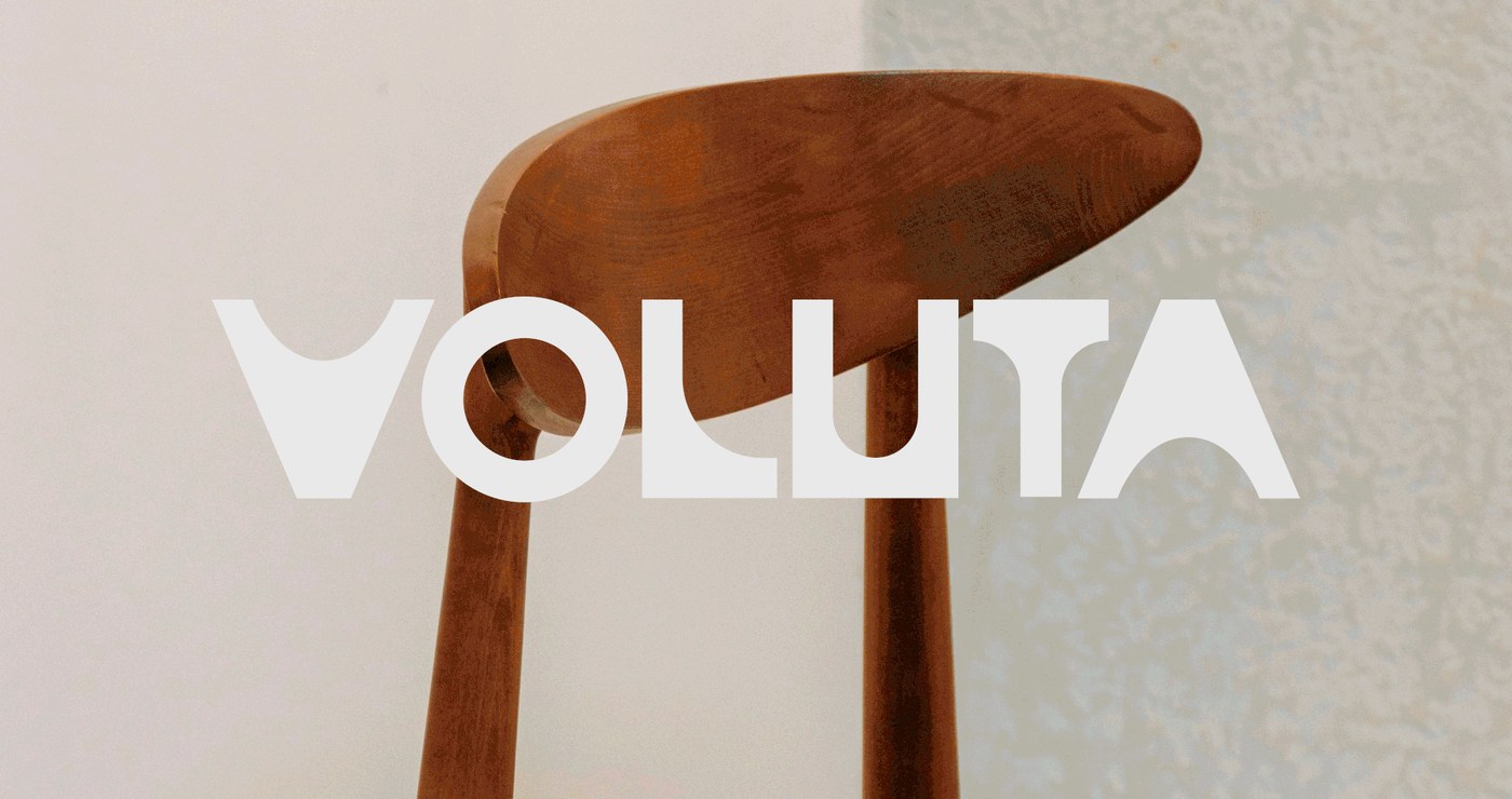
The core logotype reflects structural symmetry and concrete mass. It draws direct inspiration from Oscar Niemeyer's columns and Futura's geometric discipline. Araujo drafted custom letterforms with strict bezier curves. The initial letter V echoes a sculpted architectural pillar. Each glyph maintains consistent stroke weights and balanced circular geometry. Beyond typography, Araujo unfolded each character into a modular graphic system. This language evokes traditional Brazilian cobogó breeze blocks. These perforated patterns shift fluidly between solid forms and open space. They function as dynamic borders and graphic accents across brand applications. For text layouts, the brand pairs the mark with the Jost typeface. Set in Regular and Medium weights, Jost ensures crisp legibility across print collateral.
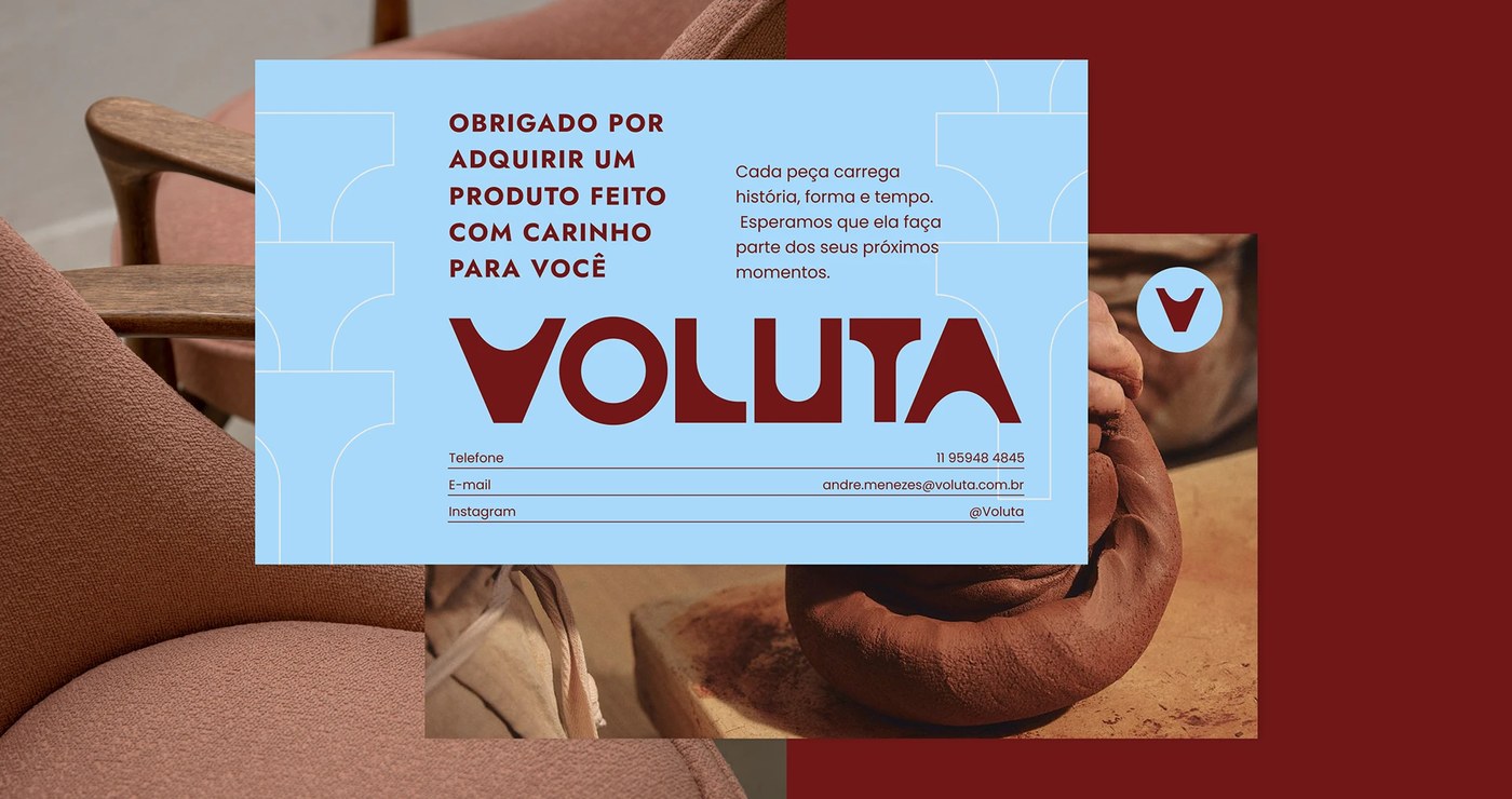
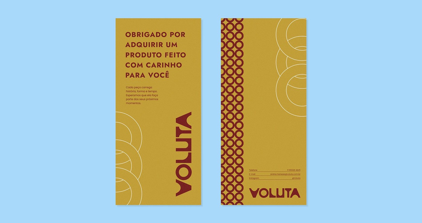
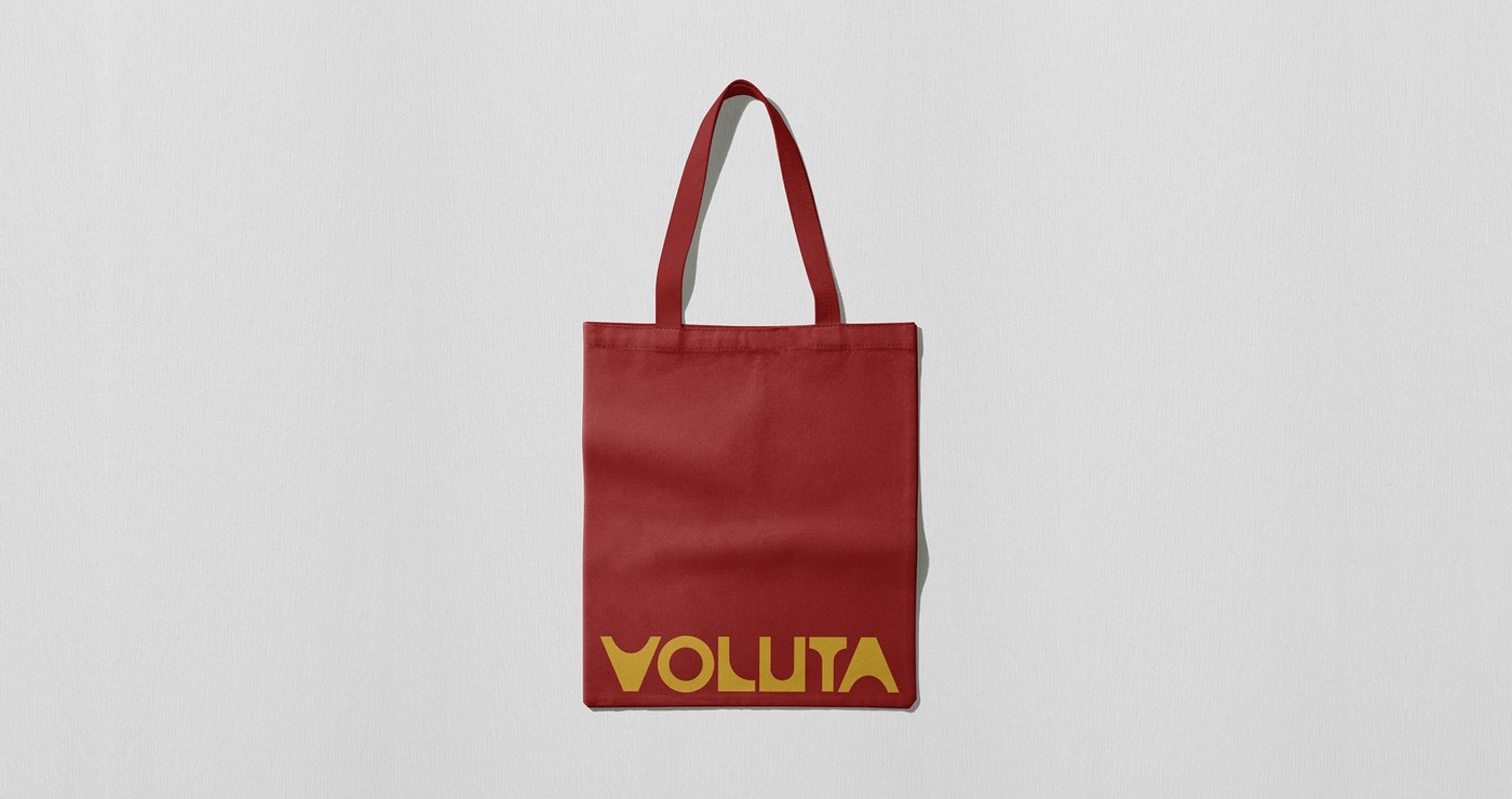
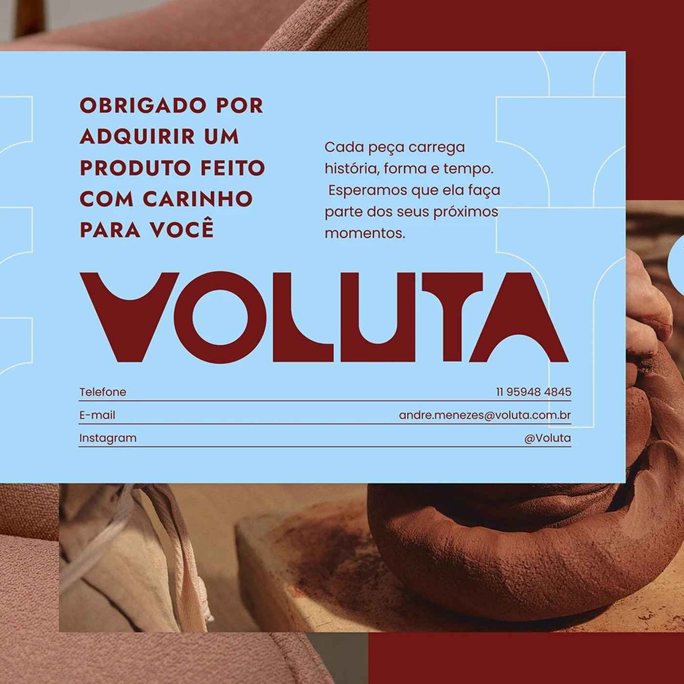
Physical collateral bridges digital precision with raw tactile craft. Slender cards in Mostarda Paulista feature repeating cobogó patterns alongside acquisition notes. Customer postcards in Azul Pilotis present the bold Vermelho Burle mark next to workshop photos. These prints capture restored lounge chairs and wet clay ceramics. Printed on heavy uncoated paper stock, the pieces complement the tactile grain of vintage jacarandá timber. A red cotton canvas tote carries the golden logotype across its base. From ceramic workshop tags to restoration certificates, this comprehensive visual identity translates Brazilian architecture into a tactile brand system.
See more from Tiago Araujo on Behance.