Branding: Gunnersbury Park Museum Identity by Wiedemann Lampe
Wiedemann Lampe gave Gunnersbury Park Museum identity a centenary refresh, building it around playful icons and confident yellow wayfinding.
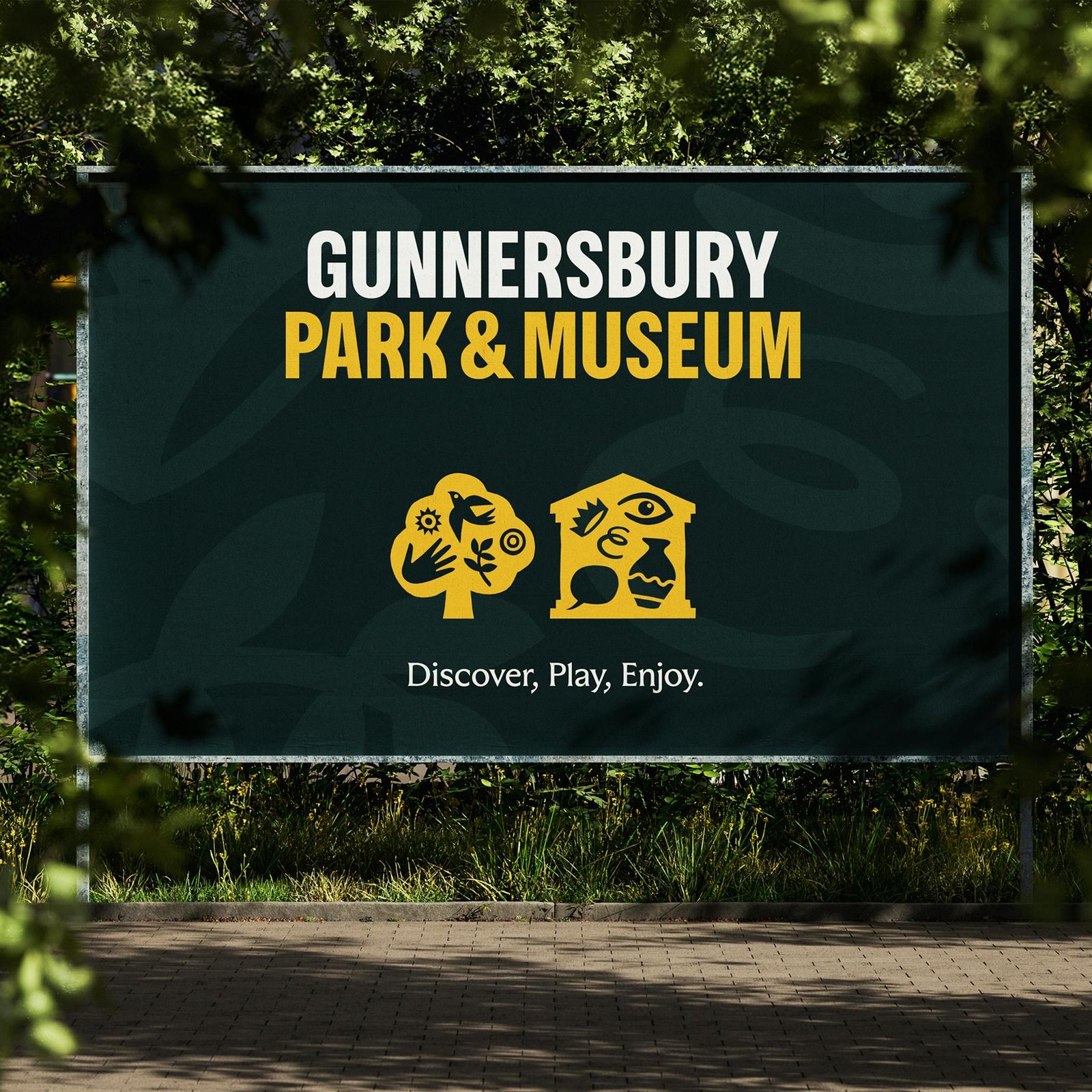
The brief had real tension. Gunnersbury is 72 hectares of Grade II listed parkland in West London, once home to royalty and Rothschilds, now a free space that belongs to everyone: picnickers, dog walkers, Park Runners, wedding parties. More than a million people visit each year, yet many regulars had no idea the museum existed. The new identity had to read as a civic institution and a playground at once. Wiedemann Lampe answered with a system built on icons: hand-drawn birds, hands, suns, eyes and vases that fill the shapes of a tree and a museum, a folk-art emblem for a place that holds many different lives.
The Gunnersbury Park Museum identity, from signage to stickers
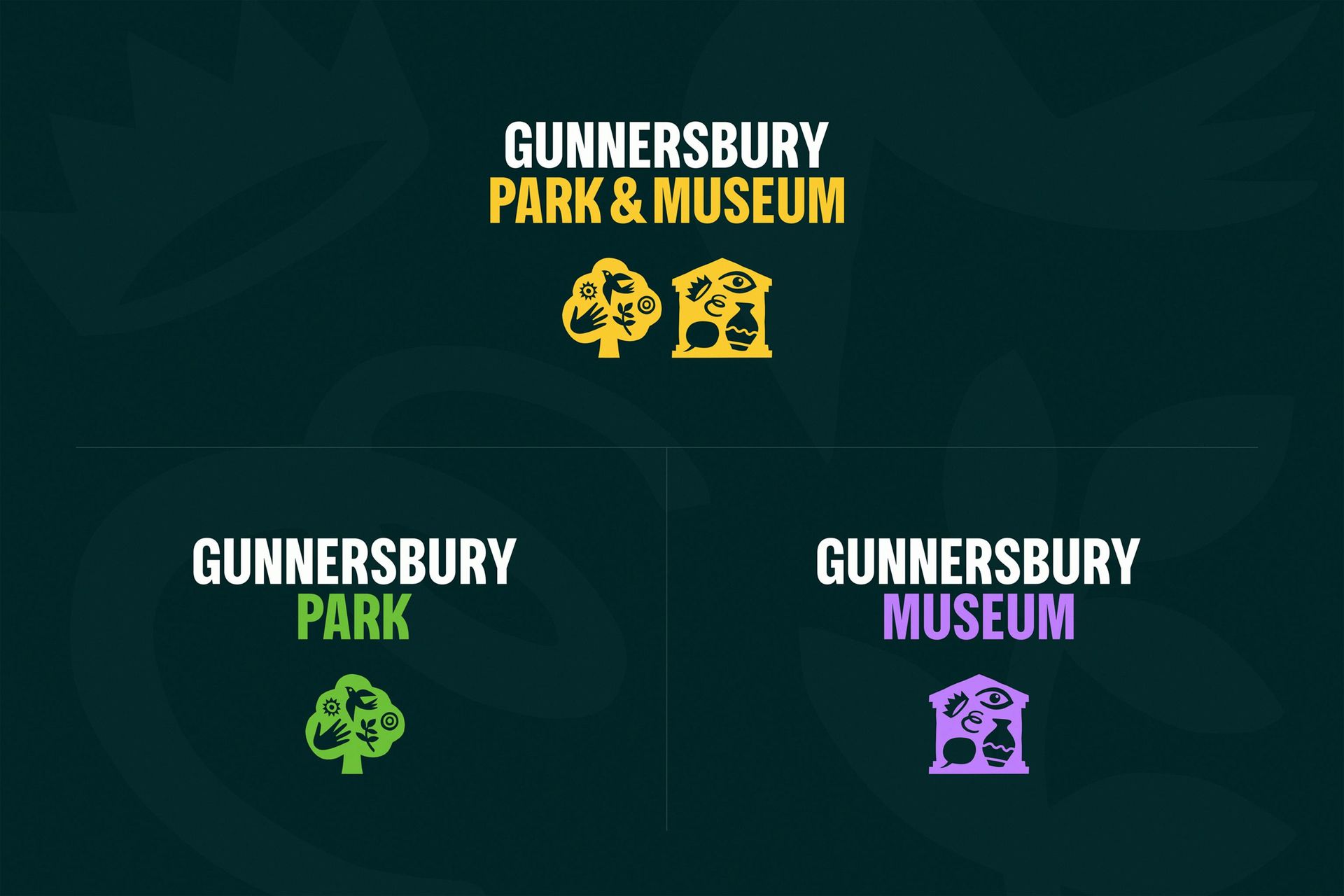
A condensed grotesque does the naming. GUNNERSBURY sets in white, PARK & MUSEUM in a warm yellow, stacked tight on a deep parkland green. The brand architecture splits cleanly: the park takes green, the museum takes purple, each with its own icon, while the master lockup keeps the yellow pair. It is a sensible hierarchy that still reads as one family.
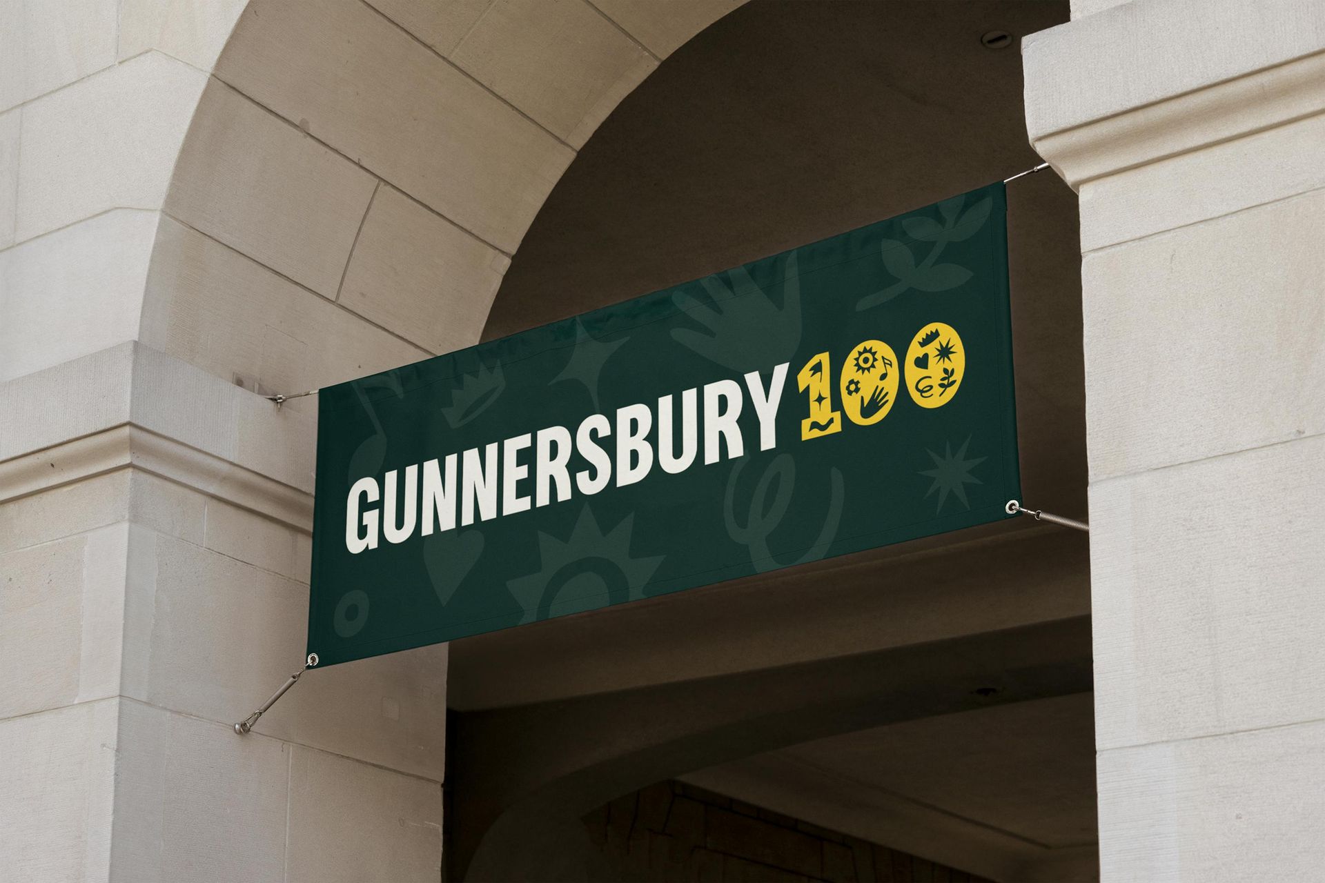
Type gets playful at the edges. Headlines arch across cafe bags and posters: WANDER AND UNWIND, DISCOVER AND DELIGHT. The centenary banner hides its best detail in plain sight, with the two zeroes of GUNNERSBURY 100 drawn as yellow circles filled with the icon set. A quiet serif sets the tagline, Discover, Play, Enjoy, and leaves the shouting to the grotesque.
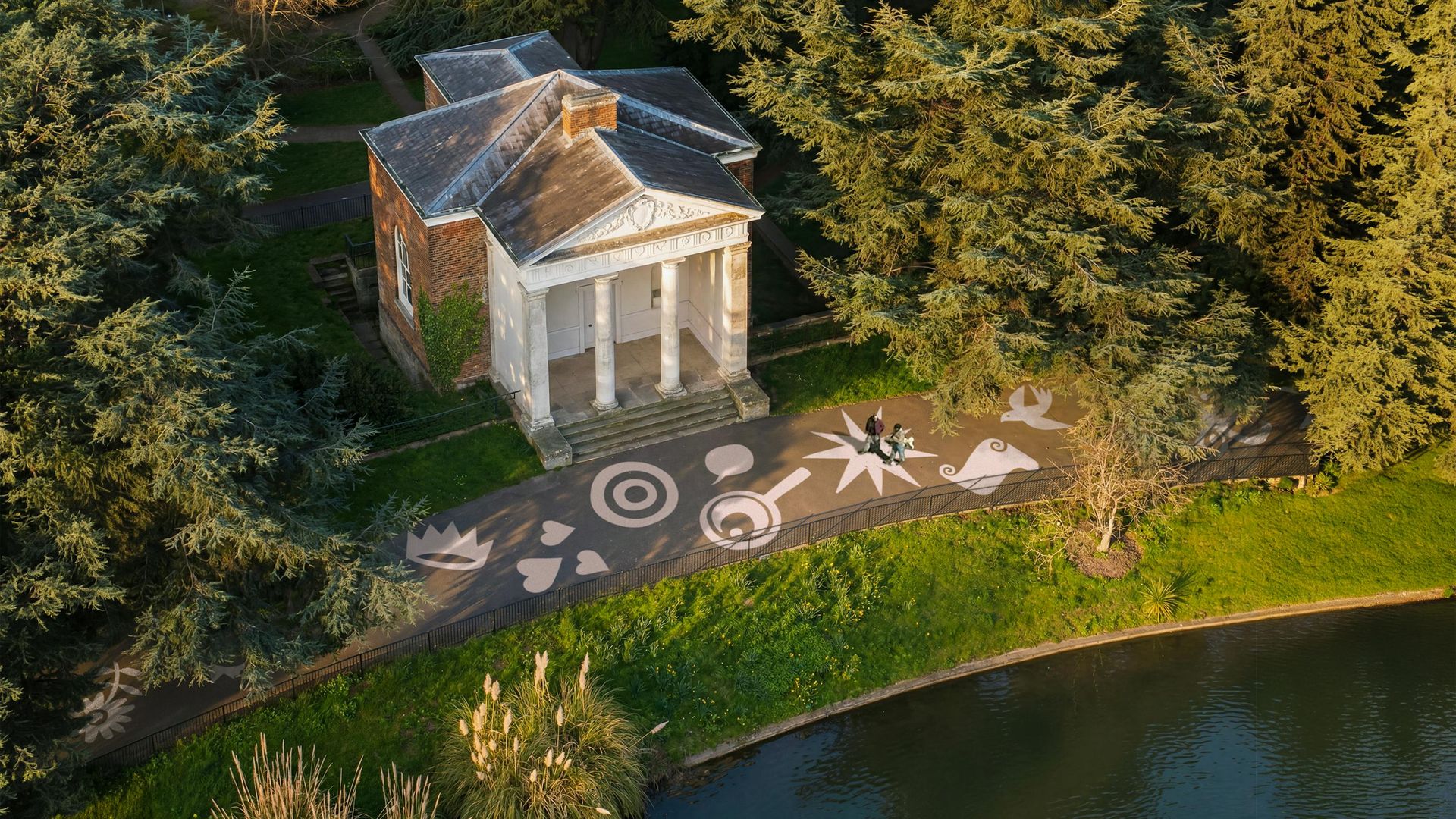
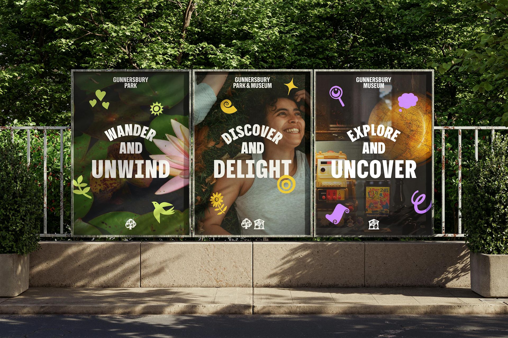
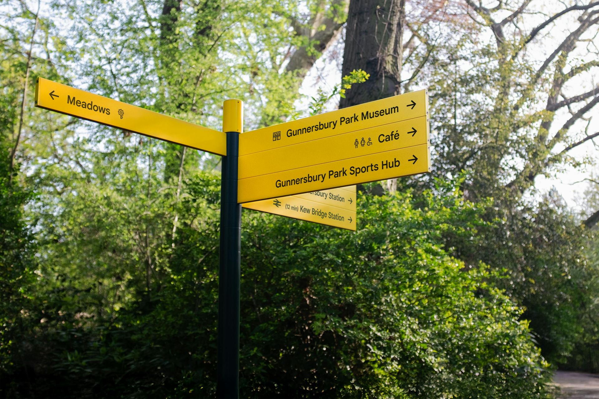
The wayfinding is where the system earns its keep. Yellow fingerpost arms point to the Meadows, the Cafe, the Sports Hub and Kew Bridge Station, each carrying its small icon, and the same marks get painted large on the park paths, turning a walk into a treasure trail. Welcome boards, interpretation panels and pond signs repeat the deep green and yellow across the whole estate.
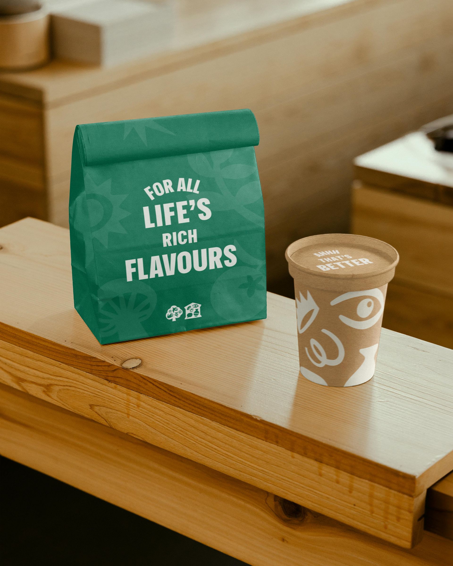
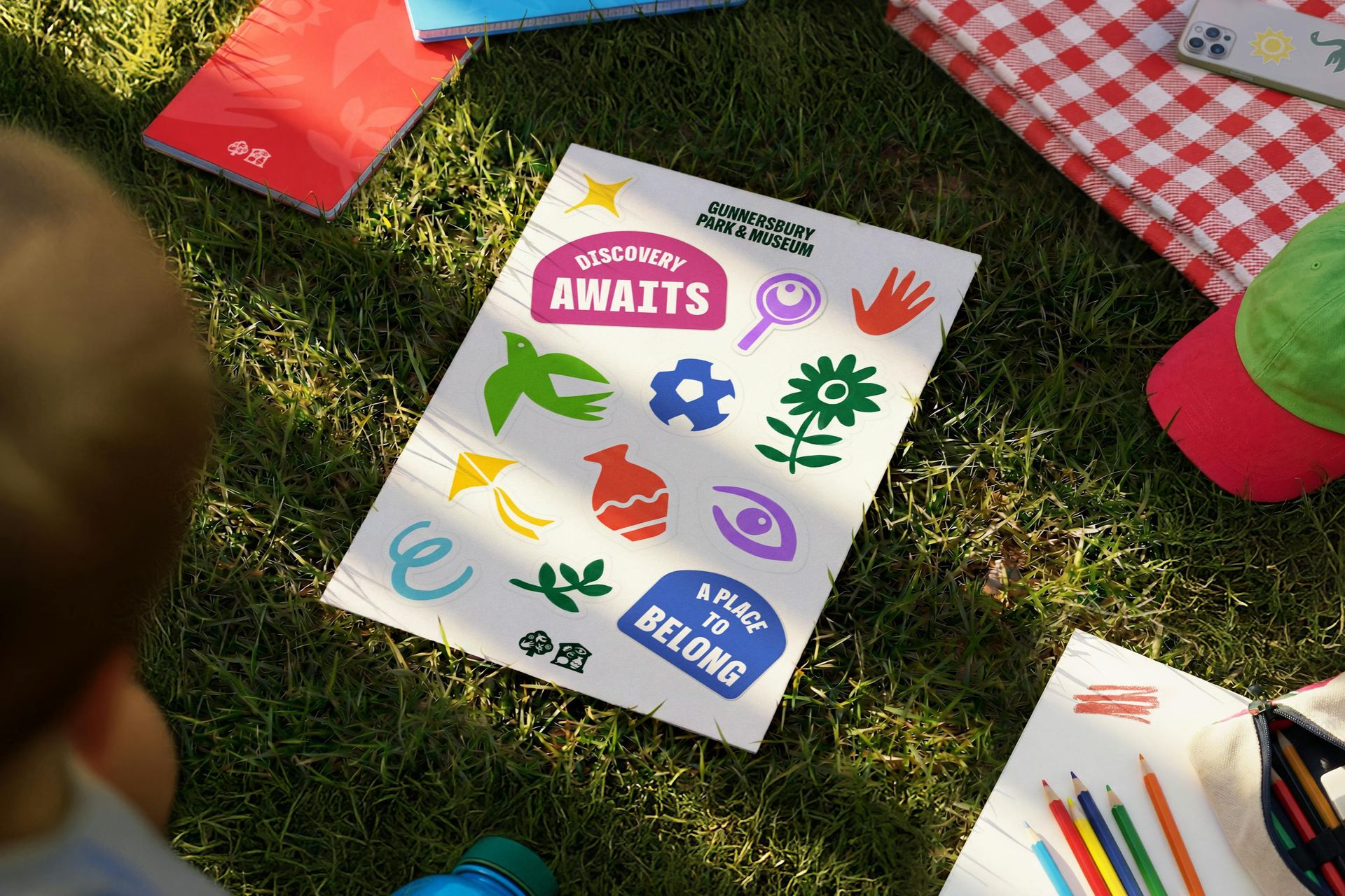
Collateral plays the full range. A green cafe bag arches FOR ALL LIFE'S RICH FLAVOURS over tone-on-tone icons, a kraft cup wears the eye and curl marks at billboard scale, and a sticker sheet of birds, kites, vases and magnifiers puts the whole system in children's hands. The wedding book, staff uniforms and apparel all speak the same language.
See more from Wiedemann Lampe.