Packaging Design: Candour Wine by Bedow
Explore the Candour Wine packaging design by Bedow, pairing a flavor-responsive variable wordmark with tactile labels on recyclable cans.
Traditional wine labels love hiding behind faux-chateau crests and cryptic French terminology. You stare at a shelf of glass bottles and still have no idea what the liquid inside actually tastes like. Even worse, carbon-heavy glass accounts for more than half of the wine industry's greenhouse gas emissions. When Candour set out to put small-batch European wines into recyclable aluminum cans under the banner of "Honestly Delicious Wine," Stockholm studio Bedow built an identity grounded in radical transparency.
Variable Type in the Candour Wine Packaging Design
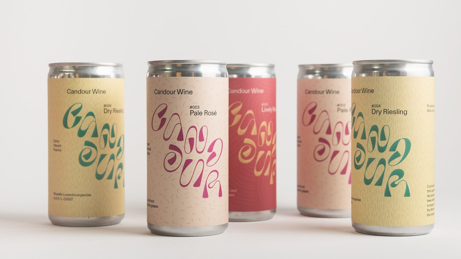
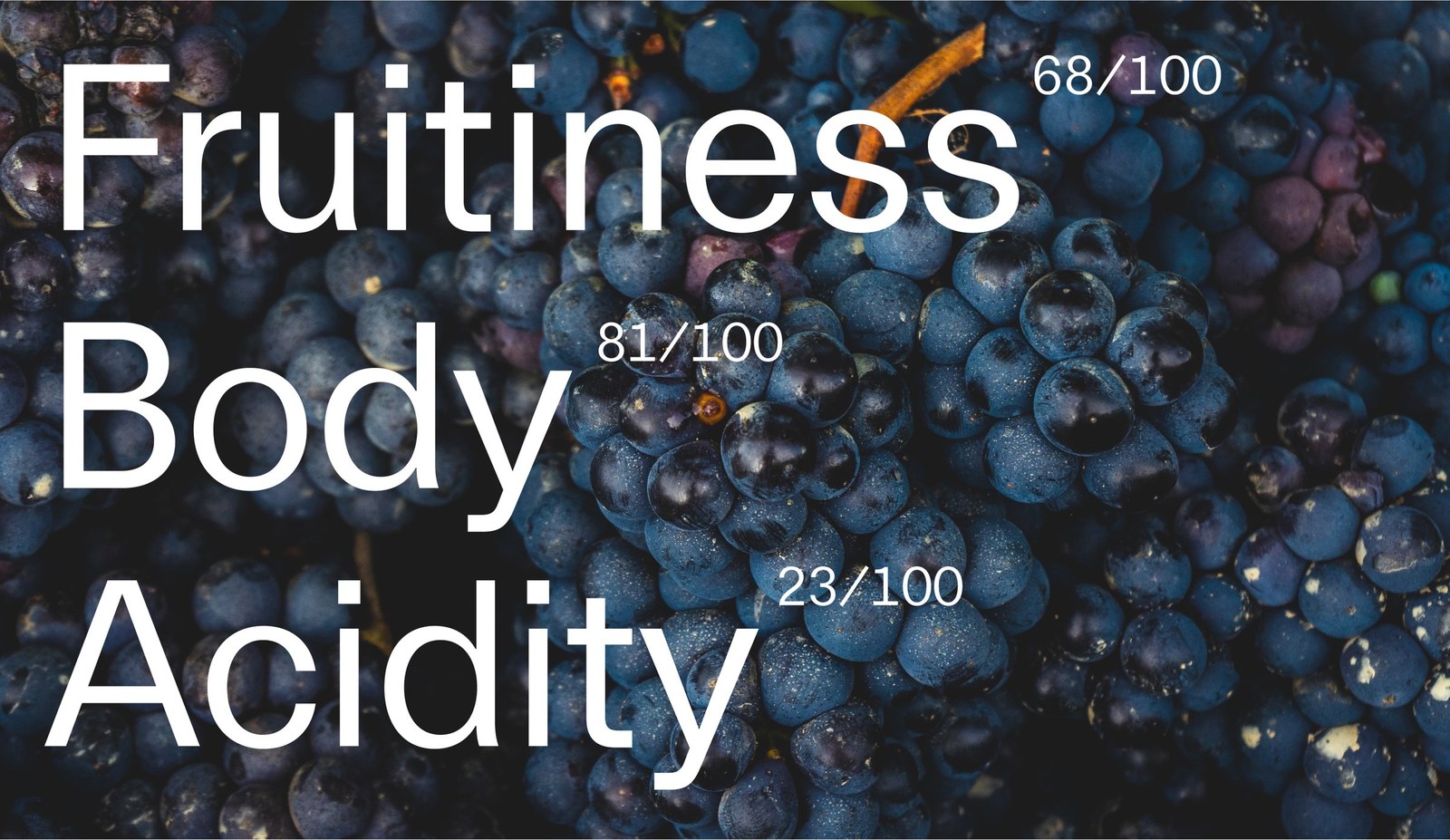
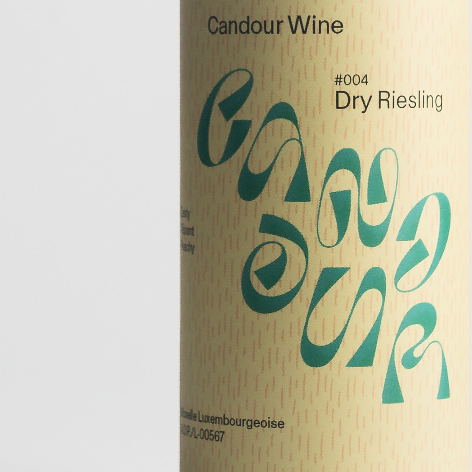
The type does the heavy lifting here. Recognized by the Type Directors Club in New York, Bedow's custom variable wordmark acts as a direct visual taste meter across the front of every can. It's a clever piece of information design drawn in Illustrator. Because sommeliers evaluate wine across three primary sensory metrics — fruitiness, acidity, and body (indexed numerically like Fruitiness 68/100, Body 81/100, and Acidity 23/100) — the seven letters of Candour physically mutate to mirror the liquid inside. Sharper letter terminals signal higher acidity, deeper stroke contrast communicates fruitiness, and heavier terminal weight reflects a fuller body. You can read the flavor profile before reading a single word of copy.
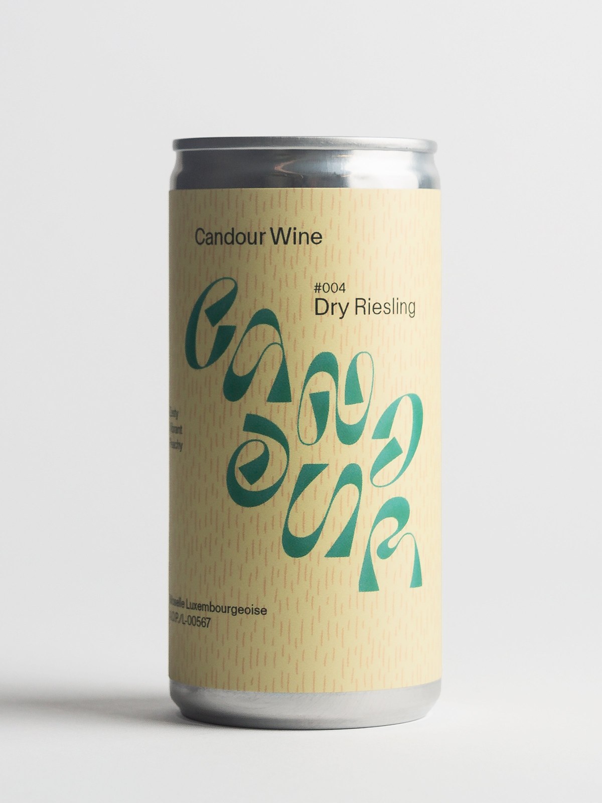
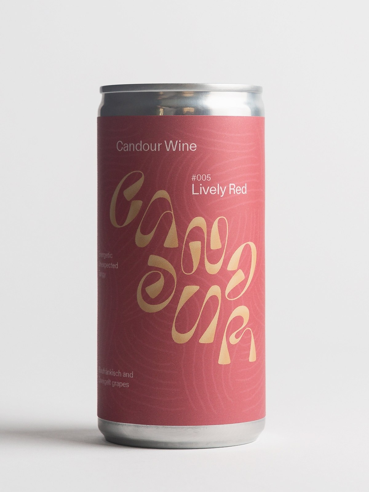
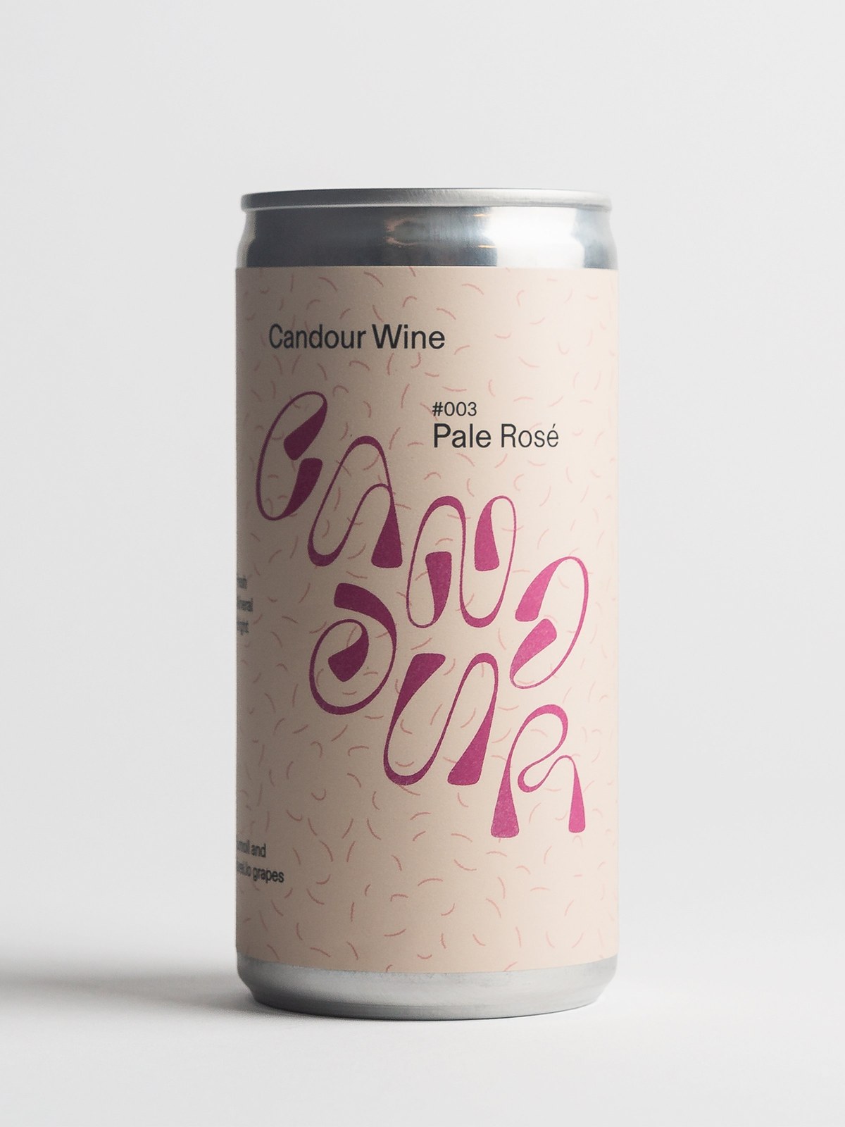
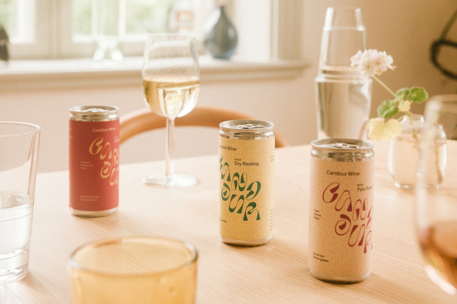
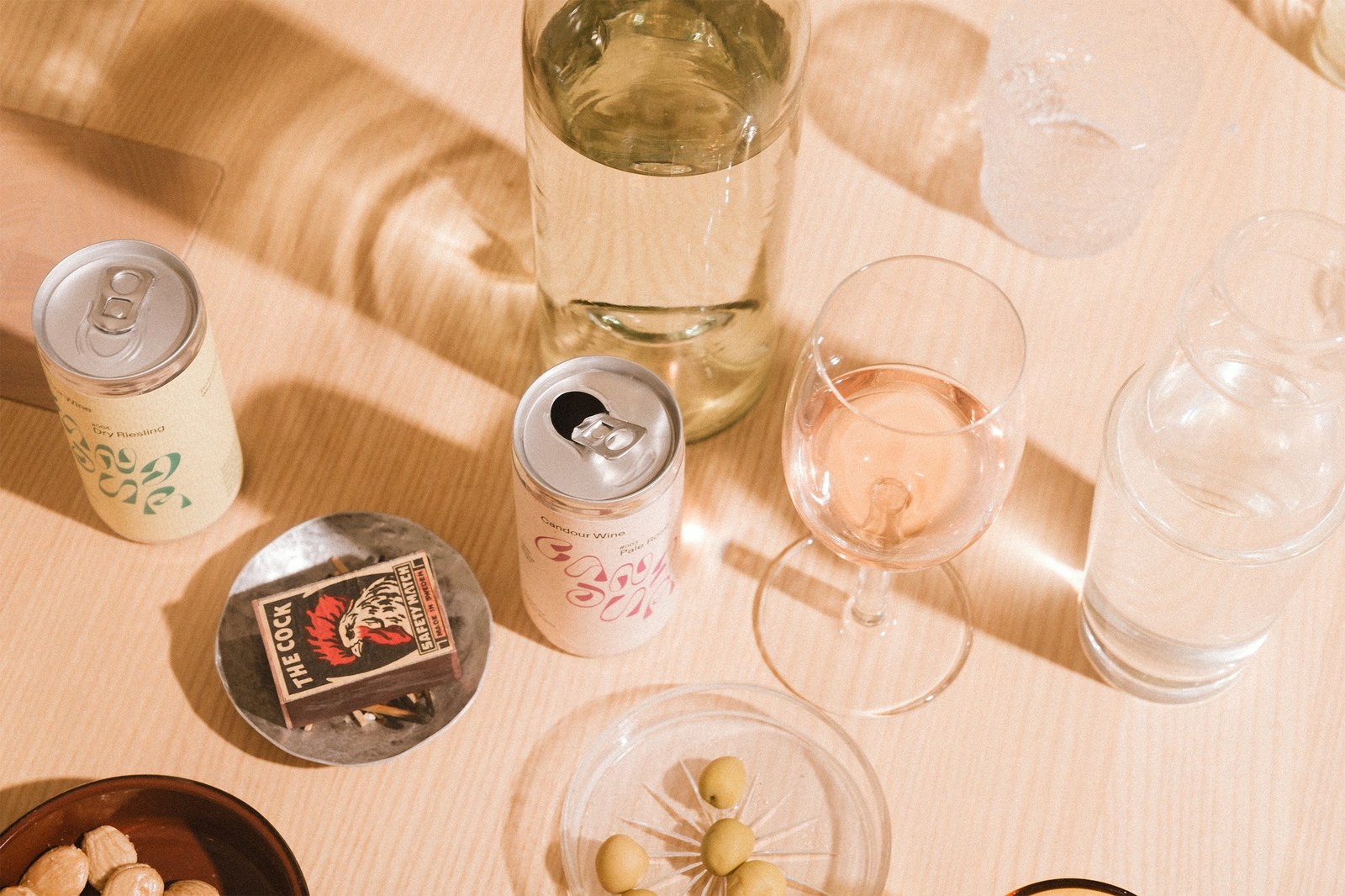
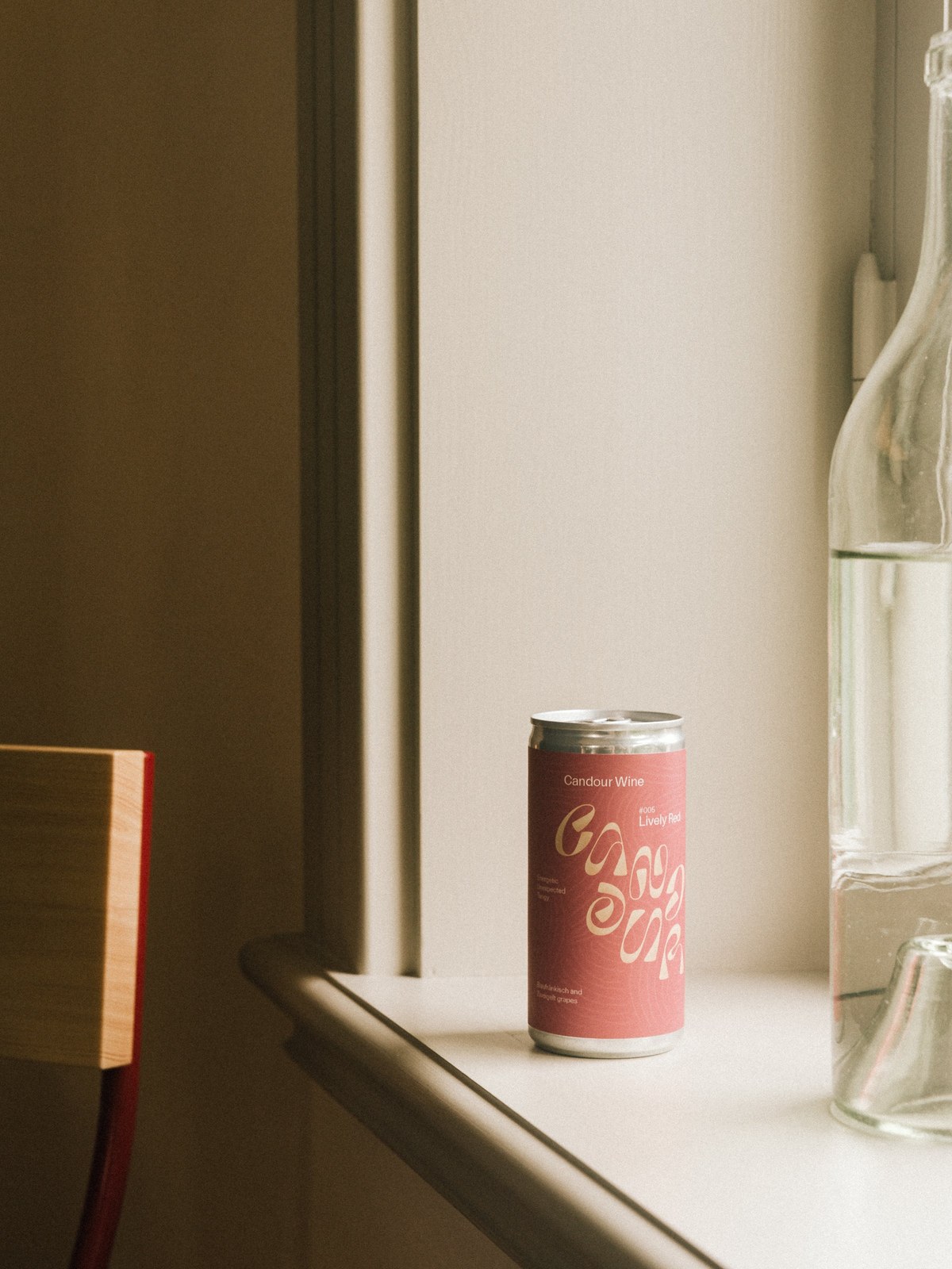
Every limited-edition release pairs its custom wordmark instance with a hand-drawn background pattern and clean grotesk typography laid out in InDesign. Edition #003 Pale Rosé, pressed from Sumoll and Xarel·lo grapes with Fresh, Mineral, and Bright tasting notes, sets its looping berry-magenta logotype over scattered pink crescent strokes on pale blush paper. For #004 Dry Riesling from Moselle Luxembourgeoise (AOP/L-00567; Zesty,, Peachy), the wordmark shifts into deep forest green over vertical rain-like dashes on butter-yellow stock. Then there's #005 Lively Red, an Austrian blend of Blaufränkisch and Zweigelt grapes with Energetic, Unexpected, and Tangy notes, where warm gold lettering sits over fine concentric contour rings on terracotta red. Wrapping uncoated textured paper around compact aluminum cans gives the system a warm, tactile grip at the table.
See the full project by Bedow on Bedow.