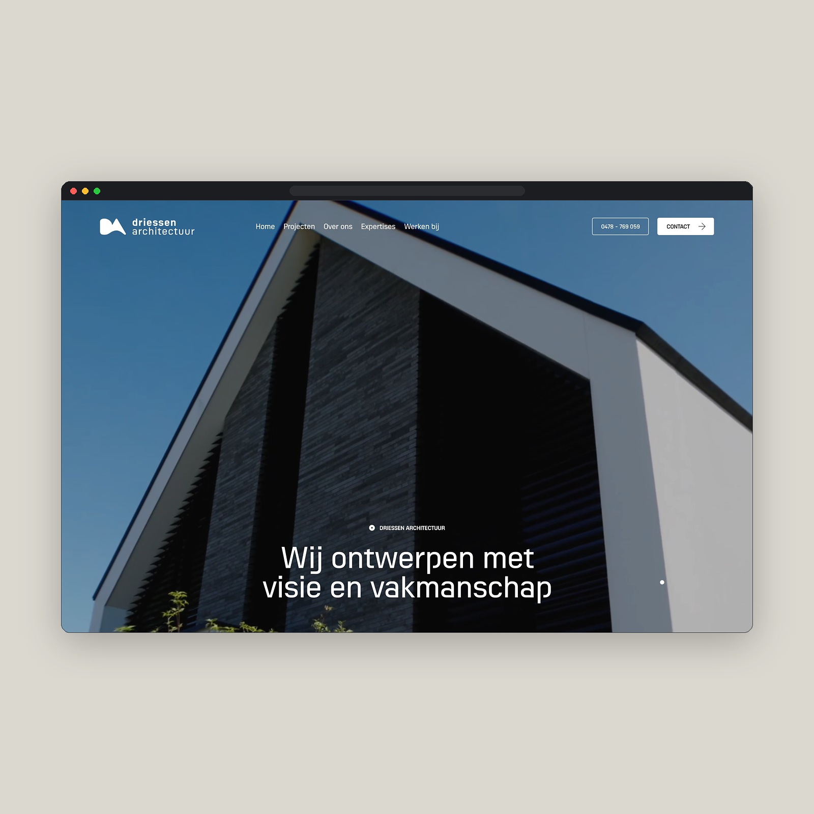
Driessen Architectuur: Minimalist Web Design & Grid Craft
Dissecting the Driessen Architectuur web design on Minimal Gallery, pairing crisp Swiss grid proportions with calm architectural photography.
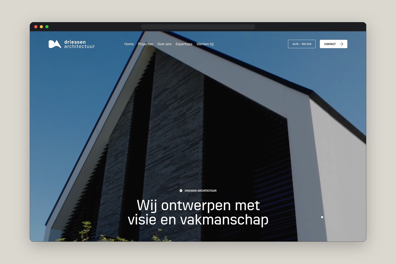
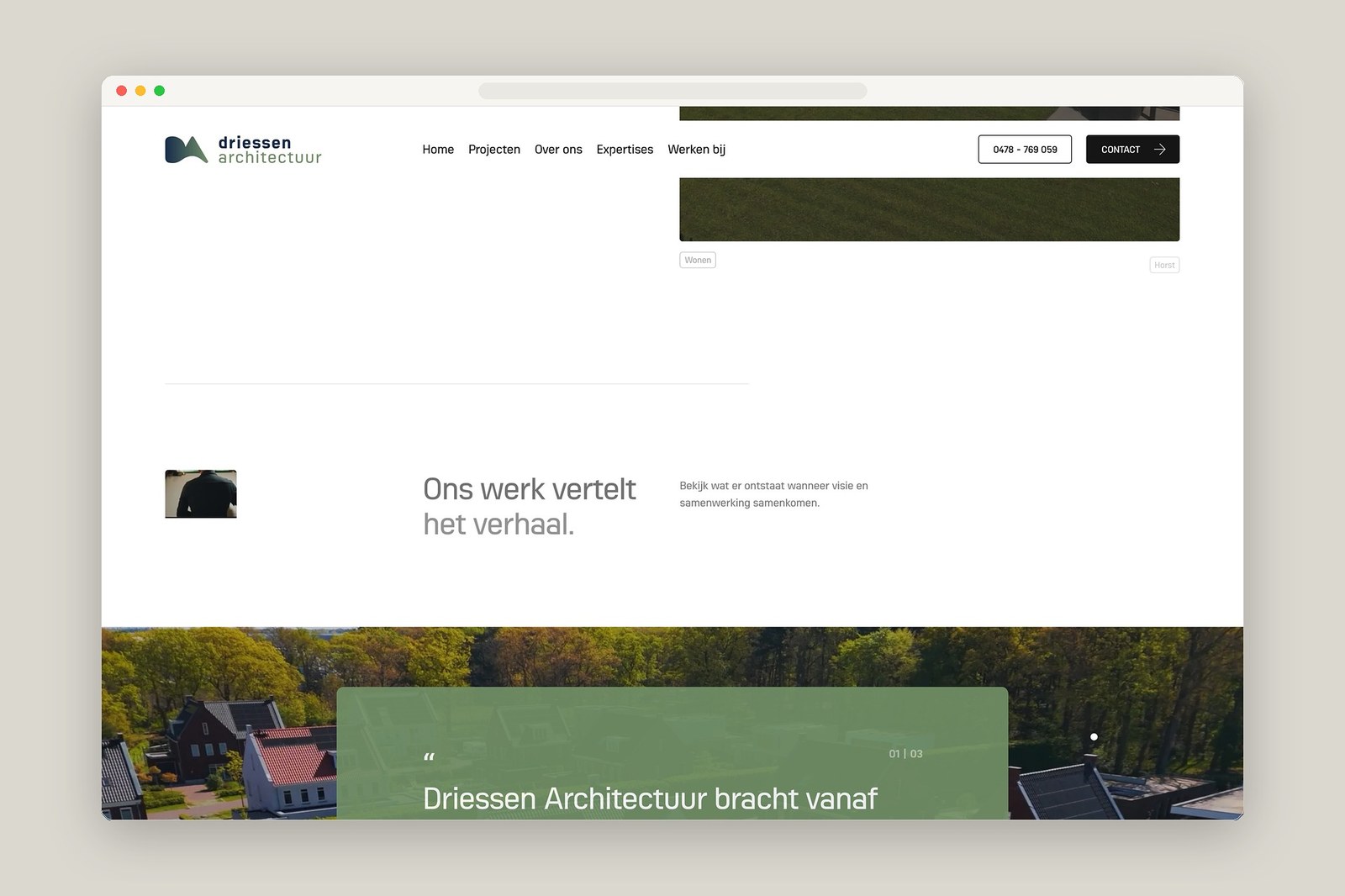
Most architecture studio websites try too hard to impress with heavy WebGL transitions and slow scroll-jacking effects. Driessen Architectuur takes the opposite route. Featured on Minimal Gallery, the Dutch architectural practice uses a calm, disciplined web design that lets physical space and daylight carry the screen. The grid does the work. Hairline rules and generous outer margins divide the browser viewport into measured columns that mirror architectural floor plans and structural elevations. Clean grotesk typography sits pinned to the top navigation bar and doesn't clutter the header, giving project photography room to breathe from the first load. Nothing fights for attention.
Indexical Typography and Architectural Web Design
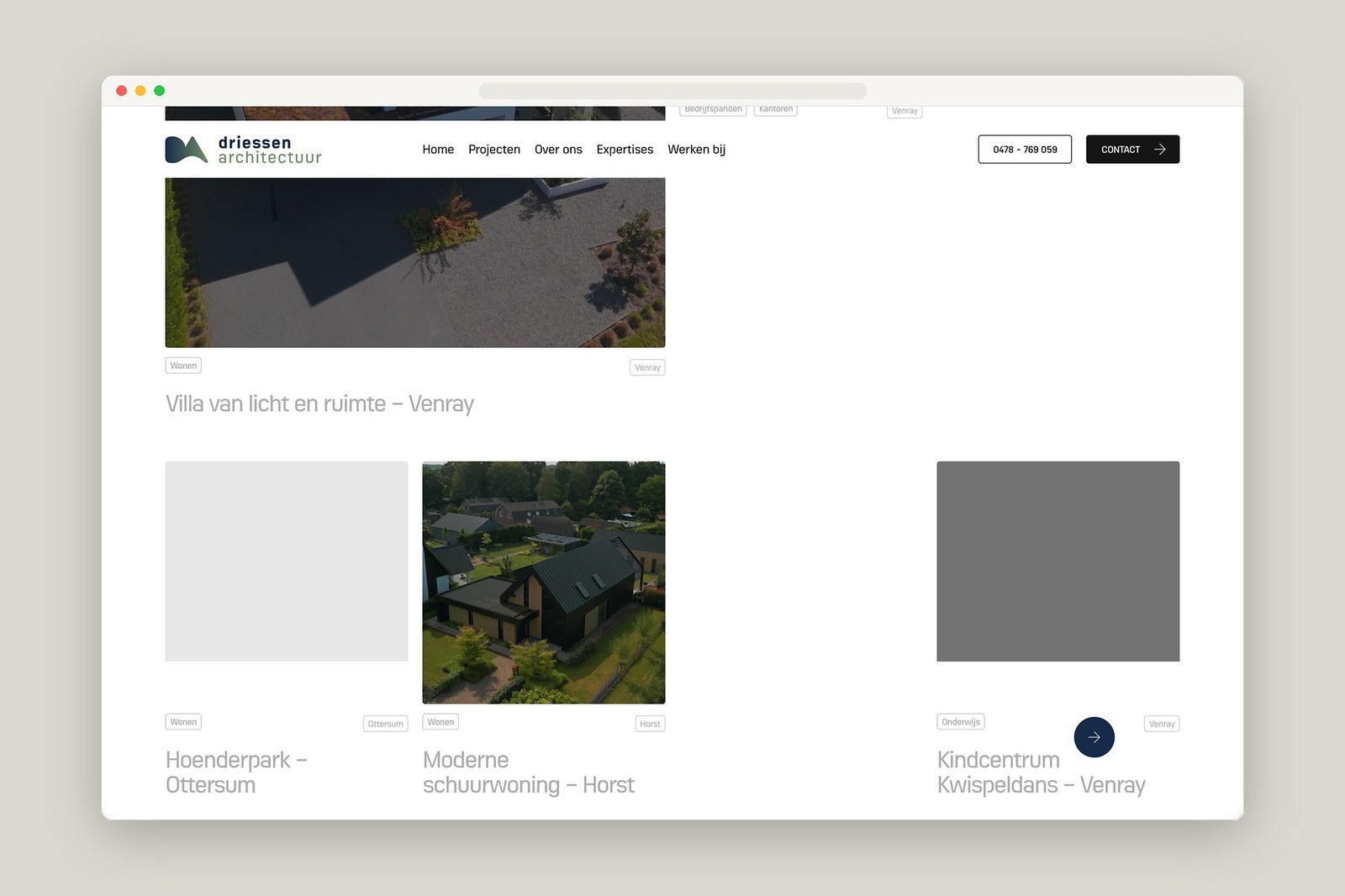
Look closely at how the project index and metadata tables behave across desktop and mobile viewports. It's quiet by design. Small, tightly tracked sans-serif labels log project titles, building typologies, and completion years along a strict baseline grid that feels closer to a Swiss print monograph than a standard template. When a visitor moves across the directory, subtle hover states shift the layout focus without jarring opacity flashes or gimmicky cursor trails. Full-height interior and exterior photographs sit against warm stone and crisp white canvas tones, preserving the natural shadow detail of brick, timber, and raw concrete. That restraint pays off.
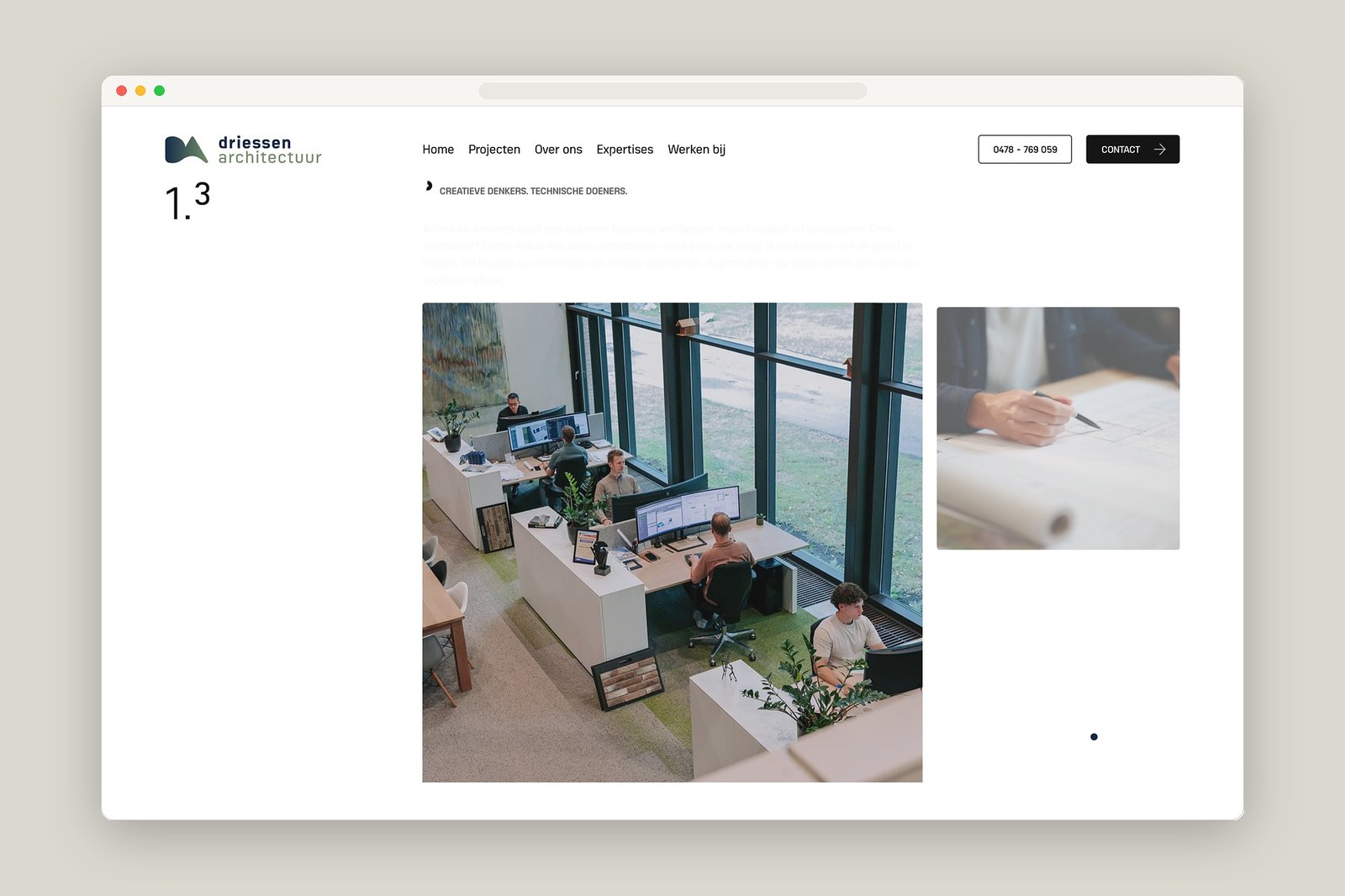
Responsive scaling often breaks minimalist layouts when wide multi-column tables collapse onto narrow phone screens. Here, the mobile view keeps the exact same typographic hierarchy and proportional spacing as the desktop experience. Single-column image stacks lock cleanly to the left margin while project specifications stay legible at small point sizes, showing the kind of system rigor designers usually build in Figma before writing a single line of CSS. Every margin feels intentional. Good architectural web design doesn't need loud motion tricks when the underlying column proportions, negative space, and photographic pacing already hold the grid together.
Explore the full feature on Minimal Gallery.