Inside the Craft of Peko-Peko branding by Manifiesto
Manifiesto's Peko-Peko branding builds a 3D universe where kawaii meets Mexican cariño, anchored by a balloon-letter logo.
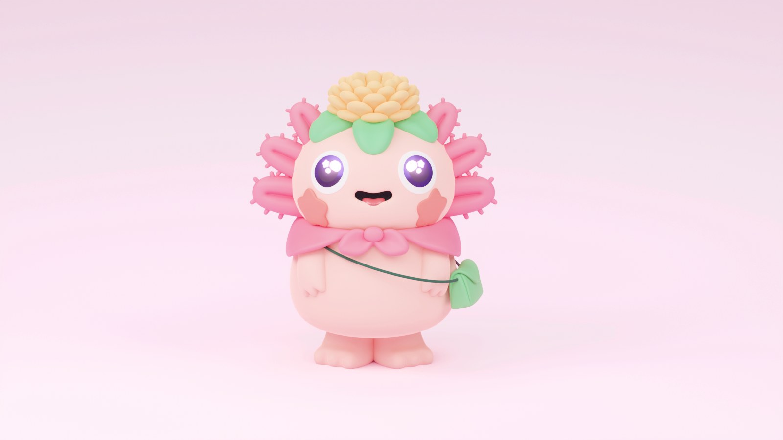
Mexico City studio Manifiesto calls the project "Mexicute is a mood," and the phrase carries the whole concept: Peko-Peko starts from a pair of charming mascots and grows into what the studio describes as a boundless universe, blending the timeless charm of Japanese culture with the vibrancy of Mexican expression. The anchor is the axolotl, Mexico's unmistakable salamander, reimagined as a pink 3D character with a flower crown and a tiny cross-body bag. Around it the studio builds a cast, a cat and a frog, each ready to melt into caps, packaging, and print. The palette does as much work as the characters: bubblegum pink, grape purple, mint, peach, and lime, applied in soft 3D scenes with the kind of squishy lighting that makes every render feel touchable. Nothing here is decorated for decoration's sake; the joy is the system.
The Peko-Peko branding system: balloon letters and 3D characters
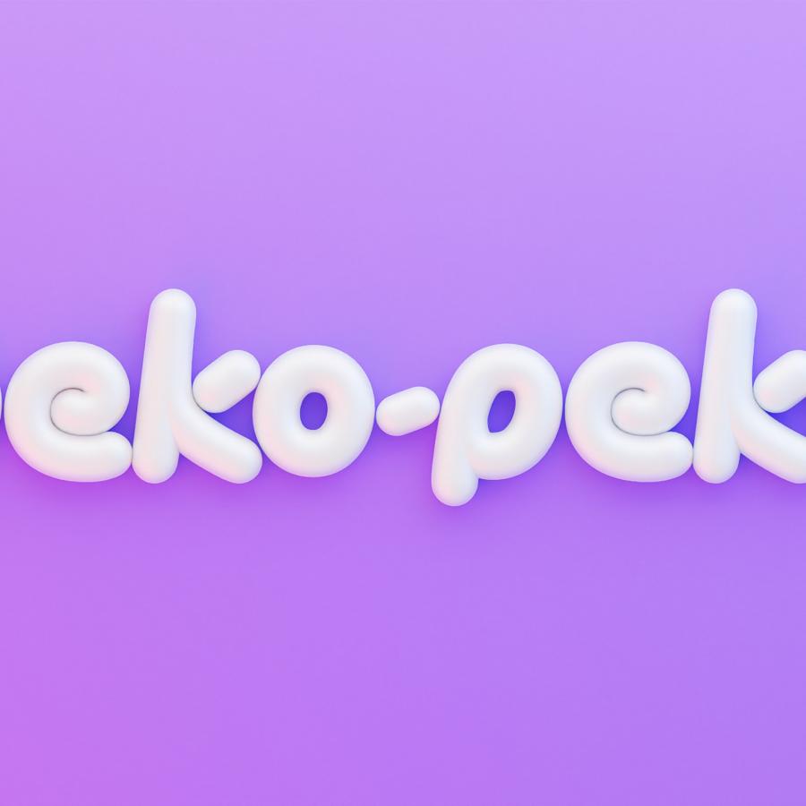
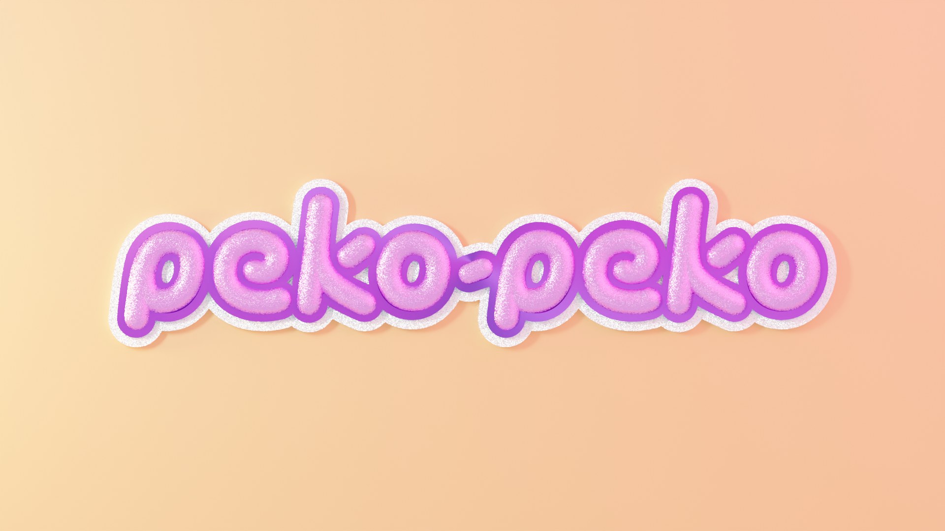
The wordmark sets the tone in one gesture: "peko-peko" in fat, lowercase balloon letters, built twice as a 3D object. One version is white and puffy, floating on a purple gradient. The other wears pink glitter with a purple outline and a white cloud halo on peach. The letters read like something you could squeeze. Supporting type stays quiet, a clean grotesque for names and phone numbers on the stationery, so the balloon letters keep all the volume.
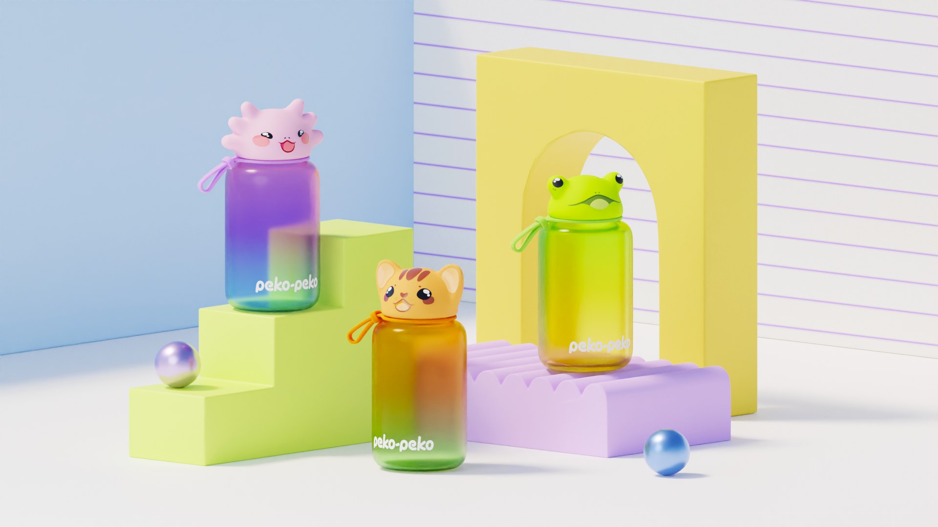
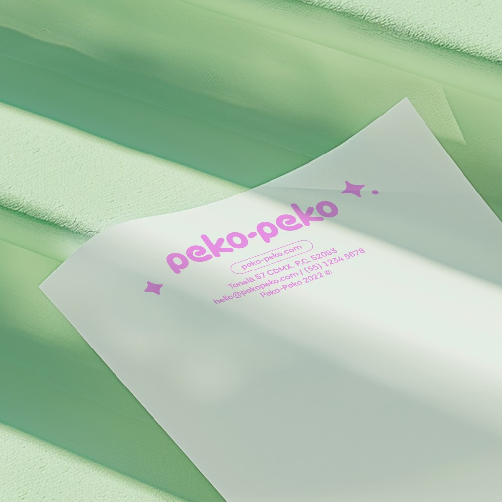
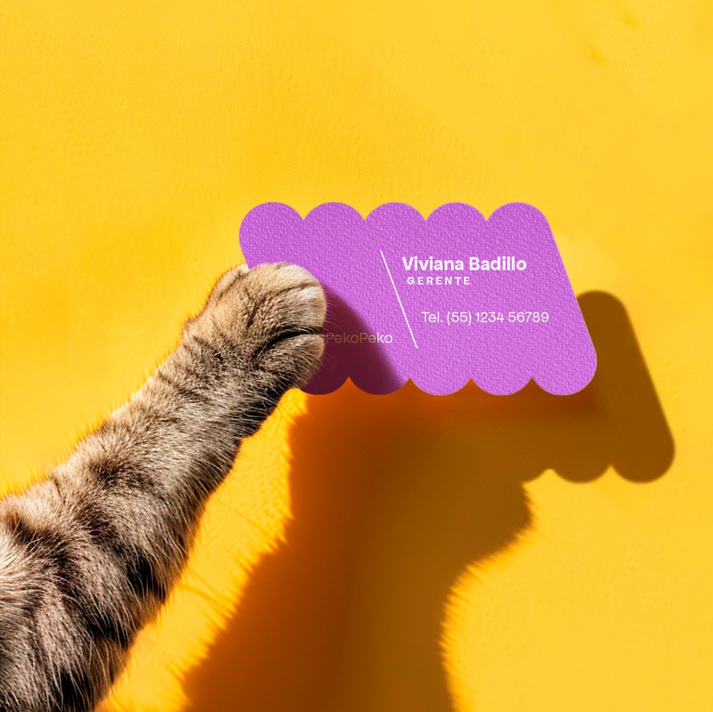
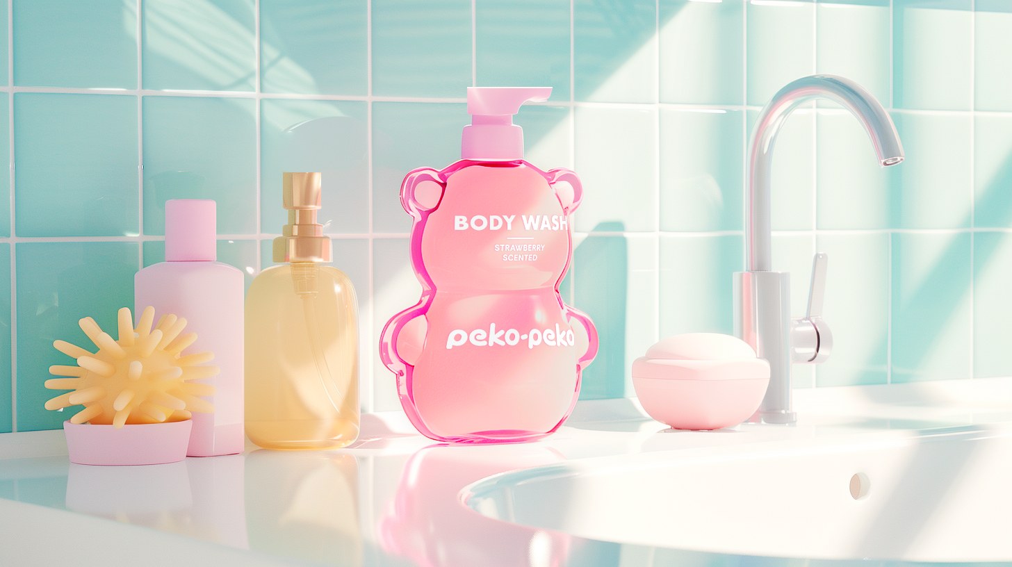
Every artifact plays along. The characters become bottle caps: a cat lid on an amber bottle, a frog on a yellow one, the axolotl on purple. A strawberry-scented body wash arrives as a pink bear-shaped bottle wearing the wordmark on its belly. The business card is die-cut with a scalloped edge that quotes the balloon letters. The letterhead keeps the pink wordmark small and centered on white, framed by a single star. It is a world, not a logo sheet.
See more from Manifiesto on their site.