Graphics Design

О графическом дизайне

RSS

Jaha Film Festival 2025

Jaha Film Festival is a celebration of films created by trans and gender-diverse filmmakers from the Global South and Indigenous communities. The festival provides a platform for stories, perspectives, and artistic voices that have often been underrepresented in mainstream cinema. Through a curated…
Dinal – W Strefie Jarania i w Strefie Rymowania album art (2026 reissue)

The new vinyl edition of Dinal’s cult album W Strefie Jarania i w Strefie Rymowania features a refreshed cover design by Marian Misiak, author of the original artwork. The typography combines Maria Connected, whose interlocking forms bring a distinctive contemporary rhythm to the composition, with…

Koalition für Konzernverantwortung merchandise

Swiss-Austrian graphic design practice and type foundry Nguyen Gobber designed the merchandise for Koalition für Konzernverantwortung, a coalition of over 100 Swiss civil society organisations. It is behind the Responsible Business Initiative, which calls on corporations to uphold human rights and…

Frankenstein by Mary Shelley, HAW Hamburg student project

Book design for Mary Shelley’s Frankenstein, made as student project at HAW Hamburg. The layout as well as the cover were created with HTML and Paged.js without the use of any proprietary software. The open-source CMU Serif – a version of Computer Modern Serif – was used throughout the publication…

Noel Design & Remodel website

Noel Design & Remodel is a home remodeling firm based in Houston, Texas. Their website titles were all composed in Amster (PampaType) and the copy was set in Beaufort (Shinntype). Formats Web(6033) Designers/Agencies unknown(4575) Artwork location United States(10561) Houston(24) Texas(87)

Olavi

Visual identity for Olavi, a service for generative engine optimization (GEO), the practice of optimizing content to be cited by AI search engines. The wordmark is set in TT Ricordi Greto. This font is exclusively for the logotype due to licensing. Headlines run in Host Grotesk and body copy in…

CBC Sports logo (2017–)

The current logo of CBC / Radio-Canada (since 1992) uses Frutiger Bold in combination with the red “gem”. However, the CBC Sports logo is in their in-house Radio-Canada font. This logo was introduced in 2017. The photo was taken at 2026 Canadian National Skating Championships, held in Gatineau,…

Cirque du Soleil's Show Goes On, Right Down to the Packaging

Cirque du Soleil is built around spectacle, so it makes perfect sense for its packaging to become another little stage for performance. Rita Arutyunova created a conceptual CPG line for the touring circus, and covered the cans and popcorn packs with acrobats, unicyclists, hoops, and circus…

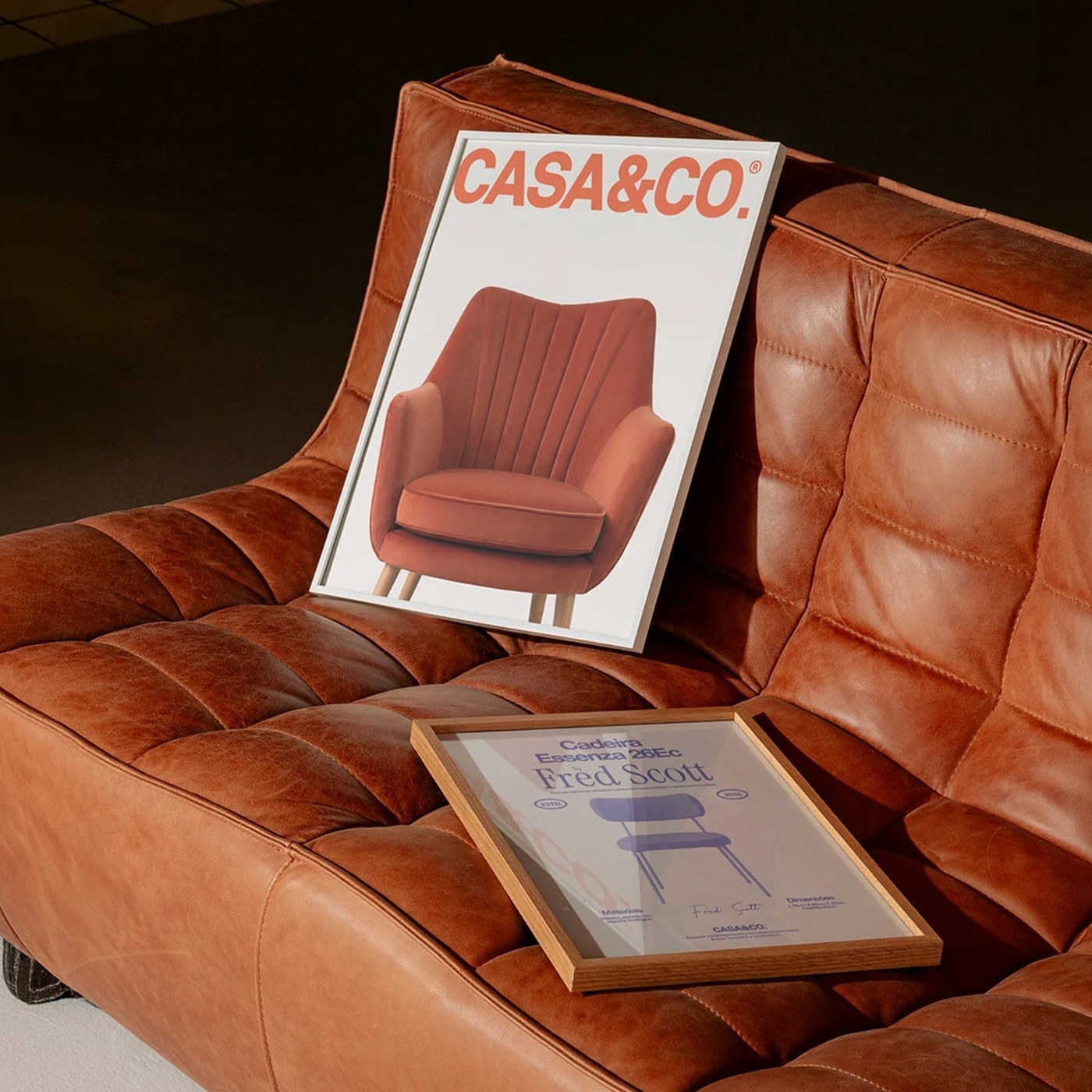
Brand Identity: CASA&CO. by Estúdio Lippi

Explore the sustainable brand identity for CASA&CO. by Estúdio Lippi, featuring bold uppercase typography and tactile editorial collateral. Brazilian creative practice Estúdio Lippi constructed a comprehensive brand identity for CASA&CO., an independent furniture studio dedicated to conscious…

Nativo Puts Frozen Food on the Front Line Against Food Waste

Frozen food is getting a rethink as shoppers look for practical ways to keep good food from becoming waste, and the student project Nativo makes that idea its entire packaging system. Eva Chistyakova borrows the visual language of Karl Troll’s climate maps, wrapping each bag in rippling contour…

LUAK Takes a Walk on the Wild Side of Coffee Packaging

LUAK takes minimalism somewhere much more curious than just being stripped back for simplicity’s sake. Anastasia Shulga builds the entire identity around an abstracted Malayan civet tail, broken into rough black marks that almost resemble ink stamps or expressive brushstrokes. The reference…

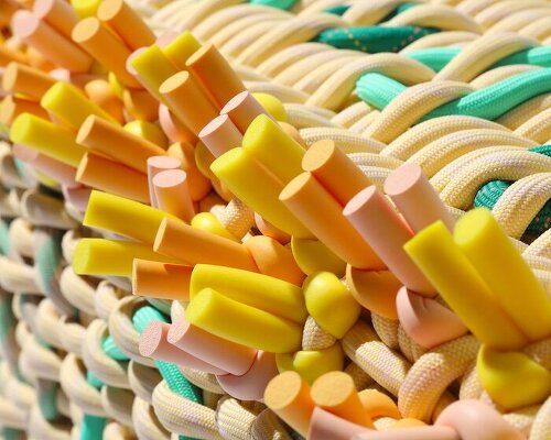
Block Design Looks to the Power of Sardine Tins for Its Giftware

Giftware brand Block Design creates adorable household goods packaged in tins inspired by Portuguese sardine cans Using the mass appeal, timelessness, and nostalgia inherent to tin packaging, Block Design reimagines these forms with vibrant, color-blocked patterns Packaging is everywhere, for those…

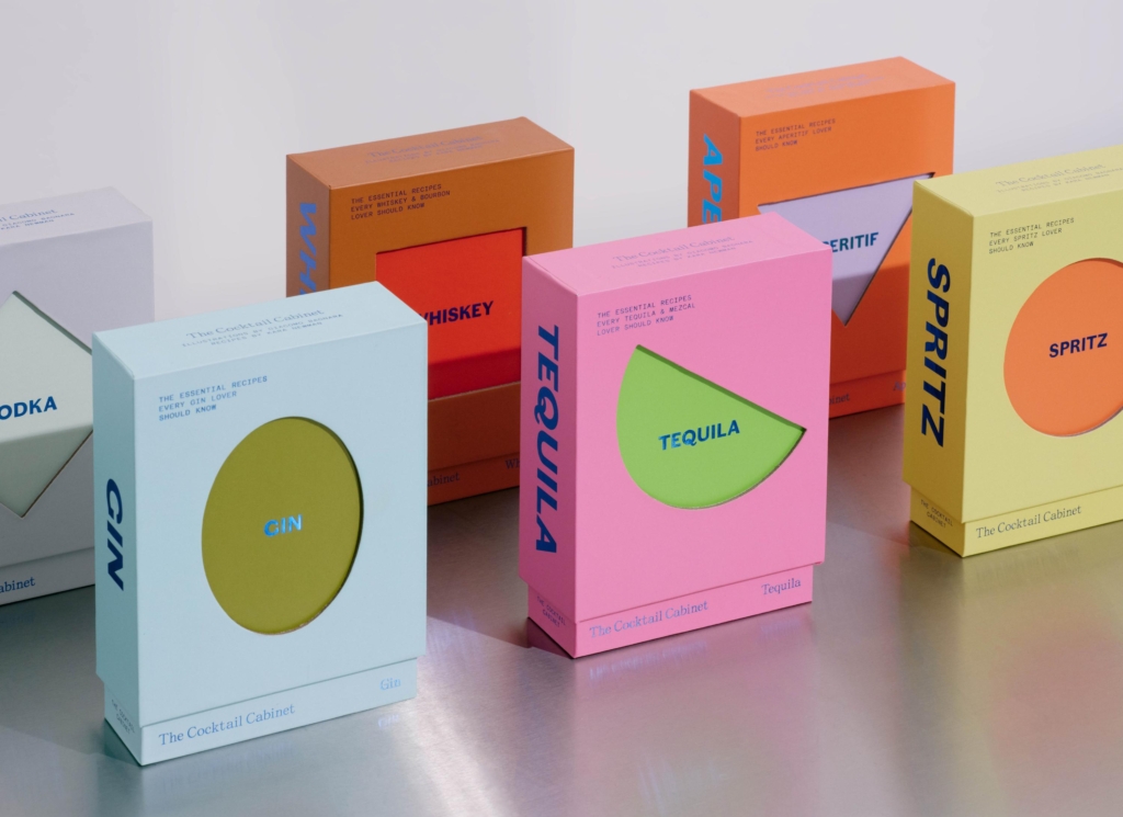
Design That Stirs – BP&O

Of course, not every cocktail is quite so easy to remember. There are thousands of the things, many with names that give absolutely no clue what you’re about to drink. “Mint to Be” or “Kitten Punch.” A dainty sip wrapped in a rugged name, or a classic twisted just far enough to make you laugh. Half…

Idealworks' brand identity, in concert | Mindsparkle

Love and Money agency Mindsparkle Mag Idealworks' brand identity keeps a robot fleet working in concert Idealworks deliver industrial automation in the harshest working environments, factory floors. They provide fleets of robots and the technology to operate them to some of the largest businesses…

ARKEN's identity runs on binary motion | Mindsparkle

Mindsparkle Mag ARKEN's identity system runs on 80s signage and binary motion ARKEN is an Amsterdam-based digital-first creative studio who work with ambitious teams on unique online experiences, combining thoughtful design with meaningful interaction. They’ve worked with the likes of LVMH,…

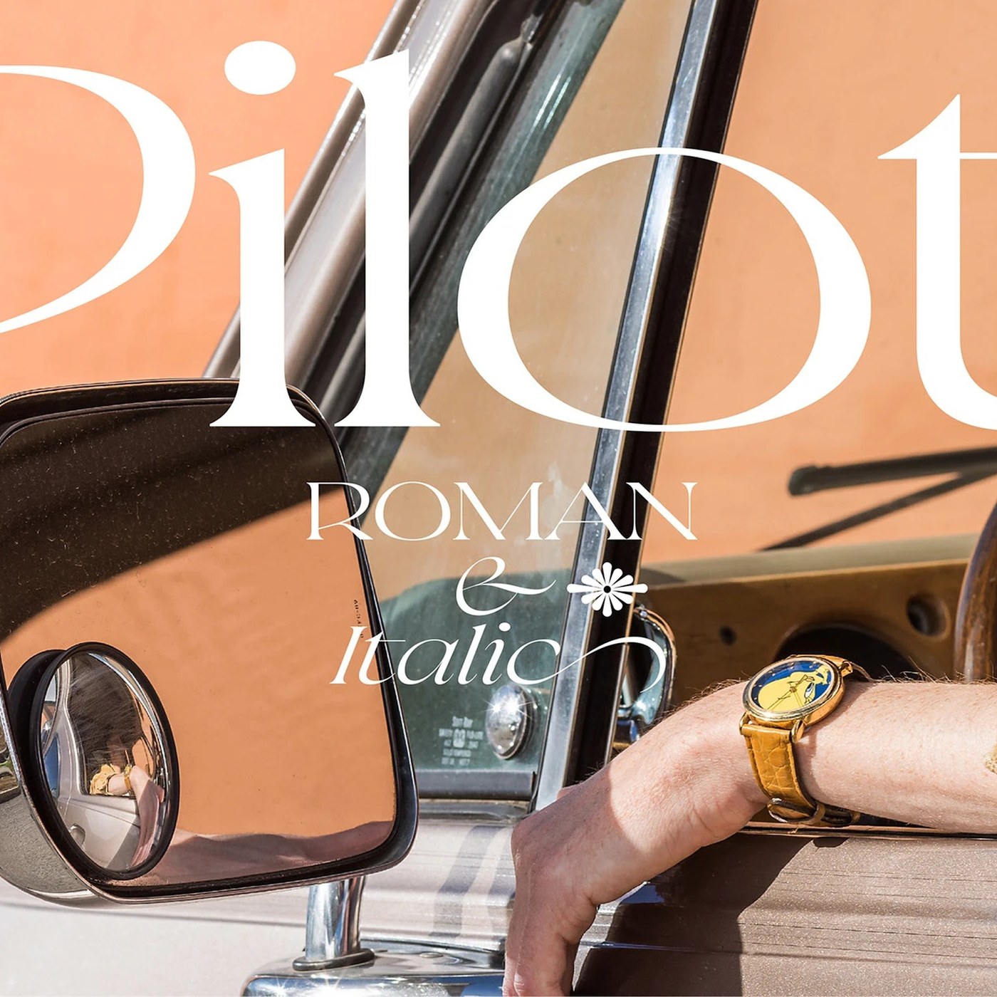
Typography: Pilot Typeface by Violaine & Jeremy

Violaine & Jeremy designed Pilot Typeface, an expressive display serif blending sharp angular tension with aeronautical precision. Parisian creative duo Violaine & Jeremy has consistently pushed the boundaries of editorial display lettering, crafting typefaces that occupy a rare space between haute…