Graphics Design

О графическом дизайне

RSS

Nativo Puts Frozen Food on the Front Line Against Food Waste

Frozen food is getting a rethink as shoppers look for practical ways to keep good food from becoming waste, and the student project Nativo makes that idea its entire packaging system. Eva Chistyakova borrows the visual language of Karl Troll’s climate maps, wrapping each bag in rippling contour…

LUAK Takes a Walk on the Wild Side of Coffee Packaging

LUAK takes minimalism somewhere much more curious than just being stripped back for simplicity’s sake. Anastasia Shulga builds the entire identity around an abstracted Malayan civet tail, broken into rough black marks that almost resemble ink stamps or expressive brushstrokes. The reference…

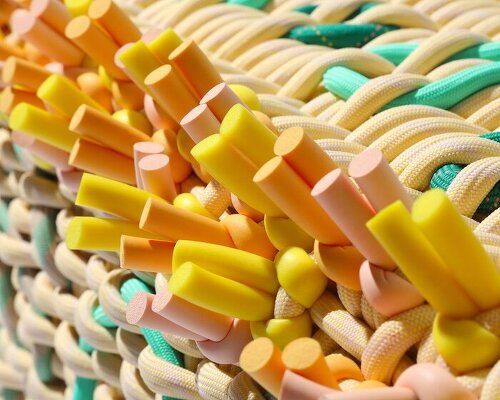
Block Design Looks to the Power of Sardine Tins for Its Giftware

Giftware brand Block Design creates adorable household goods packaged in tins inspired by Portuguese sardine cans Using the mass appeal, timelessness, and nostalgia inherent to tin packaging, Block Design reimagines these forms with vibrant, color-blocked patterns Packaging is everywhere, for those…

Design That Stirs – BP&O

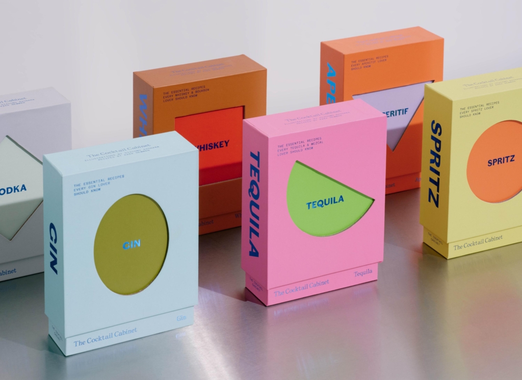
Of course, not every cocktail is quite so easy to remember. There are thousands of the things, many with names that give absolutely no clue what you’re about to drink. “Mint to Be” or “Kitten Punch.” A dainty sip wrapped in a rugged name, or a classic twisted just far enough to make you laugh. Half…

Idealworks' brand identity, in concert | Mindsparkle

Love and Money agency Mindsparkle Mag Idealworks' brand identity keeps a robot fleet working in concert Idealworks deliver industrial automation in the harshest working environments, factory floors. They provide fleets of robots and the technology to operate them to some of the largest businesses…

ARKEN's identity runs on binary motion | Mindsparkle

Mindsparkle Mag ARKEN's identity system runs on 80s signage and binary motion ARKEN is an Amsterdam-based digital-first creative studio who work with ambitious teams on unique online experiences, combining thoughtful design with meaningful interaction. They’ve worked with the likes of LVMH,…

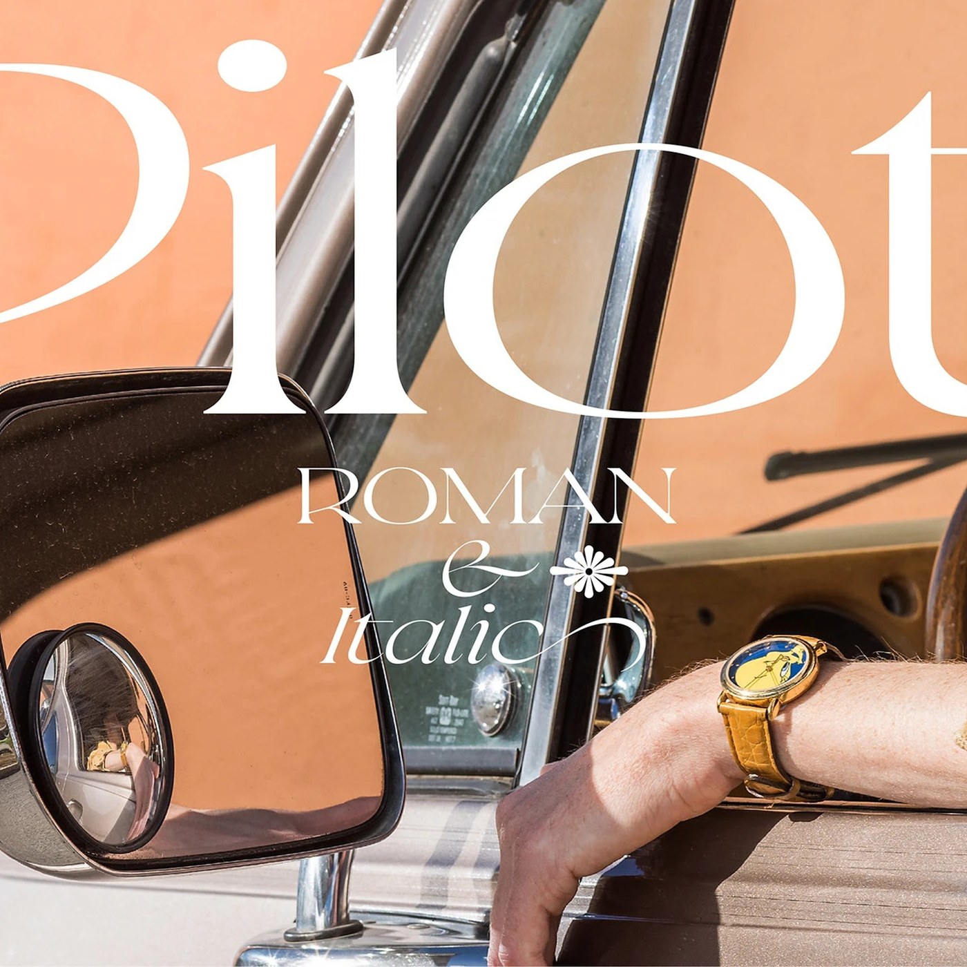
Typography: Pilot Typeface by Violaine & Jeremy

Violaine & Jeremy designed Pilot Typeface, an expressive display serif blending sharp angular tension with aeronautical precision. Parisian creative duo Violaine & Jeremy has consistently pushed the boundaries of editorial display lettering, crafting typefaces that occupy a rare space between haute…

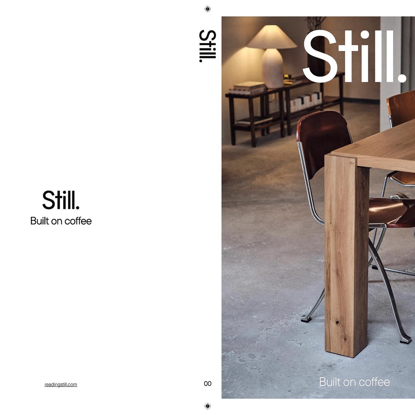
Editorial Design: Still Magazine Issue 00 by Florian Cornut

Florian Cornut designed Still Magazine Issue 00, establishing a disciplined editorial vision dedicated to coffee culture in Lisbon. Print publications that treat contemplation as their primary aesthetic standard remain rare. Still Magazine Issue 00 was conceived from the ground up to slow down the…

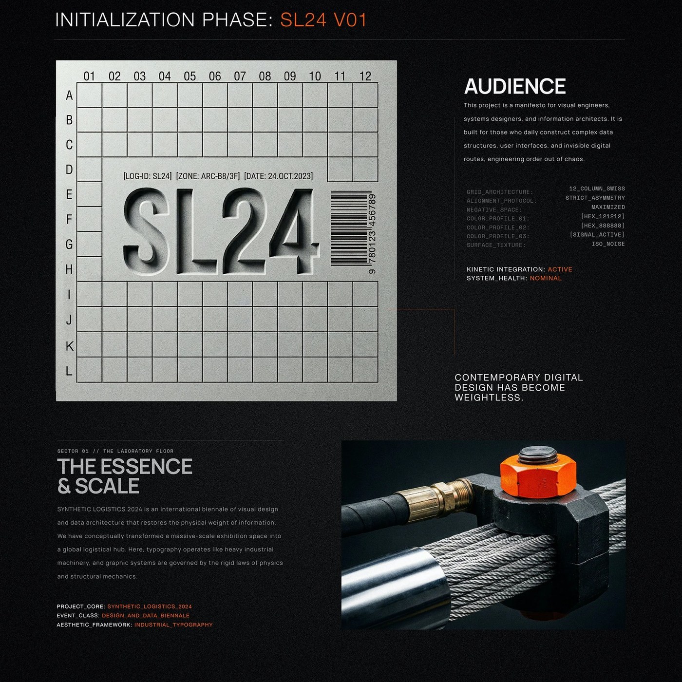
Brutalist Typography: SL24 by Kseniya Artman

Explore brutalist typography in SL24 by Kseniya Artman, merging 12-column Swiss grids with industrial cargo telemetry and safety orange accents. Berlin-based designer Kseniya Artman constructed this monumental brutalist typography system for Synthetic Logistics 2024 (SL24), a biennial exhibition…

The Legacy of Colonialism Haunts Hew Locke’s Era-Defying Flotilla

Although Hew Locke’s practice revolves around geographically bound objects—superimposed drawings of Guyanese homes and his suspended flotilla among them—the artist traces the reaches of empire that extend far beyond any singular era or point on a map. How people, capital, cargo, and ideas traverse…

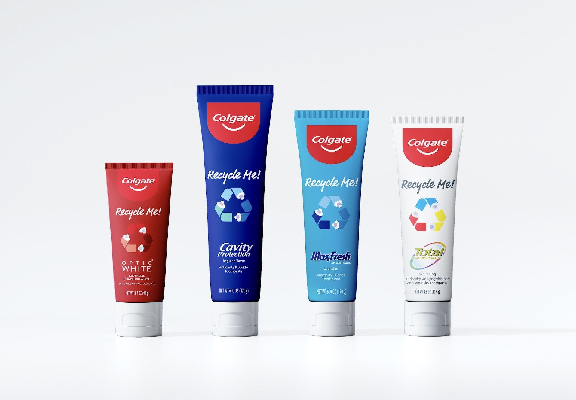
Colgate Made a Better Toothpaste Tube. Now They’re Getting Sued for It

“404 Page Not Found.“ That’s what I’m seeing as I go back into the archives to 2022 to confirm my memory of how Colgate announced the rollout of its new, widely recyclable toothpaste tube. And let me remind you, this was a massive deal for a piece of packaging that goes straight to landfill or the…

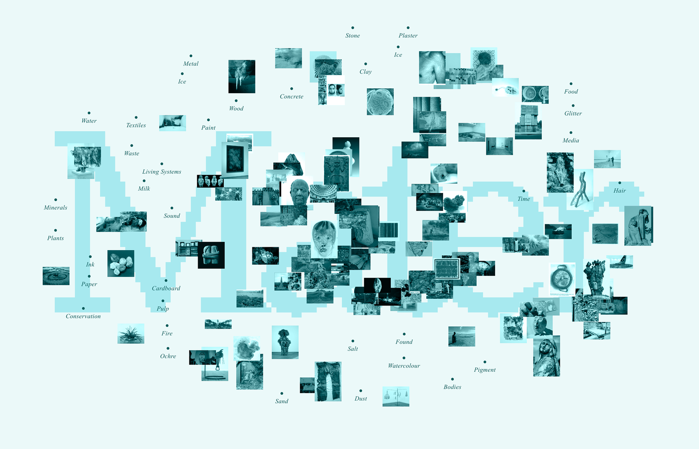
How Monumental Environmental Works by Meg Webster Cultivate Reconnection

In Derrick Jensen’s 1995 book Listening to the Land, Chickasaw poet and environmentalist Linda Hogan said, “There is a way that nature speaks, that land speaks. Most of the time we are simply not patient enough, quiet enough, to pay attention to the story.” Decades on, we continue to grapple with…

Branding Design: Auren Visual Identity by Nathalia Ultramar

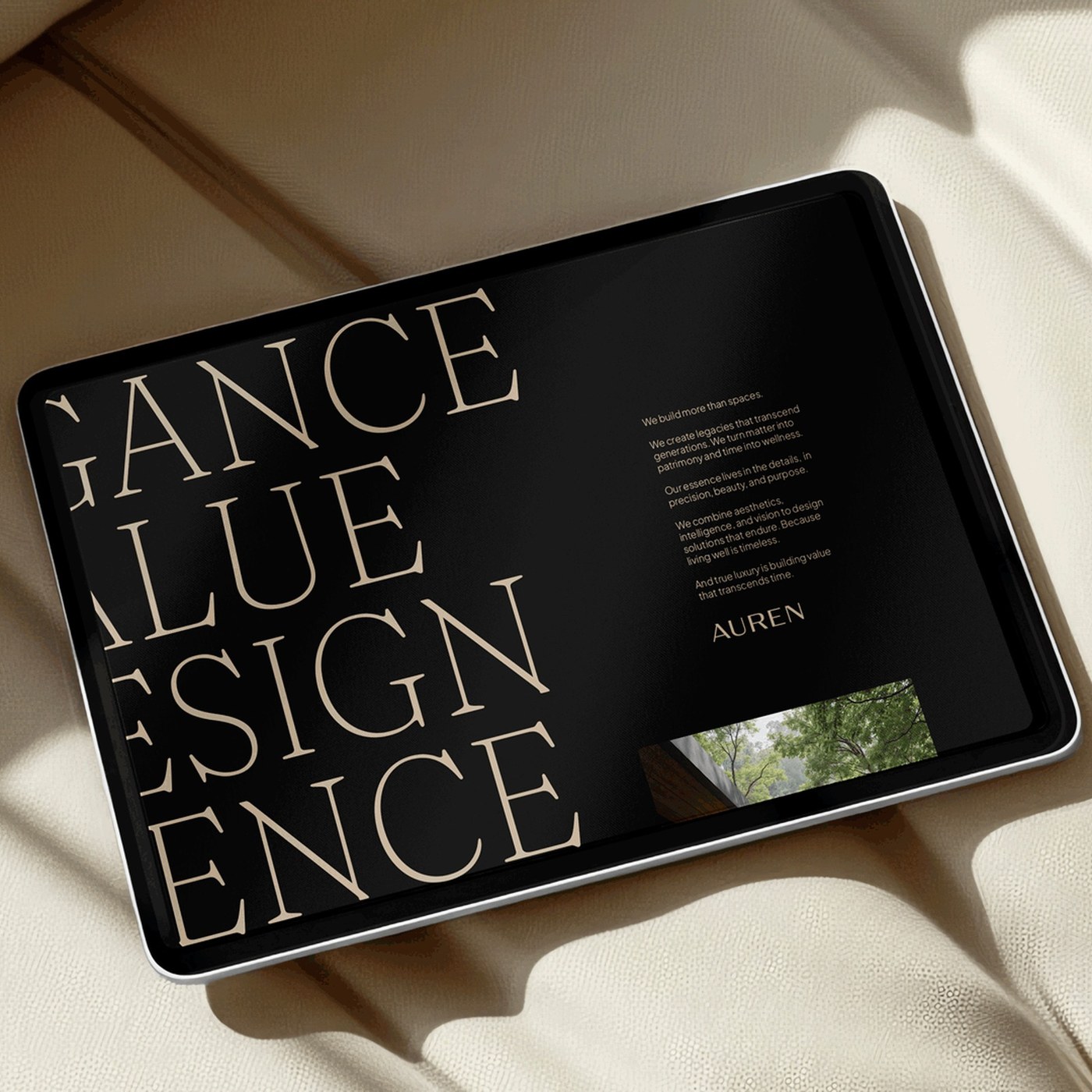
Explore the serene branding design for Auren by Nathalia Ultramar. The identity pairs architectural typography with tactile stone textures. Nathalia Ultramar created a refined visual system for development firm Auren & Co. The company unites architectural development with dedicated wellness spaces.…