Graphics Design

О графическом дизайне

RSS

Garrex Studio

Garrex Studio is an event agency, “crafting atmosphere through rhythm, light & detail.” Their visual identity is built as a graphic system able to support its productions across all materials. The typeface pairing sets the tone: Copperplate Gothic brings a carved, monumental quality to the…

Makoto San – Moso album art

Between ritual electro, analog tinkering, and invented folklore, the debut album from the collective Makoto San relies on a strong visual universe, designed as a direct extension of their music. The art direction by IGO Studio deploys singular imagery around masked figures and bamboo objects. This…

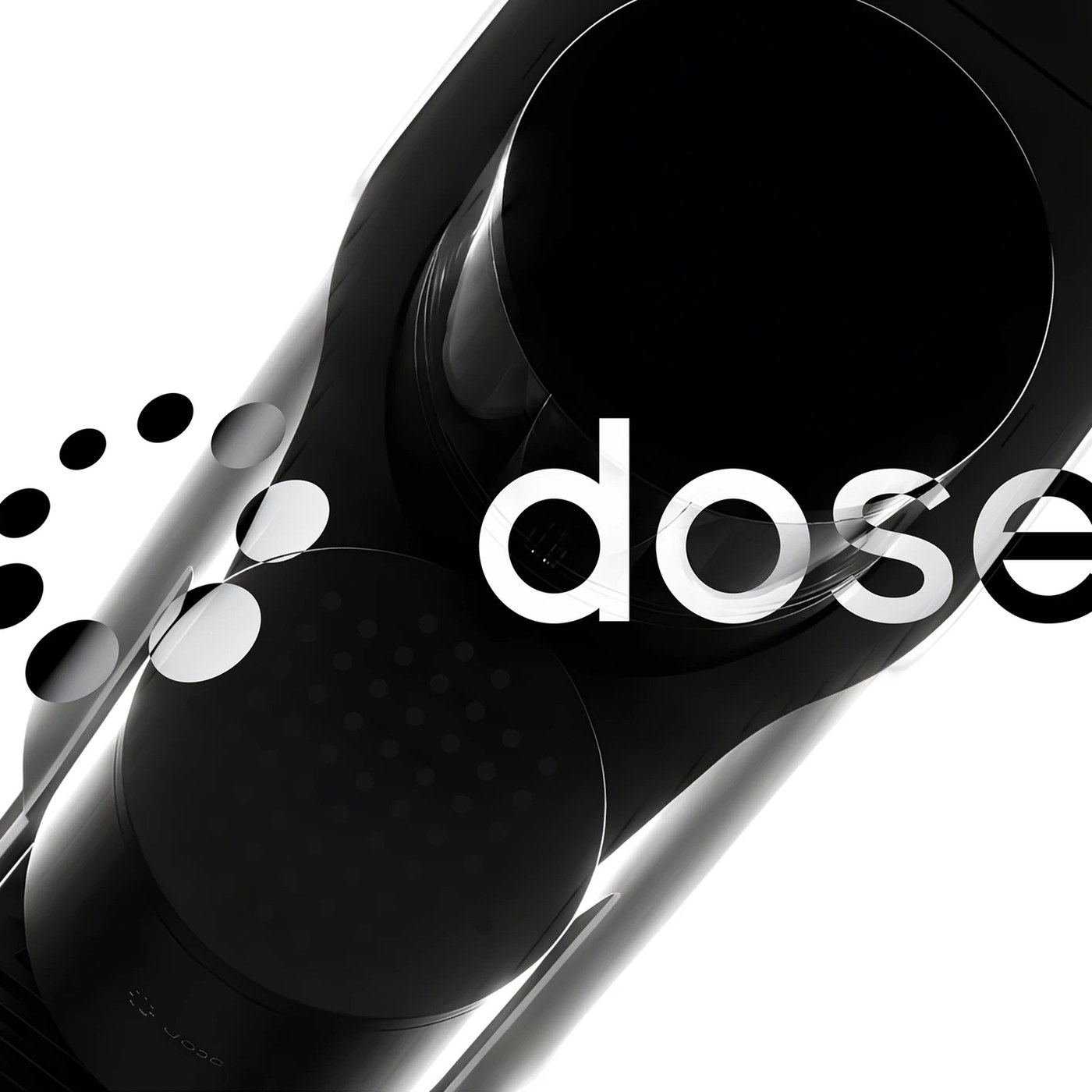
Brand Identity & UI/UX Design: dose by Sungsik Kim

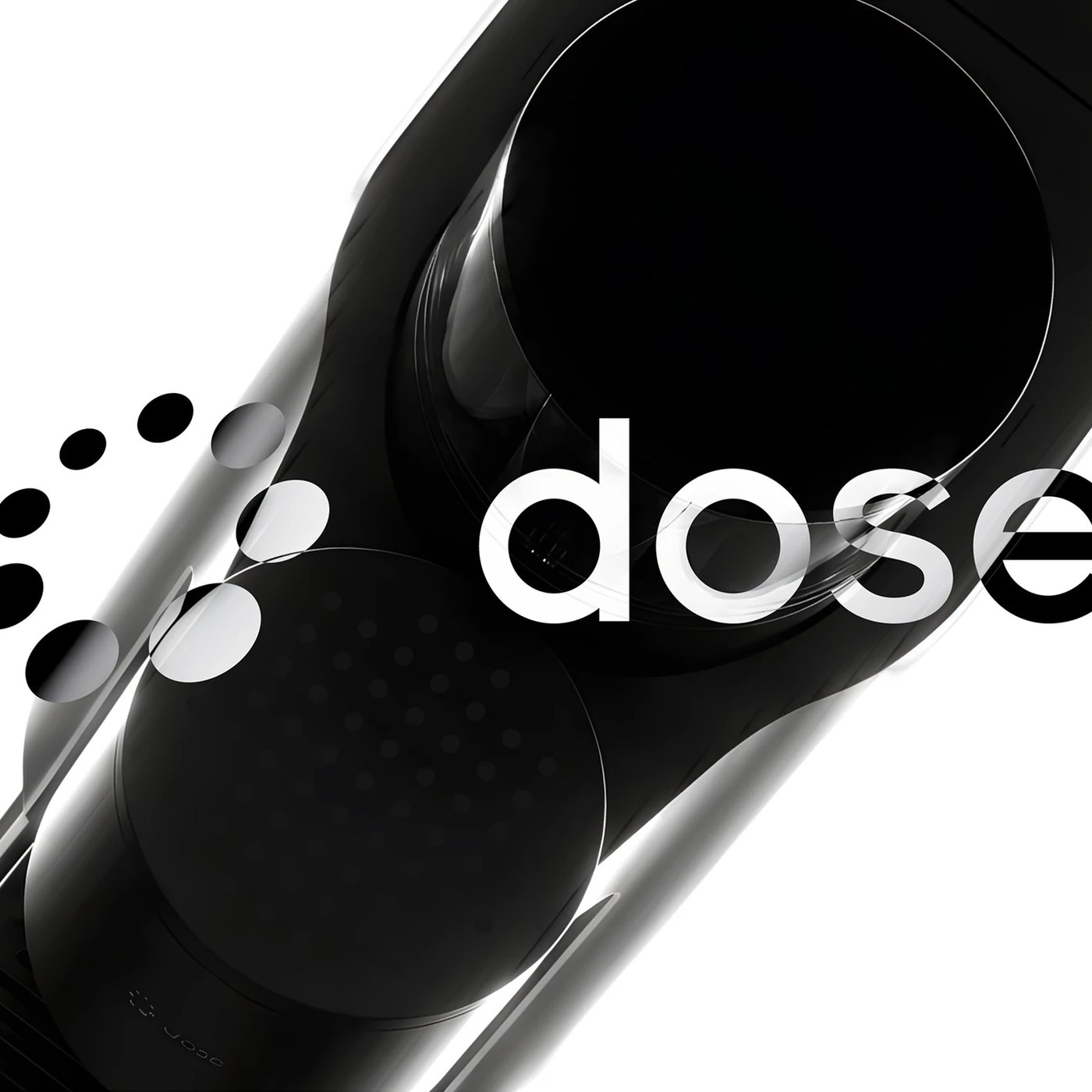
Sungsik Kim engineered the brand identity and companion ui/ux design for dose, tracking caffeine telemetry with circular dot-matrix tokens. Most coffee tools offer simple choices like decaf beans. Sungsik Kim treats daily caffeine as an exact personal dose. The project balances medical precision…

UI/UX Design: dose Precision Caffeine App by Sungsik Kim

Sungsik Kim engineered the ui/ux design for dose. The system tracks personal caffeine telemetry with circular dot-matrix tokens. Most coffee tools offer simple choices like decaf beans. Sungsik Kim treats daily caffeine as an exact personal dose. The project balances medical care with everyday…

Packaging Design: KanKan Sustainable Care by Two Times Elliott

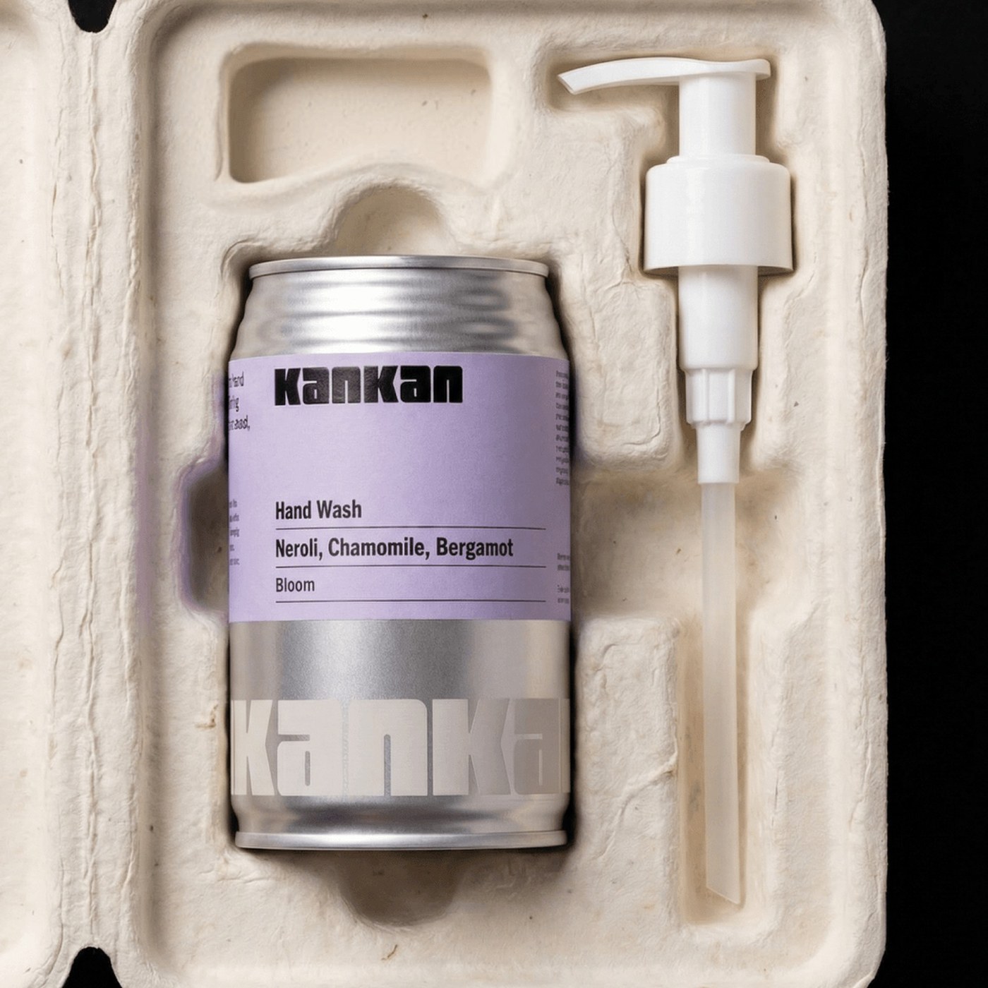
Two Times Elliott created a circular packaging design for KanKan. The system pairs aluminum cans with molded compostable pulp trays. KanKan aims to remove plastic bottles from home bathrooms. The team turned common drink cans into refill containers. Each metal can attaches to a twist pump head.…

Fantastic Plants Spring from Taehyoung Maria Jeon’s Digital Illustrations

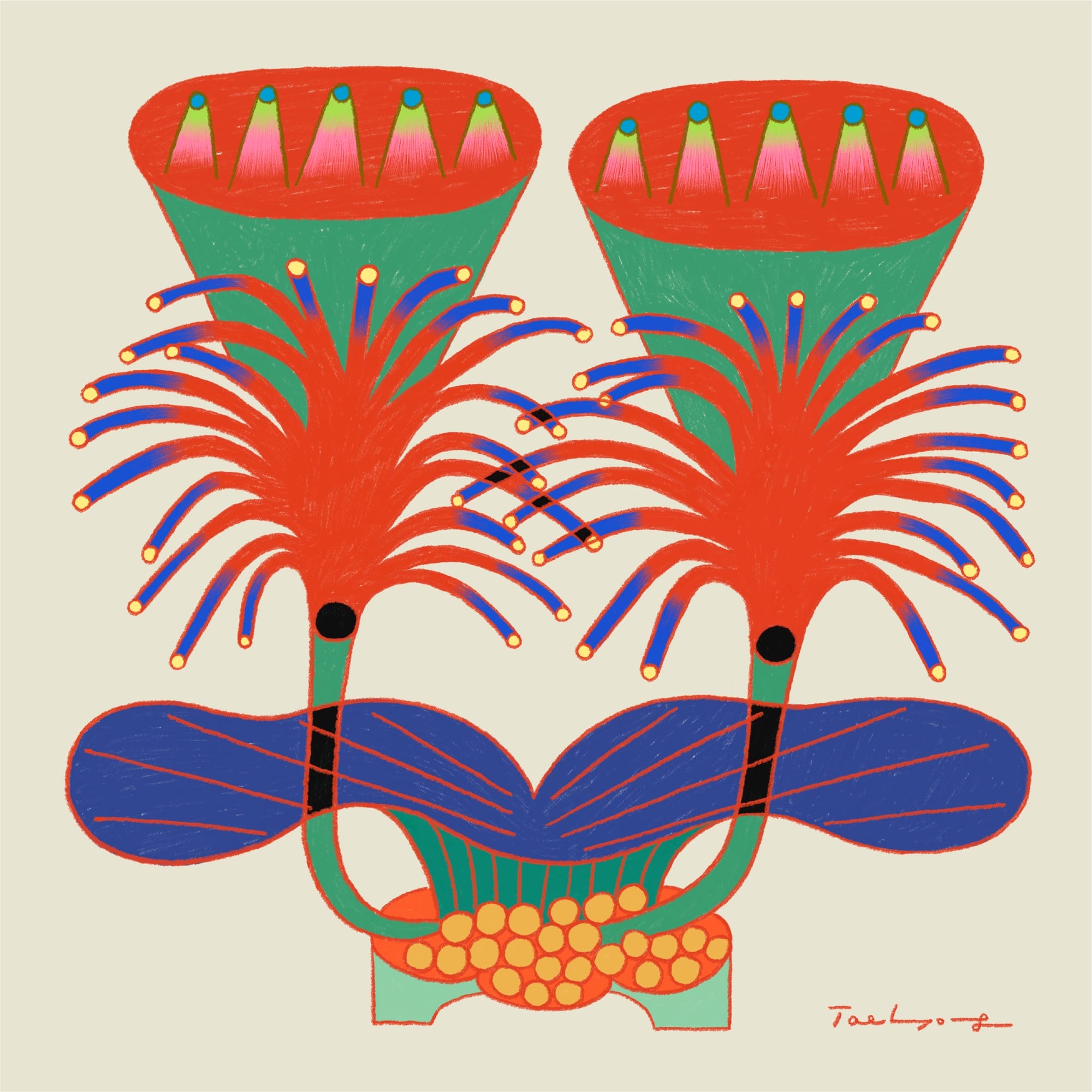
“I try to avoid playing it safe or going for the obvious. Instead, I look at plants from a different perspective and express them in my own way,” South Korean artist Taehyoung Maria Jeon says about a fantastical series of illustrations. “Ironically, having rules is what gives me the freedom to…

scars left by bears ripple through these japanese cedar surfboards

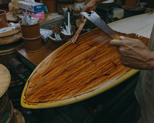
bear scars become part of the grain In the forests of Keihoku, north of central Kyoto, Asian black bears sometimes strip bark from cedar and cypress trees, leaving long wounds across their trunks. The behavior is known as kumahagi. As the trees continue to grow, new tissue forms around the damaged…

Red Moons and Lightning Illuminate Sarah Lee’s Uncanny Landscapes

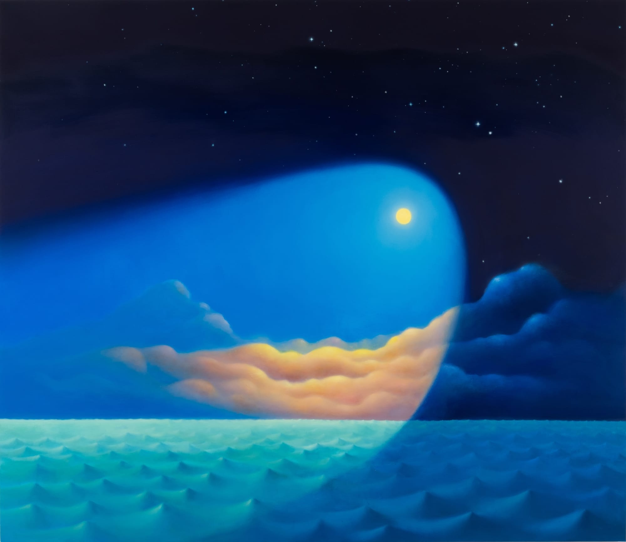
Delicate waves, mysterious fissures, and diffused lightning set some of the scenes in Sarah Lee’s dreamy landscape paintings. Moons with strangely direct beams of light and supple mountains cradled by lakes and forests are tinged with magical realism. Most of the works seen here are part of Lee’s…

Typography: Formula Condensed Typeface by Pangram Pangram

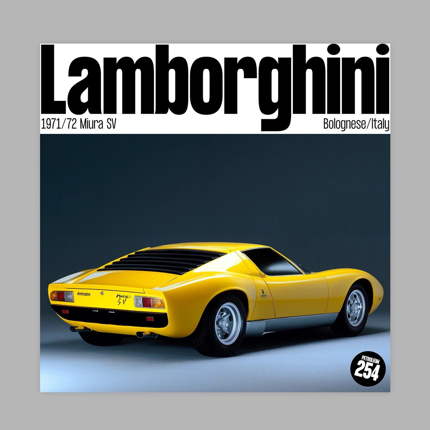
Pangram Pangram built Formula Condensed for display layouts. The sharp typography pairs tight grotesque glyphs with wide alternates. Mathieu Desjardins drew Formula Condensed to blend speed with clean craft. The family takes a narrow stance across five weights. Straight vertical stems save space…

Sidepiece Taps into the Snackstalgic Demo With a Reboot of a Millennial Classic

Designed by Truffl, Sidepiece is a new “better-for-you” snack for adults inspired by the beloved snack brand of yore, Dunkaroos Sidepiece is the latest CPG brand to feed into “kidult” culture in which nostalgic Millennials are turning to goods reminiscent of those for children Do we ever really…

Leckerlee Turns 15 Years of Lebkuchen Tins Into a Collectible Tradition

Leckerlee has been treating its Lebkuchen tins as collectible objects for fifteen years. Strohl Design Studio builds on the German tradition of gifting Nuremberg-style Lebkuchen in decorated metal tins, but changes the artwork every season, moving between folk art, Alpine scenes, botanical…

Aldi Turns Shopping Bags Into Fashion with Transformable 'Swag For Life' Jacket

Aldi UK has dropped a jacket that turns into a shopping bag called “Swag for Life.” According to Aldi, 46% of UK shoppers regularly forget their shopping bags, and their Swag for Life jacket solves this common problem. Part of the Aldi shopping experience is a middle aisle stocked with seasonal…

Visions du Réel

The 2026 visual identity of Visions du Réel, an international documentary film festival held annually in Nyon, Switzerland, was designed by Neo Neo. ES Allianz is used throughout the identity, across posters, the programme, motion graphics and the festival website. The visual identity combines the…

GoFundMe

GoFundMe is the global leader in online fundraising, where anyone can give and get help in one place. By uniting individuals and nonprofits in one place, GoFundMe is helping move humankind forward with unprecedented impact and scale. Our brand idea, ‘Help Adds Up,’ captures the feeling of…

Rezidual exhibition booklet

Exhibition booklet commissioned by Galeria Posibilă and designed by Ioana Petcu for Ghenadie Popescu’s exhibition Rezidual. The fonts in use are Gikit by Benoit Bodhuin, Riant Display by Sibylle Hagmann, and Helvetica. The photos were taken by Răzvan Șumilă during the opening.

Studio Musa

Logo, monogram, and complete visual identity for Studio Musa, developed by Filippo Baldo in collaboration with the creative agency Simple Flair. Studio Musa is the international architecture and interior studio behind pop-up installations, retail spaces, and spatial concepts for brands such as Moon…

Encore Lyon

Branding and communication for Encore Lyon, realized by Ancelin Watkins. Encore is a leading French electronic music promoter based in Lyon, specializing in creating immersive live experiences across the city’s top venues. Dedicated to promoting both popular and underground techno and house music,…

Village de Cirque 2026

Visual identity and graphic design by Juliette Hoefler for this year’s edition of Village de Cirque. The circus festival is organized by the Coopérative de Rue et de Cirque and took place in Paris in September 2026. Source: www.juliettehoefler.com Studio Juliette Hoefler. License: All Rights…

Women’s Pro Baseball League

Launching a new professional sports league is a monumental branding task, especially when it means creating four team identities from the ground up. For the inaugural season of the Women’s Pro Baseball League, Arrivals + Departures developed the names, uniforms, and visual identities for the Boston…

Optit

Our ongoing collaboration with Optit is about consistency and helping a brand growing day by day through the use of different materials and on various channels. In the last year we worked on a brand new website, advertising pages, product and HR trifold brochures, leaflets, small publications,…

Estenove

Estenove is an Istanbul-based hair transplant clinic with a visual identity designed to combine a contemporary medical aesthetic with a bold, editorial approach. Poppins is used as a display typeface across campaign headlines and key communication materials, creating a strong contrast with the…