Graphics Design

О графическом дизайне

RSS

Backyard Farms website

Backyard Farms is a Maine-based greenhouse tomato brand from Mastronardi Produce. Freshmade’s redesign of backyardfarms.com brings them into a more playful, motion-driven space. The design leans into the brand’s signature primary colors and emblematic white picket fence. Sculpin, from Process Type…
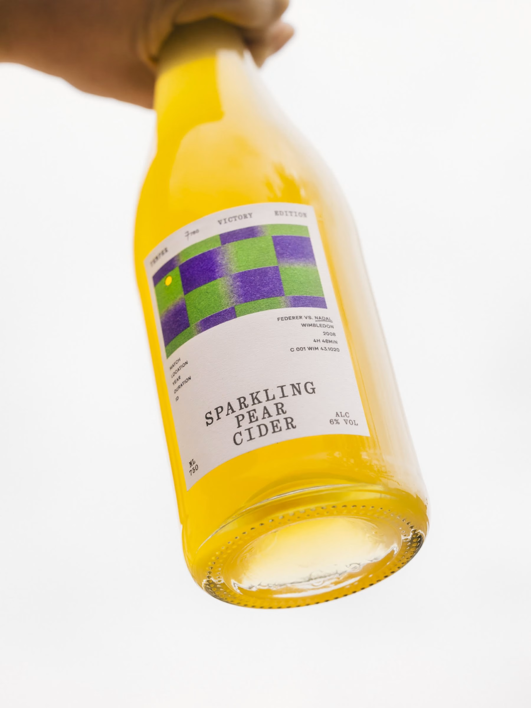

Sixty cider labels replay a Wimbledon point | Mindsparkle

Hono Studio Mindsparkle Mag Sixty cider bottles replay the last point of the 2008 Wimbledon final Five sets, nearly five hours of tennis, rain delays, fading light and two players who clearly had no interest in going home. The 2008 Wimbledon final between Roger Federer and Rafael Nadal was either…

San Francisco to Yellowstone: A Photography Journey

A travel photography journal documenting a camper van road trip from San Francisco to Yellowstone, captured on Sony, Ricoh, and Lumix cameras. Summer is officially behind us, making way for what is easily my favorite season. Fall always brings that quiet urge to slow down, get comfortable, and…

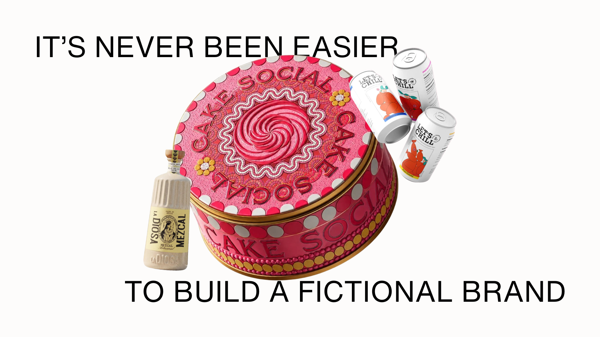
Shelf Life 127: It's Never Been Easier to Build a Fictional Brand

I’ve been doing this job for over five years, and I’ve been viewing concept work (amongst produced work) ever since. We’ve covered plenty of it, from brands built as speculative exercises to student-produced projects. That’s nothing new. What is new, however, is the sheer volume of concept work,…

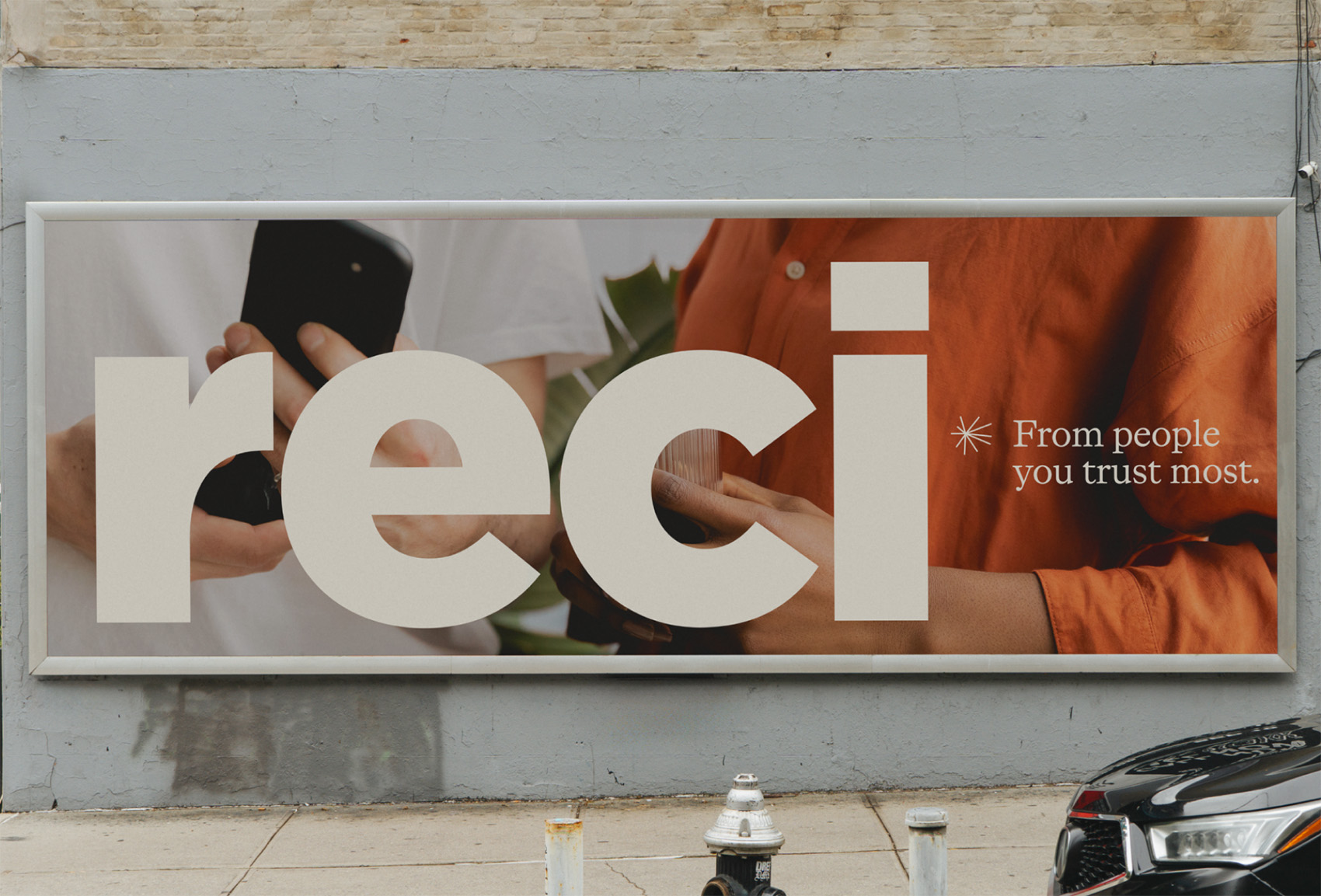
Reci

Thank you! ✌️

Typography: Fluxetype Variable Typeface by Nikita Kanarev

Discover Fluxetype, a versatile typography system by Nikita Kanarev bridging humanist sans and serifless roman across three variable axes. Bridging the structural clarity of a humanist sans with the classical proportions of a serifless roman requires exceptional anatomical precision. Designed by…

Packaging Design: Saucy by Nathalia Ultramar

Discover the bold packaging design for Saucy by Nathalia Ultramar, pairing punchy typography with bespoke color palettes and body care bottles. Brazilian designer Nathalia Ultramar developed this comprehensive packaging design and brand identity for Saucy, an original body care line created in…

Best of the Week: Editorial Pacing and Modular Type

We gather the best of the week features across branding, packaging, editorial design, and typography from ISO week 2026-W37, spotlighting architectural grids and tactile print craft. This week’s editorial throughline examines the tension between structural restraint and tactile material expression.…

Peanuts books from Determined Productions

Connie Boucher founded Determined Productions to publish these Peanuts books in the early 1960s, and they’ve been reprinted and even redesigned while staying within this aesthetic. The design is great, the type is great, the text is great, the illustrations are great. They also made other materials…

Die sexte Versuchung by Ferry Hirschmann

Die sexte Versuchung. Liebe & Lust in Österreich (“The Sexth Temptation. Love & Lust in Austria”) is a 1970 book by Austrian journalist and author Ferry Hirschmann. It adopts a reportage approach typical of the period, combining social observation and an irreverent, mildly provocative perspective…

Twilight book series by Stephenie Meyer

First edition of Twilight, Megan Tingley Books, Little, Brown, 2005 Zephyr is the typeface used for the Twilight series. Written by Stephenie Meyer, the four vampiric-fantasy romance novels were published by Little, Brown between 2005 and 2008. Gail Doobinin’s jacket designs pair Zephyr with…

Rizohm Events

Logo and poster series for Rizohm, an independent electronic-music event series in Treviso, Italy. The logo is the Kernel Blossom, a seed-and-bloom symbol drawn for the series and kept independent from the wordmark rather than built into it. The wordmark alongside it is custom lettering: six…

Blood for Dracula trailer title card

As a counterweight to the current ubiquity of ITC Serif Gothic and ITC Benguiat Bold Condensed, wonderfully evocative as they may be, here is a novel combination of fonts from the American theatrical trailer for Blood for Dracula, a.k.a. Andy Warhol’s Dracula. The opening titles of Blood for…

Im Postkraftwagen durch Dresden und das schöne Sachsen

A charming bilingual booklet describing the various routes and tours of the German Post Office postbus routes in the Dresden and Saxony regions and issued in 1929. It includes text, photographs and maps showing the routes and the various attractions and destinations. It is officially titled Im…

Mission Hill end credits

From Wikipedia: Mission Hill is an American animated sitcom created by Bill Oakley and Josh Weinstein for the WB. It originally aired for five episodes from September 21, 1999, to July 16, 2000; unaired episodes were burned off on Cartoon Network’s Adult Swim from May 26 to August 11, 2002. The…

Gift of Curiosity logos (2014–)

Gift of Curiosity is a website made “to help parents, teachers, and caregivers support children”, offering “educational resources, printables, and hands on activities that spark children’s creativity and learning.” It was launched in 2012, initially with a different logo font. In May 2014, the logo…

Mira Aizawa – “I am an AI” music video

“わたしはAI” (“I am an AI”) is a song by Japanese AI virtual singer Mira Aizawa, released on 2August 2026. Japanese lyrics use the retro-styled (1930s Showa Era) Japanese geometric typeface Kaisotai by Moji-Waku Research.

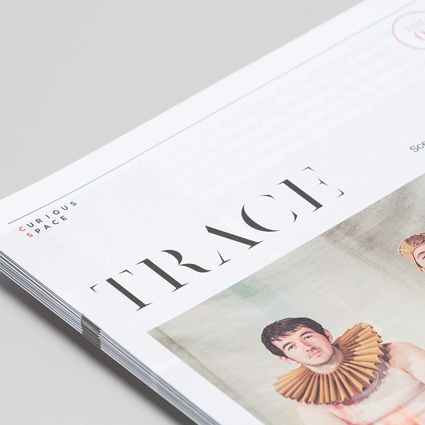
Editorial Design: Trace Magazine by SocioDesign

SocioDesign crafted Trace Magazine with clean editorial design. The biannual print piece frames spatial work with calm skill. Curious Space designs exhibition sets for museums and theatre events. SocioDesign turned these physical spaces into a printed paper piece. The editorial design uses stark…

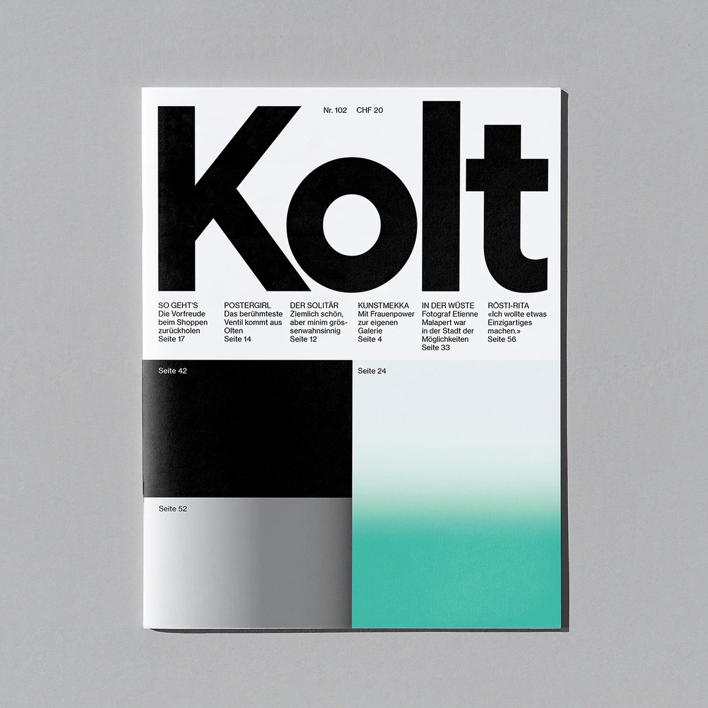
Editorial Design: Kolt Magazine by Alice Poma & Studio Feixen

Alice Poma and Studio Feixen crafted a dynamic editorial design for Swiss cultural publication Kolt Magazine, featuring bold typography. Based in Olten, Kolt covers local Swiss culture and art. Alice Poma teamed up with Studio Feixen to reshape the publication. The team built an editorial design…

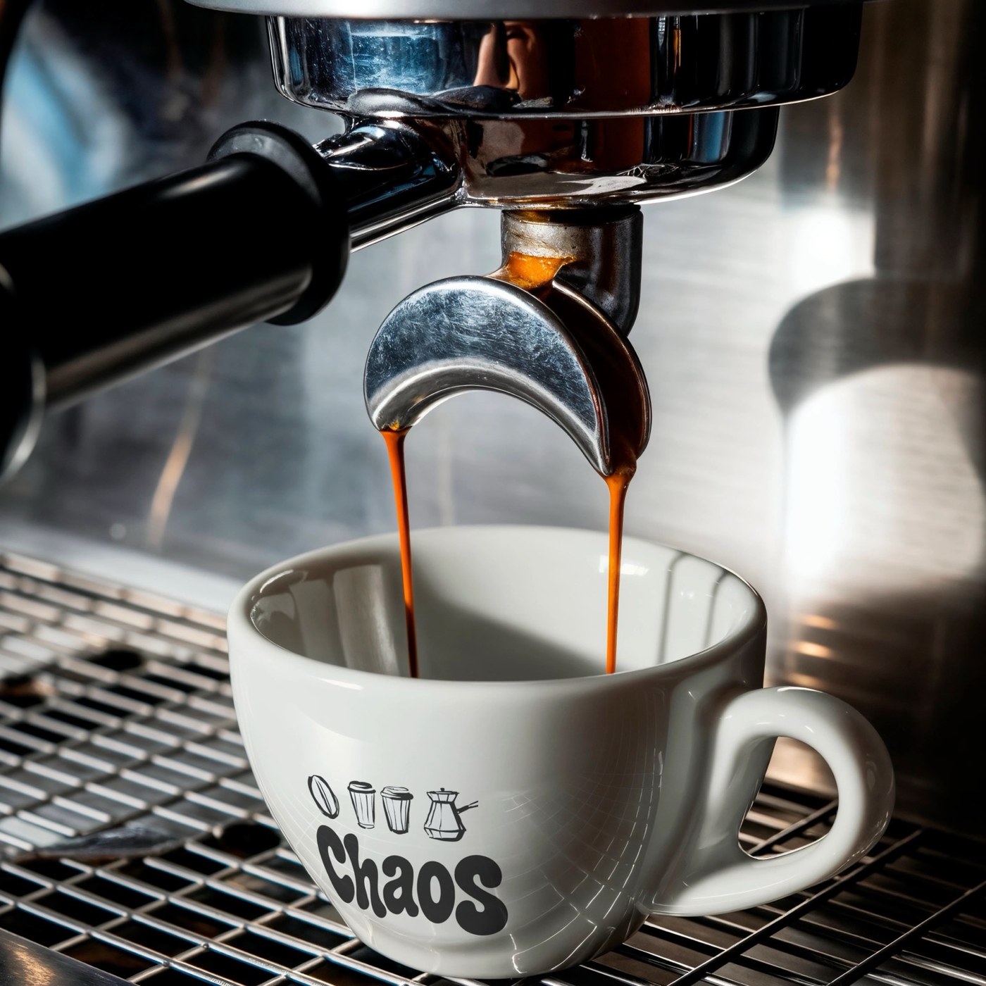
Brand Identity: Chaos by Youssef Abdelhamid

Youssef Abdelhamid designs a tactile brand identity for Chaos coffee, pairing chubby Moresugar typography with linocut iconography. Specialty coffee branding frequently defaults to austere Scandinavian minimalism or sterile clinical laboratories. For Chaos, a youth-oriented specialty coffee roaster…

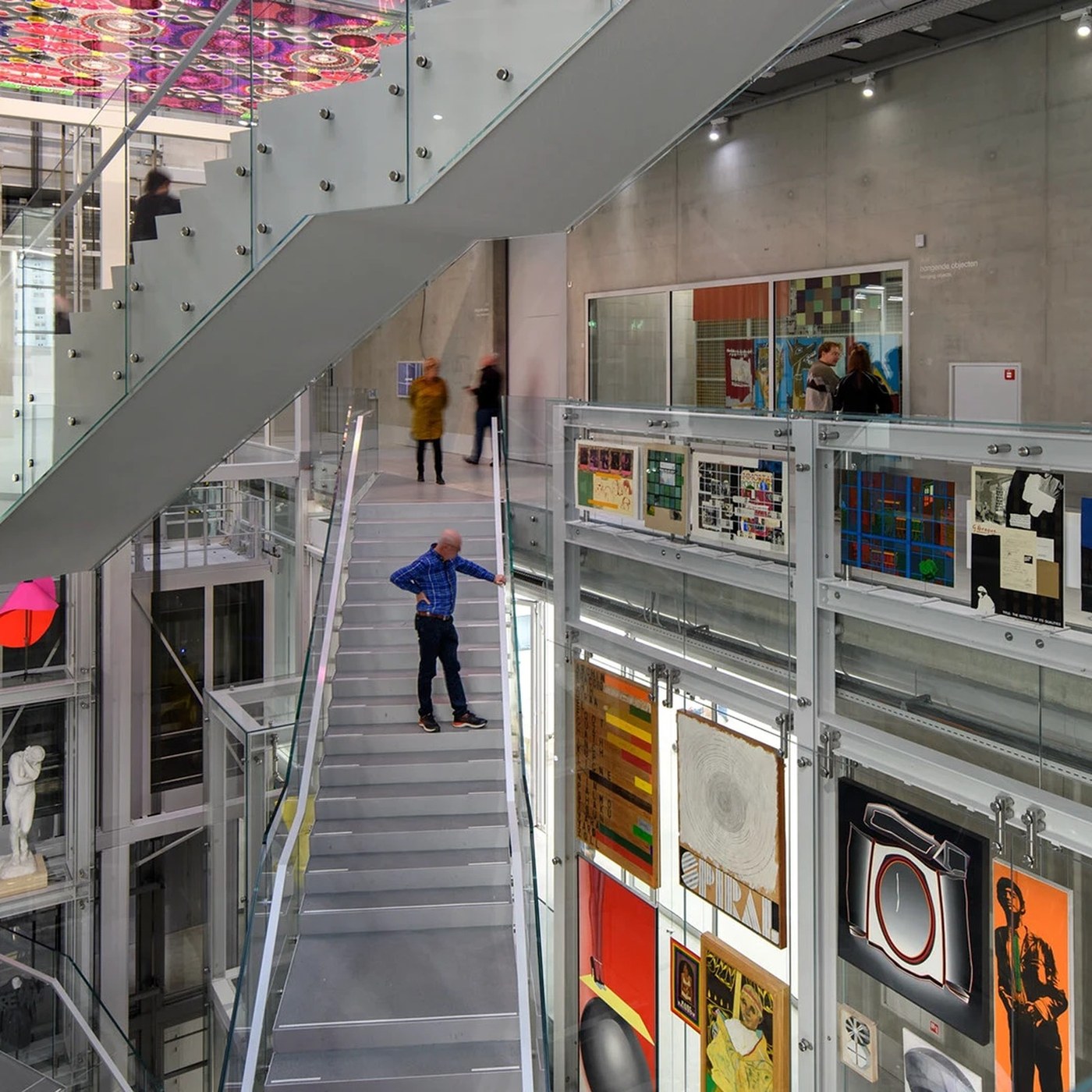
Spatial Design: Depot Boijmans Wayfinding by Silo

Silo built a spatial design and signage system for Depot Boijmans Van Beuningen. The work turns an art warehouse into an open public vault. Depot Boijmans Van Beuningen is not a classic museum. The building serves as an active art storage space. Silo approached the vast Rotterdam interior as a…

Andre Kostelanetz and His Orchestra – Music of Irving Berlin album art

Music of Irving Berlin is a 1950 album released by Columbia Masterworks. The album contains eight songs the composer produced for various Hollywood films. The typeface used for Irving Berlin’s name is Norton Vaudeville Act 7. It is paired up with various gothics for the minor details.