Graphics Design

О графическом дизайне

RSS

Andre Kostelanetz and His Orchestra – Music of Irving Berlin album art

Music of Irving Berlin is a 1950 album released by Columbia Masterworks. The album contains eight songs the composer produced for various Hollywood films. The typeface used for Irving Berlin’s name is Norton Vaudeville Act 7. It is paired up with various gothics for the minor details.

The Hill-Top Four – Barbershop Quartet album art

This album with barbershop music was released around 1960 by various record labels, with different titles and covers. Shown here is the (undated) version by Spin-O-Rama Records, by “The Hill-Top Four”. “Barbershop Quartet” is shown in a bichromatic setting of Davison Carousel’s “C” style (solid…

Carl Sandburg Sings His American Songbag album art

Carl Sandburg Sings His American Songbag is a 1968 folk country album by American poet Carl Sandburg (1878–1967). Recorded in New York between May 27, 1952, and June 13, 1953, it was released posthumously by Caedmon Records in 1968. The cover design by Frederick Hubicki uses a photography by…

Dodie Stevens – Over the Rainbow album art

Over the Rainbow is a 1960 studio album by teenage pop singer Dodie Stevens, released on Dot Records. The 12-track LP features traditional pop/vocal standards, including the title track, “The Trolley Song”, and “You Made Me Love You”.

Gary Lewis & the Playboys – She’s Just My Style album art

Four guys in a band? Scratch that, five guys in a band. And the main guy’s the son of a funnyman. The group name is group name is set in various styles from Europa Grotesque by Techni-Process: Lewis’ name in bold, ampersand in regular, and the proper group name in bold condensed. The album title…

Florence + The Machine – Dance Fever album art and single covers

The album art for Florence + The Machine's Dance Fever Florence + The Machine’s fifth studio album Dance Fever features a slightly modified version of Chambord by Scriptorium in a design by Thunderwing. The album and its singles were released in 2022. [More info on Discogs] The single art for the…

Arlanoa & Lourene – “Lua De Amor” single cover

Arlanoa is an artist and DJ specializing in house music, based in Berlin. For the single “Lua De Amor,” released in August 2026, he collaborated with Brazilian artist Lourene. Clara Ogino’s cover combines digital illustration and typography. Formats Album Art(4526) Designers/Agencies Clara Ogino(1)…

Danny Wilson – Meet Danny Wilson album art

Meet Danny Wilson is the debut album of Scottish pop band Danny Wilson. Released in 1987 on the Virgin label, it included their most popular hit, “Mary’s Prayer”. The cover art shows a photo of the band over a white background. The top part of the album title and the back cover are set in Stempel…

Marion – Por Favor! album art

Marion (Marion Rung, b.1945) is one of Finland’s most popular artists. Her career began in the early 1960s and continues actively to this day in the 2020s. Por Favor! is Marion Rung’s ninth studio album, released in December 1978. The cover was designed by Seppo Järvinen, pairing photography by…

Don Carlos – Harvest Time album art

Harvest Time is one of the early album releases by Jamaican reggae singer and composer Euvin Spencer (b.1952), better known by his stage names Don Carlos or Don McCarlos. The cover typography uses a single size of ITC Bauhaus Bold, in all caps. [More info on Discogs] Formats Album Art(4526)…

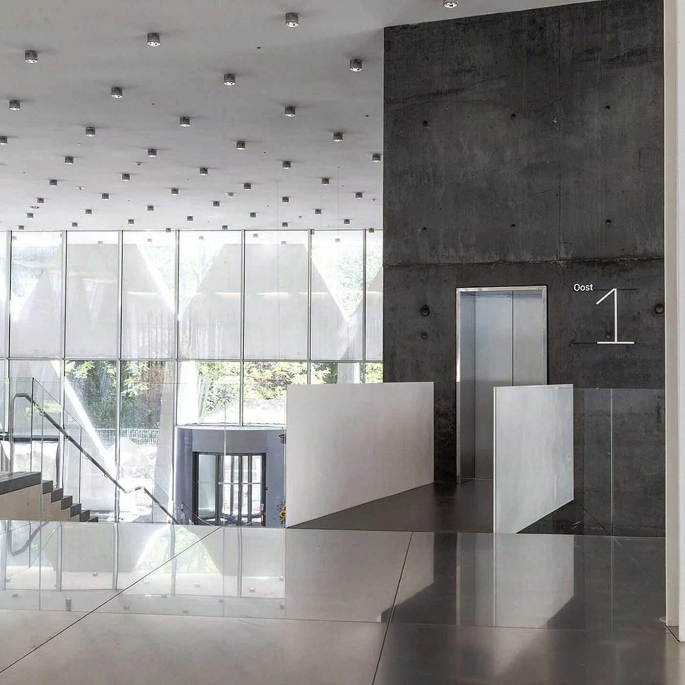
Spatial Design: Province of Antwerp Wayfinding by Silo

Silo designed a disciplined spatial design and wayfinding system for the Province of Antwerp headquarters, framing XDGA's brutalist tower. The Antwerp provincial headquarters pairs a glass low-rise base with a twisting tower by XDGA. The facade uses a clean grid of triangular windows. Inside, raw…

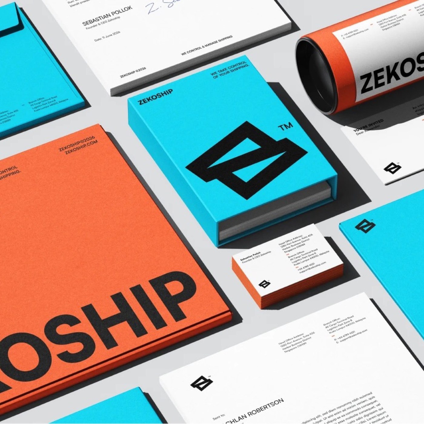
Brand Identity: ZEKOSHIP by Rokeya Akter

Rokeya Akter crafts a high-impact brand identity for ZEKOSHIP, pairing utilitarian logistics telemetry with high-contrast chromatic restraint. Modern global logistics demands immediate visual authority and operational clarity. For ZEKOSHIP, a freight forwarding and transportation management…

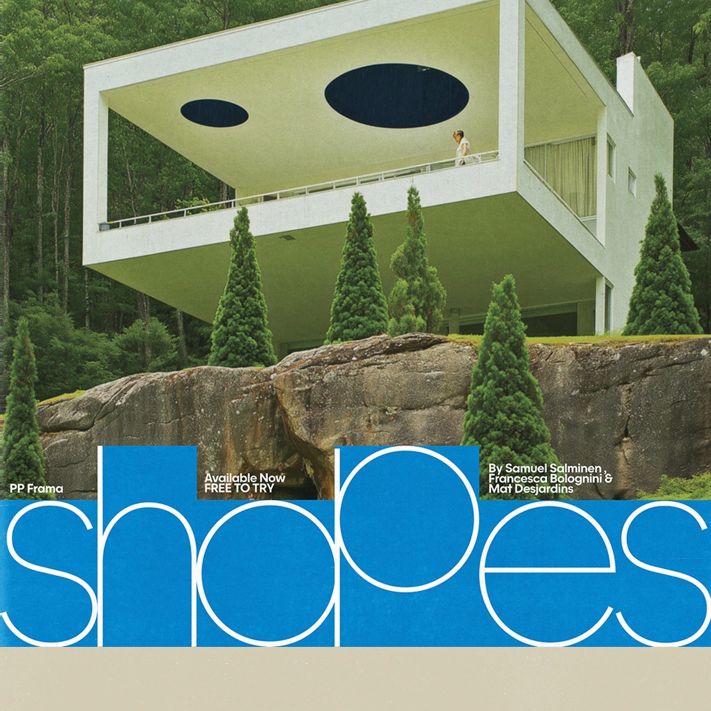
Typography Design: PP Frama by Pangram Pangram

Pangram Pangram crafts a bold typography design with PP Frama. The typeface blends clean Futura geometry with calm modernist rhythm. PP Frama takes inspiration from two famous type families. It borrows clear structure from Futura. It also takes bold forms from Avant Garde. Studio founder Mathieu…

Sara Anstis’ Soft Pastels Summon Mythology, Dreams, and the Renaissance

A figure appears to have been subsumed by a bookcase, and another is swathed in a green sleeping bag beneath a makeshift tent. Whether navigating a bathtub fitted with oars or sleeping in a bed while stacked like pancakes, the figures in Sara Anstis’ atmospheric drawings are immersed in curious…

Oatly Calls On Politicans To Address Climate Change On Its Packaging

89% of people want governments to do more about climate change. Oatly is calling on politicians to act by making a plea to them on one side of its cartons. Alt-milk brand Oatly wants to bring more attention to climate change and is using a significant portion of its packaging to do so. Launched in…

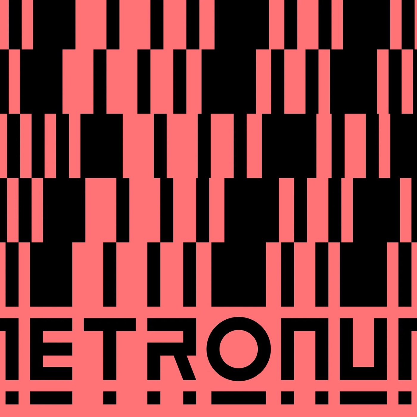
Branding Design: Le Metronum Visual System by Brand Brothers

Brand Brothers built a bold branding design for Le Metronum, a Toulouse music venue, using modular geometric patterns and custom type. Le Metronum serves as a central hub for contemporary music in Toulouse, housing a 600-seat concert hall, rehearsal spaces, and recording rooms. In 2022, the venue…

Alec's x Purely Elizabeth Collab Takes The Shame Out Of Ice Cream For Breakfast

Alec’s Ice Cream and Purely Elizabeth have dropped a collab called “Ice Cream for Breakfast.” The packaging follows the same design style as the rest of Alec’s Ice Cream and is exclusive to Target. Eating ice cream for breakfast might seem like an overindulgent way to start the day. Having dessert…

Say Hello to PÉPET, a Pear-Shaped, Palm-Size Paper Pal

Have you ever imagined a pear or an apple with a personality? If the fruit suddenly had two eyes and a stem-like nose, it might look a little like PÉPET, the palm-size “paper friend” produced by TAKEO Co., Ltd. Originally designed by Masae Nagao, the colorful characters come with names like…

7UP Lemonade Is Pretty in Pink

Are we wearing rose-colored glasses, or is everything pink? 7UP Pink Lemonade fully commits by trading the classic green look for a can drenched in juicy pink. The familiar 7UP shapes are still there, but now they twist through the pack in white and green like ribbons, making the whole thing look…

Le rêve d'être artiste

Le rêve d’être artiste (“The Dream of Becoming an Artist”) was an art exhibition at the Palais des Beaux-Arts de Lille, bringing together Albrecht Dürer, Marina Abramović, Jacques-Louis David, Édouard Manet, Frida Kahlo, Jeff Koons and many more. But what makes an artist an artist? The exhibition…