Graphics Design

О графическом дизайне

RSS

Rachel Comey and Unreal Transform the Candy Wrapper Into Runway-Ready Fashion

Fashion and food are increasingly trading materials and visual codes, and the Coco Bag takes that crossover literally. Fashion brand Rachel Comey turns UNREAL’s familiar silver wrapper interior into the bag’s entire exterior, giving disposable snack packaging the presence of a crinkled metallic…

Reducing Perkins Park to just PARK | Mindsparkle

Hochburg Design Mindsparkle Mag PARK changes the beat of Stuttgart nightlife with a new identity by Hochburg Since 1980, Perkins Park has been part of Stuttgart’s nightlife. In 2026 it becomes PARK — and, more than a rebrand, the new identity marks a fundamental shift in the club itself. House and…

New Branding for Oodles by Studio South – BP&O

There’s so much to love about this identity – not least that it manages to make a noodle joint look like a perennially hip skate brand (yes, I am obviously talking about Supreme – all no-nonsense stocky black lettering on postbox red backgrounds). The identity in question is that for the delectably…

IED master of arts graduates deploy design against the loss of common goods

IED MASTERS of arts EVOLVE PRACTICE THROUGH DESIGN X COMMONS Marking an evolution in how design intervenes within contemporary society, the Master of Arts programs at Istituto Europeo di Design (IED) treat the discipline as a mediator between communities and common goods. Grounded in the…

HyperWerk

The Institute Experimental Design and Media Cultures (IXDM), part of the HGK Basel in Switzerland, is organized around two spaces and communities – HyperWerk and Critical Media Lab. HyperWerk is a space of possibility for new and unexpected forms of design, and a matrix for transdisciplinary…

La Grande Folie

La Grande Folie is an event identity and art direction project developed for Théâtre Jean Vilar in Vitry-sur-Seine, France. The visual identity makes a bold and direct use of Parabole (Dávid Molnár), combining its expressive letterforms with a vibrant colour palette and playful compositions across…

Le Phénix Scène Nationale Valenciennes, 2026–27 season

Le Phénix, the national stage in Valenciennes, unveils a new visual identity for its 2026–2027 season. Developed in close collaboration with the Phénix team, the identity is built around a series of bold headlines, vibrant visuals and the BBB Poppins TN typeface by Bye Bye Binary, used as the…

Way Out West Festival 2026

Way Out West 2026 uses Alias Ano across social media, website and on-site signage. The secondary typeface is Lateral. It’s used in several styles, including in modified extrabold italic caps for this year’s logotype.

What about the Art? Contemporary Art from China by Cai Guo-Qiang

Designed by Miko McGinty with Mallory by Frere-Jones Type, What About the Art? Contemporary Art from China examines the contributions of Chinese artists to the international canon of contemporary art, focusing on their innovations. Curated by New York-based, Chinese-born artist Cai Guo-Qiang to…

Mill Italian Bistro

The brand identity for Mill Italian Bistro treats operational constraints as creative material.⁠ ⁠ The logotype appears stretched and rolled like dough – hand-sketched first, then refined digitally. Charcoal illustrations crumble like flour scattered across a kitchen surface, all drawn by Lead…

Tochki kasaniya / Common Ground

Точки касания / Common Ground is a bilingual magazine made as student project at TH Nürnberg. The editorial project explores migration and inclusivity in Germany, shifting the narrative from abstract statistics to deeply personal human experiences. The typographic concept relies on extreme contrast…

Chito Sushi & Ramen website

This is the website for Chito, a sushi and ramen restaurant in Lausanne, Switzerland. Most text is set in Reforma 2018 (PampaType). Small texts are set in Lato (tyPoland). The design was made by Bessttech. Formats Web(6025) Designers/Agencies Bessttech(1) Artwork location Switzerland(1206)…

Typography Design: Lock Superfamily by Mash Creative

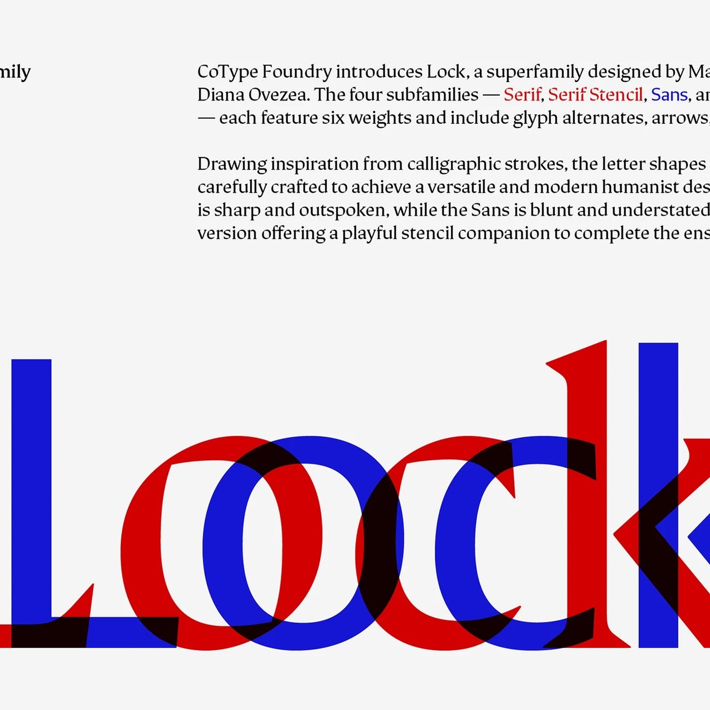
Mash Creative crafts a versatile typography design with Lock Superfamily, uniting sharp serifs, blunt sans letterforms, and playful stencils. Mark Bloom and Diana Ovezea developed Lock over two years for CoType Foundry. The system solves a common challenge in typography design by bridging two…

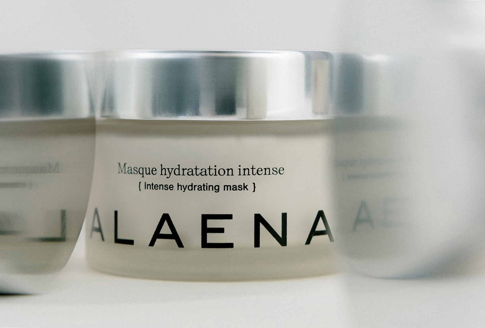
Alaena

Thank you! ✌️

Diminutive Seahorses Top the 2026 Ocean Photographer of the Year Contest

As deep swells from an offshore hurricane were further empowered by king tides in Southern California over the past several days, residents experienced firsthand the impacts of human-generated climate change. Erosion is an innate process along coastlines, where waves and wind constantly shift the…

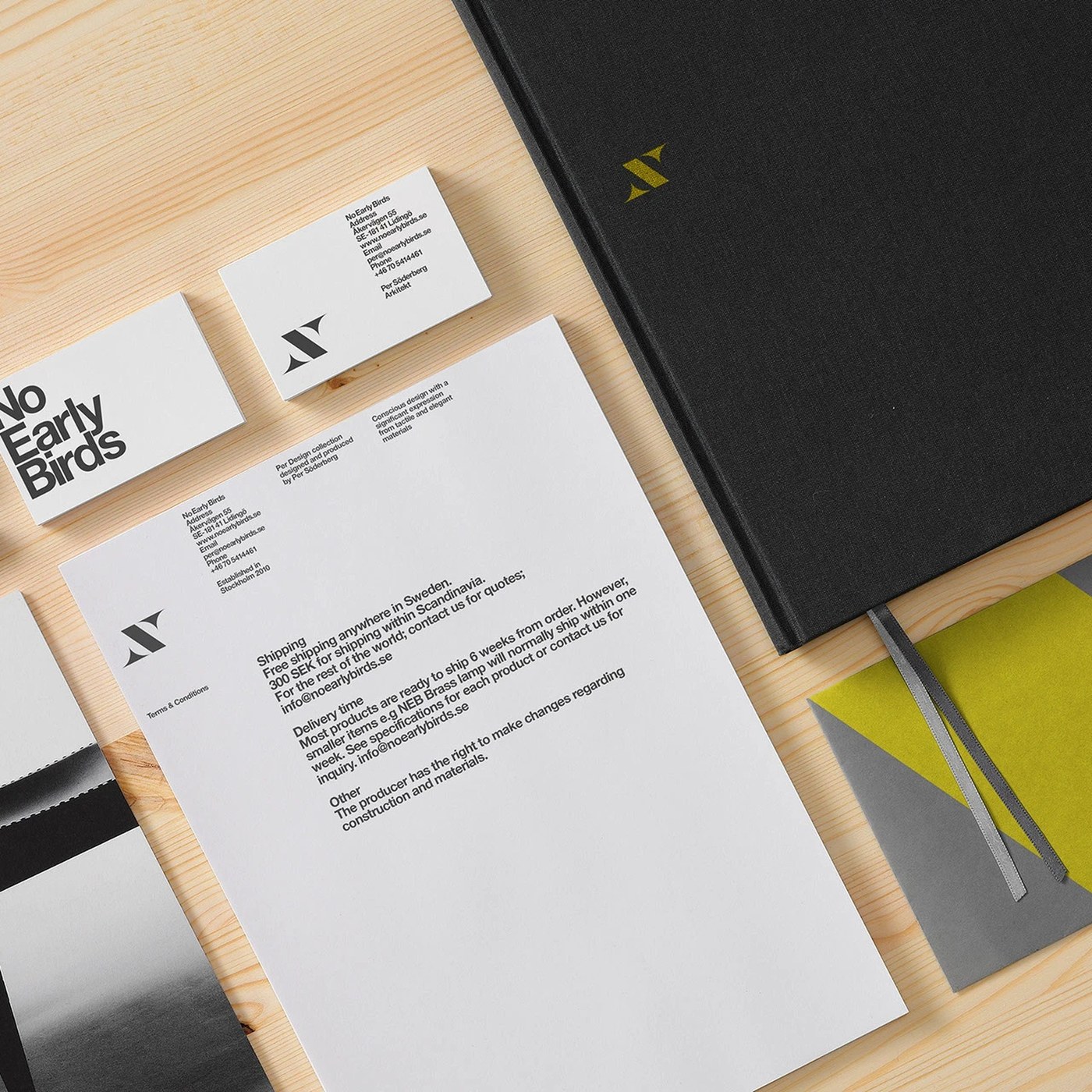
Branding Design: No Early Birds by Kurppa Hosk

Kurppa Hosk created a sharp branding design for No Early Birds. Modern Swedish furniture meets stark black and white print. Swedish architect Pär Söderberg built the No Early Birds collection. His furniture is known for its custom cross-leg base. Kurppa Hosk shaped a bold visual identity around…

Karla Wong’s Folkloric Portraits Conjure Mysterious Portals to Another World

Although Karla Wong has always been passionate about drawing, it was her degree in law that ultimately spurred her current practice. The Mexican artist spent her adolescent and early adult years in Oaxaca, where she attended university and eventually became a forensic and witness sketch artist for…

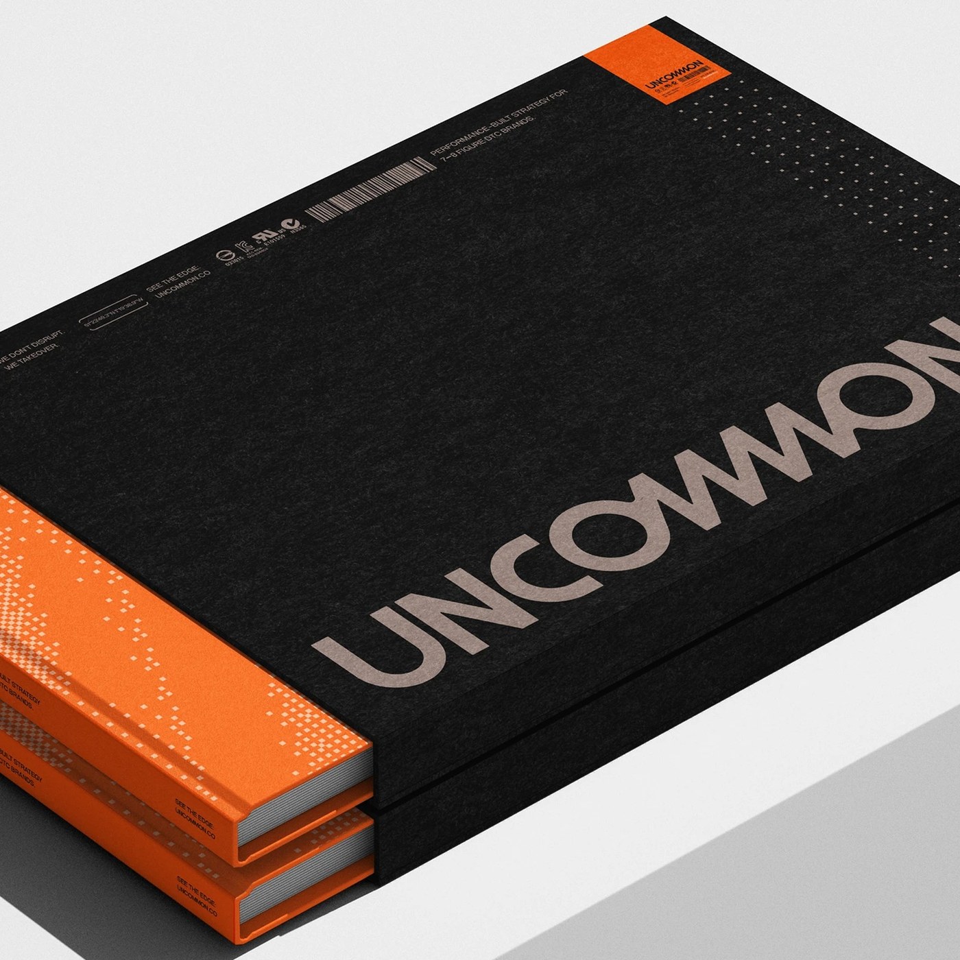
Brand Identity: Uncommon by Victor Berriel

Victor Berriel crafts a high-precision brand identity for DTC agency Uncommon, pairing Neue Montreal with tactical orange telemetry. Performance marketing agencies frequently lean into predictable design tropes: sterile corporate gradients, friendly rounded cards, and stock dashboard wireframes.…