Graphics Design

О графическом дизайне

RSS

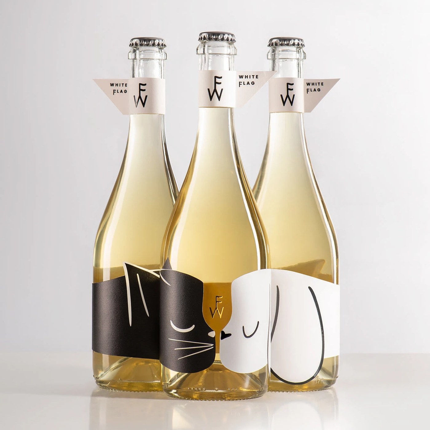
Packaging Design: White Flag by Backbone Branding

Backbone Branding built an expressive packaging design for White Flag wine. Paper neck flags pair with a playful cat and dog bottle label. Yerevan studio Backbone Branding approached this project with a clear message of peace. Wine often brings people together across different views. The studio…

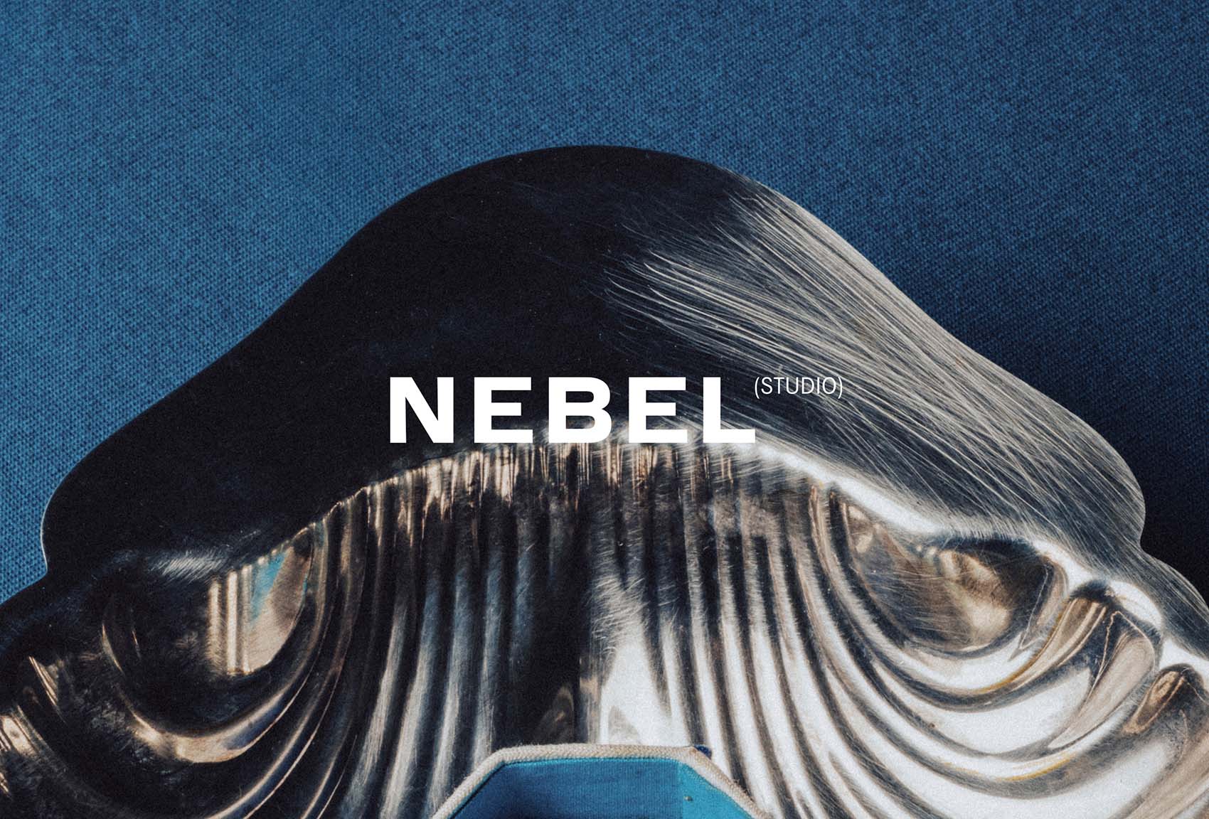
Nebel

Thank you! ✌️

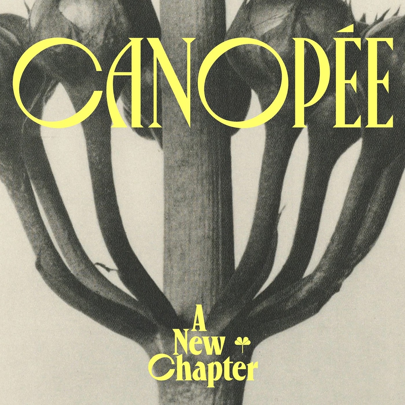
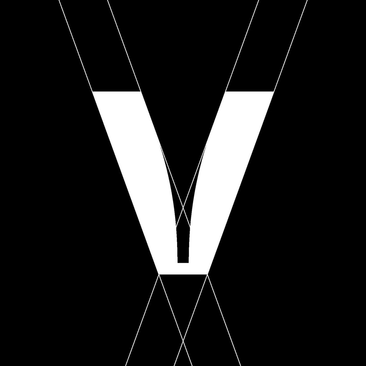
Typography Design: Canopée Typeface by Violaine & Jeremy

Violaine & Jeremy crafted a fresh typography design for Canopée Typeface. The updated collection pairs razor-sharp serifs with rich organic letterforms. Parisian studio Violaine & Jeremy expanded their display font through VJ-Type. Ten years after its debut, the family gained a fuller voice. This…

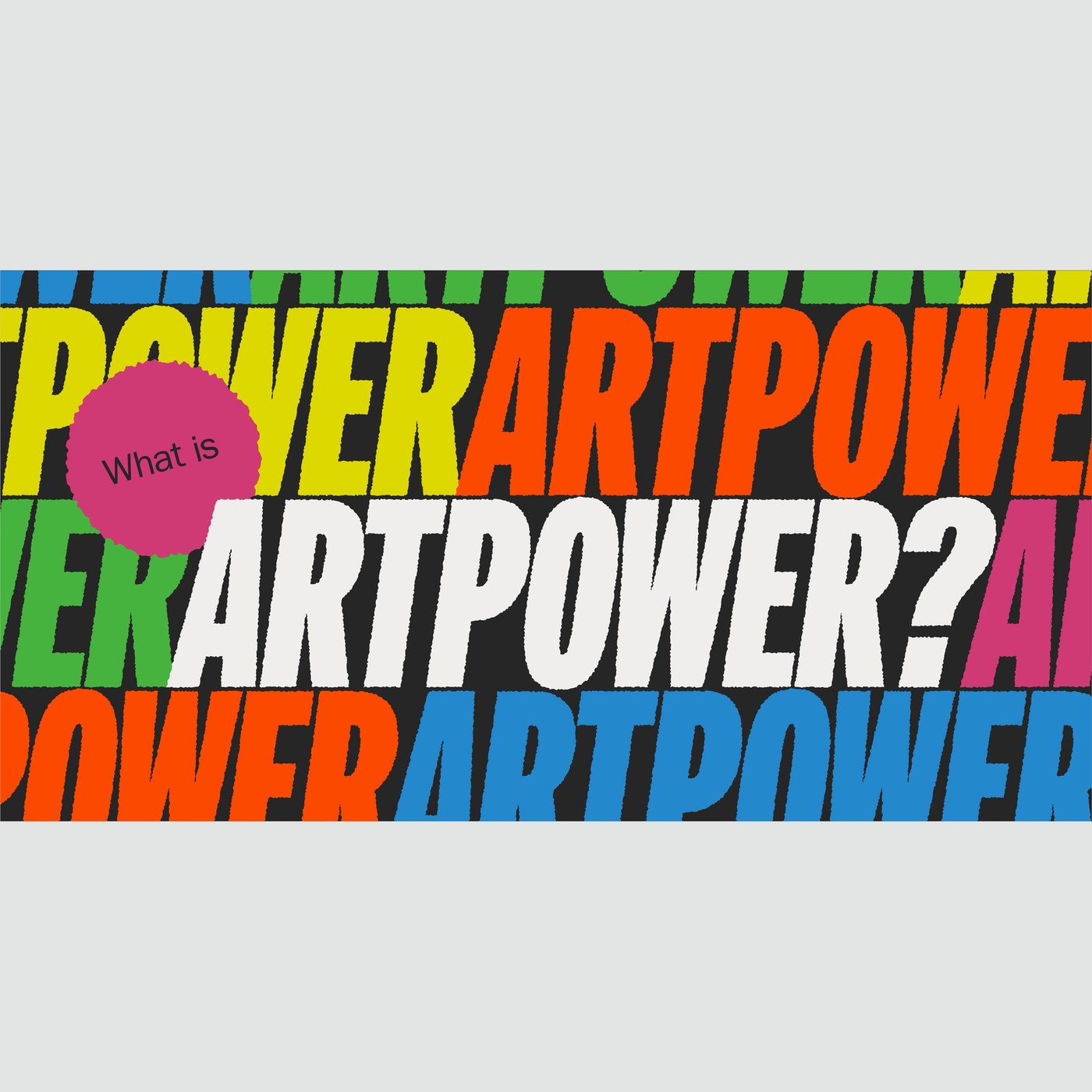
Editorial Design: ARTPOWER First Zine for Tortoise

Explore the new editorial design of ARTPOWER debut zine celebrating Tortoise, examining artist finances and transparent creative economies. To celebrate the one-year anniversary of Tortoise, cultural organization ARTPOWER has released its debut zine. Built by artists for artists under the…

Branding Design: Vif Visual Identity by Brand Brothers

Brand Brothers built a sharp branding design for French dining spot Vif. The visual system blends bold custom type with bright red marks. Chef Geoffrey Gotfryd opened a new dining room in Paris. The spot serves fresh food cooked over an open grill. The team built a raw visual world for the brand. A…

FFF – French Football Federation

Redesigning the visual identity of a century-old institution requires finding the precise balance between heritage and contemporary uses. Designed by the team at Solstice Studio for the French Football Federation (FFF), in collaboration with Blaze Type, this new identity unifies all national teams…

Schmidt & Pütz

Schmidt & Pütz ranks among Germany’s most experienced architectural firms, realizing train stations, commercial, cultural, and residential buildings across the country. In close dialogue with clients, they create economically efficient, user-oriented, and architecturally sophisticated buildings. No…

SAIBAI website

SAIBAI is a homebuilding company combining Japanese manufacturing with U.S. assembly to deliver fully custom residential architecture. Working alongside architects, the company emphasizes precision, efficiency, and uncompromising execution from design through construction. Set in Octave, a serif…

Hiperfòssils: L’estranya materialitat dels mitjans digitals

From Anna Maris Salinas (translated): Hiperfòssils: L’estranya materialitat dels mitjans digitals (“Hyperfossils: the strange materiality of digital media”) is formalized through a publication that collects the research, reflections and examples found throughout an archaeological research, tracing…

Naratyvy masovoho znyshchennya by Artem Zakharchenko

Published by Nash Format, Наративи масового ураження. Тактики і стратегії інформаційної війни (English: “Narratives of Mass Destruction: Tactics and Strategies of Information Warfare”) by Artem Zakharchenko explores the mechanics of information warfare, cognitive influence, and modern propaganda…

VIVA PHX 2026

TT Neoris has become part of the refreshed brand identity for the American festival VIVA PHX. The logo is based on Media Sans Ultra. VIVA PHX is an annual event that transforms the city of Phoenix into one massive venue for music, food, art, and live interaction. Our font helps establish a clear…

McDonald’s Mid-Autumn Festival campaign in China

McDonald’s used HY ShangWei ShouShu in its Chinese Mid Autumn Festival campaign. The Mid-Autumn Festival is an important traditional festival in China, and brands often need a warmer and more emotional visual language during this season. For McDonald’s, the campaign needed to connect a global fast…

NextOre

Helping miners extract the minerals we need more efficiently with less waste. We partnered with NextOre to refine their brand strategy and visual identity, positioning them as a vital innovation partner in sustainable mining. As the global leader in Magnetic Resonance Sensing and Ore Sorting…

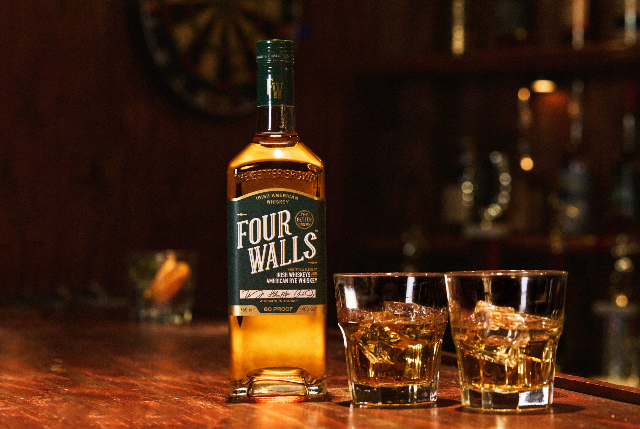
Rest Stop Gives Four Walls Whiskey a 'Sunny' and Timeless Design

It’s Always Sunny in Philadelphia co-stars Glenn Howerton, Rob McElhenney, and Charlie Day have launched an Irish American whiskey called Four Walls. Inspired by Irish American dive bars, the identity comes from creative studio Rest Stop and draws on heritage beer and spirits brands. It’s easy to…

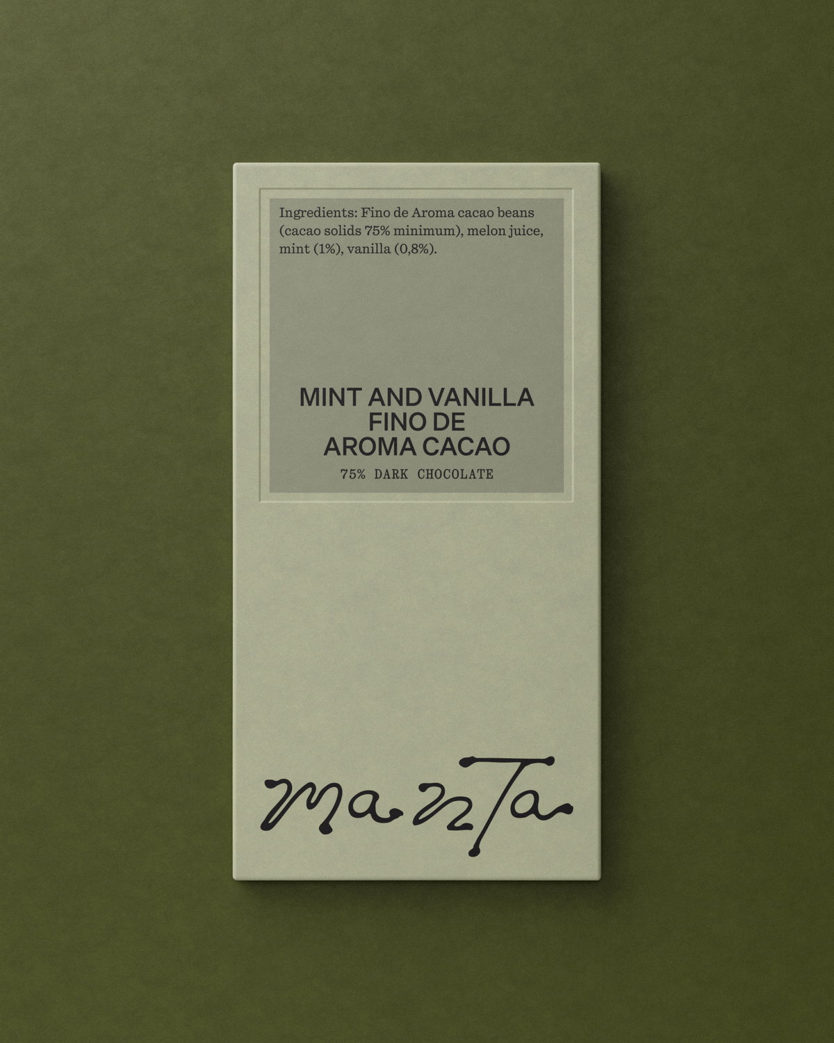
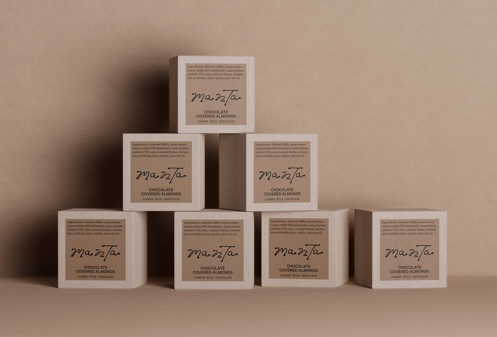
Manta

Thank you! ✌️