Graphics Design

О графическом дизайне

RSS

Typography Design: Rocket Type System by TypeType Foundry

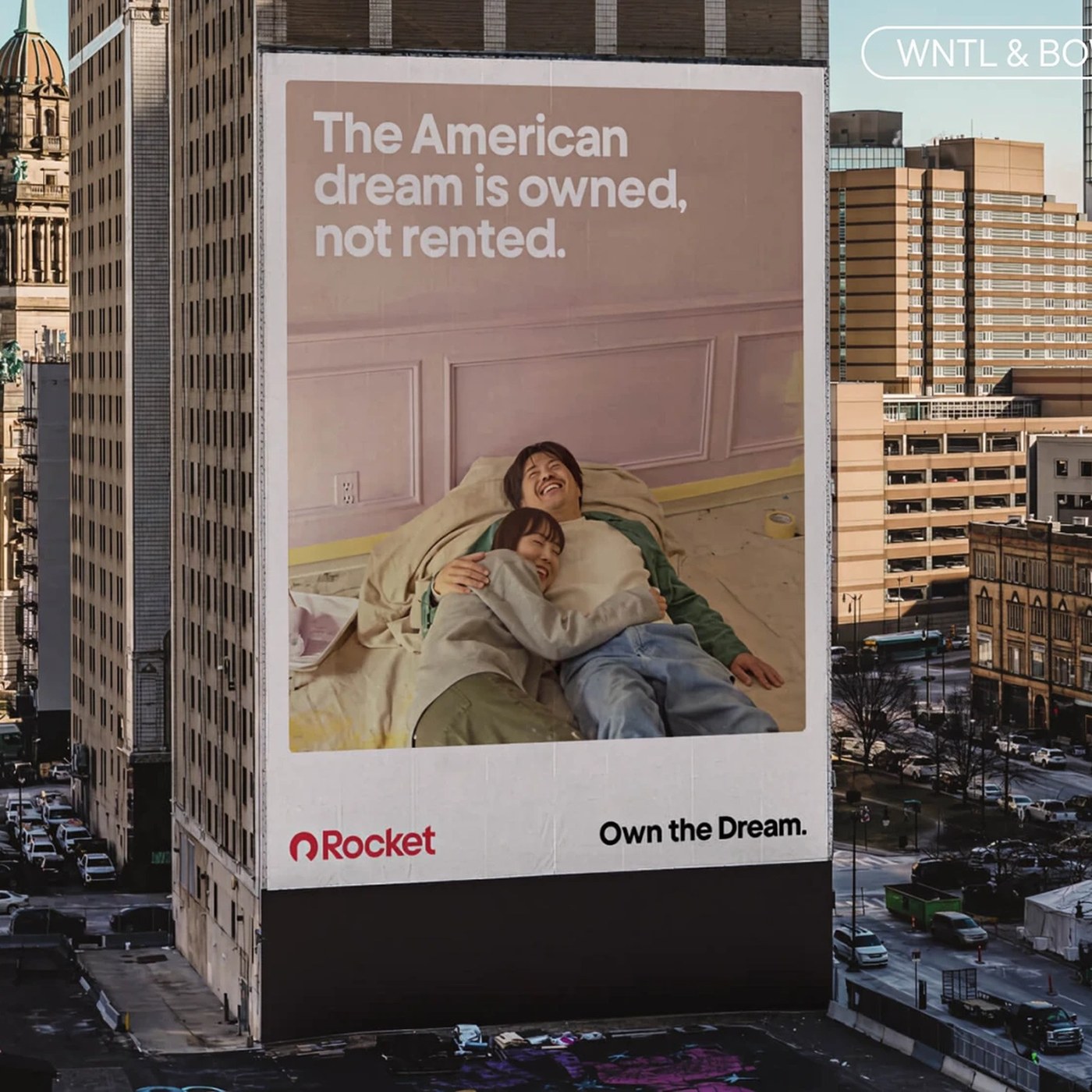
TypeType Foundry engineered a bespoke dual-family typography design for Rocket, pairing geometric sans WNTL with transitional serif Bowtie. Built as the centerpiece of Rocket’s visual ecosystem, the dual-family system reconciles two distinct design voices into one cohesive engine. WNTL modifies TT…

Matchacha Japanese Tea Studio Visual System and Branding

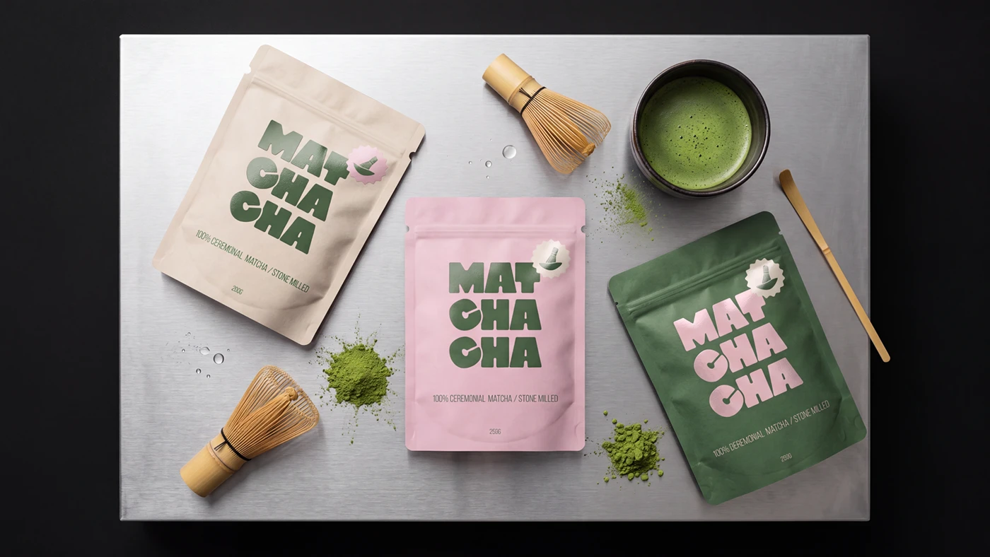
Matchacha explores modern tea ritual branding, combining forest green packaging, pink foil type, and custom bamboo whisk art. Designed by Yuliya Kuznetsova, the brand system blends Japanese tea habits with a fresh modern look. Each graphic item pairs deep green color fields with soft pink type. The…

Boldtype Management Visual Identity and Typography Branding

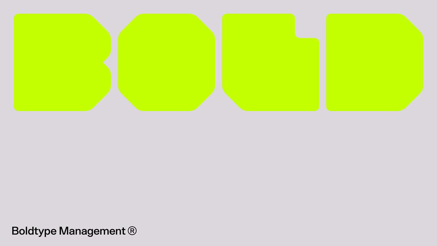
Boldtype Management is a dynamic visual identity and branding project by Aptum Studio featuring ultra-bold geometric block typography. The visual system relies on a big custom font that acts as the main hero graphic. At the core of the branding sits the word BOLD drawn with thick octagonal block…

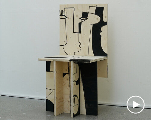
motspråk cuts plywood painting apart and rebuilds it as chair

Motspråk turns a plywood painting into a chair Motspråk by PEYTIL and lead designer Eitil Arbenz Thorén is a painting on plywood that has been cut apart and reassembled as a chair, exploring the transition from artwork to functional object. Developed during Thorén’s studies at Konstfack in…

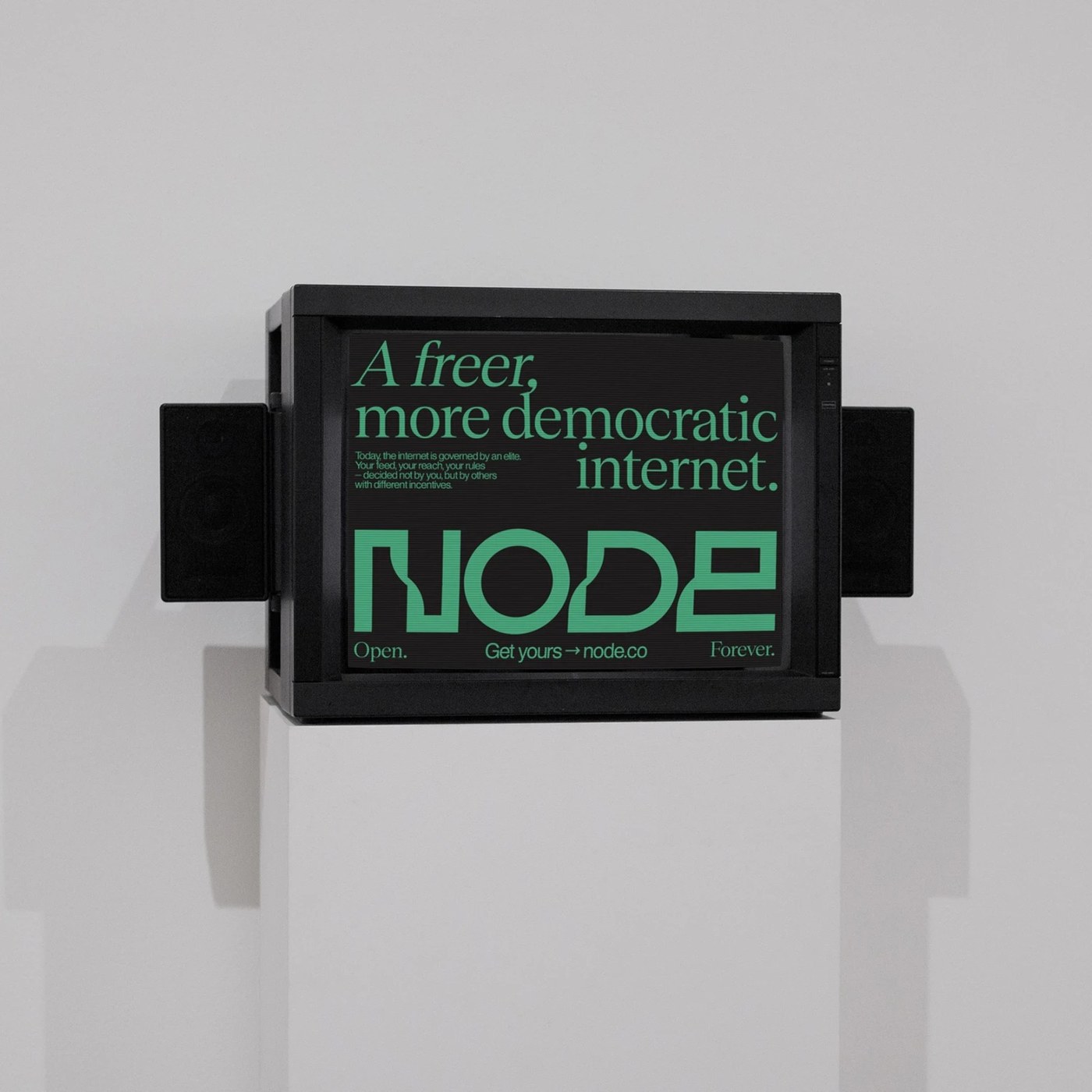
Brand Identity: Node Visual System by Brand Brothers

Brand Brothers crafted a bold brand identity for Node. The modular design system frames private personal server hardware. Economy V1 created Node as a compact personal server device. It lets users run private AI agents and Bitcoin Lightning nodes. The product gives people direct control of their…

Gino Ritmo & Ricci Verace – Night Shift (Part I) album art

Gino Ritmo started in 2018 as Léo Gilliard’s solo project, built around FM synths and vintage drum machines in tribute to 80s new wave and italo disco. In March 2020, mid-lockdown, Tatiana Tagli joined as Ricci Verace on vocals, and the duo’s first album with 11 tracks landed on CAF? in July 2022.…

Sonospheres flyer

Flyer for the first event of the Sonospheres sound collective at Summer Camp Space, Rote Fabrik, Zurich, initiated by Clara Götte. The flyer uses OO Arketa, a monospace typeface by Outline Online, as its primary typographic voice. Its monospaced construction gives the event information a raw and…

Festival ŽVF 2026

Ženy Víno Funk (in short: ŽVF) is a music festival held in the heart of the Pezinok vineyards in Slovakia. What began in 2019 as a birthday celebration for 150 people has grown into a carefully curated two-day experience while intentionally remaining limited to 4,000 attendees. ŽVF combines…

“Poveri umani / Poor Humans” scarf

“Poveri umani” is a jacquard wool scarf, sized 180×20 cm and produced in a limited edition of 100 pieces. The scarf features the text “Poveri umani / Poor humans”, the title of a poem generated with the help of an artificial intelligence instructed by Numero Cromatico to generate epitaphs and…

Film and Music Awards Canton of Bern

Each year, the Canton of Bern honours outstanding work in music, film and animation with a series of awards. Alongside the recognition itself, the prizes come with substantial financial support, giving the recipients valuable room to continue and develop their artistic practice. The awards are…

Hoàng Phúc International (HPI)

Hoàng Phúc International began in the 1990s and grew into one of Vietnam’s most popular fashion retailers through the 2010s. At its peak, a dense network of stores marked the streetscape, instantly recognisable by its brick walls and the brands behind them: Dr. Martens became a defining symbol for…

Framer Commerce

Framer Commerce is an ecosystem of plugins and templates enabling creators and brands to build custom, highly aesthetic Shopify storefronts directly within Framer. Sitting at the intersection of design-led e-commerce and cutting-edge web tools, their site identity relies on a thoughtful typographic…