Graphics Design

О графическом дизайне

RSS

Arrêt 59

Arrêt 59 is cultural center in Péruwelz, Belgium. The typeface system is based on three b•v-h families: Anto Rounded (Regular, Bold) for all technical information like performance schedules; these typically dense blocks were given rhythm, making them legible and visually appealing; Anto Rounded…
Inspiro magazine (2020–)

Inspiro is a Bulgarian magazine on lung and respiratory health, distributed locally to doctors. Krassen Krestev has been designing its covers since the magazine’s launch in 2008. In 2020, TheSans was introduced as the cover typeface, first appearing on issue 55, dedicated to COVID-19. Since then,…

Ot Avtora

От автора (Ot Avtora, “From the Author”) is a series of readings launched by Roman Liberov and Vladimir Rayevsky in Moscow back in 2016. At each of these events, an invited poet would read and comment on their selected work. All 64 readings that the project’s creators eventually were able to host –…

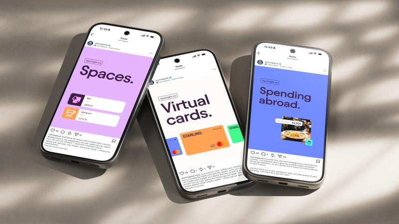
Buff Motion's motion identity for Starling is built around confidence, not cash

Be honest: when did a bank's social feed last stop you mid-scroll? Me, personally? I'd rather bury my head in the sand than look at my account balance, not to mention all the beige and boring financial content I'd rather ignore. So it's rather refreshing to come across a project that treats the way…

Ueshima rebrand champions the Japanese art of coffee

As Ueshima sets its sights on Lavazza and Starbucks, The Clearing refreshes its UK identity to bring the brand’s heritage to the fore In 2021, London-based agency The Clearing worked with prominent Japanese coffee house Ueshima to create a brand for its UK presence. Over the next few years, Ueshima…

Founders Makers redesigns Hi*Ball for UK launch

London creative studio Founders Makers has overhauled the brand identity, packaging, and strategic positioning for cult US sparkling energy water brand Hi*Ball as it makes its UK debut. Design News 28 July, 2026 American beverage owner Tilray Brands has introduced sparkling energy water Hi*Ball to…

Landor designs McLaren F1 trackside experience

Landor designs human-centric trackside experiences for McLaren Racing Global brand and design consultancy Landor has created a multi-storey Team Hub and redesigned Garage experience for the McLaren Mastercard Formula 1 Team, aiming to support team performance and bring guests closer to trackside…

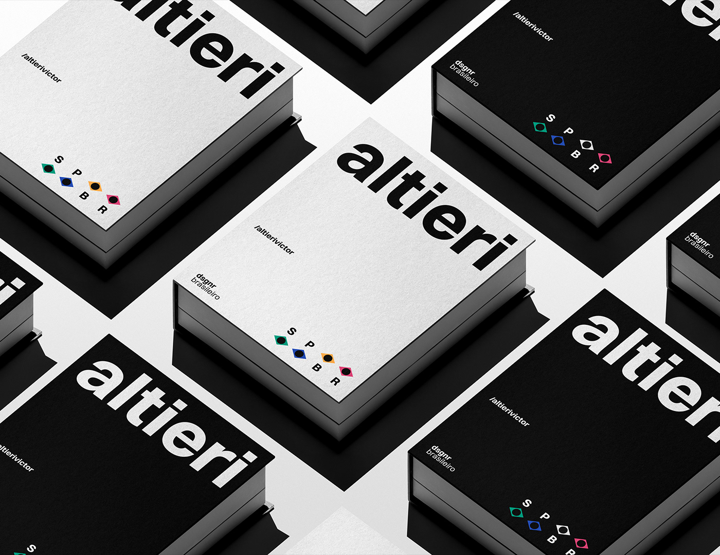
Victor Altieri Reimagines Studio Identity with Modern Branding

Victor Altieri launches a refined visual identity with strategic branding, combining geometric shapes and clean layout structures. Designer Victor Altieri redesigned the studio's brand assets, establishing a minimalist and highly memorable visual identity. The new branding uses a soft color palette…

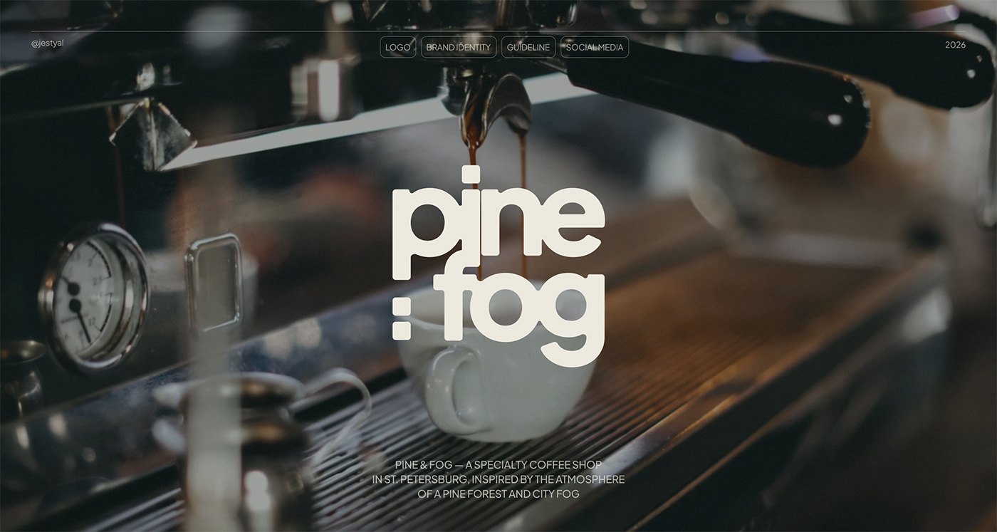
Natalia Doroshenko Designs Branding for Pine & Fog Coffee Shop

Pine & Fog launches its specialty coffee shop identity with strategic branding, combining organic textures designed by Natalia Doroshenko. Designer Natalia Doroshenko redesigned the coffee shop's brand assets, establishing a welcoming and highly memorable visual identity. The new branding uses a…

Olivia Colman narrates Monzo’s global brand platform launch

Developed by BBH London and directed by Daniel Wolfe, Get busy living is the digital bank’s biggest-ever integrated campaign Monzo has launched its first global brand platform, Get busy living, positioning the digital bank for its next phase of growth in the UK and across Europe. Developed by BBH…

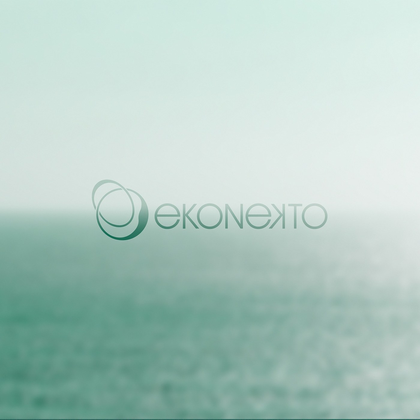
Brand Identity: Ekonekto by Pablo Pelaez Gallego

A close look at the visual identity and brand design for Ekonekto by Pablo Pelaez Gallego. The system uses typographic structure and geometric layouts. The design system is built around a modern typographic framework. It establishes a strong visual hierarchy on both print and digital substrates.…

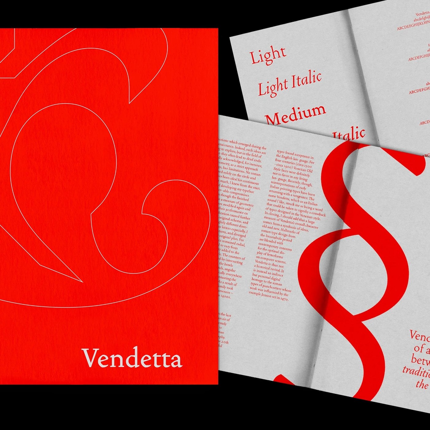
Vendetta Typeface Specimen Book Design Layout Typography

Bruno King explores the Vendetta typeface specimen book design layout typography. The work balances print scale and historical proportions. The project presents rigorous grid discipline. Bruno King establishes strict typographic contrast. Display headlines use large scale. Paragraph copy remains…

Why Codea is putting humour at the heart of creativity

For the Barcelona-based studio, humour isn’t just about making people laugh – it’s a way of challenging conventions, as co-founder Ricard Sunyol explains ‘We take our own jokes seriously.’ This somewhat paradoxical statement was adopted by Codea earlier this year to describe its new positioning.…

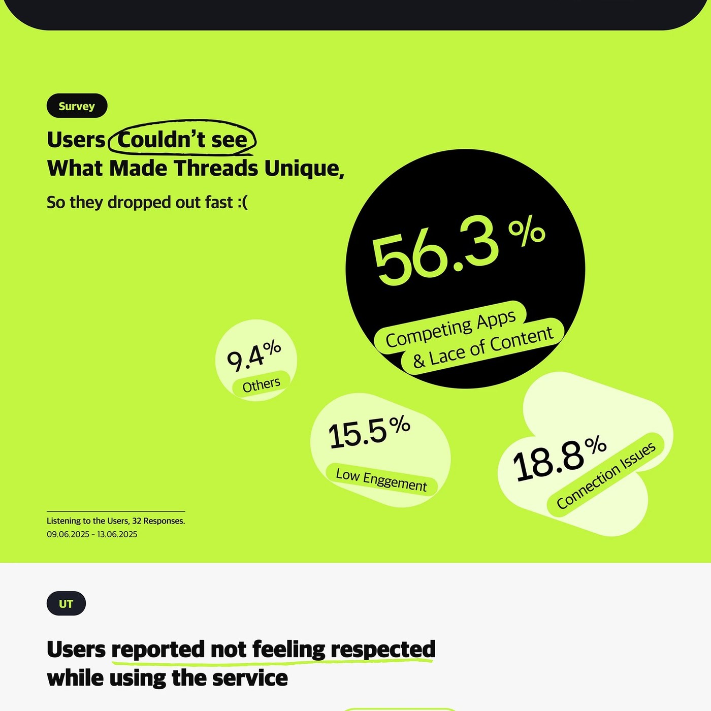
Minimalist Mobile App UI UX System for Threads - byulha Park

byulha Park presents a refined mobile UI UX concept for Threads, combining high contrast typography, dark mode component tokens, and spatial layout rhythm. In digital product design, refining an existing mobile interface requires balancing familiar navigation patterns with elevated visual polish.…

Dose Branding Redefines Medical Wellness Aesthetics

Dose launches a refined wellness identity with strategic branding, combining clean typography designed by Sungsik Kim and Hawon Lee. Designers Sungsik Kim and Hawon Lee redesigned the company's brand assets, establishing a minimalist and highly memorable visual identity. The new branding uses a…

The Brand Identity – Home of the Greatest in Graphic & Brand Design

Frans Enmark found his way into design through music, where the artists he loved were packaged by Warhol, Saville and Farrow – door openers that showed him how powerful design could be. That entry taught him to trust intuition over logic, a conviction that still runs through Stockholm Design Lab,…

The Brand Identity – Home of the Greatest in Graphic & Brand Design

River House is a design-led residential building company in Suffolk, in the east of England, set up to build contemporary homes for design-conscious people in the region. It pairs the construction craft of James Brindley with the design and commercial focus of Guy Johnson, with London-based Studio…

'Colorstruck!' Examines the Connection Between Race and Chromatic Expression

A nude Black woman lies on a stark white chaise, her head propped up by her thin arm. She’s surrounded by flat, abstracted color in the form of fruits and fabrics, and a glass coupe and bottle on a nearby table offer a clear, rather than refracted, view of the vibrant scene. Rendered in oil on…

Sarah Vaughan – Sweet, Sultry and Swinging album art

Cool Face for cool jazz. Or is it hot jazz? Sweet, Sultry and Swinging appears to be a reissue of Sarah Vaughan’s 1950 album Hot Jazz, with a slightly modified selection and order of tracks. It was released in 1962 on Spin-O-Rama Records. The cover was designed by Sam Suliman. For the name of the…

California’s EPR Deadline Is Almost Here: Is Your Packaging Strategy Ready?

Covered plastic producers and distributors must submit an Individual Source Reduction Plan (ISRP) to Circular Action Alliance (CAA) by August 1, 2026, targeting a 25% plastic reduction by 2032. Success requires full packaging redesigns rather than material swaps, developing local end-markets for…