Graphics Design

О графическом дизайне

RSS

The Outline - NASA geometry, spaghetti maps, and a puppet mascot

The Outline: major appointments, spaghetti maps, and a furry mascot – 24/07/26 24 July, 2026 Welcome to your weekly digest of noteworthy stories, announcements, and interesting tidbits from across the design industry. This week, we’ve got major appointments, viral designs, a matchmaking-themed…

Playful retail is serious design work.

From slide safety to 150 sample sets, making experiential retail look effortless takes serious discipline. StudioXAG co-founder Xavier Sheriff unpacks the hidden mechanics of playful design. Coachtopia’s sustainable pop-up installation at Selfridges, all images courtesy of Studio XAG The question I…

Exposure: Thadde Comar

From the streets of Paris to the frontlines of Hong Kong’s pro-democracy movement, the French-Swiss photographer’s work captures the dreamlike, unsettling realities of protest in the age of surveillance 24/07/2026 3:38 am “I have very clear memories of protests,” photographer Thadde Comar says of…

The Brand Identity – Home of the Greatest in Graphic & Brand Design

Vanessa Nguyen runs BYV.STUDIO, a Melbourne-based design practice she leads largely on her own from a home studio, designing invitations, branding and scenography that look like no one else’s. Her work sits in and around the wedding world, yet she resists the idea that a wedding should carry a…

The Brand Identity – Home of the Greatest in Graphic & Brand Design

Pangram Pangram Foundry’s PP Lettra Mono is a monospaced serif with two roots: the classic look of serif typewriters and the precise classifications of botanical illustration. For its launch, Brescia and Amsterdam-based took on the art and creative direction of the full campaign, built as a…

Vector landscape illustration graphic asset bundle: A study.

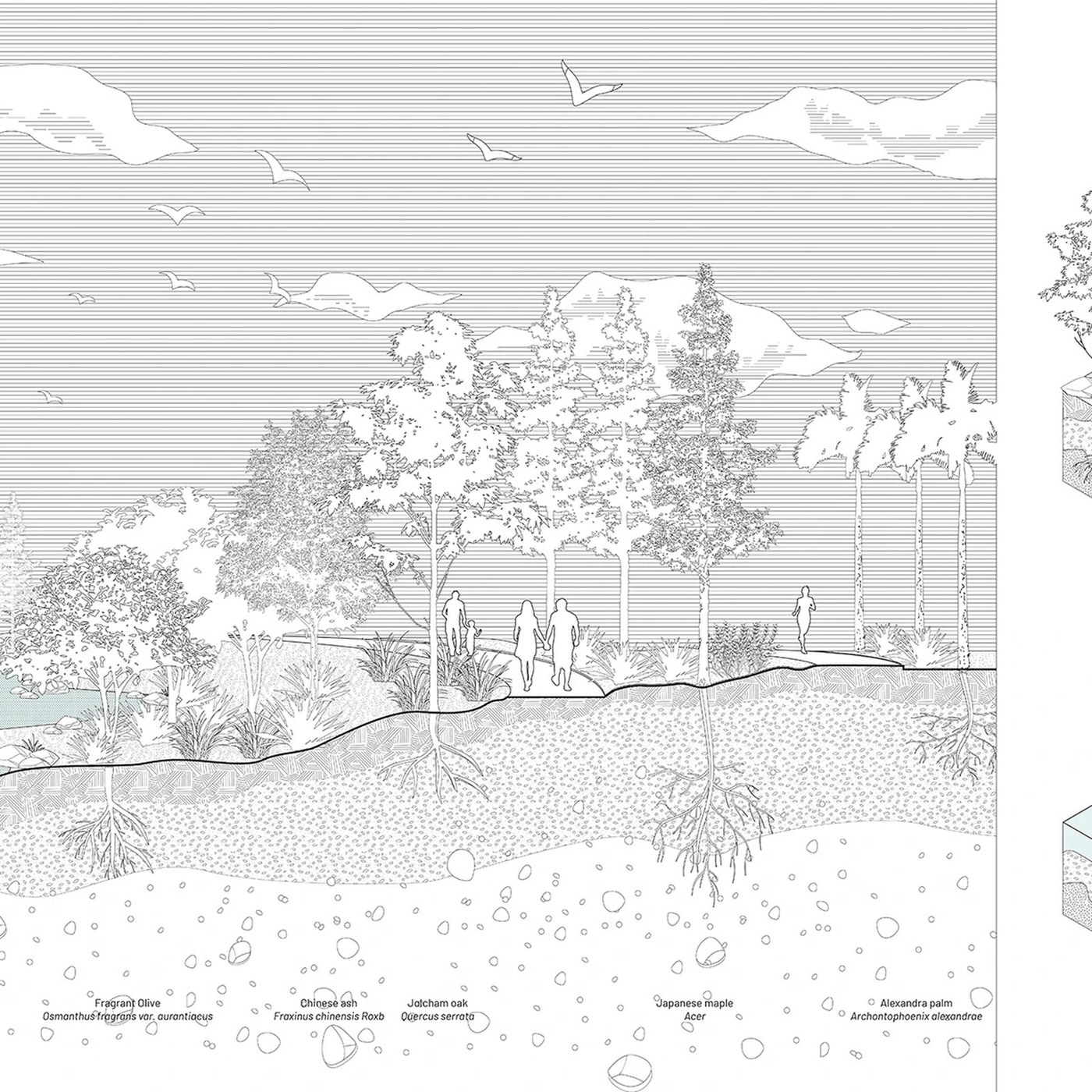
Explore the new vector landscape illustration graphic asset bundle from landspace arch. This design system features clean grids and strong visual tension. Each element uses geometric restraint. Axon diagrams create clear structural hierarchy. The soil cut layers show sharp visual rhythm. This…

Playful Knitted Pillows by Donna Wilson Infuse Interiors with Whimsy and Joy

All images courtesy of Donna Wilson, shared with permission For Donna Wilson, there’s no reason that knitwear and home decor shouldn’t incorporate a lot of color and elicit joy. From patterned towels and socks to blankets and hot water bottle sleeves, the London-based designer celebrates vibrant…

Elizabeth Goodspeed's Branding for Leaven Rises to the Top

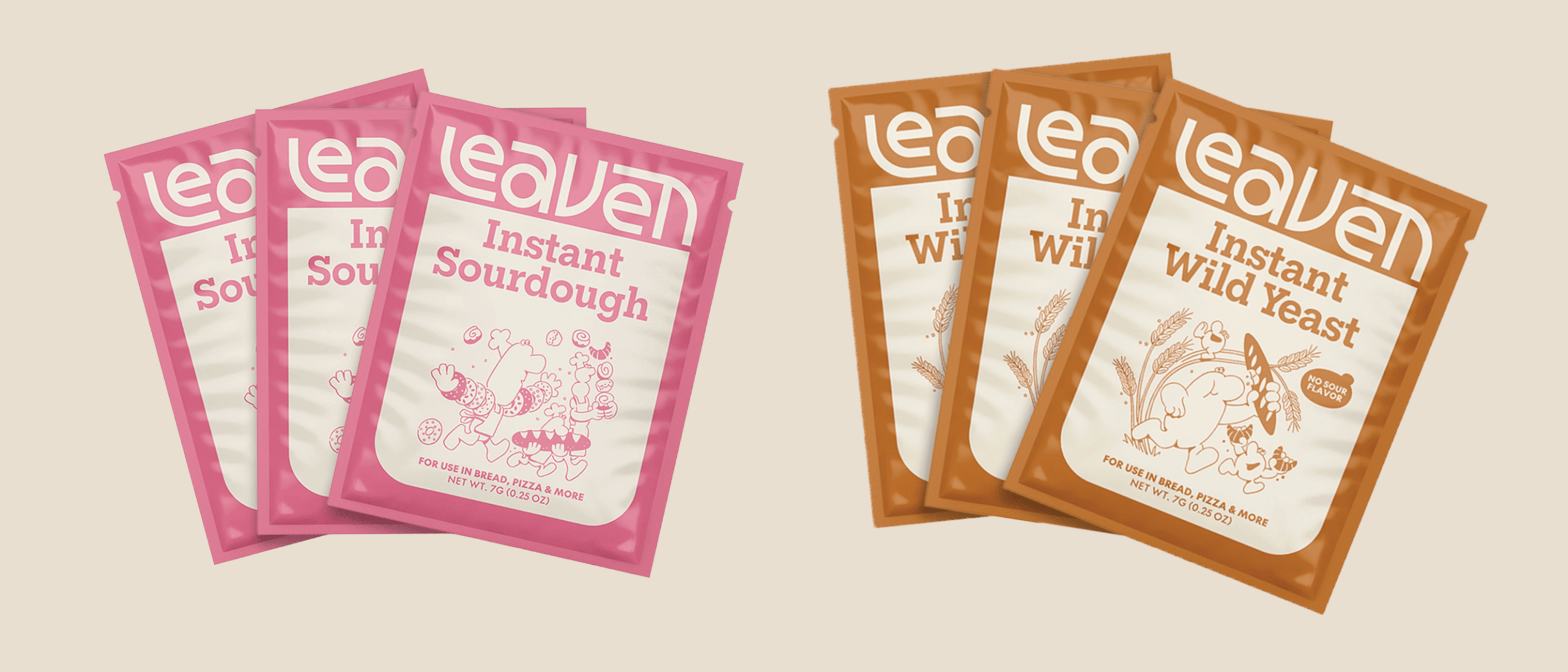
Elizabeth Goodspeed has designed a fun yet grounded brand system for the instant sourdough bread company Leaven With a retro-inspired wordmark and illustrations by Cari Vander Yacht, Leaven’s look stands out in the category and on the shelf as the company grows Cast your mind back to 2020—a…

Minimal Product Box Packaging Design Layout: Visual Tension

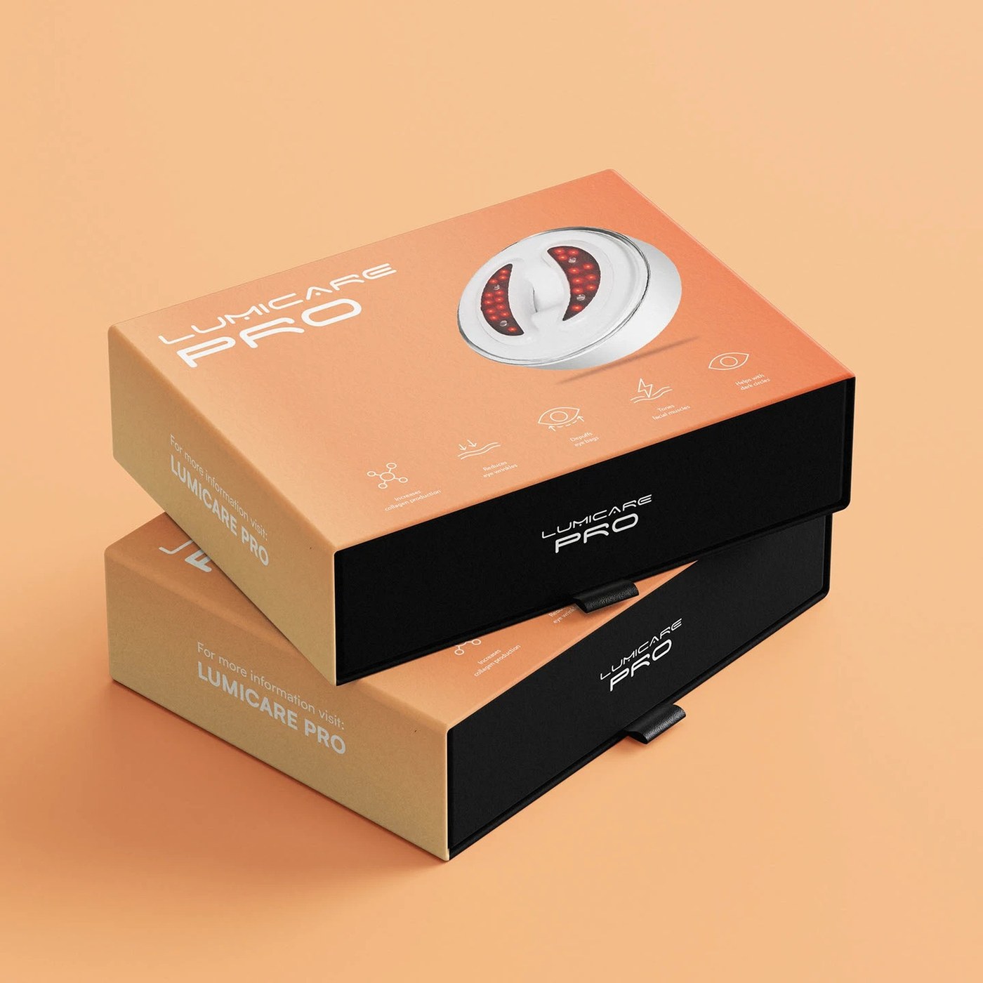
Ahmad Mujtaba's minimal product box packaging design layout demonstrates exceptionally sophisticated mathematical proportions. The packaging architecture relies on clean grids. These modular structures establish dynamic compositional tension. Clean negative space defines every visual panel. As a…

Patrick Dougherty's 'Stickwork' Installations Conjure Connections with Nature

For more than four decades, environmental artist Patrick Dougherty has reimagined the technical and sculptural capabilities of one simple material: twigs. Over the years, the North Carolina-based artist completed well over 300 large-scale, site-specific installations in a series he calls…

Who Gives a Crap x Parks Project Collab Supports Conservation Efforts

Who Gives a Crap and the Parks Project announce the return of the Park Edition toilet paper collection, featuring photography from Breakfast for Dinner that depicts some of the country’s national parks like the Grand Canyon, Yellowstone, Joshua Tree, and Acadia. To date, the Parks Project has…

Homepage Interactive Branding Layout Grid by Amin Ankward

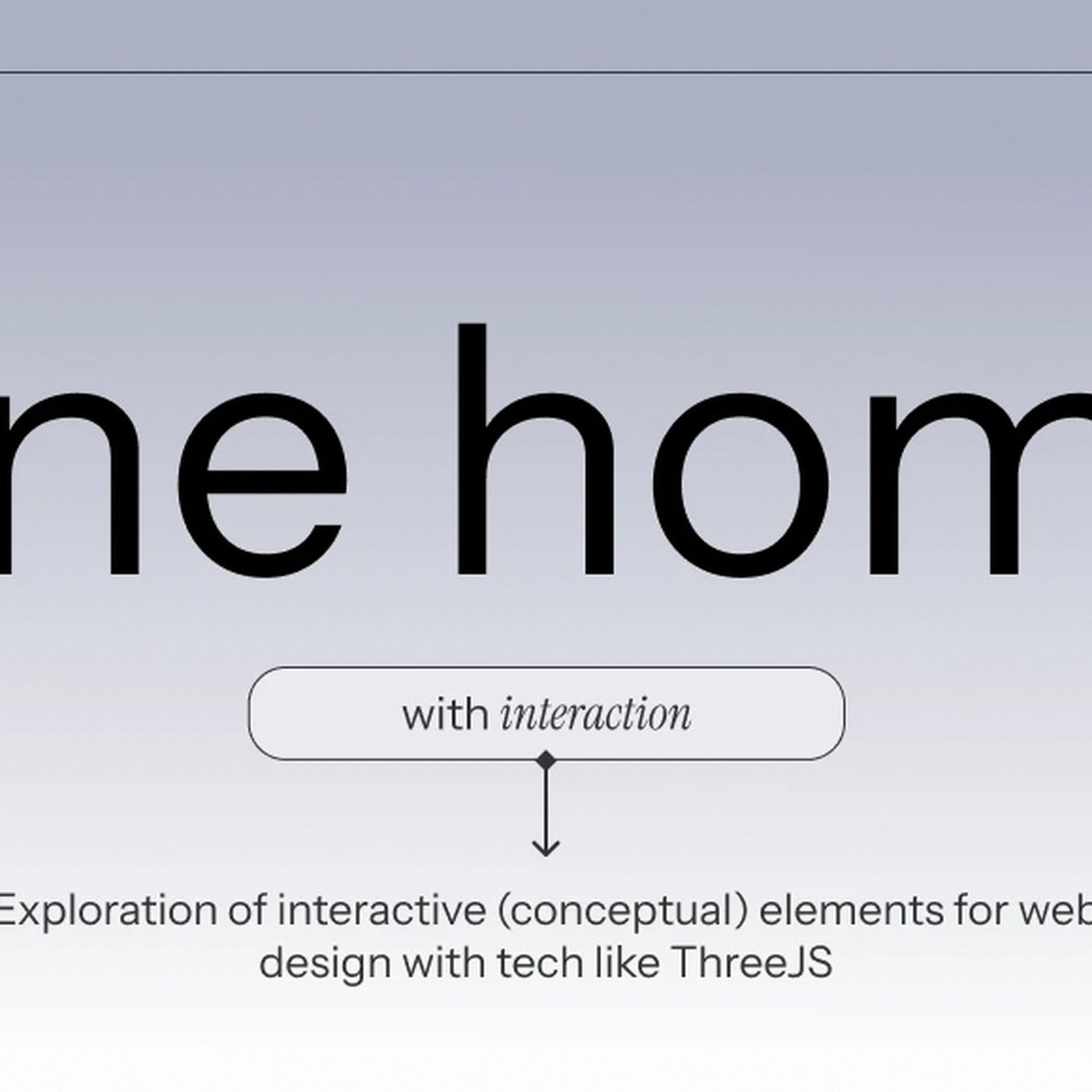
Amin Ankward's homepage interactive branding layout grid features exceptionally disciplined contemporary typographic structures. Amin Ankward anchors the page on a strict grid. The layout scales smoothly across screens. This structure creates tension between text blocks. White space organizes the…

GSA outlines 2027 gateway project for Mackintosh Building

Glasgow School of Art reveals Mackintosh reinstatement cannot be delivered alone as 2027 gateway project announced Following the settlement of its 2018 fire insurance claim, The Glasgow School of Art has published a major Strategic Outline Business Case Addendum detailing an enabling project to…

LABASAD opens applications for its next cohort of online master’s students

The creative industry is changing faster than ever, and so too is creative education. LABASAD, Barcelona School of Arts & Design, looks to complement its perpetual evolution and rethink what design education can look like, placing industry experience, practical work and critical thinking at the…

Jamiroquai recreates Virtual Insanity video for Beefeater 0.0

Created by Lucky Generals, the campaign sees the alcohol-free gin brand revisit Jonathan Glazer’s iconic 1996 original – with an unexpected twist It’s one of the most iconic music videos of the 90s – a seemingly gravity-defying sequence that has been recreated, parodied and dissected for decades.…

Perunggu PDD Tour and merchandise

Perunggu is an alternative rock band from Indonesia. They recently completed their PDD Tour, short for Pertunjukan Dalam Dinamika, which included performances in Yogyakarta, Surabaya, and Bandung. Under the Table designed the tour graphics and merchandise using my typeface Slight Chance. Supporting…

1000 Rabbits – Are we friends yet? album art and campaign

Are we friends yet? is the debut EP by 1000 Rabbits. The 6-track EP was released with Young and is available on vinyl, either in standard black or special limited dinked edition in sparkly magical pearly colour. Along with the release comes a single called “Bear Hunt”, accompanied by a music video,…

Hermit Crabs

Hermit Crabs was independently published in 2025 by Hyper Pension, a Seoul-based creative studio and artist-run imprint. Hermit Crabs is a graphic elegy for the sense of life that has faded within modern civilization. The book is printed on three types of paper, two Pantone spot colors, yellow and…