Graphics Design

О графическом дизайне

RSS

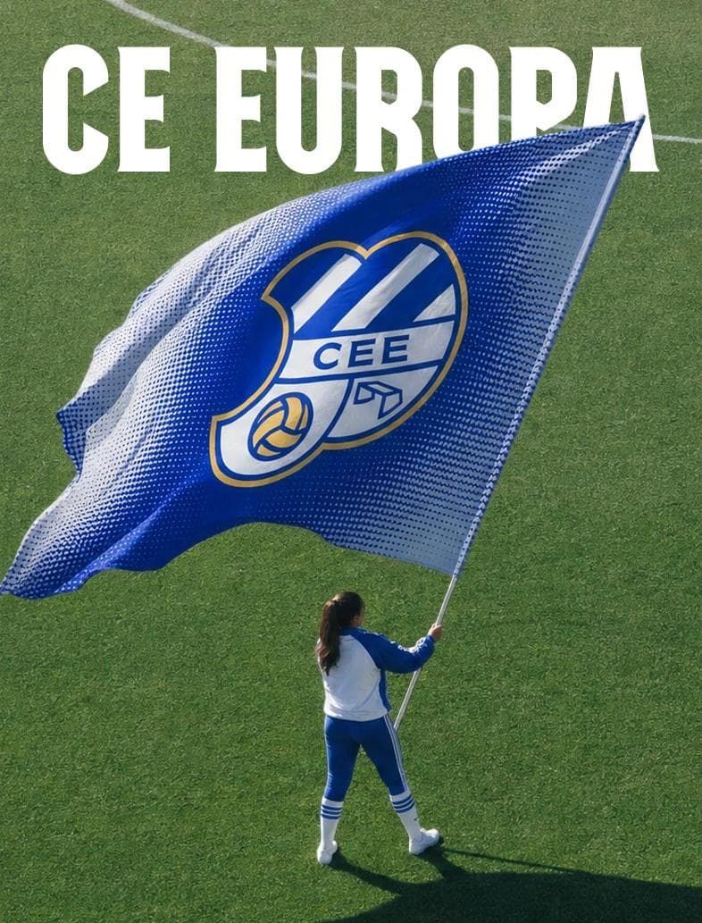
Minimalist Sports Branding for CE Europa Football Club

CE Europa launches a neighbourhood sports identity with strategic branding, combining royal blue kit apparel designed by Boc.Studio. Barcelona creative agency Boc.Studio established a modular sports branding system that grounds the football club's visual direction. The color palette pairs royal…
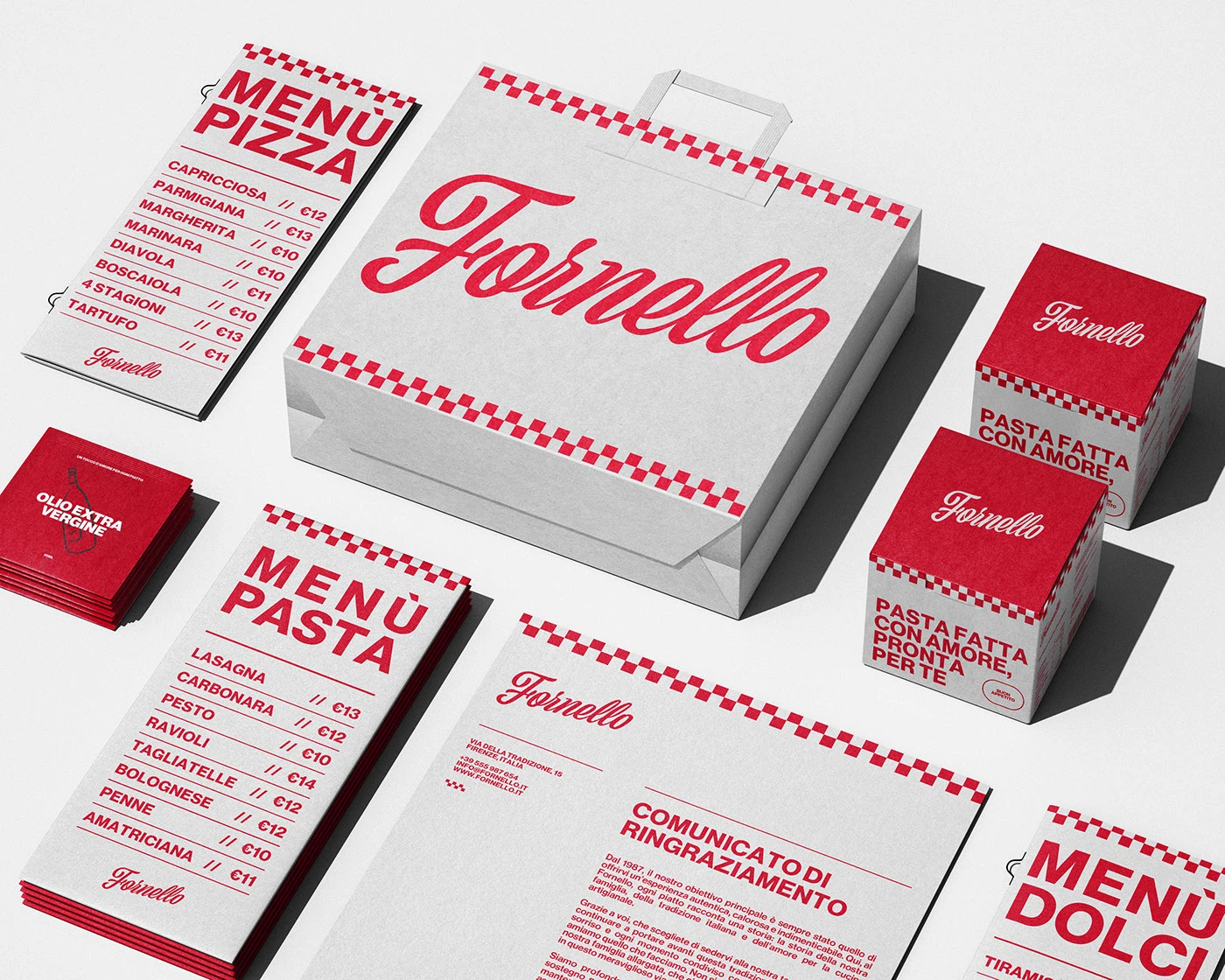
Minimalist Bakery Branding for Fornello Identity System

Fornello launches a warm Italian bakery identity with strategic branding, combining terracotta packaging designed by Fornello Design Team. Creative studio Fornello Design Team established a modular branding system that grounds the artisanal bakery's visual direction. The color palette pairs warm…

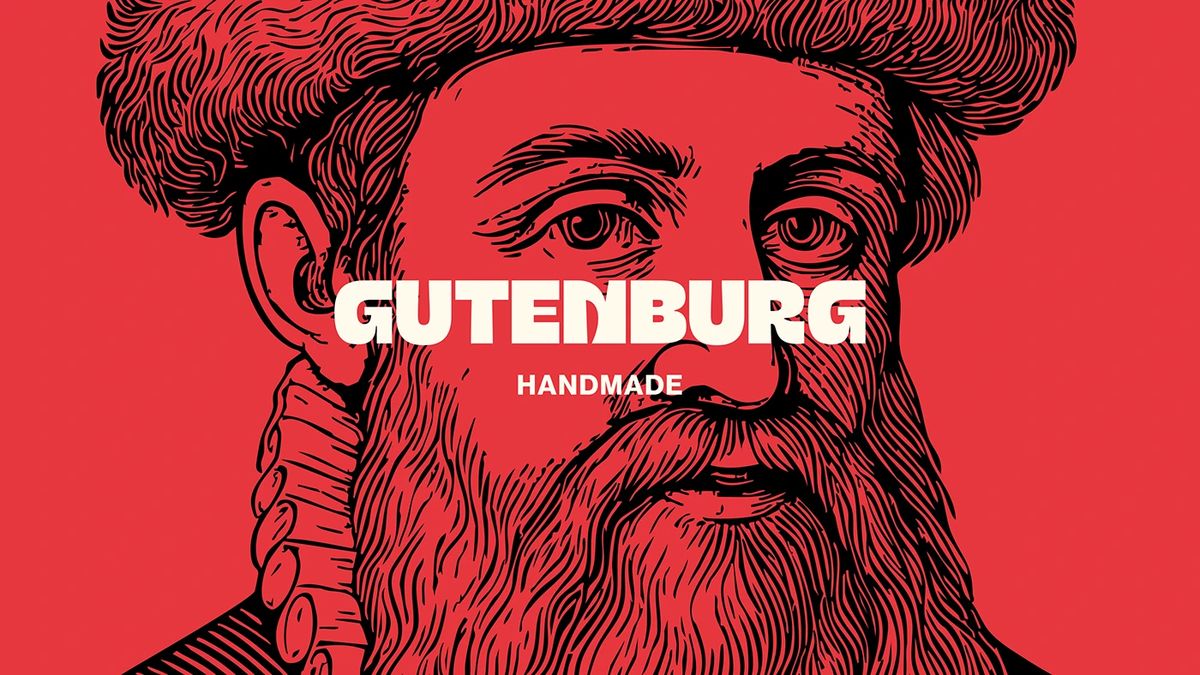
Gutenburg Design Studio Crafts Heavy Typography for Gutenburg

Gutenburg launches a high-contrast editorial identity with strategic typography, combining historic press packaging designed by Gutenburg Design Studio. Creative studio Gutenburg Design Studio established a modular font system that grounds the project's visual direction. The color palette pairs…

Comedy Poster Design: 지 현우's Visual System for Metacomedy

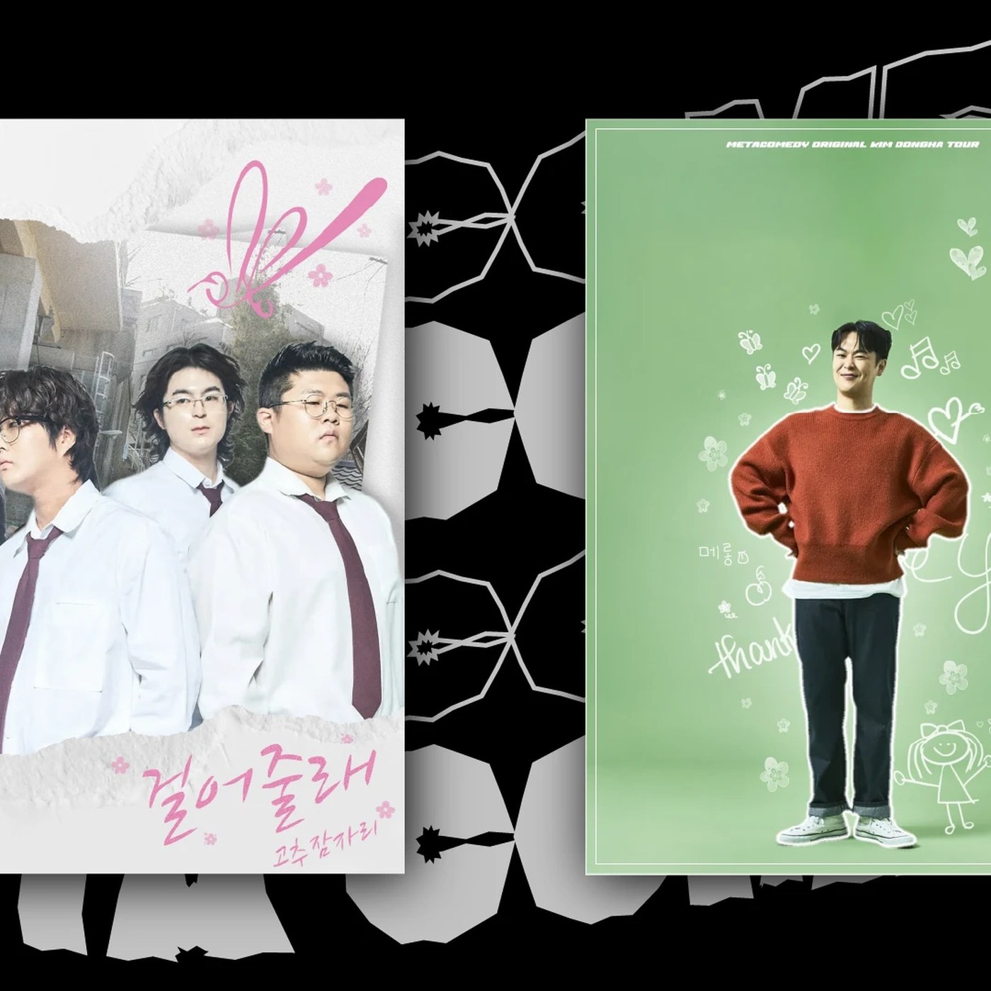
Ji Hyun-woo's comedy poster design for Metacomedy uses bold typography. It pairs expressive cartoon figures with structured layouts. The layout uses a strong modular grid. It forces elements to align precisely. A strong structural hierarchy defines the space. The visual rhythm guides the eye. Black…

The 3d architecture rendering cgi visual art of UTAMED

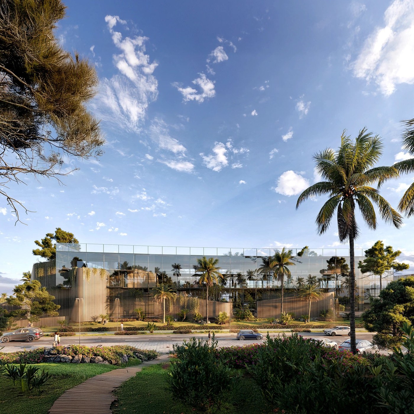
A look at the 3d architecture rendering cgi visual art of UTAMED, a project by JoseZorrilla VIZ showing minimalist concrete form and light. The visualization balances raw concrete textures with clean architectural lines. JoseZorrilla VIZ coordinates structural geometry and natural landscapes to…

Maria de la Orden

Injurial (205TF) is used for the logotype of French fashion brand Maria de la Orden. The text typeface chosen to go with it is Bellefair (Shinntype). About the brand: Season after season, since its creation in 2019, the Maria de la Orden wardrobe expresses a fresh, retro-inspired and playful vision…

Mix Interiors

Mix Interiors, the leading UK title for commercial interior design and architecture, published bi-monthly since 2000, has been given a full editorial redesign. The project reworks the magazine’s covers, typography and grid while keeping the signature features that have defined it for more than two…

Nodes 25

Nodes 25 has 140 pages measuring 20.5×26 cm. It was Risograph-printed in black on Refit Cotton Grey and Shiro Echo papers by Favini. Nodes. Journal of Art and Neuroscience is a peer-reviewed scientific journal founded in 2011 by Numero Cromatico – an artist, research centre and publisher formed by…

How to BBQ by Genevieve Taylor

Genevieve Taylor’s How To BBQ is set to be the definitive guide to live-fire cooking. The design team at Quadrille created a clever piece of typographic matching: using Brim Combined’s inner line work to echo the bars of a grill. On the cover, that connection is pushed further: Brim’s lines have…

Barro

In 2026, Barro commissioned Odd Forms Studio to create the visual identity for the opening of its restaurant in Marseille, France. Designed to reflect a lively neighbourhood venue, offering seasonal lunch menus by day and a convivial atmosphere in the evening, the identity is built around a…

Trama

Trama is a Mexican fine jewelry studio led by Carlos Pelayo. We developed a comprehensive rebranding that mirrors the brand’s storytelling essence through a carefully curated typographic system that balances organic expression with structural contrast. We crafted the logotype using TAN Waverly by…

Twist by Ouidad

Redscout worked with Ouidad to launch a new line of hair products for curly hair, Twist by Ouidad. Twist is a new generation of curl care designed to celebrate the natural movement of textured hair. Typography became a distinctive asset to bring the behavior of curly hair to life. Redscout selected…

Roots Law

Stringer, designed by Emily Klaebe, and Pastiche Grotesque, designed by Benjamin Tuttle, are used as the primary brand typefaces for Roots Law. The identity was designed by J.D. Reeves. Roots Law is a Tulsa-based estate planning firm that helps families connect, provide and protect across…

Schaanged! Tales from the Trenches of New York by S.R. Andrew

Cover for Schaanged! Tales from the Trenches of New York, a novel written by S.R. Andrew and published by Urban Forge Media. Washington Heights JNL was used for the title, with Minion for the subtitle and Trade Gothic Bold Condensed No. 20 for the author’s name. The cover design is by Miblart.

Minimalist Branding for AYA Brand Identity

AYA launches a refined visual ecosystem with strategic branding, combining warm terracotta packaging designed by AYA Design Studio. Creative agency AYA Design Studio established a modular branding system that grounds the project's visual direction. The color palette pairs warm terracotta paper…

Minimalist Branding for VXLAB Architectural Studio

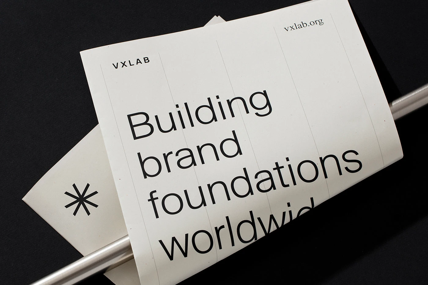
VXLAB launches a refined architectural identity with strategic branding, combining monochrome packaging designed by VXLAB Studio. Creative studio VXLAB Studio established a modular branding system that grounds the interior architecture firm's visual direction. The color palette pairs deep charcoal…

design/leader: Mark Christou, CCO at CBX

This week, we interview Mark Christou, chief creative officer at independent brand strategy and design agency CBX. With more than 20 years of experience across the London and New York design landscape, Mark talks to us about listening in the right places, solving the right problems, and sharpies.…

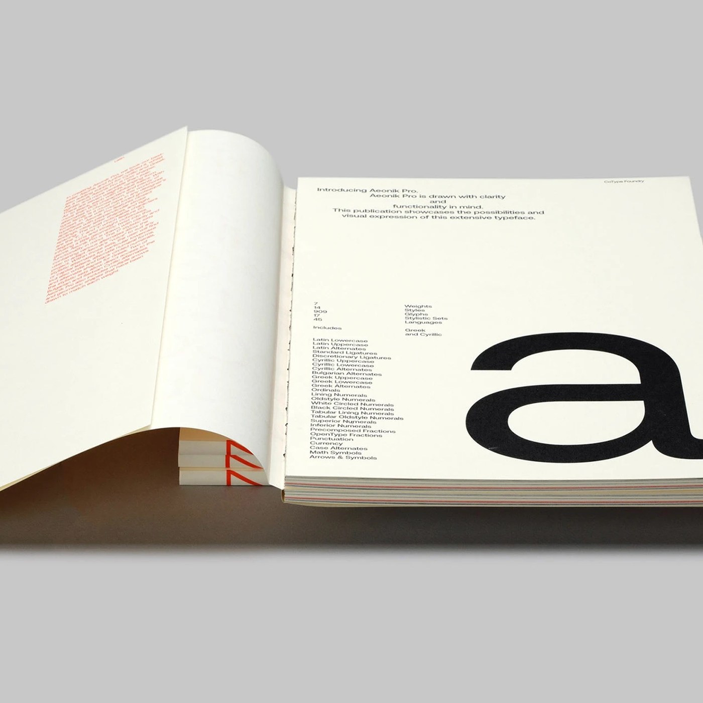
Aeonik Pro Sans-Serif Variable Font Specimen: Visual Tension

The aeonik pro sans-serif variable font specimen has clear visual tension. Mash Creative designed this clean typographic system. This typeface design shows intense typographic scale. The characters align to a disciplined modular grid. Every glyph has sharp geometric details. The letterforms present…

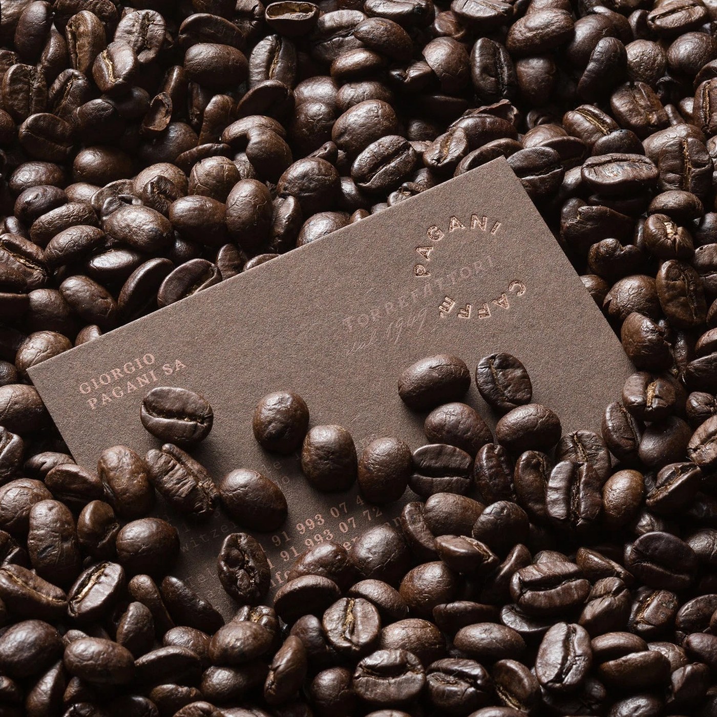
Caffè Pagani Pavel Emelyanov Coffee Branding Packaging

Explore the caffè pagani pavel emelyanov coffee branding packaging project, featuring a circular roasting metaphor and bold typography. Pavel Emelyanov anchored this caffè pagani pavel emelyanov coffee branding packaging identity in the physical mechanics of roasting. The visual language centers on…

Damien Aubin Documents a Former Soviet Mining Settlement Suspended in Time

The small settlement of Pyramiden on the Norwegian archipelago of Svalbard is literally frozen in time. A former mining outpost for the Soviet Union, industrial operations ceased in 1998, and residents relocated. It wasn’t until 2007 that a handful of new inhabitants made the settlement home.…

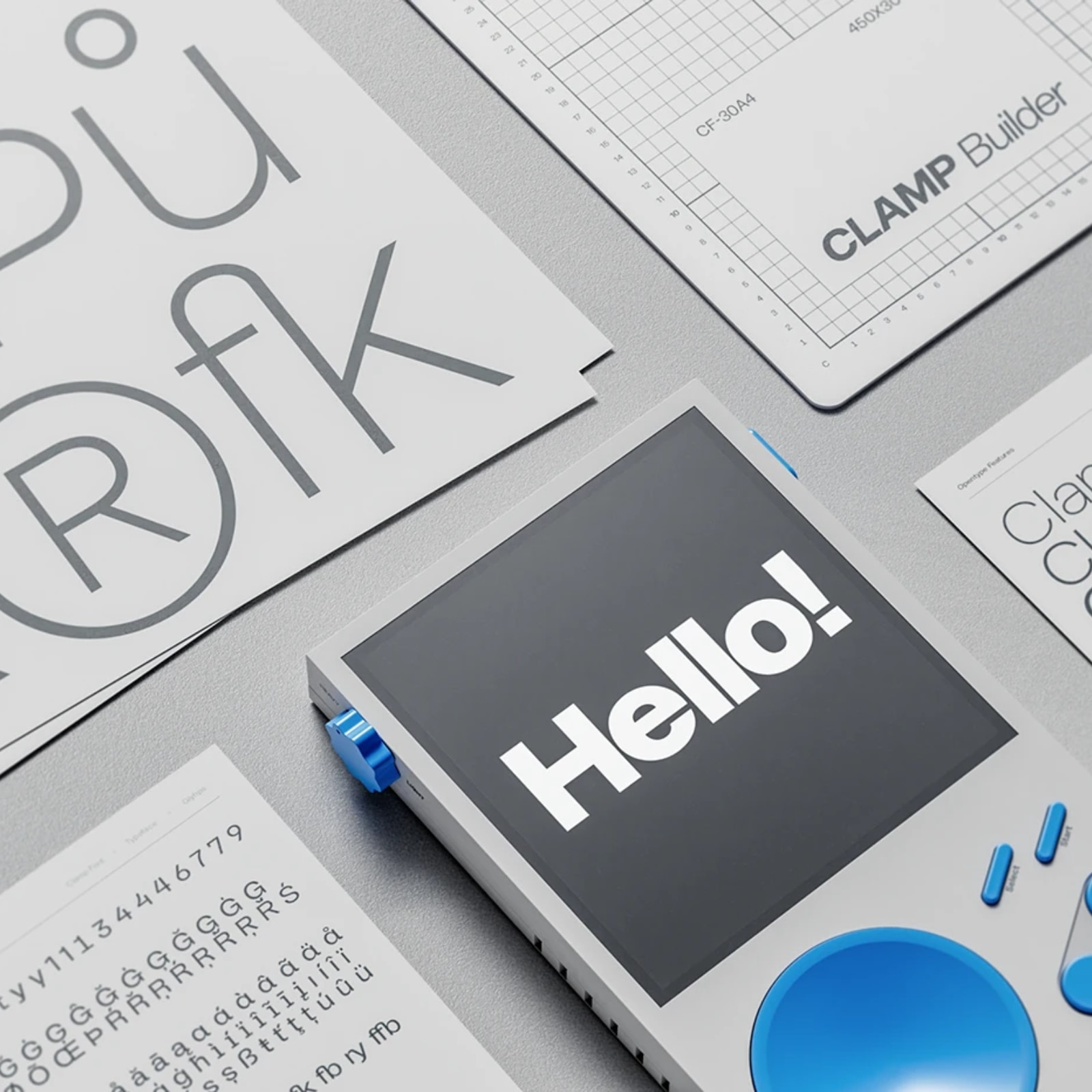
TypeFoundry Studio Crafts Heavy Display Typography for Clamp

Clamp Font Family launches a high-contrast display typeface with strategic typography, combining industrial letterforms designed by TypeFoundry Studio. Typefoundry studio TypeFoundry Studio established a modular font system that grounds the family's visual direction. The color palette pairs deep…