Graphics Design

О графическом дизайне

RSS

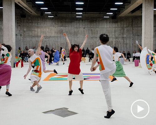
issey miyake turns matisse cut-outs into clothing and choreography at tate modern

the audience enters the choreography Inside Tate Modern’s South Tank, the performance begins as guests entered the room. A pale felt surface covered the floor, with benches following the circular concrete wall and individual seats scattered closer to its center. Lying across the floor was a pleated…
Paul Hierophant – The Elder Gods EP

The Elder Gods, the latest EP by London-based electronic artist Paul Hierophant, features AL Kunsthalle, a typeface whose forms and geometric construction draw on engraved Roman capitals. Released by Gated Recordings, the record moves between electro, techno, ambient, and dub, subtly invoking a…

Doan/Lvov – Fraction, Lvov – Bodas de Sangre EP covers

Lvov is a Neuchâtel based producer who has released two EPs on HRBR. Founded in Saigon, Harbour Saigon (HRBR) aims to build a strong community around house and techno. With deep roots in Vietnam, the label is expanding its collaborations in Southeast Asia and around the world. Designed by Pierre…

Vivienne Segal and Harold Lang – Pal Joey album art

This pressing (OL 4364) is a 1956 reissue. Pal Joey is an album first released in 1951 by Columbia Masterworks. It contains various songs from the musical play. The main typeface is Norton Vaudeville Act 3, used here for the name of the play. It’s contrasted with more sober workhorse gothics.

Chaka Khan – What Cha’ Gonna Do for Me album art

From Wikipedia: What Cha’ Gonna Do for Me is the third solo album by American R&B/funk singer Chaka Khan, released on Warner Bros. Records in 1981. It was certified gold by the RIAA. Chaka Khan’s name is set in Filmotype Quiet inside a yellow box above her portrait, which combines a photo by Gordon…

Joe Jackson – Night and Day album art

Night and Day is the fifth studio album by English musician Joe Jackson, released on 25 June 1982 by A&M Records. The front and back cover are set in all-caps Empire. It’s also used for the track titles on the gatefold, while the lyrics are set in Futura’s Medium weight. [More info on Discogs]…

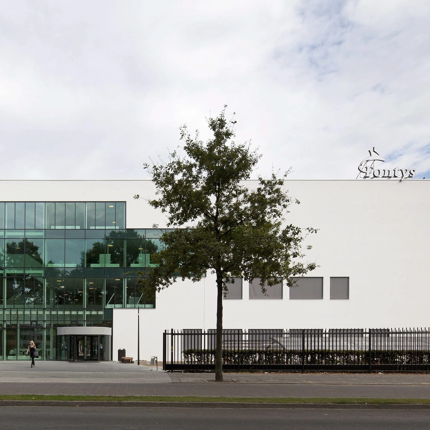
Spatial Design: Fontys University Wayfinding by Silo

Silo developed the spatial design and wayfinding system for Fontys University in Eindhoven, uniting bold graphics with vertical architecture. The R3 Economic Studies building at Fontys University was rebuilt by Mecanoo architects. Silo shaped the interior identity with an open spatial design…

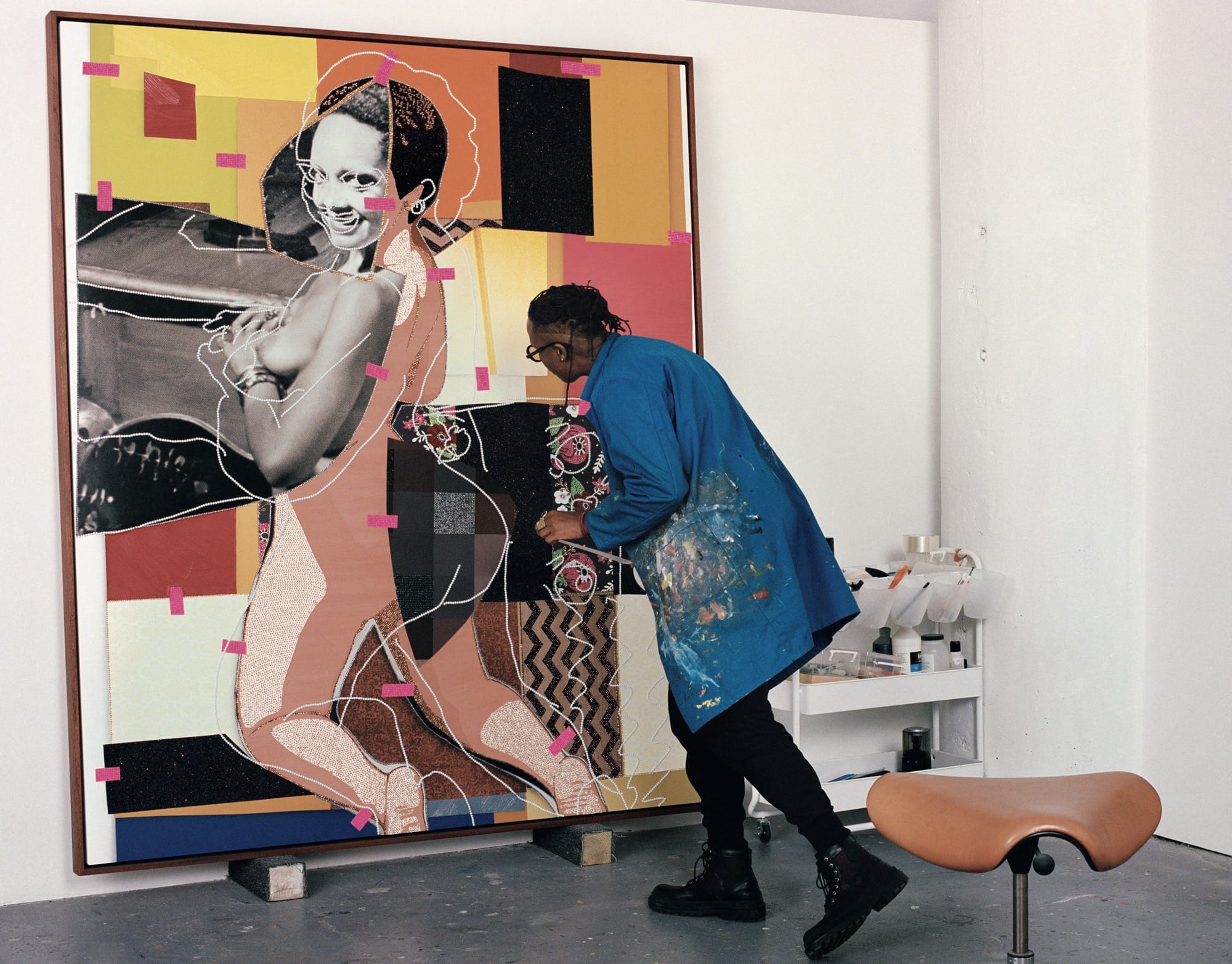
Step Inside the Studios of 20 Contemporary Black Artists in ‘Another View’

One of the most intimate windows into an artist’s practice is their studio. While some creatives thrive on methodical organization and tidiness, others reach their flow state amid a cluttered chaos where dozens of ideas unfold at once. Whether at one end of this spectrum or somewhere in the middle,…

Centers's Latest Project Offers a 'Riff' On Box Meals

Riff is a new meal-in-a-box brand from Michelin-star chef Daniel Humm, with Center-designed branding and packaging. Center visually blends fine dining and home cooking to communicate chef-centric taste, convenience, and license to improvise. Getting into a Michelin-rated restaurant takes a lot of…

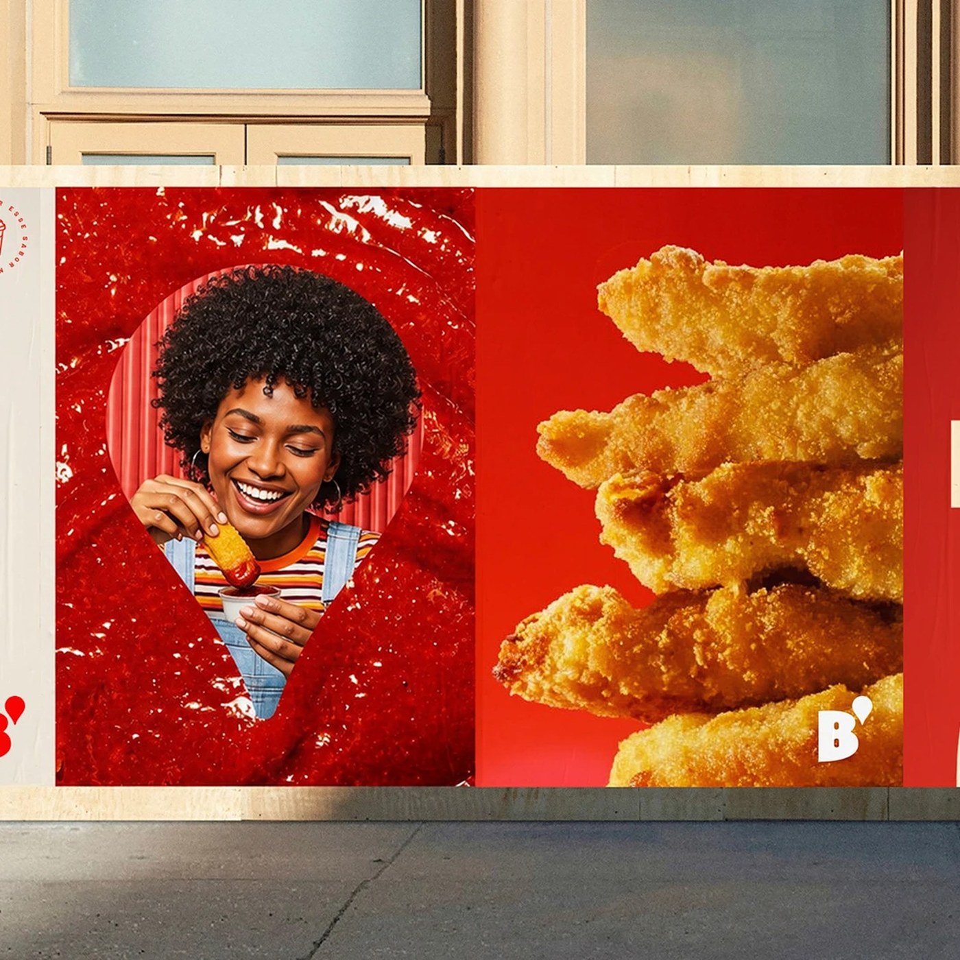
Typography Design: Bob's Display Typeface by Plau Design

Plau Design shaped the typography design for Bob's Display. The bold retail font turns classic fast-food curves into five weights. Bob's opened in 1952 as Brazil's first fast-food chain. The brand has more than one thousand stores across the country. Its curved logo and milkshakes shaped Brazilian…

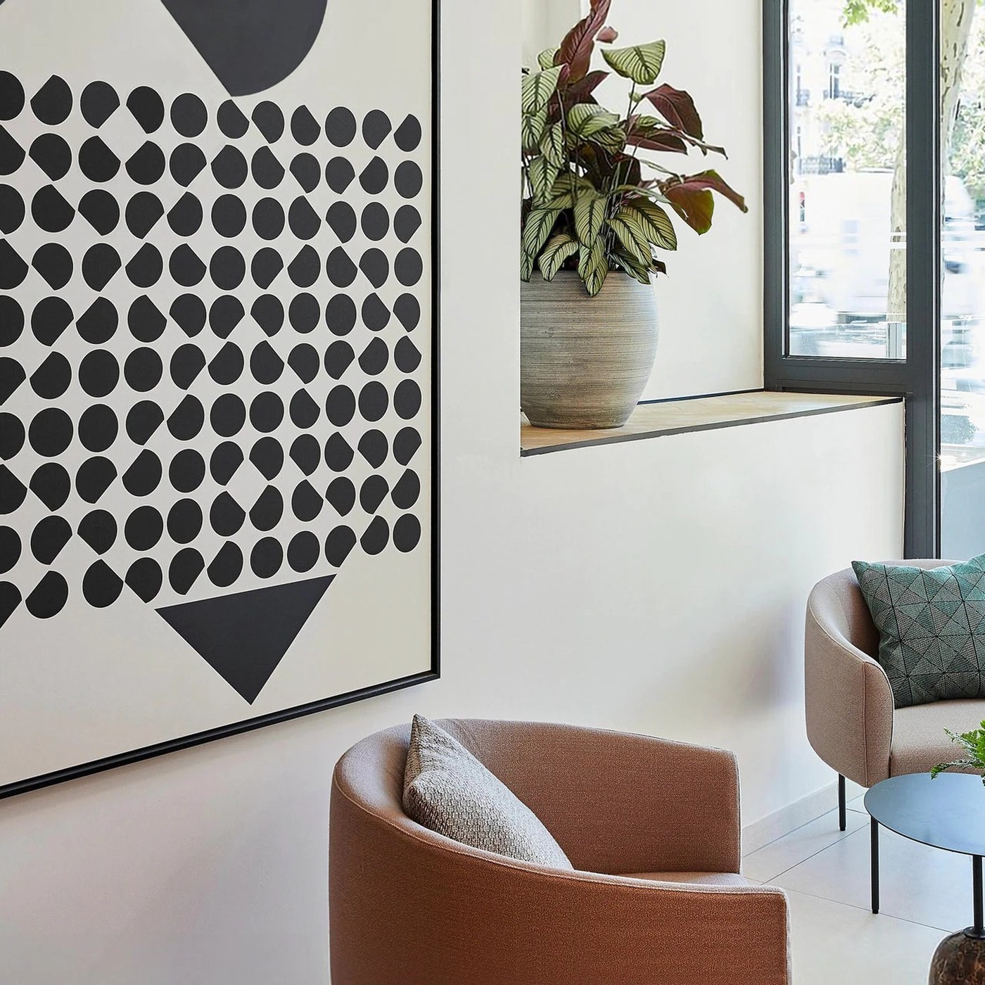
Geometric Art Direction: Artworks in Paris

Marçal Prats reinterprets the Centre Pompidou abstract canon through bespoke geometric art direction for two boutique Parisian hotels. Located within the urban fabric of Paris’s 10th arrondissement, Crowne Plaza Paris République and Le Grand Quartier commissioned graphic designer and creative…

Design Tools: Adobe Photoshop Elements 2027 Release

Adobe has officially released the Adobe Elements 2027 Family, bringing focused machine learning tools to Photoshop Elements and Premiere Elements. Photoshop Elements 2027: Intelligent Editing Tools In Photoshop Elements 2027, the primary addition is Generative Expand, which draws on Adobe Firefly…

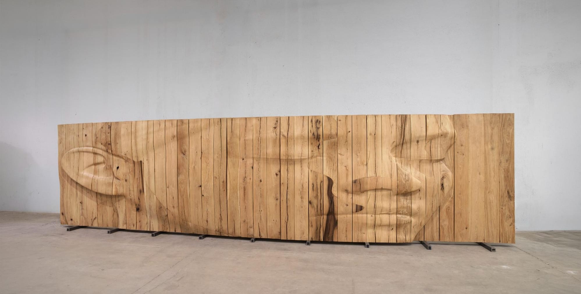
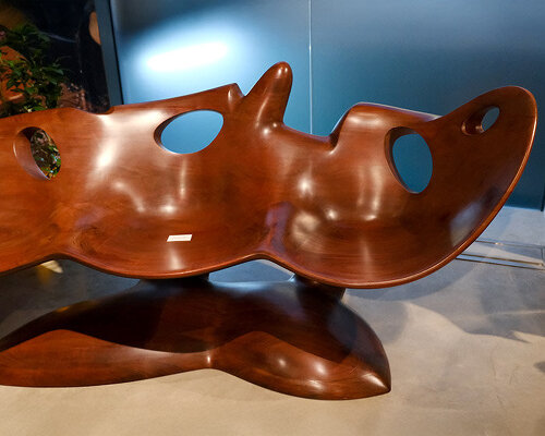
Through Carved Wooden Assemblages, Daniel Minter Communes with the Spiritual

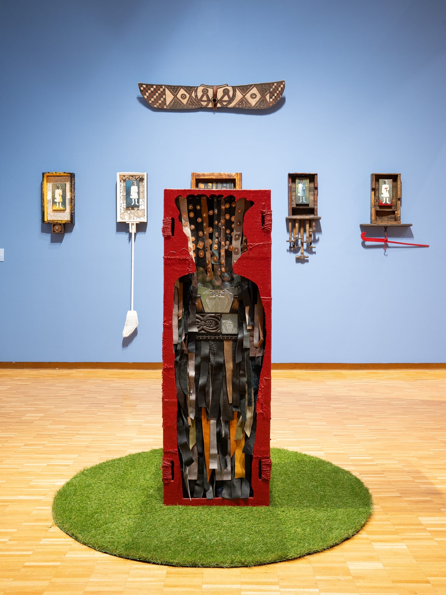
Walk into the first gallery of the group exhibition Thresholds at the Haggerty Museum of Art, and you’ll encounter dozens of hand brooms installed in long rows. Scraps of ribbons, cords, and braids in a vast array of colors and textures bind the small tools together, with raw branches from a fallen…

Branding Design: Reading Rooms by Anatolie Micaliuc

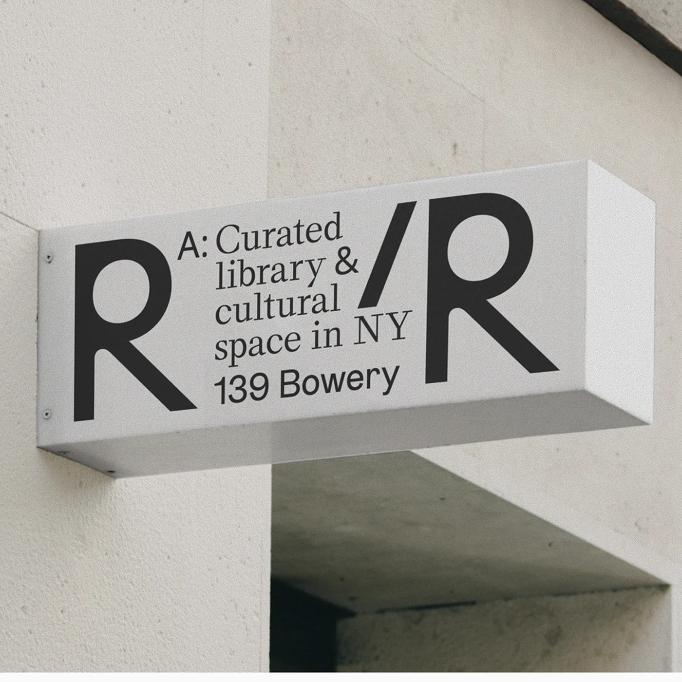
Anatolie Micaliuc created the branding design for Reading Rooms. This cultural space in New York blends classic type with tactile print goods. Reading Rooms is a curated library in New York. It brings books, quiet work, and talk together in one place. Anatolie Micaliuc led this branding design with…

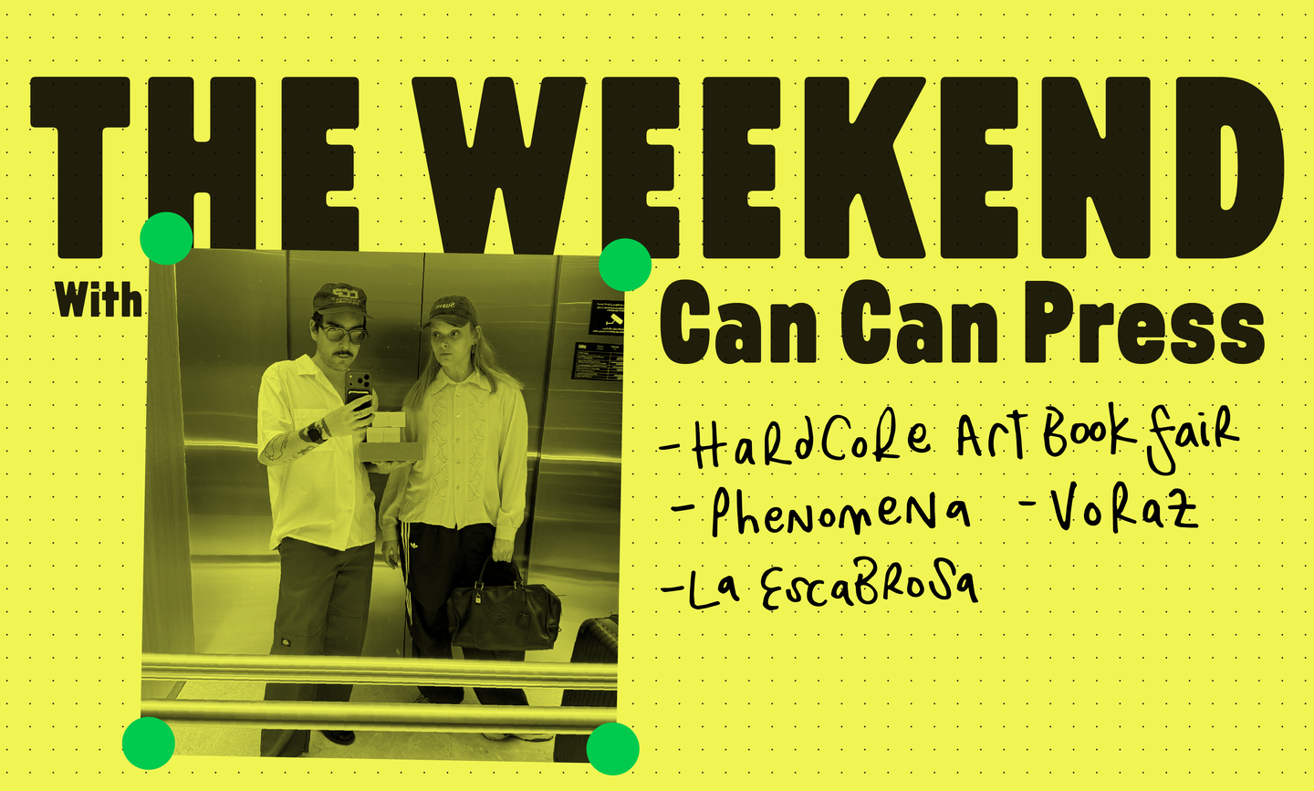
The Weekend With Can Can Press

If you know co-founders of multidisciplinary creative studio, publisher, and Risograph printing press Can Can Press, then you’ll be aware of the duos numerous, and very successful creative side-gigs. Not only did they start Can Can back in 2017, they’ve since become founders of streetwear label…

Orla by Isabel Carvalho

In her 2011 project Orla, Isabel Carvalho thinks about water, in its states and shapes, and as a metaphor of fluidity and solidity, of limit and infinity, giving privilege to the sense of audition. She plays with the idea of glass as water-made-permanent and researches Portugal’s glass-blowing…

49485 by Mia Murone

49485 explores how publication design can be used to preserve, spotlight and unearth counter-histories. Using my family archive as a case study, I investigated the archival process through gathering, deciphering and collating official documents, letters, photographs and family stories. The…

Branding & Packaging for toothpaste Bastét by Wedge – BP&O

“Nano-hydroxyapatite” isn’t exactly memorable – it takes a few tries to even attempt to figure out how to say it, and I’d wager that there aren’t too many people who can tell you what on earth it is, beyond “some sort of chemical, probably?” One thing that is memorable, however, is the brand…

Swash #5

Swash is a French training organisation for creative professionals. The presentation document for their 2027 offer is typeset in EB Trainer Grotesk by Antoine Elsensohn, and EB Venezia by Alan Madić and Clara Dousson, both available from Électro-bibliothèque. The cover number is from LL Ruder…