Graphics Design

О графическом дизайне

RSS

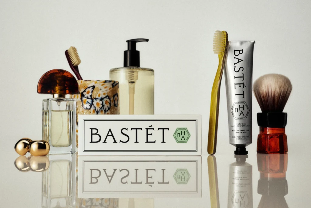
Branding & Packaging for toothpaste Bastét by Wedge – BP&O

“Nano-hydroxyapatite” isn’t exactly memorable – it takes a few tries to even attempt to figure out how to say it, and I’d wager that there aren’t too many people who can tell you what on earth it is, beyond “some sort of chemical, probably?” One thing that is memorable, however, is the brand…
Swash #5

Swash is a French training organisation for creative professionals. The presentation document for their 2027 offer is typeset in EB Trainer Grotesk by Antoine Elsensohn, and EB Venezia by Alan Madić and Clara Dousson, both available from Électro-bibliothèque. The cover number is from LL Ruder…

Opernhaus Zürich Spielplan 2026

Created for Zürich Barock 2026, this special magazine issue for Oper Aktuell explores the festival through a combination of editorial design, photography and illustration. The publication was designed by Herburg Weiland, with​​​ ES Klarheit Kurrent and Grotesk used throughout the editorial design.…

Opernhaus Zürich 2026 Spielplan

Created for the Zürich Barock Festival 2026, this special magazine issue for Oper Aktuell explores the festival through a combination of editorial design, photography and illustration. The publication was designed by Herburg Weiland, with​​​ ES Klarheit Kurrent and Grotesk used throughout the…

Ainsi on a rêvé avoir connu Chopin by Isabelle Talagrand

In 2024, Isabelle Talagrand’s manuscript resurfaced through a series of precious coincidences: discovered by Méline, a friend of graphic designer Louise Dehaye, the text made its way to this new edition. Entitled Ainsi on a rêvé avoir connu Chopin, this book published posthumously by her brother,…

Monest website

Monest is the Antwerp studio of me, Aaron Lejeune. I design and build each site myself. Headlines are set in Neue Montreal at 500, tightly tracked at display sizes, with Tiempos Text for running copy across case studies and the philosophy page. Type carries the entire homepage – there is no…

Monest

Monest is the Antwerp studio of Aaron Lejeune, who designs and builds each site himself. Headlines are set in Neue Montreal at 500, tightly tracked at display sizes, with Tiempos Text for running copy across case studies and the philosophy page. Type carries the entire homepage — there is no…

Eclipse

Eclipse Ventures (Eclipse Capital) recently unveiled a comprehensive brand identity refresh and website launch alongside their $1.3B fund announcement. To anchor the new visual ecosystem, Eclipse acquired and implemented KP Duo Sans (the sibling to KP Duo Serif) from the Copenhagen-based foundry…

Carta Bianca exhibition catalog

In the midst of the April 2020 lockdown, Vogue Italia released an iconic, completely blank cover for issue no. 836. Art curator Valentina Ciarallo chose to bring that blank canvas to life through the creative expression of 49 artists, inspiring the Carta Bianca project for which we had the pleasure…

Carta Bianca

In the midst of the April 2020 lockdown, Vogue Italia released an iconic, completely blank cover for issue no. 836. Art curator Valentina Ciarallo chose to bring that blank canvas to life through the creative expression of 49 artists, inspiring the “Carta Bianca” project for which we had the…

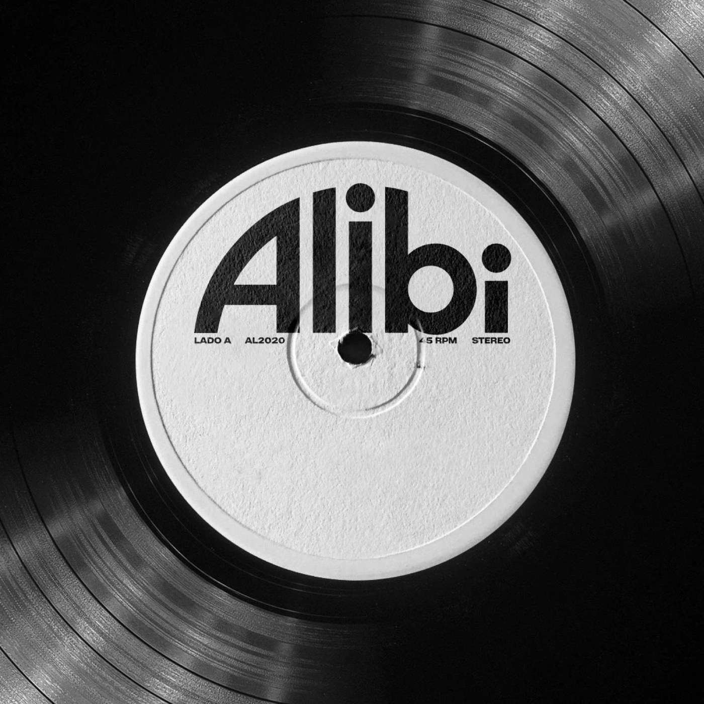
Brand Identity: Alibi Records by Polar, Ltda.

Polar, Ltda. created a dynamic brand identity for Alibi Records, an independent record label established in the western zone of Rio de Janeiro. Motown Heritage Meets Contemporary Brazilian Rap Rooted in the neighborhood of Campo Grande in Rio de Janeiro, Alibi Records represents a dedicated…

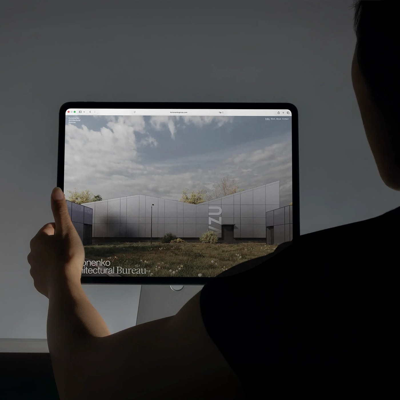
Web Design: Kononenko Architectural Website by Artem Shcherban

Artem Shcherban shaped this web design for Kononenko Architectural Bureau. Reksa Andhika built blueprint animations and clean editorial grids. The KNKO studio website explores modern digital form. Artem Shcherban led this web design project with Reksa Andhika. The creative team rejected shallow…

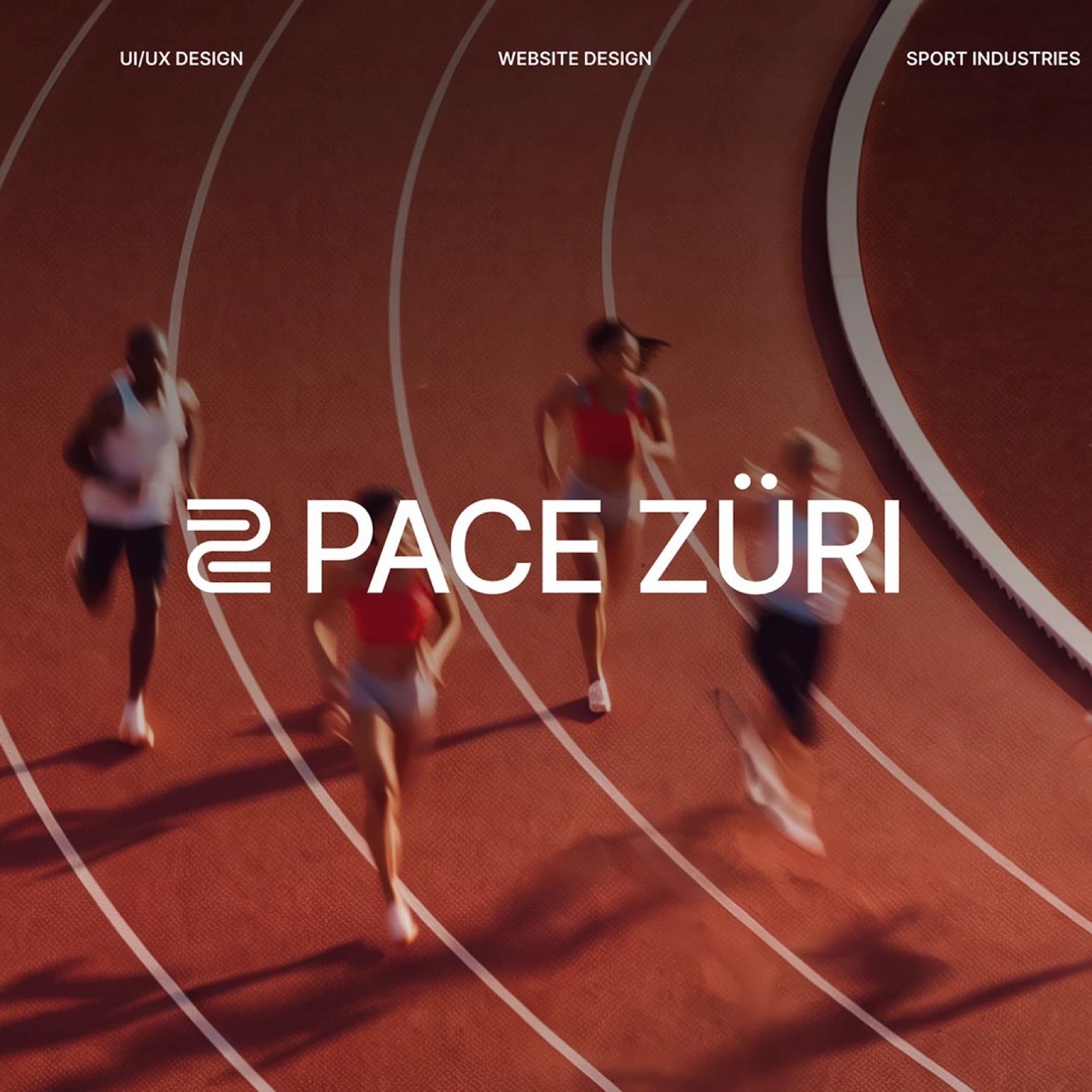
Web Design: Pace Züri by Sophie Kondratenko

Sophie Kondratenko crafts an energetic web design for Pace Züri, pairing a modular Swiss grid with dynamic running telemetry. Modern athletic communities require digital interfaces that balance logistical precision with physical momentum. For Pace Züri, a contemporary running club based in Zurich,…

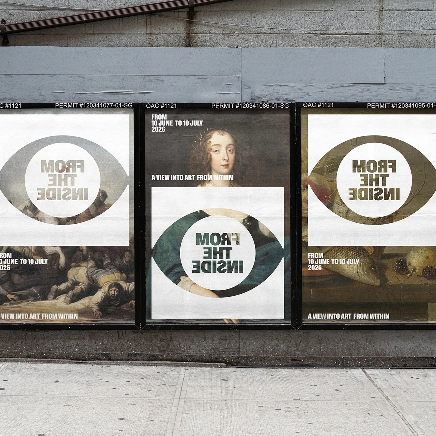
Visual Identity: From The Inside by Jarosław Dziubek

Discover the bold visual identity for From The Inside by Jarosław Dziubek. The exhibition system pairs classical art with mirrored typography. Warsaw-based designer Jarosław Dziubek developed a conceptual graphic system for an art exhibition. The project carries the title From The Inside. Its…

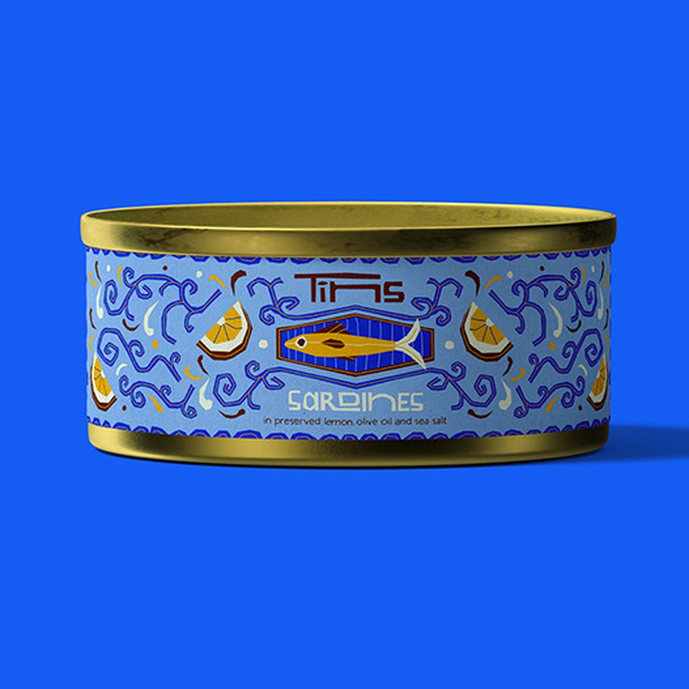
Packaging Design: Fish Tin Packaging by Deoné Rabé

Deoné Rabé crafts packaging design for collectible seafood cans. Illustrated paper labels bring fresh charm to classic tins. The Cape Town designer creates a fresh look for canned seafood. Each metal tin explores simple recipes with bold art. Sardines feature bright yellow lemon slices and sea blue…

Nymph Turns the Cicada’s Long Sleep Into Cannabis Packaging

Sleep seems to be the latest wellness obsession, and Nymph gives the space a visual language that feels far more considered than the usual sleepy moons and nighttime clichés. Sol Mitchell builds the packaging around the cicada, whose long periods of dormancy make the insect a wonderfully unexpected…

Redken Bottles Up Its Vintage Lab Roots

This Redken concept pushes straight into New York fashion territory, with a more editorial mindset. Dahyun Kang draws on the brand’s scientific history and vintage laboratory packaging, translating those references into squared bottles, oversized percentages,, and product information that reads…

Folk Cuts a New Pattern for Light Beer

One can only hope that light beer packaging is loosening its grip on macho clichés, making room for identities built around craft, community, and a much wider lens for who gets invited to the table. Julia Liut’s Folk concept draws from Polish Wycinanki, custom handmade paper cutouts, with floral…